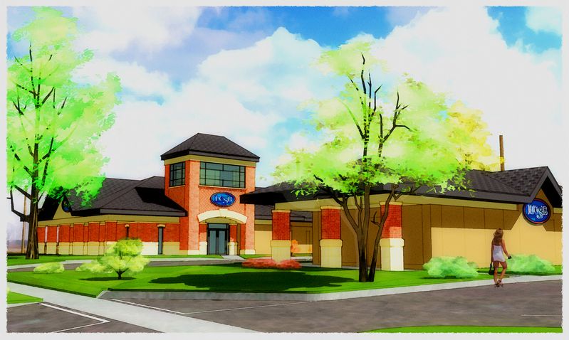
For all of this...
-
You've created a little world there! Really beautiful work Tom.
-
Feelin' a little nostalgic Tom. Your work is making me feel that way. Beautiful work
brother.Best,
Peter K -
Fantastic!
-
Thanks, guys...yeah, a little nostalgic, Peter. I got the go-ahead to finish this model two years (almost to the day) after I got my first modeling job...same architect too. That one was way over my head at the time, and this one is the biggest and most complete so far.
Lots of feelings felt last month as I was crashing to complete, but the bottomline is I'm very happy with where I am professionally and personally right now...and blame a lot of that on my efforts with this program and ya'll as co-conspirators.
A sad footnote: first email this AM was a request to do "rendered" floor plans of the three rec center options...first call was to tell me nevermind as the city commission had voted last night to forget the bond issue and repair the existing pool instead.
-
I love this Tom. You have outdone yourself on these, they look great.

-
Tom,
Sorry to hear they voted the project down but I have to say that your color palette is the most pleasing thing I've come across. The colors work so well together. I wish you'd publish the palette and rules of which color sets go with which.
Thanks for inspiring us all and we look forward to the next project of yours and the next way you choose to present it.
Allen
-
Well done Tom. Your tree just work so well in that
work. BTW, its guys like you that make this forum
work so well .... so give yourself a pat on the back
also
Mike
-
Thanks again guys...Allen, I bet you gave a few more than me a good laugh asking about my color rules :`) Still struggling with that but thanks to lots of patient help here I too think I'm getting better and these latest are at least pleasing.
Oh, and it's worse than that: this project was for the park board...the city commission acted independently without input or seeing this at all. Didn't even get up to bat...so to speak |-p
-
Allen, hope my "up too late the night before and gonna have to again tonight" comment didn't offend as if gift horse mouth looking...it's just that I've been struggling so long to loose the "great, but those colors are awfully bright" comments (the attached is one of my "best" from just last summer :`) your very complimentary request for my "rules" struck me as quite hilarious.
Seriously, then, I have been having great luck with a material paint group I downloaded here: RAL-Farben. Subtle color changes, fairly bright (which pleases me), and the entire palette works together quite well for an old black-and-white printmaker like me.
The other thing you're seeing here (which is part of an ongoing discussion going on here http://www.sketchucation.com/forums/scf/viewtopic.php?f=81&t=8219 ) is some enhancement of the straight SU export (an "overlay" layer of the same image, set to 20-40%, plus a grainy grey spots layer "burned" in at 50%, to liven up the colors).

-
Tom,
No offense taken so no apology needed.
You're way to modest fella. Your color sense is wonderful and so pleasant on the eye. When I try, my wife asks if I've been at the medicine cabinet again.
Anyway, I so enjoy and am inspired by what you and others do.
Much to be thankful for and much to learn by stopping by and looking.
Allen
Hello! It looks like you're interested in this conversation, but you don't have an account yet.
Getting fed up of having to scroll through the same posts each visit? When you register for an account, you'll always come back to exactly where you were before, and choose to be notified of new replies (either via email, or push notification). You'll also be able to save bookmarks and upvote posts to show your appreciation to other community members.
With your input, this post could be even better 💗
Register LoginAdvertisement


