A remodelling project
-
i thought i'd post a study for a remodelling of a clinic we are doing at the office.
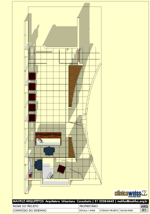
faced with a weird space (a curved corridor, for instance) we are trying to make it work better.
our moves:
- to move the receptionist's desk to the back of the space.
- to create a small admin room behind it.
- to diminish the convex effect of the curved wall by creating a storage wall by the receptionist's desk and some shelves near the entrance.
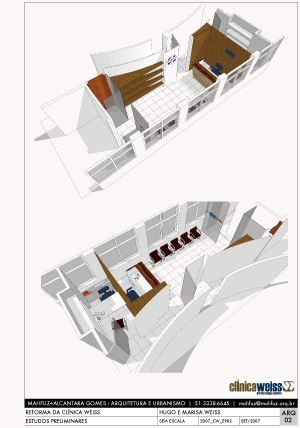
it is all straight SU. in case anyone is interested in looking at the images up close you can get them here.
-
Thats so cool!
And the top layout 'pop's out' due to shadows, looks like model is growing out of page.
-
Great presentation Edson. Your client must be pleased.
-
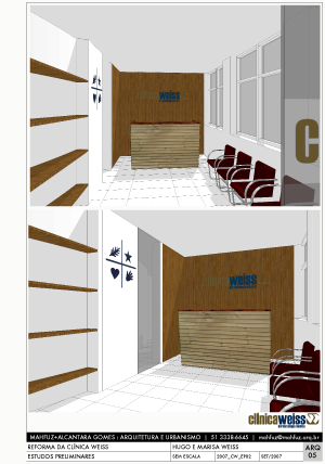
Edson - I like your design very much. The shelves against the curve works very well -- hopefully they won't get cluttered with stuff. They look like they need careful planning of what goes on them to not diminish the strong sculptural effect you've achieved. The only thing I have 'trouble' with is the flat panel (cabinet?) against the curved wall at the side of the reception desk. I feel it would have been better to let the curve continue to exist in some apparent manner.
Regards, Ross
-
Very elegant design Edson.
I agree with Ross, and would add the wood pattern behind the wood partial wall should all run horizontally. What do you think? -
i think ross and cheffey are right. i'd prefer leaving the other strech of curved wall apparent too. the reason i did not do it was because the client said they need more storage space in that area and it would be difficult to thicken the wall behing the receptionist's counter (it would make the reception smaller).
however, we are still at a stage in which this kind of change can be introduced. let see what they say about it.
thanks for your interest.
-
And an elegant model and presentation to go with the design!
-
Nice work, Edson. I like the presentation.
-
thanks, guys.
i quite like this kind of basic presentation, especially when it is for a rush presentation. as you could see, i kept all the existing parts in white and black and gave some color/texture to the new parts.
one little trick i used was to to use the sun to light the interior by: 1. selecting the ceiling, and 2. deselecting the cast shadows check box in the entity info dialog box.
-
Very nice work Edson! I really like the layout of the middle image. I like all the white. Very elegant.
-
What I like about your presentation the most is your contrasting use of color and B&W. I find that some designers get swept away with making the design output be the focal point. Amazing renders, watercolor effects etc. that look beautiful as an image but are not calling attention to what the client should be looking at. I am assuming that what is in color is what is being remodeled. Nice work.
-
@sketchy said:
I am assuming that what is in color is what is being remodeled
exactly, sketchy.
thanks, tina. this way of presenting my ideas is an attempt at being coherent with the architecture i do, which tries to employ as few elements as possible to solve a problem.
Hello! It looks like you're interested in this conversation, but you don't have an account yet.
Getting fed up of having to scroll through the same posts each visit? When you register for an account, you'll always come back to exactly where you were before, and choose to be notified of new replies (either via email, or push notification). You'll also be able to save bookmarks and upvote posts to show your appreciation to other community members.
With your input, this post could be even better 💗
Register Login


Advertisement