Revisiting npr
-
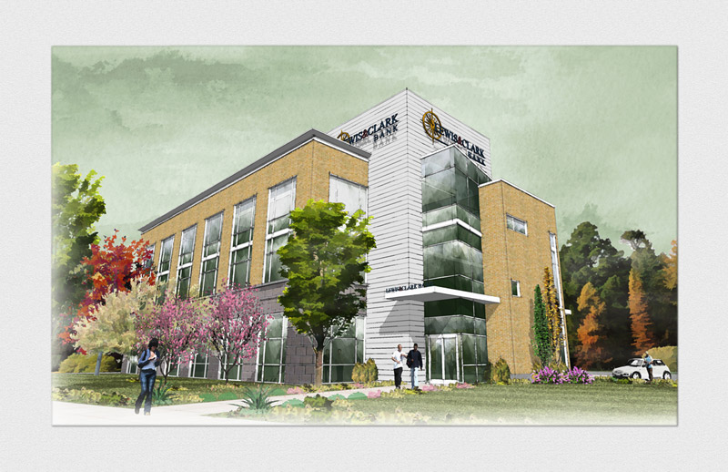
Revisiting the dw/mixed media/npr look.
There are things in it I absolutely like and things that I absolutely don't like. Can you tell which ones?!!..
...and what do you think? How can I improve this?SU+FormFonts' stuff+GM's glass texture + SU styles & Layered (messed around) in Photoshop

Thanks!PS. Didn't know where this belongs so moderators please feel free to move this thread to appropriate gallery
-
I very much enjoyed seeing that! So many great aspects that inspire.
If you were inclined to work on it a bit more I'd suggest faking some reflections in the glazed walls above the entry. A few relections would raise it to the next level. Its already very high.

Regards, Ross
-
Thanks for the kind words Ross! Much appreciate your comments.
-
I feel like the sky, lighting, overall tone is a little drab. Nothing wrong with that in and of itself, I just like a happy sky

Very nice work.
my two cents
-
Overall it's a beautiful image. There are two items that jumped out at me: 1) The green sky appears unnatural; and 2) the multi-colored vegetation is a bit too much and is competing with the building (assuming the purpose of the rendering is to present the building design).
-
I appreciate everybody's comments...
and thanks for the critique Daniel! I will keep these in mind when I do a next one. -
might i add that usually watercolor illustrators do 2 point perspectivess of their renders... it was easier to do it than the 3 point one. the next time try it out with the 2 point perspective!
 should look cool!
cheers! -
good point jj
-
Im loving it.
I would personally change the perspective, it somehow does not look quite right and I would try losing the two pink blossoming cherry trees.
-
@nick w said:
I feel like the sky, lighting, overall tone is a little drab. Nothing wrong with that in and of itself, I just like a happy sky

Very nice work.
my two cents
And some "happy trees".

Nice work Irsuser.
Hello! It looks like you're interested in this conversation, but you don't have an account yet.
Getting fed up of having to scroll through the same posts each visit? When you register for an account, you'll always come back to exactly where you were before, and choose to be notified of new replies (either via email, or push notification). You'll also be able to save bookmarks and upvote posts to show your appreciation to other community members.
With your input, this post could be even better 💗
Register LoginAdvertisement


