sketchucation logo sketchucation
    • Login
    Oops, your profile's looking a bit empty! To help us tailor your experience, please fill in key details like your SketchUp version, skill level, operating system, and more. Update and save your info on your profile page today!
    πŸ›£οΈ Road Profile Builder | Generate roads, curbs and pavements easily Download

    Revisiting npr

    Scheduled Pinned Locked Moved Gallery
    10 Posts 7 Posters 855 Views 7 Watching
    Loading More Posts
    • Oldest to Newest
    • Newest to Oldest
    • Most Votes
    Reply
    • Reply as topic
    Log in to reply
    This topic has been deleted. Only users with topic management privileges can see it.
    • L Offline
      lrsuser
      last edited by

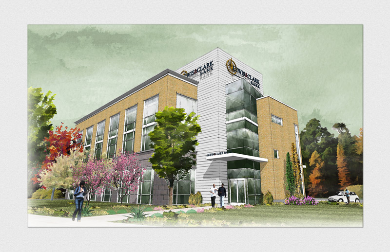
      Revisiting the dw/mixed media/npr look.
      There are things in it I absolutely like and things that I absolutely don't like. Can you tell which ones?!!..πŸ˜„
      ...and what do you think? How can I improve this?

      SU+FormFonts' stuff+GM's glass texture + SU styles & Layered (messed around) in Photoshop

      largeSketch01.jpg
      Thanks!

      PS. Didn't know where this belongs so moderators please feel free to move this thread to appropriate gallery

      1 Reply Last reply Reply Quote 0
      • R Offline
        Ross Macintosh
        last edited by

        I very much enjoyed seeing that! So many great aspects that inspire.

        If you were inclined to work on it a bit more I'd suggest faking some reflections in the glazed walls above the entry. A few relections would raise it to the next level. Its already very high. πŸ˜„

        Regards, Ross

        1 Reply Last reply Reply Quote 0
        • L Offline
          lrsuser
          last edited by

          Thanks for the kind words Ross! Much appreciate your comments.

          1 Reply Last reply Reply Quote 0
          • N Offline
            Nick W
            last edited by

            I feel like the sky, lighting, overall tone is a little drab. Nothing wrong with that in and of itself, I just like a happy sky πŸ˜„

            Very nice work.

            my two cents

            http://www.nrwiesneski.com

            1 Reply Last reply Reply Quote 0
            • DanielD Offline
              Daniel
              last edited by

              Overall it's a beautiful image. There are two items that jumped out at me: 1) The green sky appears unnatural; and 2) the multi-colored vegetation is a bit too much and is competing with the building (assuming the purpose of the rendering is to present the building design).

              My avatar is an anachronism.

              1 Reply Last reply Reply Quote 0
              • L Offline
                lrsuser
                last edited by

                I appreciate everybody's comments...
                and thanks for the critique Daniel! I will keep these in mind when I do a next one.

                1 Reply Last reply Reply Quote 0
                • jenujacobJ Offline
                  jenujacob
                  last edited by

                  might i add that usually watercolor illustrators do 2 point perspectivess of their renders... it was easier to do it than the 3 point one. the next time try it out with the 2 point perspective! πŸ˜‰ should look cool!
                  cheers!

                  1 Reply Last reply Reply Quote 0
                  • L Offline
                    lrsuser
                    last edited by

                    good point jj

                    1 Reply Last reply Reply Quote 0
                    • D Offline
                      dylan
                      last edited by

                      Im loving it.

                      I would personally change the perspective, it somehow does not look quite right and I would try losing the two pink blossoming cherry trees.

                      http://dmdarchitecture.co.uk/

                      1 Reply Last reply Reply Quote 0
                      • Dave RD Offline
                        Dave R
                        last edited by

                        @nick w said:

                        I feel like the sky, lighting, overall tone is a little drab. Nothing wrong with that in and of itself, I just like a happy sky πŸ˜„

                        Very nice work.

                        my two cents

                        And some "happy trees". πŸ˜„

                        Nice work Irsuser.

                        Etaoin Shrdlu

                        %

                        (THERE'S NO PLACE LIKE)

                        G28 X0.0 Y0.0 Z0.0

                        M30

                        %

                        1 Reply Last reply Reply Quote 0
                        • 1 / 1
                        • First post
                          Last post
                        Buy SketchPlus
                        Buy SUbD
                        Buy WrapR
                        Buy eBook
                        Buy Modelur
                        Buy Vertex Tools
                        Buy SketchCuisine
                        Buy FormFonts

                        Advertisement