Watercolor...
-
Its a nice effect, but like you said, i think it could do with a bit more background and a bit more foreground. perhaps a better grass texture as well, all just fine details really

-
Carex, thank you for sharing. Your technique is good. There are some other great techniques in the "how to" forum. I think if you added a sketchy line layer to your drawing it would look great!
-
Remus… agreed, thanx
Tina Anne… Yes, I saw one of yours with the (I believe) ‘pencil’ line. I downloaded the style, but could not get it to install. However, just yesterday I spotted something in the ‘Style’ forum regarding same. I’m on my way there now.
Thanx for the input, have a sparkling evening,
Bob -
Bob, I really like (among other things) what the watercolor effect in PS did to the watercolor paper texture from SU...very interesting. I too think a edge only layer burned over the top of the image in PS would punch it up quite nicely!
Hope to see more, Tom.
-
I like that Bob, it is totally transformed from your last image.
The good use of trees and adding the clouds works really well.Now looks like a pretty good watercolour.
-
New and improved (me thinx).
Additional steps…
Early was to render in KT07, last was to run back thru Adobe Elements and /Enhance/Unsharp Mask.
I messed with 'edges' but couldn't find one that appealed to me.Have a sparkling week-end,
Bob

-
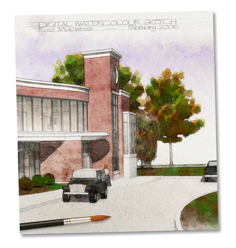
Hi Bob! Great to see your digital watercolours. I think the area you should try developing more relates to linework. Right now the lines are detracting in my opinion. I think you'll see a big improvement in your technique if you do what you're doing now but start with a SketchUp export that has edges off. When you are satisfied with the watercolour look then you can overlay fine edge-work to add some definition. For that line layer I typically just export an edges-only image from SketchUp with a white background and no shadows. I usually process that image with a filter that adds a little waviness and some roughness (for more of a graphite look) and then overlay it on the 'watercolour' using transparency to visually merge it with the colour below.
I attach an example I hope will show the benefit of the more subtle linework I think is reminiscent of traditional watercolours.
Regards, Ross

-
Ross,
I agree. I dare say your example is about as close to the real thing as one could get. I’ve tried literally ‘countless’ times to achieve a similar end result… but to no avail. I imagine I need to find another ‘effects’ routine. I can’t seem to achieve the subtle color blends, soft lines and semi-wet look that are seen in watercolor prints.
I appreciate your input. Have a stunning evening,
Bob
-
CARex,
You might consider posting your skippy file and asking others to do a quick watercolor post processing on it and see what they come up with. Keep up a dialogue to find out what their processes are. Try to incorporate what Ross, TinAnne, Tomsdesk are saying. They have logged a lot of hours at these various techniques.
I am also currently learning, studying, experimenting with watercolor techniques, so I sympathize with your situation. You are trying to develop a style that is pleasing to you.
I like your second attempt much better than the first. The bushes in the front may be bit too black and distract. I did a couple of watercolor's of your jpeg, attempting to vignette the perimeter of the image, just to see what that would look like. It's more difficult to get the lines that Ross is talking about without the Skippy. I'm posting the results just to give you a different perspective of your own image.
Best, PKast


-
Hi Pkast,
Thanx for the input. I’m still at it, but nothing has ‘struck my fancy’ yet. The current batch of end results tend to be washed out. Or if colorful enough, they are “dry” looking. I tried a few via Akvis Sketch (trial) software. But they also lacked the desired ‘soft wet-ish’ color blend look that appears in Ross’s image.
Still experimenting… Thanx,
Bob
Hello! It looks like you're interested in this conversation, but you don't have an account yet.
Getting fed up of having to scroll through the same posts each visit? When you register for an account, you'll always come back to exactly where you were before, and choose to be notified of new replies (either via email, or push notification). You'll also be able to save bookmarks and upvote posts to show your appreciation to other community members.
With your input, this post could be even better 💗
Register LoginAdvertisement


