Interior Design
-
Greetings fellow Sketchers. After using SU for about a year, I have become proficient enough where I am actually using it for my interior designs. So much so that yesterday, with the release of KT Echo, I did my first rendering. Thank you for this forum and those of you who have answered noob questions.
that being said, I searched the forum for "Interior Design" to see if I could find the best way to go about designing an interior of say an apartment in Manhattan. Luckily, I found "How a professional designs a house" and this is great, however, if you are simply interested in the interior aspect, and not the overall construction (i.e. foundation, etc..) would you still recommend this approach?
Thus far, I have been sketching the plans with closed lines in order to "Push/Pull" the interior walls into correct height and position. I have viewed the "Drawing A Room Tutorial", but would you use this approach for multiple rooms?
Again thanks, and I look forward to any advice or input you can offer.
Scott -
Hi Scott,
Well, I guess you are referring to Kriss' "How a pro builds a house" thread (parts 1 and 2).
As for interior design, you'd most probably not need all the details but if I were you, I'd still follow most of what's said there. At a point you will need shots where you can see some of the other rooms, you'll need shots where it is obvious (and apparent) that there are double walls and finally; this way you can always make sure that you are only using front faces which is essential when you are doing renders. -
A couple of simple suggestions if you are working a lot with interiors, but you may already be using are:
FOV - adjust your field of view which in Pro defauts at 35degrees. You can change this to help with your views, make internal modelling easier and it will also eliminate some of the clipping.
Sections - You can use sections to eliminate some walls to get into the internal spaces better.
-
Thank you for your feedback, it has been very helpful. I am diligently working on my sketches and the process becomes more intuitive each day.

Scott -
allright, well I have been working on a few sketches, trying to find the best way to do the interiors to my satisfaction. I have came up with some nice pictures, but in regards to the best way to do a large scale project, I am still coming up really frustrated as to what works.
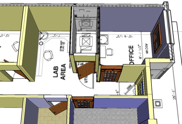
Here is one of the sketches I am working on--->

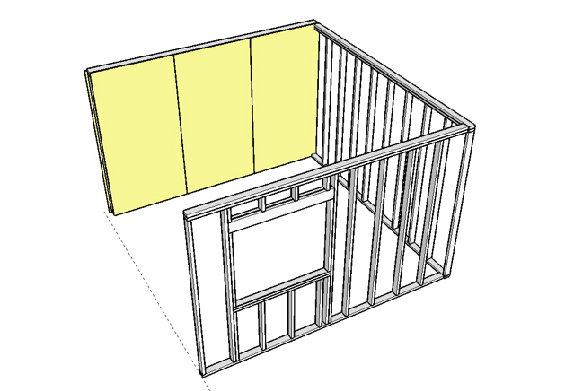
So as you can see, I have a lot of work and learning to do. I have also been attempting to model the interior using framework and the plywood components (is there a drywall component somewhere?). This has resulted in the frame lines showing through the plywood for some reason. Anyway, here is a picture of that-->

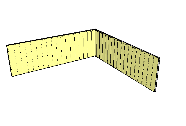
And also--->

Am I missing something major here or is it for the most part trial and error and find what works best? I have rendered a few shots of other models which turned out quite nicely, but I am a long way off from feeling confident with modeling...
Any feedback would be appreciated and this is the newbie section eh?
-
Hi Scott,
If you are using a single face for your pywood covers on your framework, it will always show through. Actually I'm not sure why you are modelling whatever will obviously been hidden (for interior design as I understand) but if you insist on doing so, you'll need to add some thickness to your plywood too (like in real life) to prevent lines showing through.
Note however that from a certain distance lines may show through "thick" materials, too. The reason is that the lines are of permanent (1 pixel) thick when modelling while thickness can get foreshortened to less than this from a bigger distance (this is just how the program works).
As for the first image... As far as I can tell from it, there is a fair amount of back faces in your model. Try to right click on them and "reverse face". Is that yellow the default front face in your settings?
-
Since I do a lot of interiors a way I have found helpfull in presenting different views
especially of smaller spaces is to apply the same colour material to all the wall faces except the interior ones. In that case making the selected colour transparent You can view the space from the outside whatewer the field of view might be leaving the interior walls visible. -
Gaeius, the sides are facing correctly, I was attempting a few different color variations in the midst of that shot. Let me get a new picture up.
As for the construction components, in the future, I would like to convert my work in to a DXF file.
-
I see. Then you won't have any better thing to do than to give thickness to that pywood sheet as well.
-
I doubt you will need to model the whole interior to show the client, unless its a few rooms. Most clients dont need to see a perspective plan - but its nice for students to messy about with these things.
The usual way to do it is you should first sketch out the plan to scale with your hand! or CAD.
Then build up the model and as you go along u can start to develop (pushpull and modify the elevations, etc...
If you are spending too much energy messing about clicking stuff and building stuff and no time designing(like all those stud partitions I saw above, then you are the equivielant of a labourer or brick-layer), for me thats a warning sign that you are not being creative. Be the master of the tool and make it help u DESIGN/CREATE. If SU causes u to design something thst you might not have seen while sketching with your hand, then it has done its job. IMHO
If your just making some typical residential house - most of the design will be in the furniture which can be bought or down loaded. But these spaces can be easy to draw in free hand so you should think is it worth while to spend ages to build this type of space.
Personnaly I find it annoying to model and view within small spaces. Not to mention my complains on the unfair interior lighting in SU. I sometimes just make the 3 main sides to the room as Im selling that part to the client and all I want to do is get him to say yes, then I can just draw up the rest in 2D drawings and instruct the contrctor etc etc
Well I have waffled on. I am not experienced as most on this forum, but I am an interior designer so I hope I have helped you a bit..
-
Very helpful, thanks for the waffling.

Yes, I know what you mean. As an independent designer and consultant, there is always sooooo much work to do with getting a project completed successfully that I am often left wondering how much time I should spend modeling a project in SU. There are many times when I literally must force myself into modeling a particular space because I do feel very strongly about the details.. and I guess I figure if I model the details, well, then it will be done according to my specs. Furthermore, it impresses the client when they can see their space virtually complete before the exterior walls are finished.
For me it seems that the more a person uses sketchup, the easier it becomes to incorporate into the design process... -
Hi all !
Agree with you "skilco" ..I'm an interior designer too, using SU for 5-6 months now.. still a lot to learn, and always happy to find people with similar inrerests.
My question is about this "FOV" -"field of view"- where can i find this option ?
is this changing the depth of the focal point ?
Thank you !
-
-
OHH !! soo simple !
I feel stupid
Köszi Gaieus!
_OFF
( one more thing, we discussed before the texture mismatch on MAC, You told me it will probably fixed in the next update, the problem is that I use 10.3 osx, and as i've read the new update wont work on that version of os. .. so don't even try ? )Oliver
-
Well, I'm not a Mac user myself so can't really give any advice. I know that OS 10.3 is not supported but I don't know if any next version will support it. As the things seem to be now, I guess the next version will be SU7 already - and that will take a while to fully beta test and bug fix before a public release.
Hello! It looks like you're interested in this conversation, but you don't have an account yet.
Getting fed up of having to scroll through the same posts each visit? When you register for an account, you'll always come back to exactly where you were before, and choose to be notified of new replies (either via email, or push notification). You'll also be able to save bookmarks and upvote posts to show your appreciation to other community members.
With your input, this post could be even better 💗
Register LoginAdvertisement


