A House for the Coast of Nova Scotia...
-
Many of you may know the architect Gregory La Vardera, a early adopter of SketchUp who sells modern house designs via his website. His work has been featured in Dwell. In the last year Greg has been kind enough to steer two different clients my way. Greg felt those clients who wanted to build in my neck of the woods would be better served having a local designer -- and I came to mind. Both clients were interested in the same design by Greg, a design he calls the Plat House. I worked with the first client and adapted Greg's design to suit their particular needs and local conditions. That house was built less than three miles from my home here in Prince Edward Island, Canada.
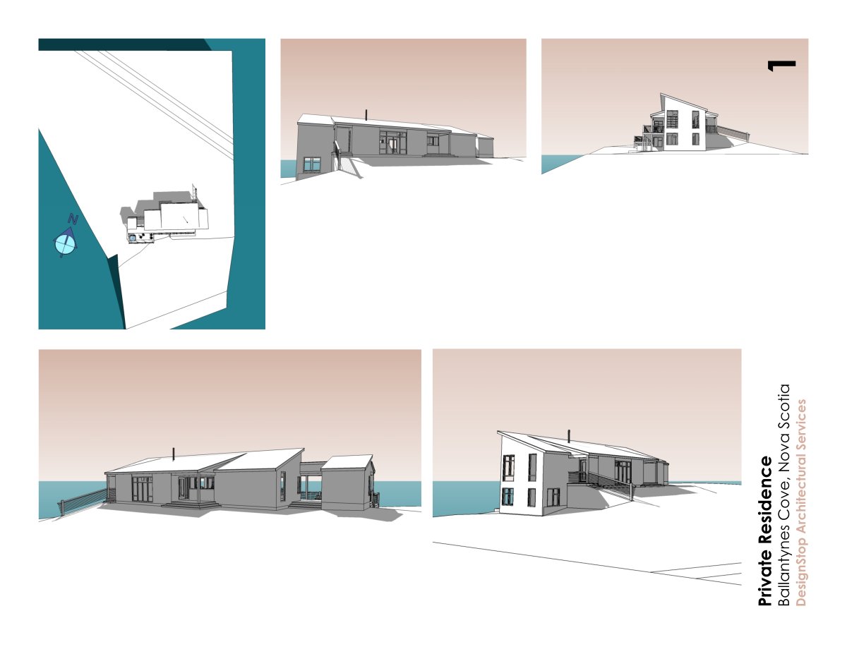
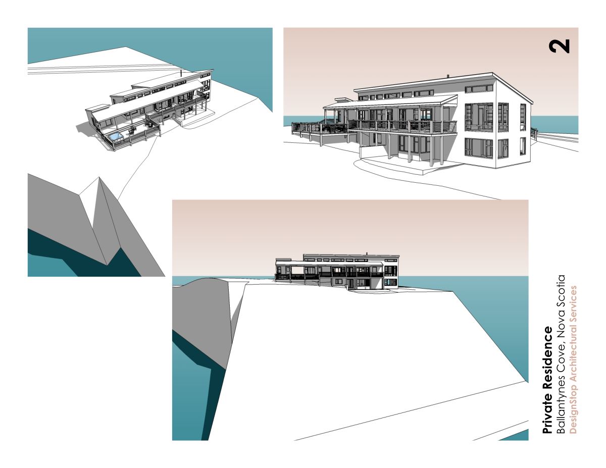
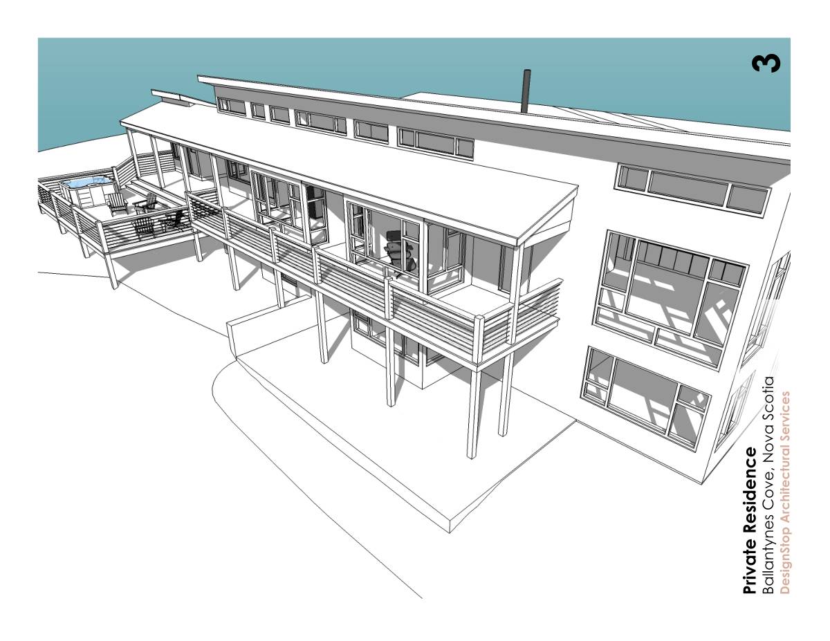
The design I attach in this thread is for the second client who intend to build in 2008. Their two acre site, in rural Nova Scotia, is a spectacular ocean-front one and they want to build on the crest of a steep bank above the beach. If you look at my drawings and those of Greg's Plat house I think you'll see lots of differences but still lots of the same 'feel'.
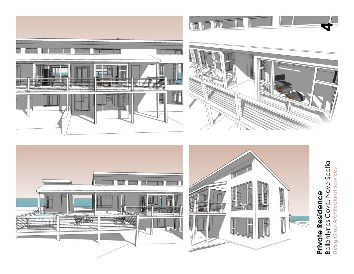
The attached images are straight SU exports that I assembled into panels using Xara Xtreme Pro. This is part of the first presentation to the client.
Regards, Ross
-
More panels...
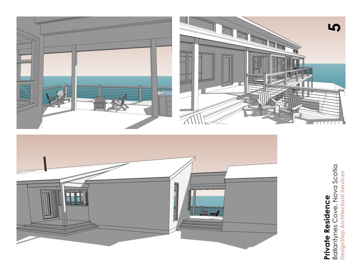
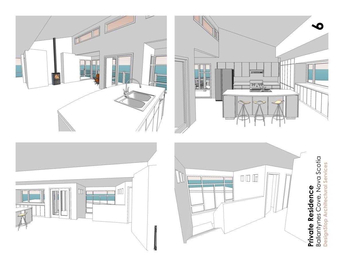
-
And the last two...
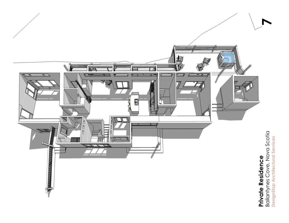
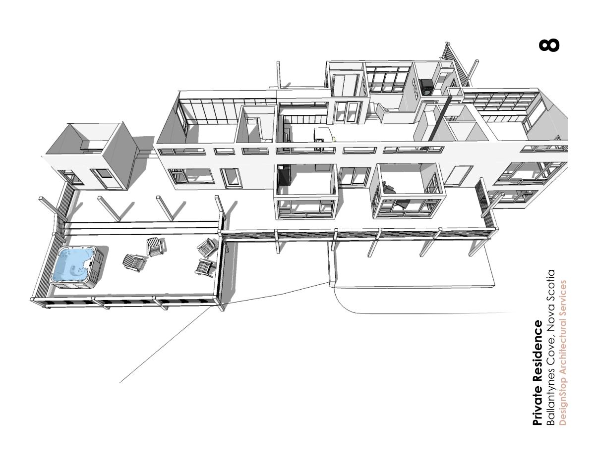
-
Beautiful package, Ross...just beautiful! LayOut?
-
Wow, really nice!
-
the B/W really showcases the wonderful simplicity of the design... and the renderings, are gorgeous. although you might educate me... being local, is the mass of glass and high eaves not a little dangerous on the shore? I don't know if you guys get hurricanes or not...
-
Thanks for the kind comments guys!
I did the panels using Xara Xtreme Pro which is a vector illustration program. I suppose I could have done the same thing in LayOut. I love Xara because it seems more intuitive to me - I've been using it for many years. To me Xara & SketchUp are a very powerful combo. I typically use Xara to do all my post-production stuff on SU output. In this case I exported a multi-page pdf from Xara to email to the client. All the design work was done building the model. This is how the client saw it -- I didn't do traditional plans & elevations, just gave them unannotated views of the model so their eyes could explore and their imaginations be primed.
Here in Canada's Atlantic Provinces (Nova Scotia, Prince Edward Island, New Brunswick, and Newfoundland) we do occasionally get hurricanes. More common are winter gales that come in off the North Atlantic. The wind can blow pretty good here. The coastal location for the house I posted will definitely be exposed regularly (three or four times per year) to heavy winds (65mph+). It won't be subjected to storm surge or ocean spray. Wood-framed wall construction here is typically 2x6's @ 16" OC. For this project we'll likely use plywood (vs. OSB) sheathing. The roof will be framed with TJI pre-engineered joist systems using hurricane clips to anchor them down. I significantly beefed up the structure of the overhangs from what Greg used on the Plat House. He gave it a thin crisp roof edge that we can't do safely here. Our typical construction here, even without hurricane clipping, seems to survive the local conditions pretty well. Large windows tend to survive pretty well too. Air infiltration of windows is a bigger problem for us than actual wind damage. In general our coastal conditions really aren't much different than Americans would have on the coast of Maine or Massachusetts.
With regards to the design, I should note that the room at the end with all the large windows is a library/office. At the other end is the master bedroom. The small out building at that end is a sauna. On the lower level are two guest bedrooms & a bath plus an art studio (under the library). It is a home for a medical research scientist and an artist. They are fans of modern design and intend to have it sparsely furnished. It is a home for the lifestyle they want. They want a place to slow down, read, listen to music, and just enjoy looking out at the expanse of the ocean. They will have lots of privacy in their location -- no window curtains required.

Regards, Ross
PS - I attach a pic showing the location. The site is at the top of the grassy bank just beyond the little fishing harbour. A very beautiful place to be sure.
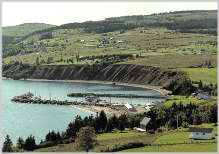
-
oh what a spot... that's fantastic...
-
Indeed Kristoff -- maybe you should plan a trip up our way sometime.

-
As everyone else has pointed out, the simple white model with the hints of ocean and sky are perfect to share the simplicity and elegance of the project. I love it when people learn to harness the power of SketchUp for there presentations rather than always going for an over developed photoreal image... simply beautiful.
Bob
-
I second Bob's comment, the use of colour is very effective.
Beautiful presentation, very simple.
-
you the man, Ross.
-
It's going to be beautiful-and the images are too (except for the too wide camera angles, my pet peeve).
No chimney on the sauna? Here in the "homeland" of sauna a separate sauna like that would generally be wood-heated, or equipped with both a wood and an electric stove. The extreme thing is a "smoke" sauna that has a wood stove without a chimney, but as it poses some fire hazard it is generally built more apart. The sauna roof form is also somewhat problematic, the high part will gather all the steam. A flat or less steep insulated inner ceiling would perhaps be better. Overall the sauna appears too high, of course I cannot be sure.
Anssi
-
Ross Boss,
Color choice, and gradations... I'm Jack bird into that action.
Killer.
Do the dance of nice.
I'll support your choice of sandwiches -- a warm love bun with a pickle, special sauce soon to be delivered.
Add a few scribbles and I'm popping a socket.
Durant "clean is in" Hapke
-
ross,
great design and thoughtful draftsmanship. please keep your work coming.
best wishes.
-
Very nice work Ross - thank you for sharing it.
Excellent presentation.cheers
john -
Ross
This is excellent work. Great design, simple and elegant.
A beautiful presentation. So good I think I'll post it again!
Lawrence -
Ross
This is excellent work. Great design, simple and elegant.
A beautiful presentation.
Lawrence -
100% Ross
The building plot reminds me of the West Coast of
Ireland. Then again ! Where they joined up at
some point in the distant past ?I'm interested to know the proposed construction
methods ?Mike
-
Really lovely Ross. I'm curious about the exterior materials and colour? what will it be?
Hello! It looks like you're interested in this conversation, but you don't have an account yet.
Getting fed up of having to scroll through the same posts each visit? When you register for an account, you'll always come back to exactly where you were before, and choose to be notified of new replies (either via email, or push notification). You'll also be able to save bookmarks and upvote posts to show your appreciation to other community members.
With your input, this post could be even better 💗
Register LoginAdvertisement


