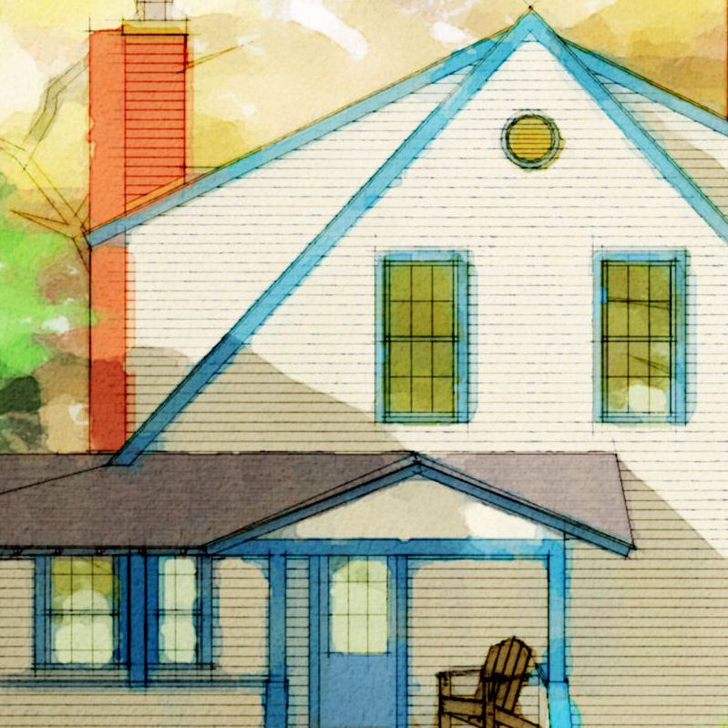
A quick hundred bucks...
-
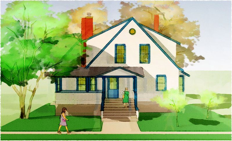
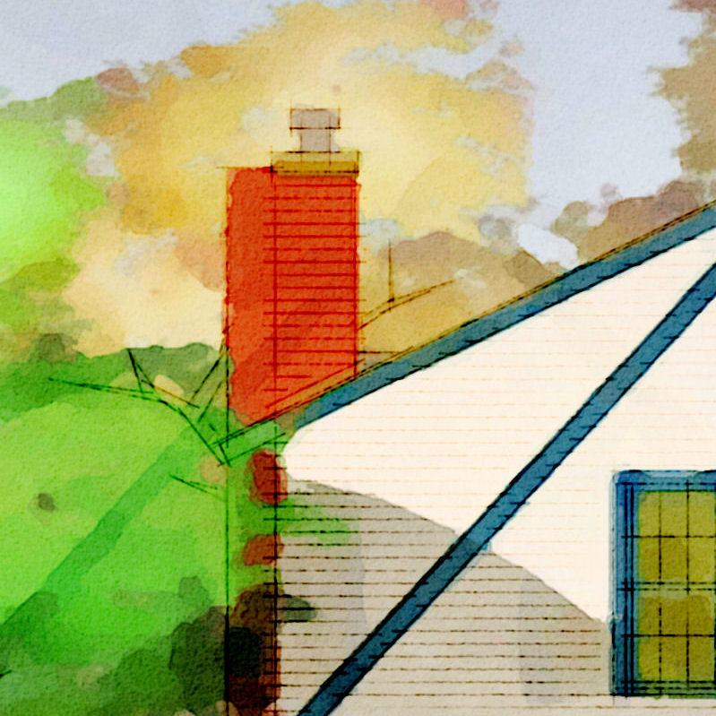
...only took it on because I'd done the autocad elevation and knew it was good to go: fast! Remember trying 1-pt perspective/elevations like FLW? Anyway...imported, faced, faked (for shadows and foreground), colored, and exported in just over an hour; then DWC'd and delivered with almost an hour to spare/profit. Whadaya think?
-
I think they got a bargain and you made off great. Win Win.
That is awesome
-
Great job Tom!
-
Okay, funny story...sorta, and this little image just downgraded from small profit hedge to hourly - not to exceed (and did by a bit but still nice work if you can get it :`)
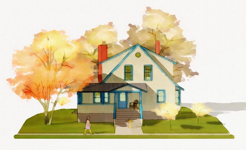
Backstory: This project was a private-entrance mother-in-law addition to a house I did the working drawings for a few months ago. I'd heard it died before construction started (and sadly the client's marriage, a good buddy of the architect, was in death-throws too...happens all too often). Anyway, yesterday I get the call for this rendering which is to be a "surprise! we're gonna build it" anniversary present (patched up and all better marriage, I assume) to the client's wife. The anniversary is today. Now, I know my client, this jokester architect, and his good-ol'-boy small town client buddies...so I didn't question too much when he told me which of the new peeps he wanted me to use. I just grinned: here we go again.
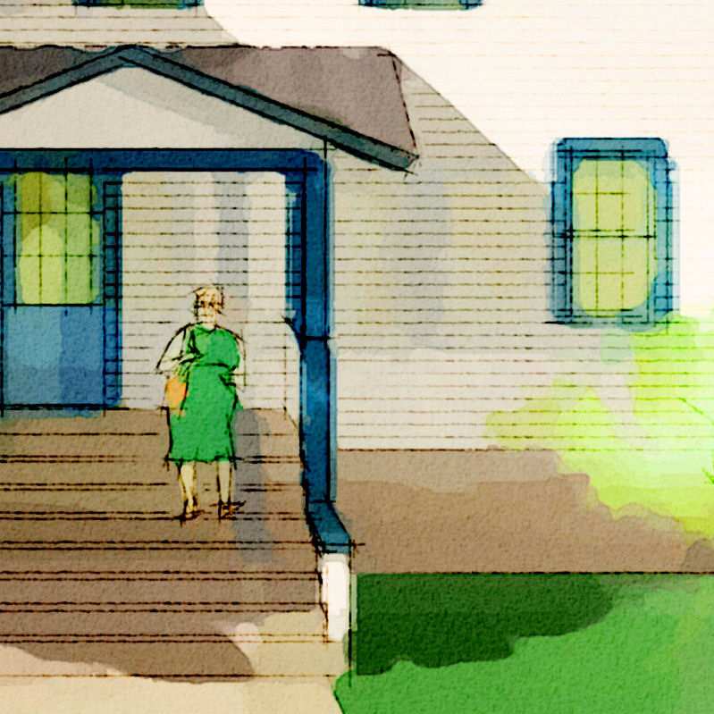
So, frantic call this morning, client in the room...picture frame in hand: "We gotta fix it!" Seems the full-figured lady coming down the stairs was too "spot-on" and pushed this intended to be a bit tongue-in-cheek image beyond usuable. She's out, chair in for scale, (he doesn't like all the green was chucked in 'cause he knew I wouldn't balk on speaker-phone), and "can he put in a cat?"
"Well, the only cat I have quick is a rather nasty hissing, claws out, up on hind legs...?"
"Perfect, make it yellow."
I've never met the client, but I now know quite a bit about his mother-in-law and his relationship with his wife...?!? Just gotta laugh!
Link is to the full size image...sure would like some professional sketch/rendering C&C, thanks, since I intend to pursue and maybe market this type of quicky to see where it goes.
-
LOL! Tom's marriage counsel and therapy, will color your world...perfectly! you are in a unique business aren't you? selling the dream...sell on.
-
Tom,
Wonderfull images - I like both versions. I love your DWC style and the stories. These images look and present much better than the ones that deveolpers typically place in those little real estate books you find at the grocery store. You would think there would be a market for this type of work.
Bytor
-
What a great story!

-
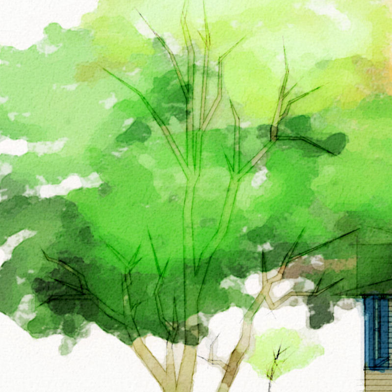
One more for me ('cause TV was crap) and my fav so far (when I can make myself cut the color back a bit, and can do it without deadening the image, much better...wish I could do it consistantly?):

-
I had a somewhat less enthralling similar experience. I did a 3d model and renderings for a commercial complex, It was going to be for health care providers but the top corner unit was going to be for the developer. I was doing the work as a consultant for the architect. I showed a man and woman on the balcony of the corner unit. The architect told me that I had to change the woman who was a brunette to a blond because the developer did not want his wife to think he was cheating on him.
Hmm do people really think this way?
anyway the brunette got the ax and a bubbly blond took her rightful place on the balcony.
Now as for what goes on in reality what I don't know can't hurt me.
Nice rendering though. Maybe you should have put the cat on the back of the woman you know claws dug in and make the woman blurry like she is running as fast as she can to get the furball off her back....hehe Far be it from me to heed the warning not to add gasoline to a fire..
-
I remember reading about a famous and highly popular British modelmaker who likes to insert these kinds of visual jokes in his models (depcting architecture by the likes of Foster, Grimshaw etc...), with people engaged in all kinds of natural activities etc...
The name of the firm escames me...Anssi
-
Tom:
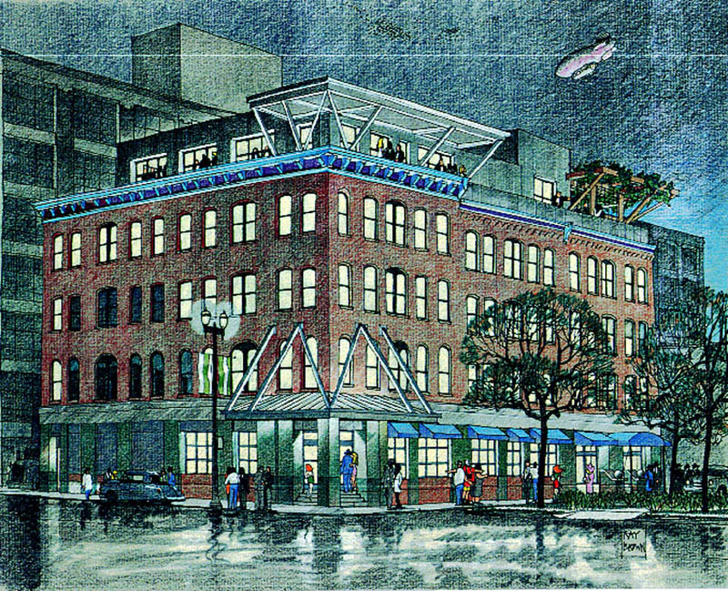
Years ago, I did a number of illustration for the planning department of the city where I lived at the time. In the drawing with the blimp, you'll notice a redhead in a short skirt walking up the entry steps. Along with the tourists who are pointing in different directions, the woman in the black picture hat, and others, she became a recurring character in little dramas being played out in the entourage.
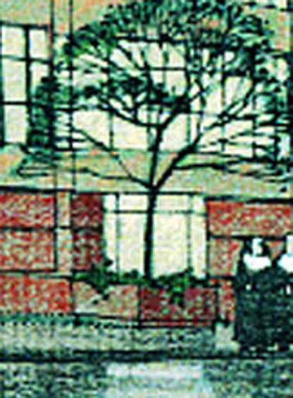
A woman in an entirely different branch of the city government took great umbrage to the redhead. So in future drawings, I replaced her with another set of recurring characters. See the lower right hand corner of the second drawing for her replacement.
Some people have no sense of humor...
Ray
![Brownstonesc1d4b3ff[1].jpg](/uploads/imported_attachments/cP1g_Brownstonesc1d4b3ff1.jpg)
-
Hey Ray Brown, good to see you're still around! Took me awhile 'cause the pics are so small, but when I finally saw the "portly" woman in the second image I nearly fell off my chair laughing. Thanks for sharing.
(These night images are great BTW...I remember the first from a post long ago, seeing the second is a delight

-
Tom:
Thanks so much.
I never really went away, just haven't had anything to submit lately, so I've been lurking...
You're right about the image size though. You actually can't see the "replacements" too well, so I've enlarged that corner of the second drawing. Maybe that will help those of us with old eyes...
RB
-
this whole thread was worth a hundred bucks...
we discuss these 'entourage' issues in the office all the time... I used to sneak people into my drawings too... but it wasn't any fun when no one seemed to notice.
-
Ray, so good to see your delightful work again.
Tom, et al, I am often just galled by people's chutzpa. For a lousy hundred bucks to bother the artist all ove again over a little cartoon person in a little sketch that was intended for nothing more than to convey an idea ( artist's concept) of what the structure will look like.
What kind of nut cases believe that some drawing by a stranger depicts an intimate knowledge of the client's reality? This kind of thing really gets my goat. It is really unfair to the artist and I hate unfair.
-
Tom:
For what it's worth, I'd encourage you to continue populating your drawings with "real" people doing real things. Part of my personal beef with photorealism is that too often, the buildings appear to be in an unpopulated world. I suppose that for many clients, the fact that such drawings focus exclusively on the building as an object is a plus. And even when people are included in either photoreal or non-photoreal drawings,they end up being abstracted and static.
But buildings, or streets, or squares are environments to support human activity. People in action are interesting to watch; that's why we all do it. So many shapes and sizes, so many movements and expressions. In my drawings, I've always tried to convey that the buildings shown are just background to the life of the city they make up, and to do it as much good humor and wit as I can muster.
Given your warmth and wit as expressed in the forums, I hope you continue to express it through your work.
-
I wish I could remember what book I looked at in college. It was a large really large book showing hand drawn illustrations done in the late 1800's early 1900's. These illustrations were most likely done with a ruling pen. The illustrations were black and white perspective drawings of for example the interior of a wondrously rich baroque theater. every seat had a person in it and there were actors on stage. The drawings were like perspective sections so you could also see people in other smaller rooms surrounding the main theater. We were looking at the illustrations with a photography lupe (8x) enlargement. We started to notice some odd things a wine bottle here and there. broken wine glasses and then as we looked closer we noticed naked people in the audience and couples in the back rooms doing what couples in back rooms would do.
Mind you these drawings were dripping with detail they must have taken months to draw. Our conclusion was that in order to stave off a mental breakdown the illustrators would insert humorous characters to break up the monotony of drawing boring people. I really do wish I could remember what that book was I'd like to have another look at it since it was a hoot. And knowing that this went on so many years ago was reassuring considering that we had some of the same ideas. One of the mechanical engineers who did work for a firm I worked at in New York always drew a beer can somewhere in his drawings. A simple can with two x's on it. It became an office treat when we got drawings from him to be the first one to find his beer can.
We are nothing with out humor.
-
u have a good, real good hand and lot opportunities
Hello! It looks like you're interested in this conversation, but you don't have an account yet.
Getting fed up of having to scroll through the same posts each visit? When you register for an account, you'll always come back to exactly where you were before, and choose to be notified of new replies (either via email, or push notification). You'll also be able to save bookmarks and upvote posts to show your appreciation to other community members.
With your input, this post could be even better 💗
Register LoginAdvertisement


