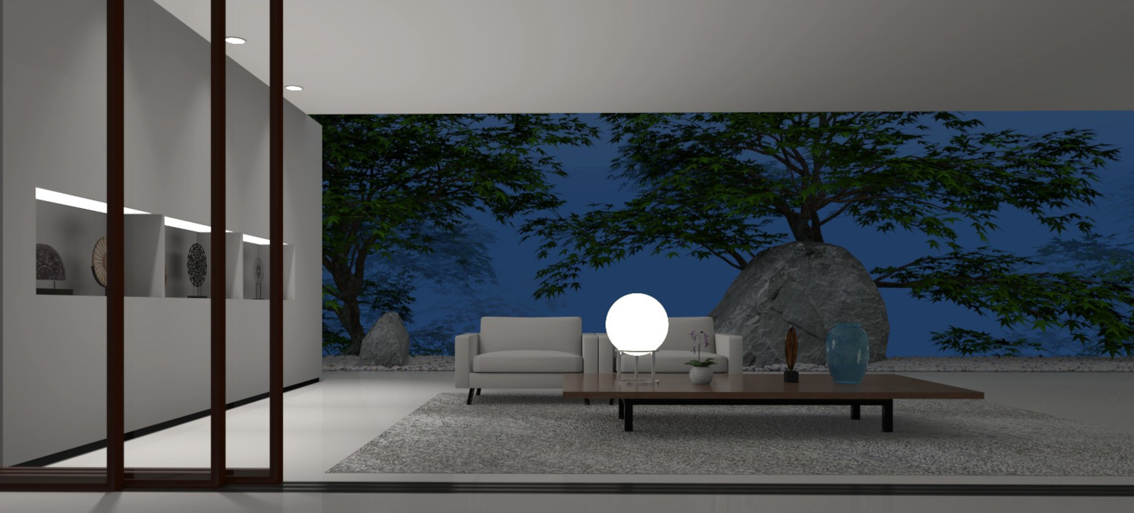
Luxury Asian patio
-
Sort of a foggy evening scene.
Room by me from a picture and furniture, decor and tress from the warehouse.

-
My blood pressure just went down about about 25% just looking at that
 Needs a better rug though mate
-
I concur, almost there mate. I have tried several surfaces with differing transparency and a cloud terxture. Might be worth trying again.
-
@l i am said:
My blood pressure just went down about about 25% just looking at that
 Needs a better rug though mate
Thanks.
Good suggestion. Yeah, I see it now. Going to try that. Lighting is bit off as well. Update coming.
-
@mike amos said:
I concur, almost there mate. I have tried several surfaces with differing transparency and a cloud terxture. Might be worth trying again.
Thanks.
The original picture is this foggy background, only it has better lighting I could not reproduce. Raylectron is a great program but very diffuse lighting through fog is not one of its strengths. I spent all week trying to find any solution, including mechanical effects like screens within the model and such and nothing worked. This was the best I could get.
-
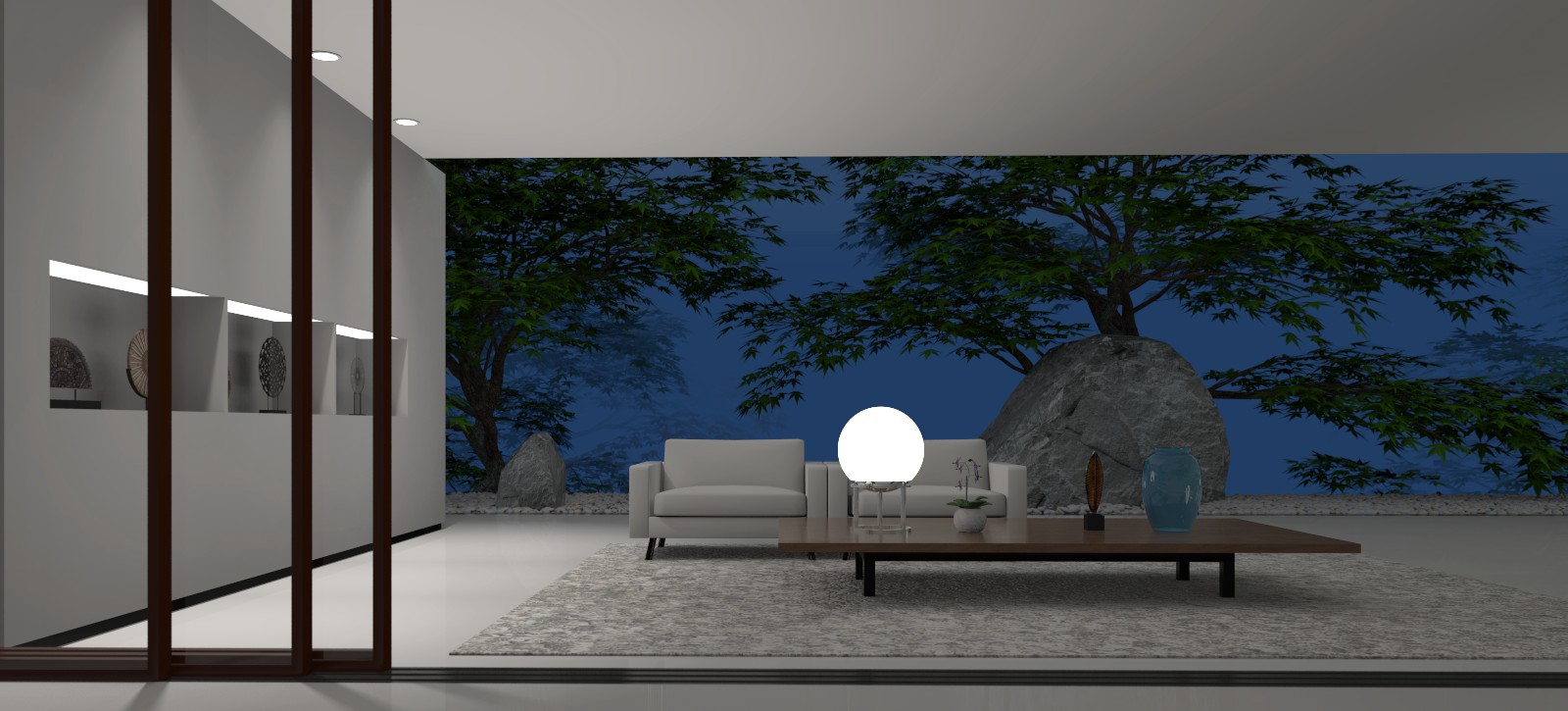
Update. Very minor subtle changes.

-
Those trees gotta go.
I'm thinking of making a custom tree. Those are words I thought I'd ever be able to say.

Also just got an update to Raylectron. Much better lighting control and so much faster.
-

Misty Pines HDRI • Poly Haven
Free 16K unclipped HDRI of a misty pine forest - soft, low-contrast morning/afternoon natural light, overcast diffused illumination and haze.
Poly Haven (polyhaven.com)
-
What's wrong with the trees??
-
@mike amos said:

Misty Pines HDRI • Poly Haven
Free 16K unclipped HDRI of a misty pine forest - soft, low-contrast morning/afternoon natural light, overcast diffused illumination and haze.
Poly Haven (polyhaven.com)
Thanks, but I don't see SU files. Can you tel me where to look? Thanks. I really need a better tree for this model.

-
@marked001 said:
What's wrong with the trees??
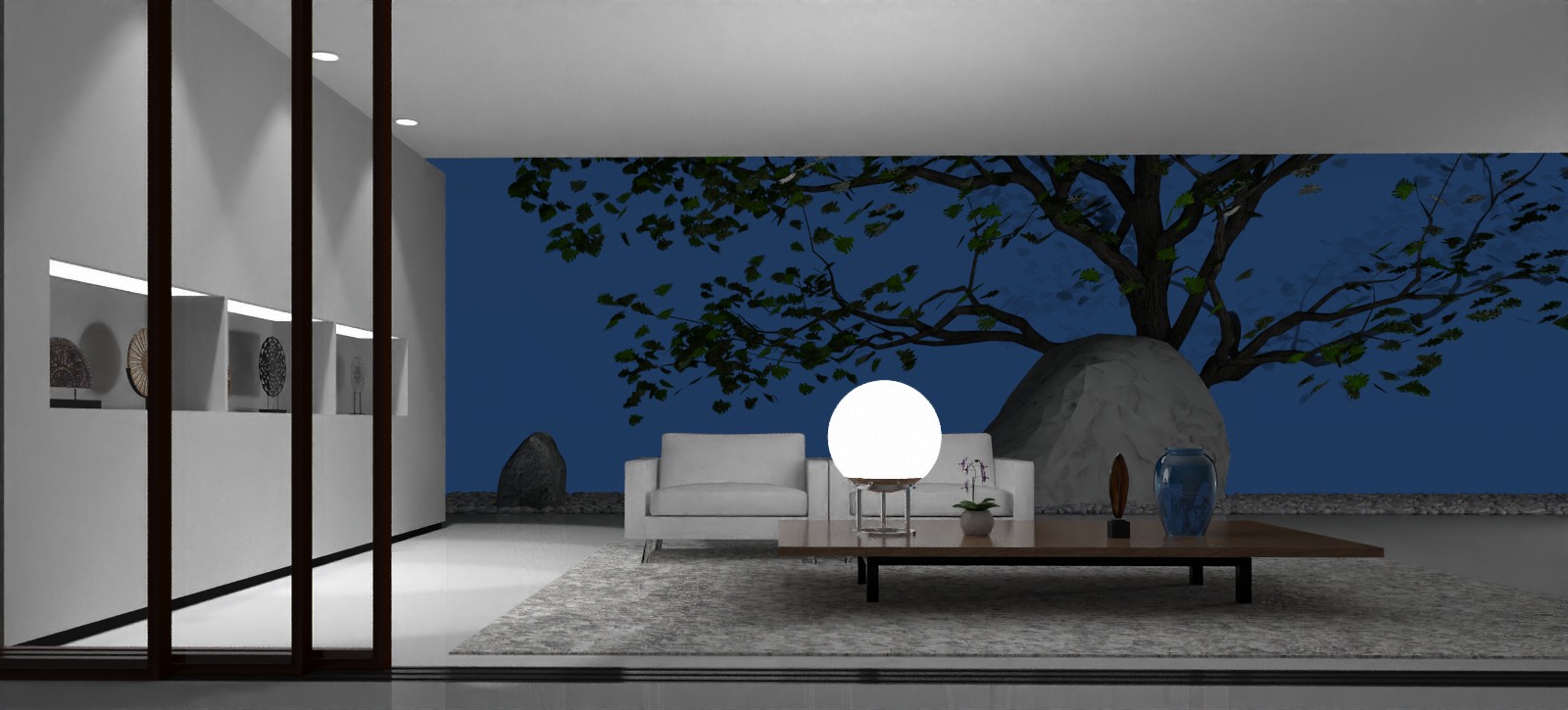
This model and render are actually a compromise of the original picture. I had two problems, the trees and the outdoor fog and light. I may have resolved the fog/light issue, and I've found the tree that more closely match the original picture, but it looks bad in the lighting set-up.
-
VBery nice work Bryan. I liked the prior blue wall, the combination of that (Night Sky colour) worked with the spherical lamp. Like a mood in the night sky, That is what works so very well


-
@l i am said:
VBery nice work Bryan. I liked the prior blue wall, the combination of that (Night Sky colour) worked with the spherical lamp. Like a mood in the night sky, That is what works so very well


Cool! Thanks! I may just go with that with then and the very minor furniture tweaks and updated render.

-
Cool, I meant "moon in the sky"

-
Oops. Forgot all about this one. Really busy at work. Here's the update.

Hello! It looks like you're interested in this conversation, but you don't have an account yet.
Getting fed up of having to scroll through the same posts each visit? When you register for an account, you'll always come back to exactly where you were before, and choose to be notified of new replies (either via email, or push notification). You'll also be able to save bookmarks and upvote posts to show your appreciation to other community members.
With your input, this post could be even better 💗
Register LoginAdvertisement


