Lumion Work
-
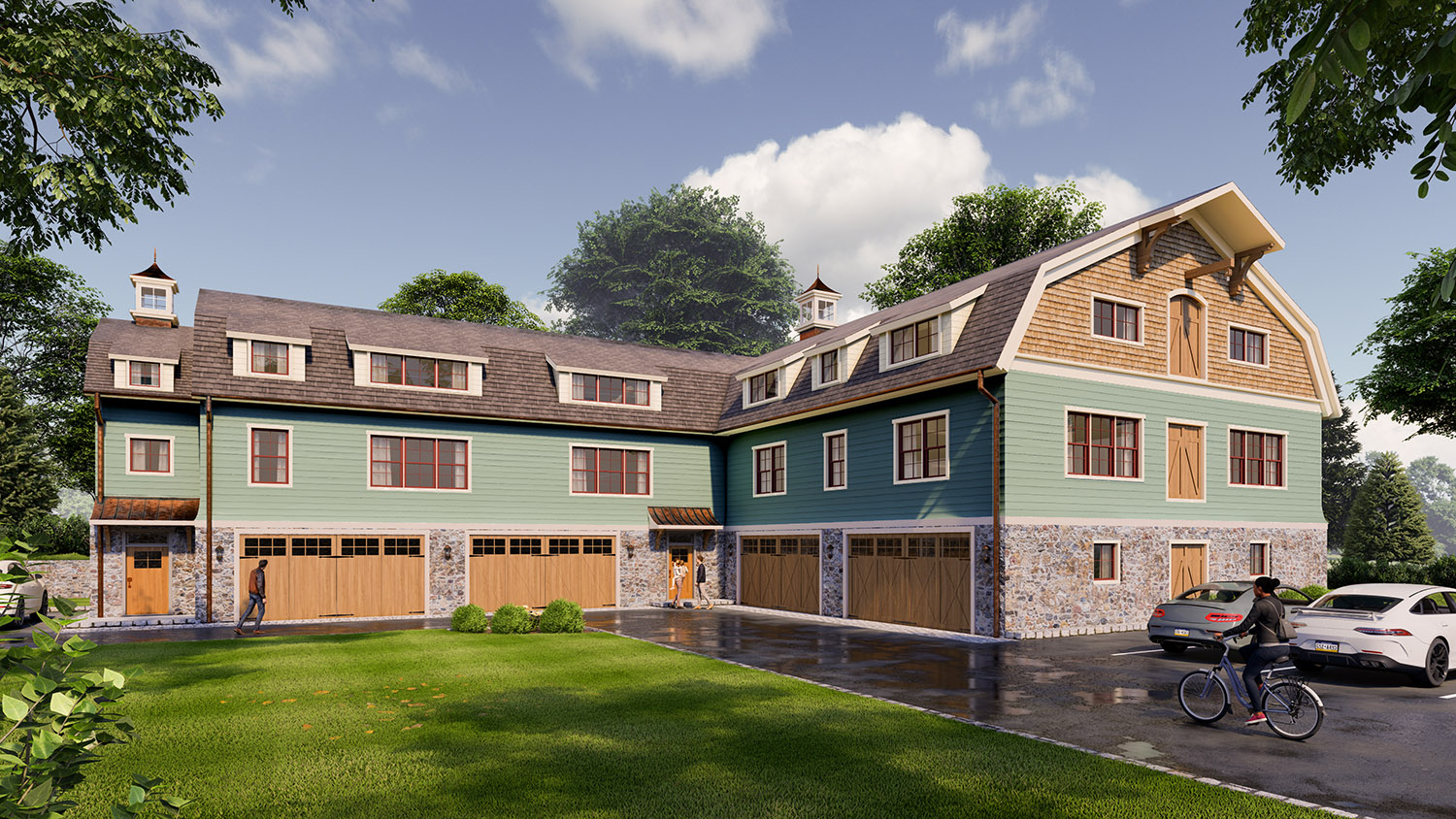
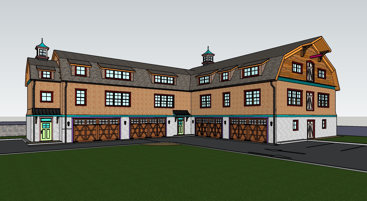
Here's a quick concept design for a multi-family apartment building. The architect gave me a footprint and a couple inspiration photos. The idea was for it to look like a carriage house/barn because its behind an existing home. Probably a BIT too big to be a carriage house, but we tried

-
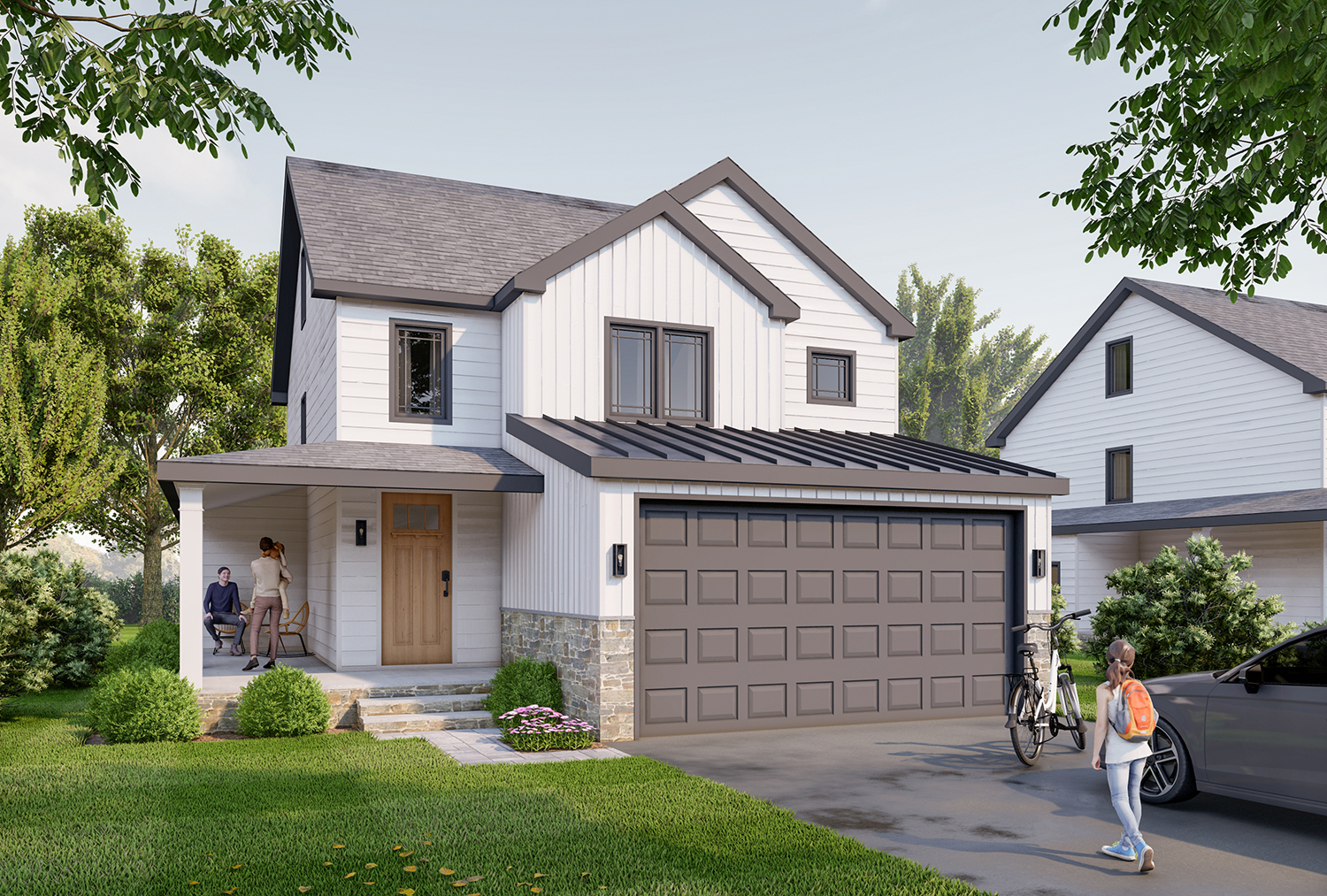
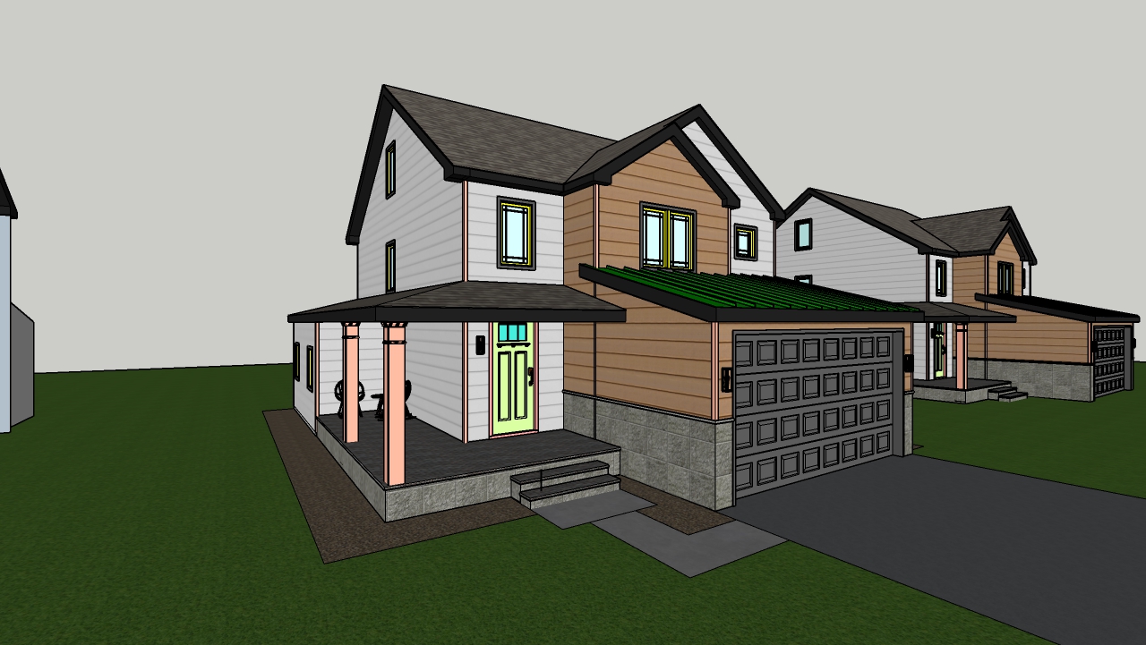
Here's a spec house I modeled/rendered quickly for a broker.
-

-
Top notch work, indeed!

-
Thanks guys!
-
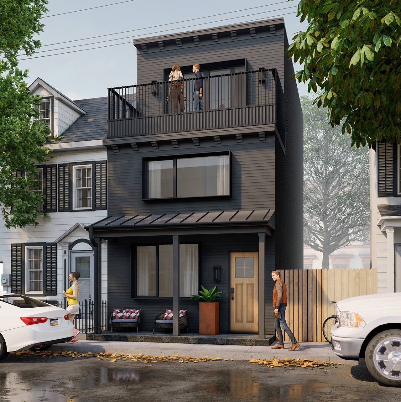
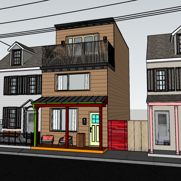
New Rowhouse..
-
Very nice!

-
That will do very nicely. Bravo.

-
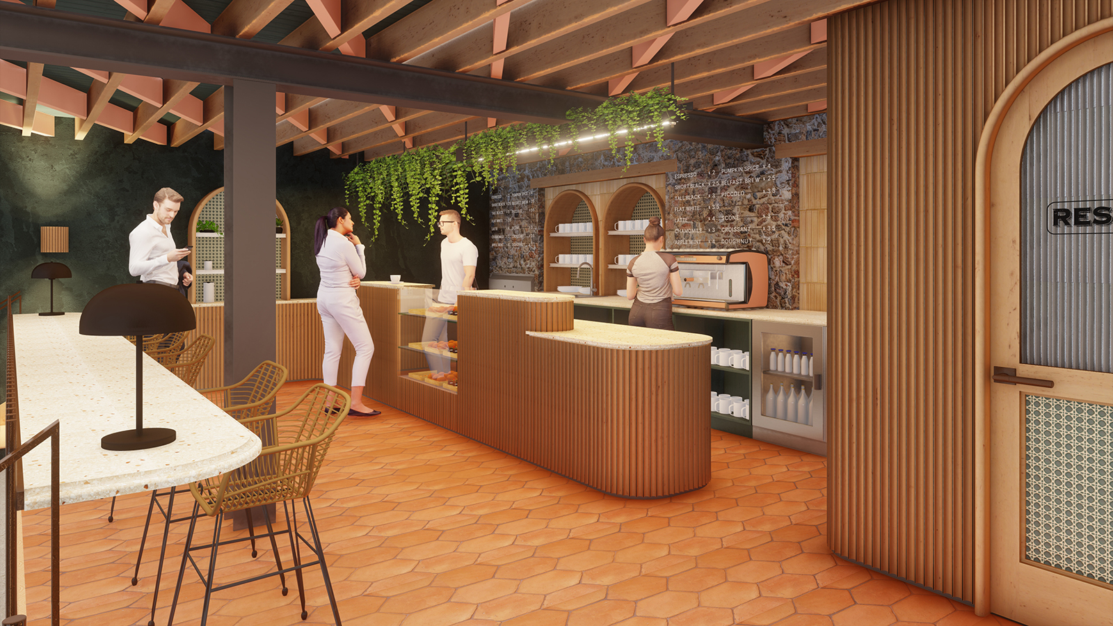
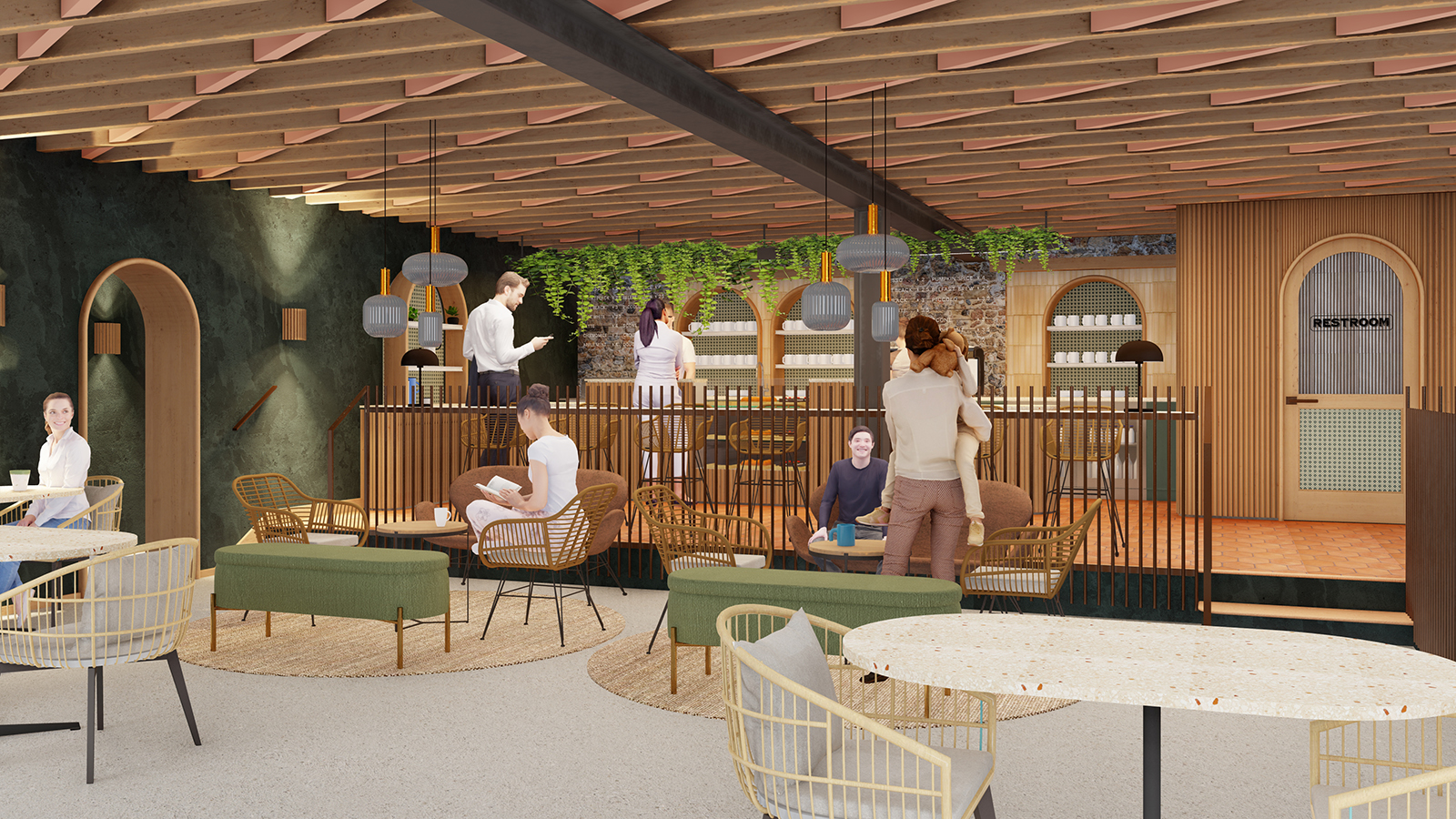
Still trying to get the hang of interiors in Lumion. Here's a little cafe.
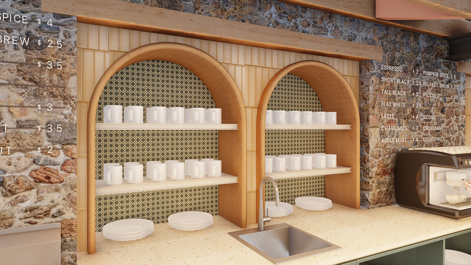
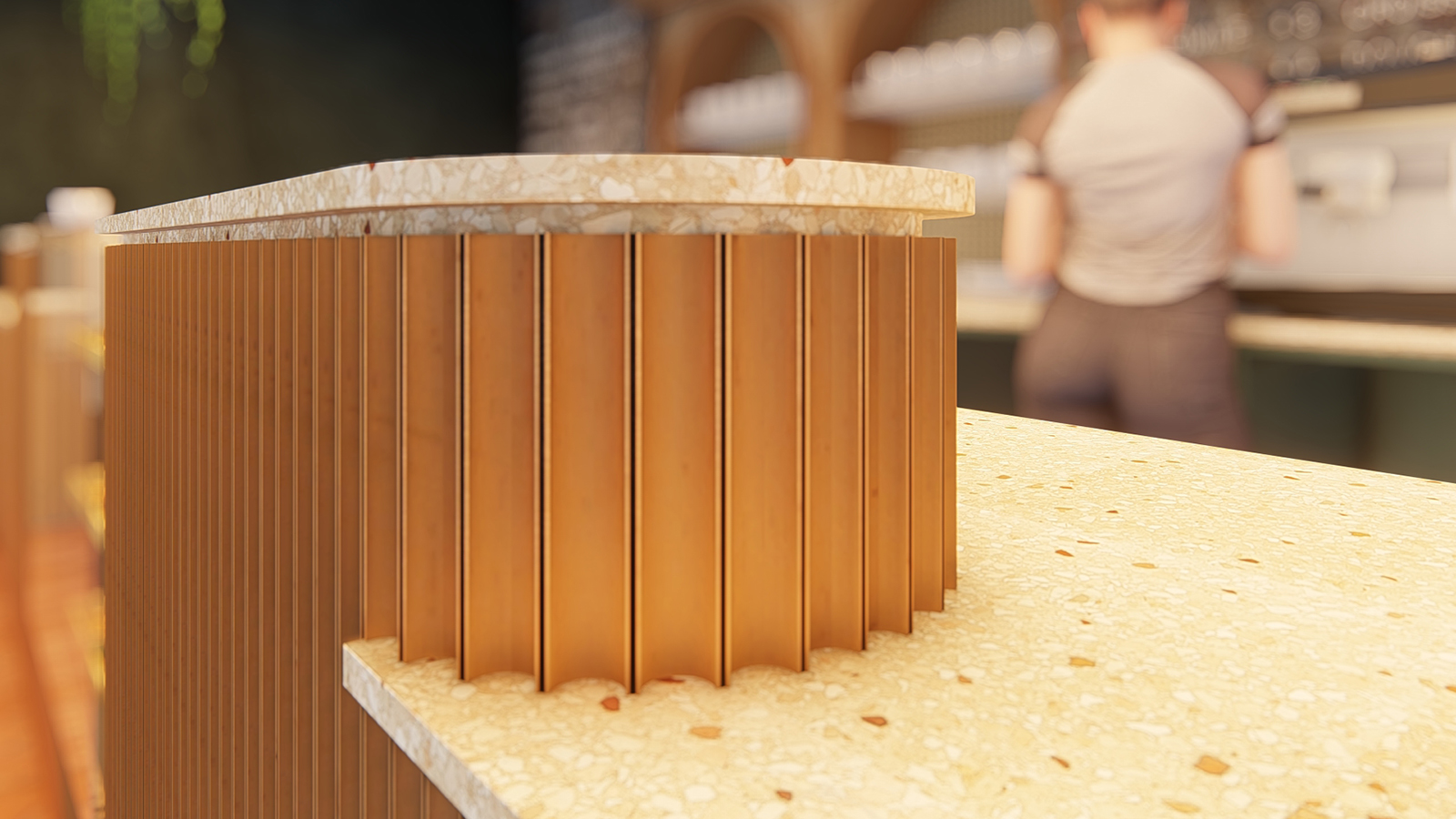
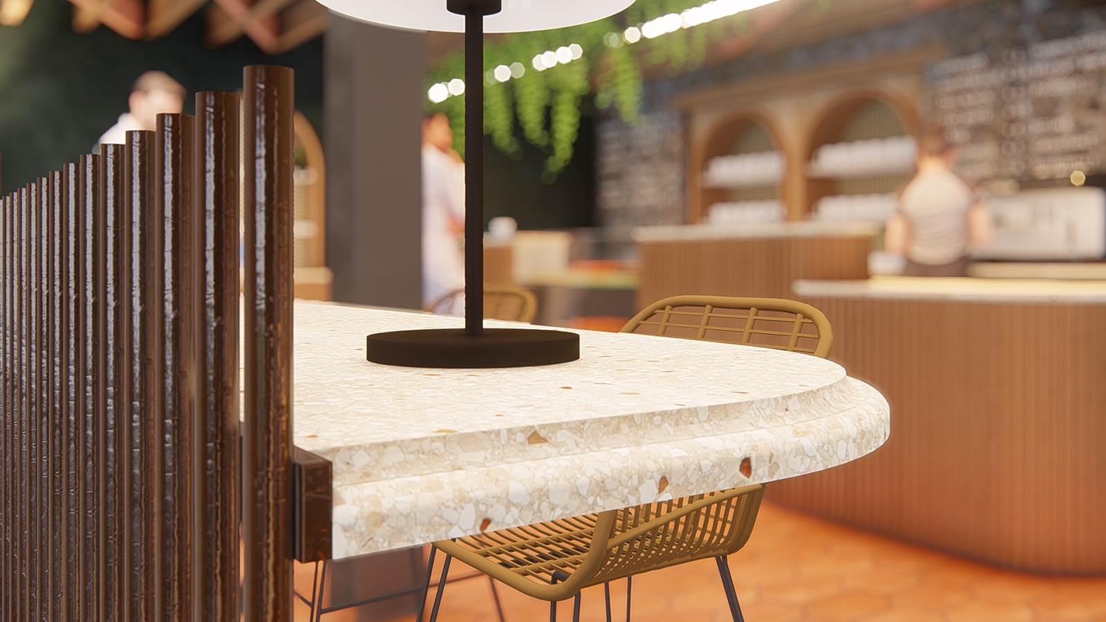
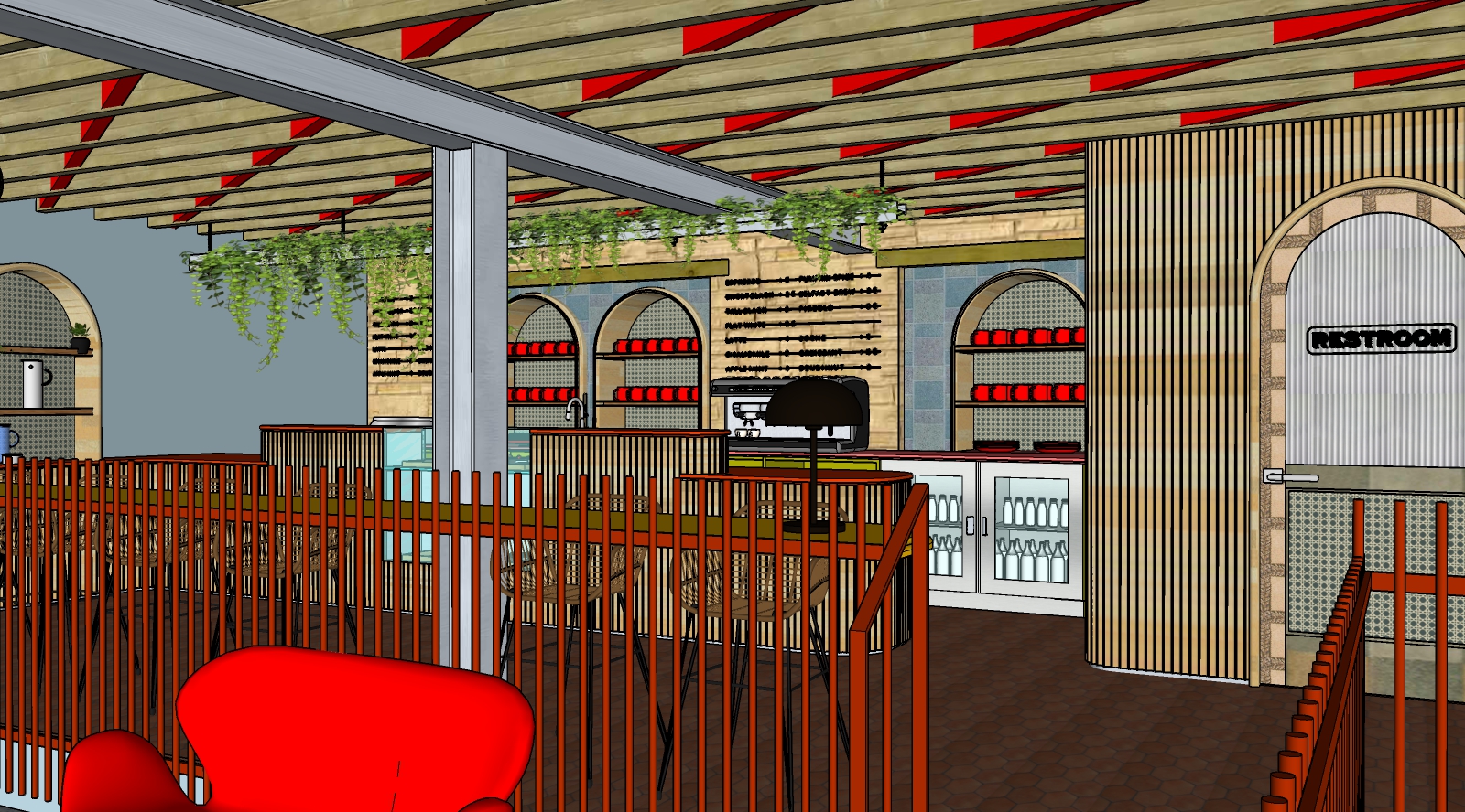
-
Interesting layout. Just one question: would a cafe like this really have table lamps on a counter?
-
I just do what the architect tells me
 but as far as I know, they are mounted to the counter, not just sitting on it.
 -
@marked001 said:
I just do what the architect tells me
 but as far as I know, they are mounted to the counter, not just sitting on it.
Interesting. I have seen them in the middle of a table but never on a counter like that. But we will assume the architect knows what they are doing.

-
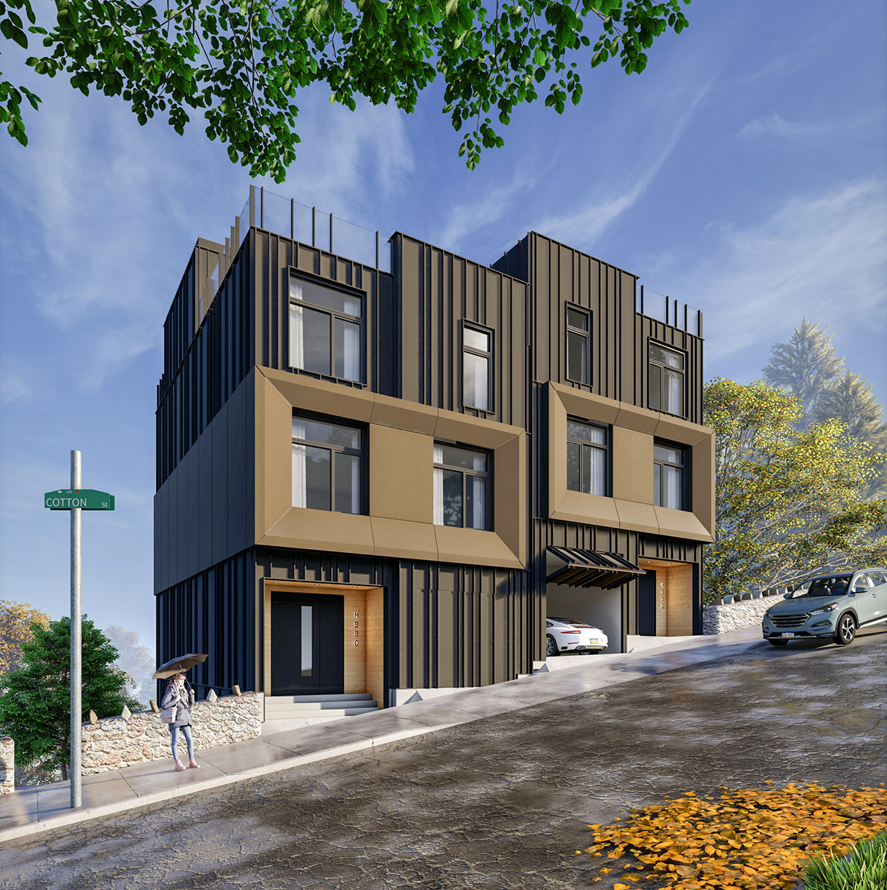
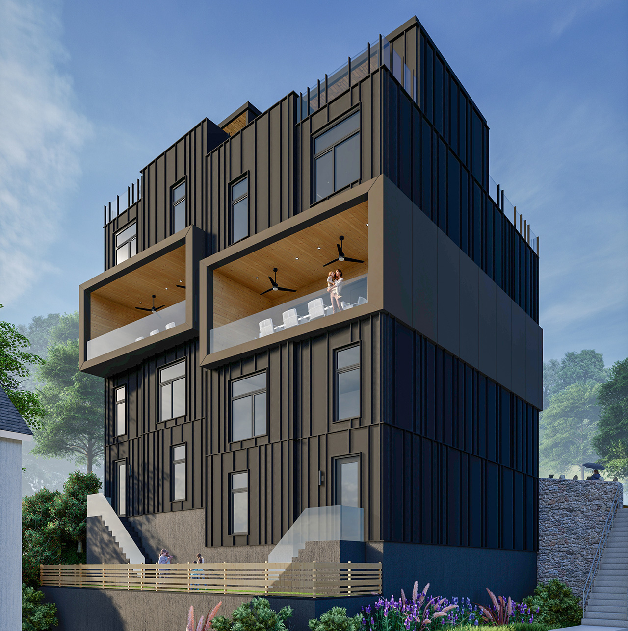
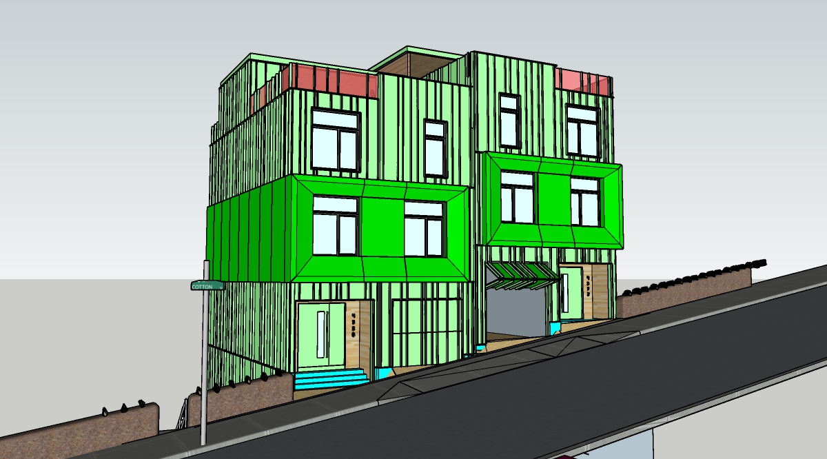
Pretty crazy site here.. 20' high stone retaining wall and then the site keeps dropping. Luckily had the topo to use for the model.
Two semi-detached homes
-
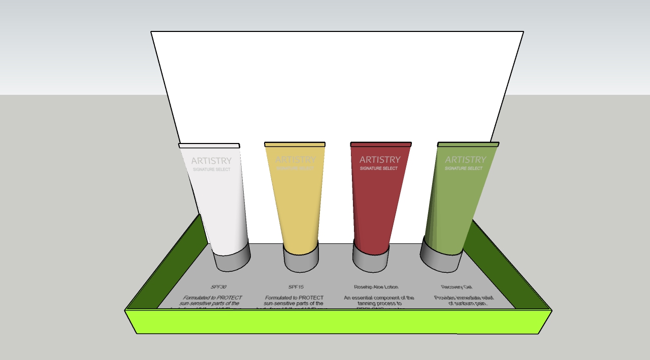
Not something I do too often but was a fun change. Hopefully I can get more and get better at it.

-
Perfect!

-
Thanks Bryan!
-
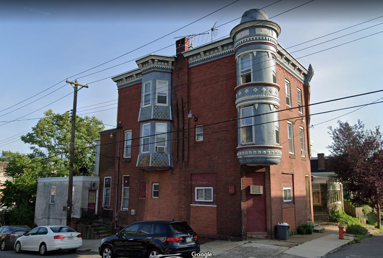
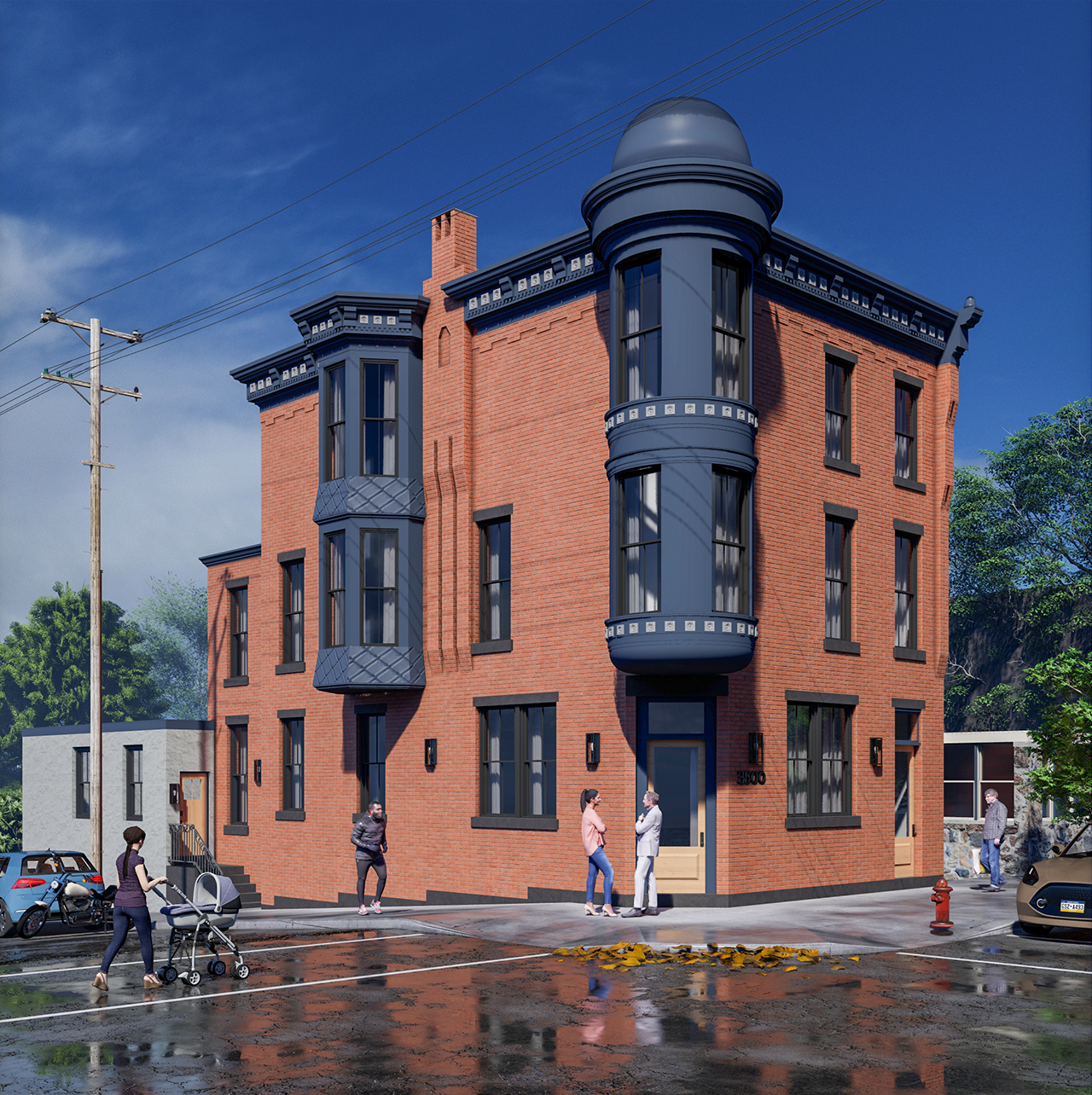
The task here was to take a street view photo of this house and make it look 'new' for a renovation. I skipped over a ton of detail because there was alot... but I think I got the idea across.
-
Nice

-
Very sharp mate.

-
Well done!

Advertisement


