Library of Babel
-
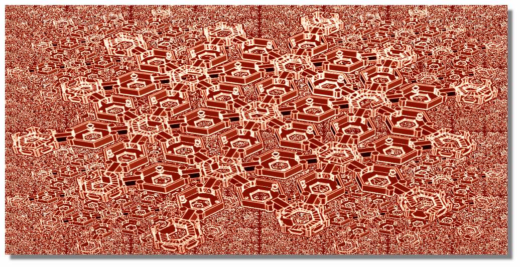
An attempt at Jorge Luis Borges's universe metaphor 'The Library of Babel'. I did try and render this but the file becomes very large, very quickly even using Fog.
-
Wow awesome model ! This deserves a render surely ?
-
Make one in the time


-
Thank you for the comments guys. I did try some renders but it just choked my machine. The SU file size with just plain colours for textures is not huge by any means. Each gallery is a component and by itself is a relatively simple room. The slowdown comes when copying the gallery sufficiently to give the impression of infinity and then adding enough lighting. There was always some empty space in view that required another set of galleries to fill it! With realistic textures my system would not even allow shadows to be toggled on without freezing.
Somehow I always end up with very complex models - even if I try something simple! My admiration goes to Chedda, his recent Marienplatz and Midnight Maze convey so much with none of the clutter that I seem to have.
-
-
Perhaps your limitation is sketchup itself ? You might consider using proxies for each element or even making the entire floor a component proxy. You could then achieve your infinite look. However i think fixing your camera view to be more sympathetic to your model is a much easier route. If you want the depth then put a bend or a foyer/lobby as the target instead. Or if you insist on this infinity view use a mirror or a water feature to create an illusion
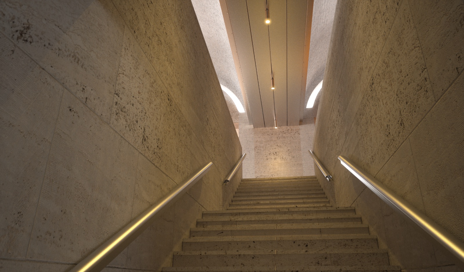
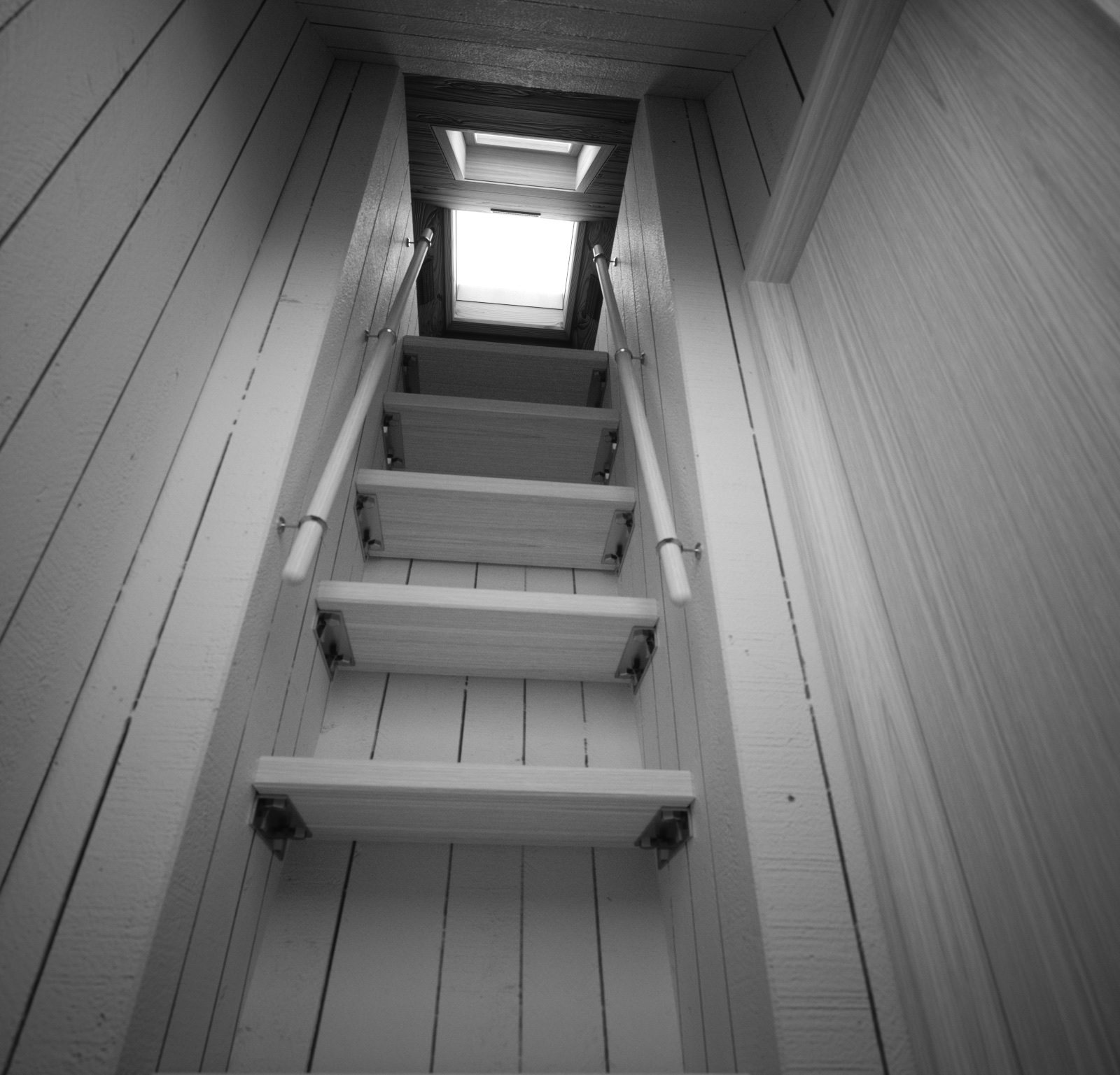
 I have attached a few of my staircase images i also am currently working on a new one


-
Thanks chedda, I think I understand what you are suggesting. The limitation is my PC in that it doesn't have the processing power needed for this type of model. To stick with Borges's description of the Library each gallery has to be exactly the same as all the others. To show this idea each view must indicate that wherever you look everything is identical. So the infinity thing is an essential component otherwise it is just a room with some bookcases! I will try and explore your idea of using proxies and see if that lightens the load. Also, using a mirror(s) might work so will give that a try as well. Thank you again for the input!
-
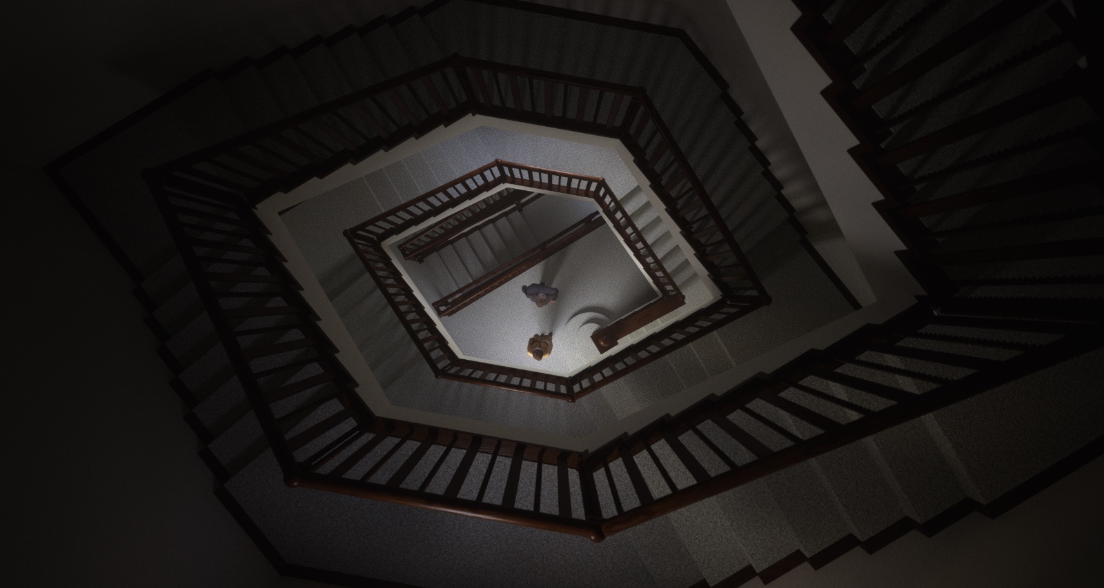
Couldn't resist posting this rough and ready render using chedda's mirror idea. Only one gallery component is used in this view along with opposing mirrors. To infinity and beyond?
-
Excellent so the mirror worked. Did you use 2 one in each doorway ? I think the mirror would also work vertically in the void too. The geometry of the view looks fine its just the inconsistent lighting thats a clue because of the mirrors. I wonder if your software would allow you to hide these mirror objects from shadows etc or even render the reflections to s different channel and then compose them in photoshop.
-
Yes, one mirror in each doorway. The scene still needs a gallery positioned above and below the one shown. The gallery component is open at the top and bottom so daylight is getting in at the moment. The lighting and textures now need a lot of work, I just had to rush out a fast render to see if it would work with the mirrors and report back! Going to try the mirrors vertically today.
-
Looking good!
-
Cheers Bryan, as usual things conspire to get in the way of modelling time so haven't done much more. I did, however, try the mirror effect in the vertical direction. It works the same but as the view looking up is different to that looking down, the combined mirror image shows both - so up and down appear in the same image. If that makes sense!
-
Going to leave this one here as I've reached a bit of a dead end with it! Time to move on to something else.
-
Dead end? If you say so, but that looks great!
-
Thank you for your kind words Bryan. I really wanted to illustrate the premise of the infinite Library. Borges's description is loose enough to allow a broad interpretation. However, the very real limitation is that I wasn't able to create a model that could do it (the Library) justice. I'm quite happy with the render that I did complete but the requirement for more and more gallery modules to be in view to give the infinity impression just slowed the model and render process exponentially. This is despite using Chedda's excellent mirror suggestion. What you see in the final render is really the limit of what can be shown in any one view. Anything more always seems to reveal a space at the end of the reflected views that needed another gallery to fill it! And so on....
So, not a dead end but more of a limit reached perhaps. It was a very enjoyable learning experience and not at all wasted. Not sure what I will try next but likely there will always be the false starts and trail of unfinished models!
Hello! It looks like you're interested in this conversation, but you don't have an account yet.
Getting fed up of having to scroll through the same posts each visit? When you register for an account, you'll always come back to exactly where you were before, and choose to be notified of new replies (either via email, or push notification). You'll also be able to save bookmarks and upvote posts to show your appreciation to other community members.
With your input, this post could be even better 💗
Register LoginAdvertisement


