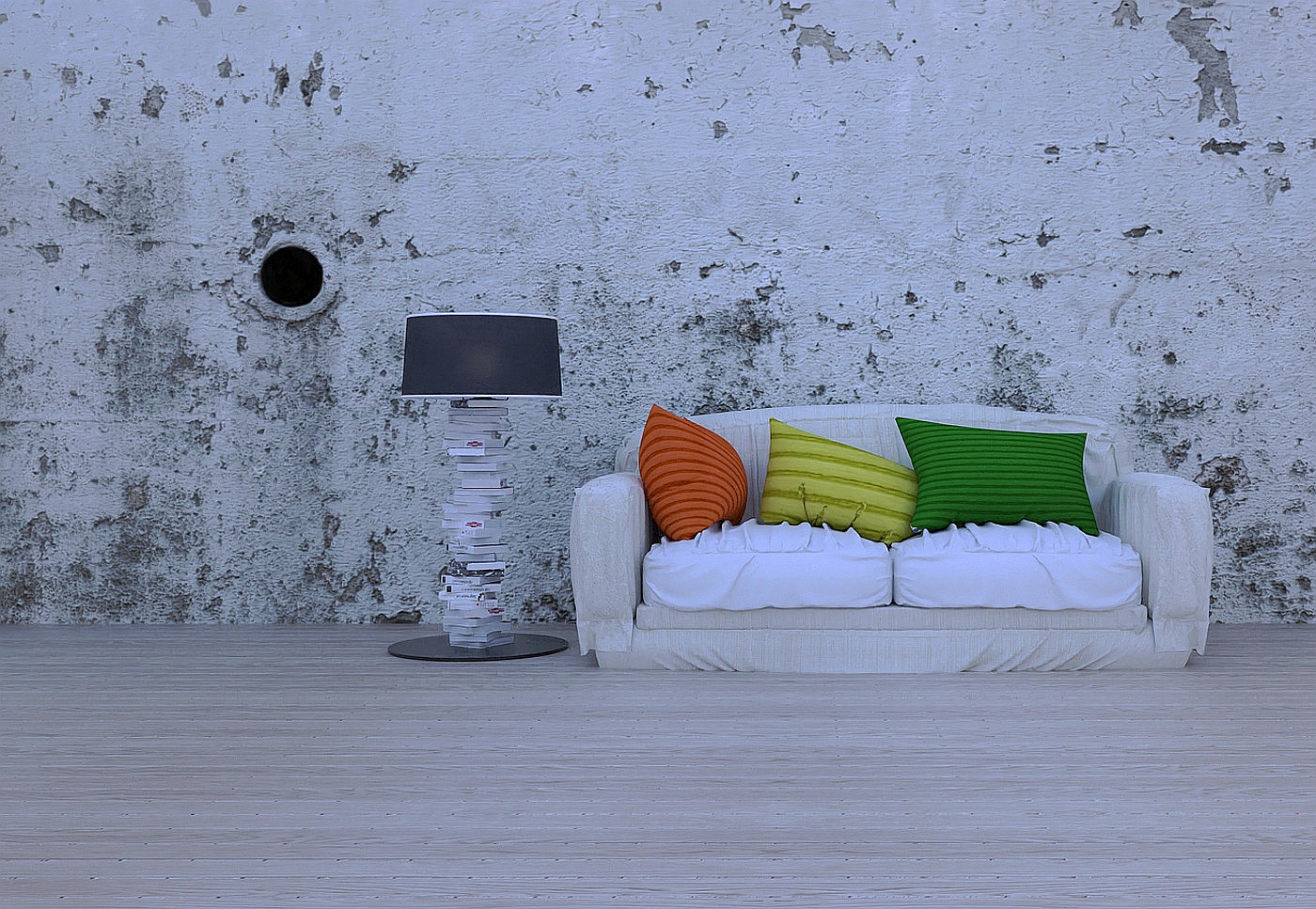
Grunge living room.
-
A minimalist render, Twilight V2.

-
I think the image would benefit from some more interesting lighting. Maybe turn on the floorlamp?
-
... and a bit more crappy floor maybe?
(just an example of what I mean)

-
The lamp is on, I must look at another way of raising that impact there. Looking at it in the light of day it does not look as good.
-
Hi Mike, I think the concept of the image is on the money
 I do think the grungy floor has merit.
Also the couch looks like it is "into the ground" and think a single book or magazine on the floor near the couch could work sort of like a person has just moved out of shot, tells a little bit of a story. Hope you do go further with it. -
Thanks mate, I have to admit to not being 100% at the moment and some of the prescribed chemicals may mean I am not so critical as I should be, taking the points on board and will have another run at it in a bit.
I very much appreciate the comments folks.
-
To get the lamp light looking good start with a normal light intensity for that kind of lamp and turn off all other lights including sun and sky. Then correct the camera exposure and other settings until it looks correct and then if you want some ambient light turn sky and sun on but at a very low intensity not to blow the image out.
-
Thank you, Sir, much appreciated tip.
-
Does anyone know of a repository where I can find some good seamless distressed floorboard textures please. Thanks.
-

Sketchup Textures, free seamless textures for 3D CG artists
Sketchup Texture Club is an educational comunity, a 3D art gallery that unites all CG artists. We share free seamless textures, 3d model and many 3D resources.
Sketchuptexture (www.sketchuptextureclub.com)
-
Thanks mate, no distressed textures at the moment.
-
-
See here, maybe. ;.)
https://cc0textures.com/list.php?q=WOOD&method=&sort=latest -
@mike amos said:
Thanks mate, no distressed textures at the moment.
Mike there are literally hundreds of them
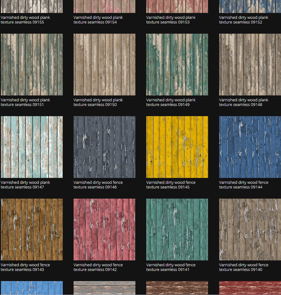
https://www.sketchuptextureclub.com/textures/architecture/wood-planks/varnished-dirty-planks
-
At Euro 12 for a year's access to the hi res versions, Sketchup Texture Club is great value.
-
Thanks mate, I saw the planks, no floorboard textures at present.
-
Try Architecture/Wood Planks/Old wood boards for the bare floorboards. (Sketchup Texture Club)
-
Mike they are floorboards or most of them are anyway. The site is italian and the english
nomenclature is dodgy sometimes . -
Hope you keep going with that render. I really like the overall style and like the lighting as it is. the use of a lot of white and strong colour keeps it "young and sylish and inline with the "grunge" sub culture style

-
Thanks L i am, not giving up. I'll have another go later after opd visit.
Hello! It looks like you're interested in this conversation, but you don't have an account yet.
Getting fed up of having to scroll through the same posts each visit? When you register for an account, you'll always come back to exactly where you were before, and choose to be notified of new replies (either via email, or push notification). You'll also be able to save bookmarks and upvote posts to show your appreciation to other community members.
With your input, this post could be even better 💗
Register LoginAdvertisement


