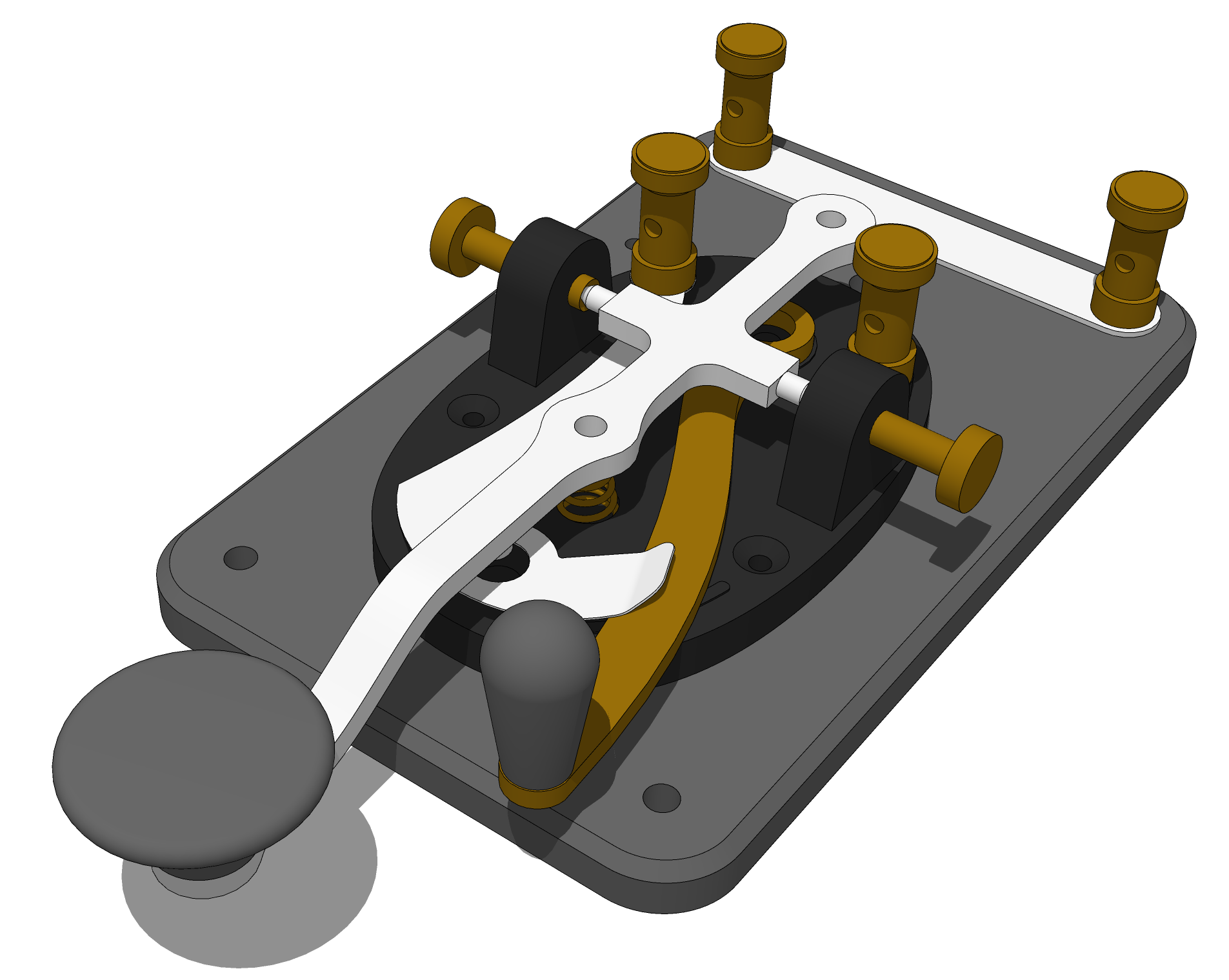
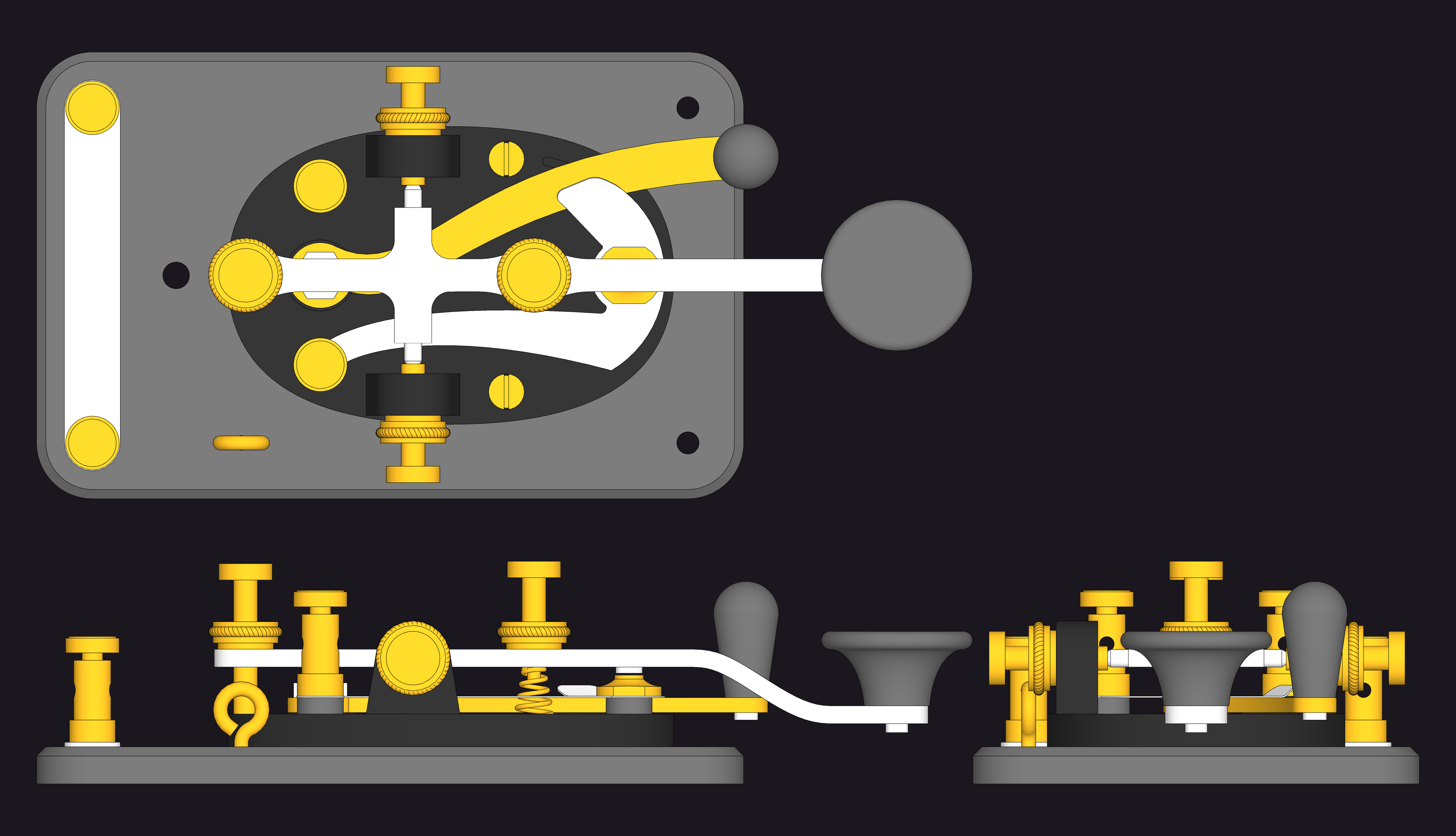
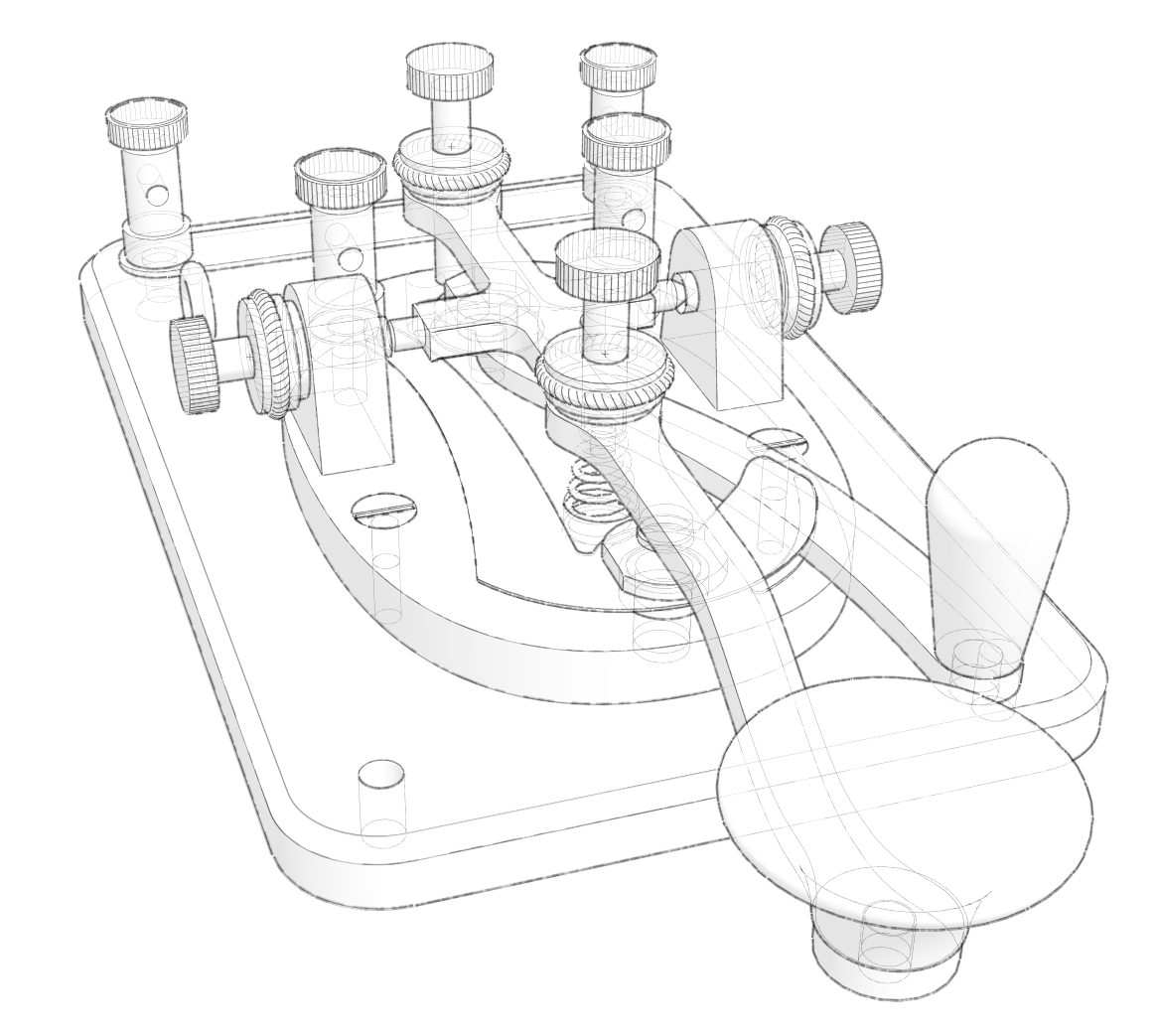
[WIP] Lionel J-38 Straight Key
-
I know it's not woodworking but I thought I'd show a model I've been working on this morning.

This is a WWII vintage code key that was manufactured by Lionel. Although there's not that many folks using Morse code anymore, these keys are still in use. I was gifted with two of them. One is a very rare version in it's military issue box. I need to add some small parts, mostly screws and lock nuts but the big parts are modeled. I may add threads to the screws. There's some labeling on the base for which I need to find a suitable font and I'm searching for a good image of the Lionel logo from the period.
-
--. .-. . .- - -.-.--
-
- .... .- -. -.- ... -.-.--
-
da did, did did da, Kasperle ist wieder da ..

Please a translation of the Morse code ..
-
I typed Great!
Dave replied Thanks -
Nice!
-
Still need to add the screw threads, labels, and Lionel logo. Having a hard time finding a suitable font for the labels.

-
@dave r said:
Still need to add the screw threads, labels, and Lionel logo. Having a hard time finding a suitable font for the labels.
When you first posted this a few months ago I got curious and searched for it. Correct me please if I'm wrong, but it would seem that this is the same Lionel, whose trains I've owned since the early '50s?
And I hate to say it but from all the ones I looked at, I think you are missing an eye-bolt, I might be wrong...Never mind, I see you have it in your latest version. -
Christopher, you are correct. Same company that made the )-27 model trains. I have my father's prairie locomotive sitting here near my desk and a bunch of cars and track in a box. During WWII, they branched out to help the war time effort.
And yes, the screw eye hadn't been modeled in the first image but it is modeled now. It also needs screw threads.
-
" I was gifted with two of them. One is a very rare version in it's military issue box. "
please if you ever get the time, can you take reference photos and post them for us? I'd love to have reference like that in the files...
-
superb


-
Thank you! I was playing a bit this morning.

-
That's a beautiful model! Adding the knurling, really did the trick!
I have that same locomotive but probably a slightly later early 1950's version, as it had pellets to drop down the smokestack and the transformer provided the forward/backward motion. I see that the one you have has a three position switch for that, so your train goes sidewards?

-
Thanks. Threads are next, I guess.
The switch on the loco is really a 2-position thing. As I remember, it was always a little tricky to get it working correctly.
-
Show us the logo Dave, I have a huge bunch of fonts.
-
Thanks baz. The logo is just the Lionel L.
The font I need is the one used for labels on the base. You can see it in these photos.

I think it was a standard font specified by the US Army Signal Corps or maybe the US Government during WWII.
-
[quote="Dave R"]
The font I need is the one used for labels on the base.Dave isn't it just one of the Tecnic fonts?
-
@cjryan said:
Dave isn't it just one of the Tecnic fonts?
Not sure. The fonts I found didn't match it.
I just did another search. Found one called Technic that is close but the 3 is wrong. Might be able to cheat it with a modified 8. Thanks.
-
Sorry Dave, I hastily typed that in, Technic was what I meant. The "E" is a little different also, but close.
-
No worries. That's as close as I've been able to come, too. i've been looking for some document that would list standards like this from that time. I'm sure there was something.
Hello! It looks like you're interested in this conversation, but you don't have an account yet.
Getting fed up of having to scroll through the same posts each visit? When you register for an account, you'll always come back to exactly where you were before, and choose to be notified of new replies (either via email, or push notification). You'll also be able to save bookmarks and upvote posts to show your appreciation to other community members.
With your input, this post could be even better 💗
Register LoginAdvertisement


