[WIP] Lionel J-38 Straight Key
-
"Futura" maybe ?
-
@tuna1957 said:
"Futura" maybe ?
Maybe. I'll check it out.
I went ahead and used Technic but modified the E and the 3. Might call it close enough for government work.
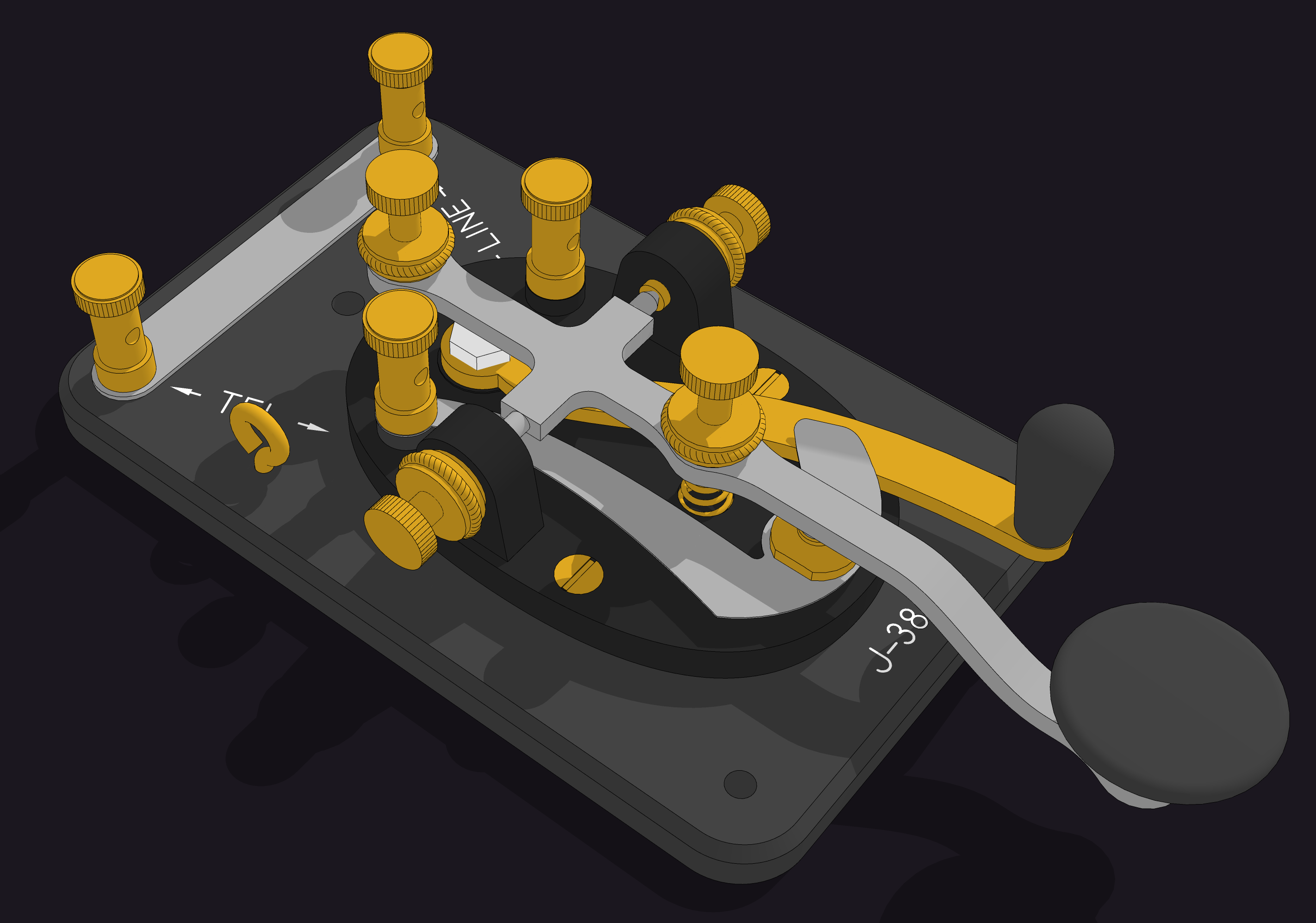
Now to create the Lionel L logo. I was hoping to find a decent BMP or other image to use but I think I'll be drawing it manually. Not a big deal, though.
-
Dave,
There must be 10,000 sans-serif type faces, and after a while they all begin to look alike. My best guess is the type face on the straight key is called News Gothic. My second-best guess is Futura. You can look up both (along with the other 9,998) on a site called fonts.com. It's also possible that Lionel created its own lettering for the straight key--something done by an underpaid draftsman using his Leroy lettering templates. Regardless, the font you chose looks pretty close to the orginal--definitely close enough for gummint work, as you said.
Best,
dh -
Thanks David! News Gothic could be it. The font/type face appears to have been available in the time period. I had thought about but rejected the Leroy lettering sets based on the 3 but you could be right. At the time, other companies manufactured the key and other devices that use the same lettering. I remember some shortwave receivers and a direction finder receiver that I was given when I was about Ian's age. They had seen action in WWII. They had the same or nearly the same lettering on them. (I wish I still had them but they got passed on being too heavy to move.)
I guess I'll leave the labeling as it is on the key now, though. Your clues led me to find a set of fonts created from the Leroy lettering guides. My next overly detailed model might be the scriber and of course I'd need to model the templates.

Hello! It looks like you're interested in this conversation, but you don't have an account yet.
Getting fed up of having to scroll through the same posts each visit? When you register for an account, you'll always come back to exactly where you were before, and choose to be notified of new replies (either via email, or push notification). You'll also be able to save bookmarks and upvote posts to show your appreciation to other community members.
With your input, this post could be even better 💗
Register Login


Advertisement