Adjust a dark photo?
-
I doubt there were any photos taken during this time, if I understand your answer Mike, besides I want to understand how to adjust dark photos like this.
-
My experience the local planning / building departments barely have records, let alone drawings prior to the last couple decades. Somehow, asking for multiple copies, they lose or destroy them all or never put them on film. Now they will likely get scanned and put on an antiquated computer network. The departments barely existed in the early 20th century.
-
Plus I took this photo around 1991.
So how else can I improve these photos besides the brightness, contrast and intensity?
-
Joe, If I understand correct , your wanting to "brighten up" the area of the gate. If that's the case your starting to cross into some more advanced territory with an image editor. I'm by far no master at this but I took your pic into Gimp to see what I could do. Biggest roadblock for me is not knowing what the gate actually looks like. Reposting the pic to show where I ended up. Will try and describe what I did....
First I cropped the white border off the top of the image. Ran the "Auto White Balance" tool. Used the "Curves" tool to brighten up the image. I have found the "Curves" tool doesn't screw the colors of image up as bad when trying to brighten up dark images as much as using "Brightness & Contrast" does.
Now the fun begins. Used the "Select by Color" tool to select the area of the gate. The "Curves" tool brightened this area up but the colors got pretty whacked out. Had to use "Color Balance" and "Hue & Saturation" tools along with the "Scissors Select" tool to try and work the color back where I thought it looked o.k. When I got the gate looking reasonably decent did minor "Hue & Saturation", "Brightness & Contrast" on the whole image and there you have it. Hope this long winded example helps some.
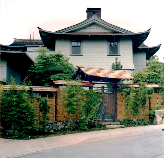
-
This is the best I could, There simply isn't enough light to work with.
-
Understood but by my thinking, the roof framing should be in the planning permission papers.
-
Thanks for going to all the work for me Tuna but I don't use Gimp so don't understand hardly any of those commands you mentioned. The photo came out pretty well though! I was wanting to not just lighten up the gate but the whole image.
Can you explain what you did Bryan, and what program you used? Yours came out pretty well too!
Mike I understand what you meant now, that's a good point about the planning Dept!
-
This is another original scan I made, you can see how dark it is.
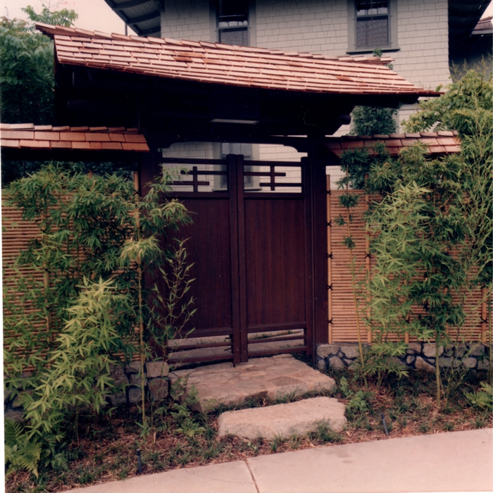
and then me just playing with the Brightness and Contrast a little, and pushing up the Intensity this time, did I set those three Settings well?
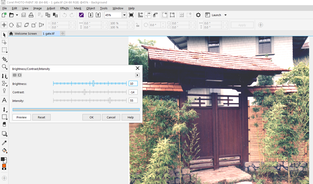
and I'm pretty happy with it
 and it was easy 1 step.
Bryan's looks a little better, so when I'm looking at the Tools in that Adjust menu, if I had to choose 1 more Tool to use would it be Hue / Saturation?
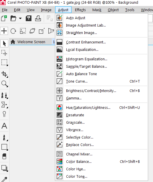
-
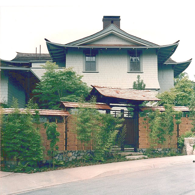
I used an old verison of Adobe Fireworks. It has much of the same adjustments as Adobe Photoshop of that era.
I did several things:
The curves (just used auto adjust)
The brightness contrast
Hue adjustment. There was too much red in the picture
Sharpen (yep, sharpen)Then ran the above again.
So basically, just minimal Photoshop tweaks.
-
Hhmmm, Hue and Sharpen. I'll play with those!
what are these 'curves' Bryan, can you explain?
-
Tone curve. Looks like curvy line inside a a box. You can actually grab the line itself and drag it diagonally. Usually up and to the left. Not very far either.
-
Update
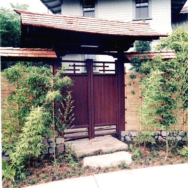
-
Joe, Going to throw one more thing your way.... What resolution are you scanning your originals at ? Higher resolution scans give way more information for the software to work with when doing edits/fixes. The fixed image can always be scaled down if needed for posting on the web.
-
I was going to ask about the initial scanning.
I put a 4x6" photo on the scanner and scan at a high setting.
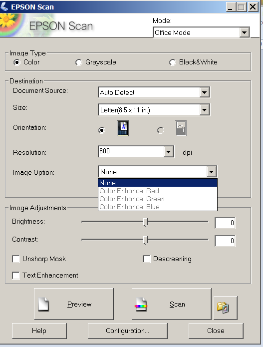
the image plus scanner table area scans at 6800x8800
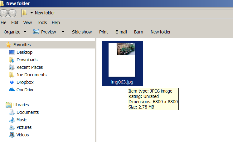
then when I crop the image it's 4600 pixels wide.
-
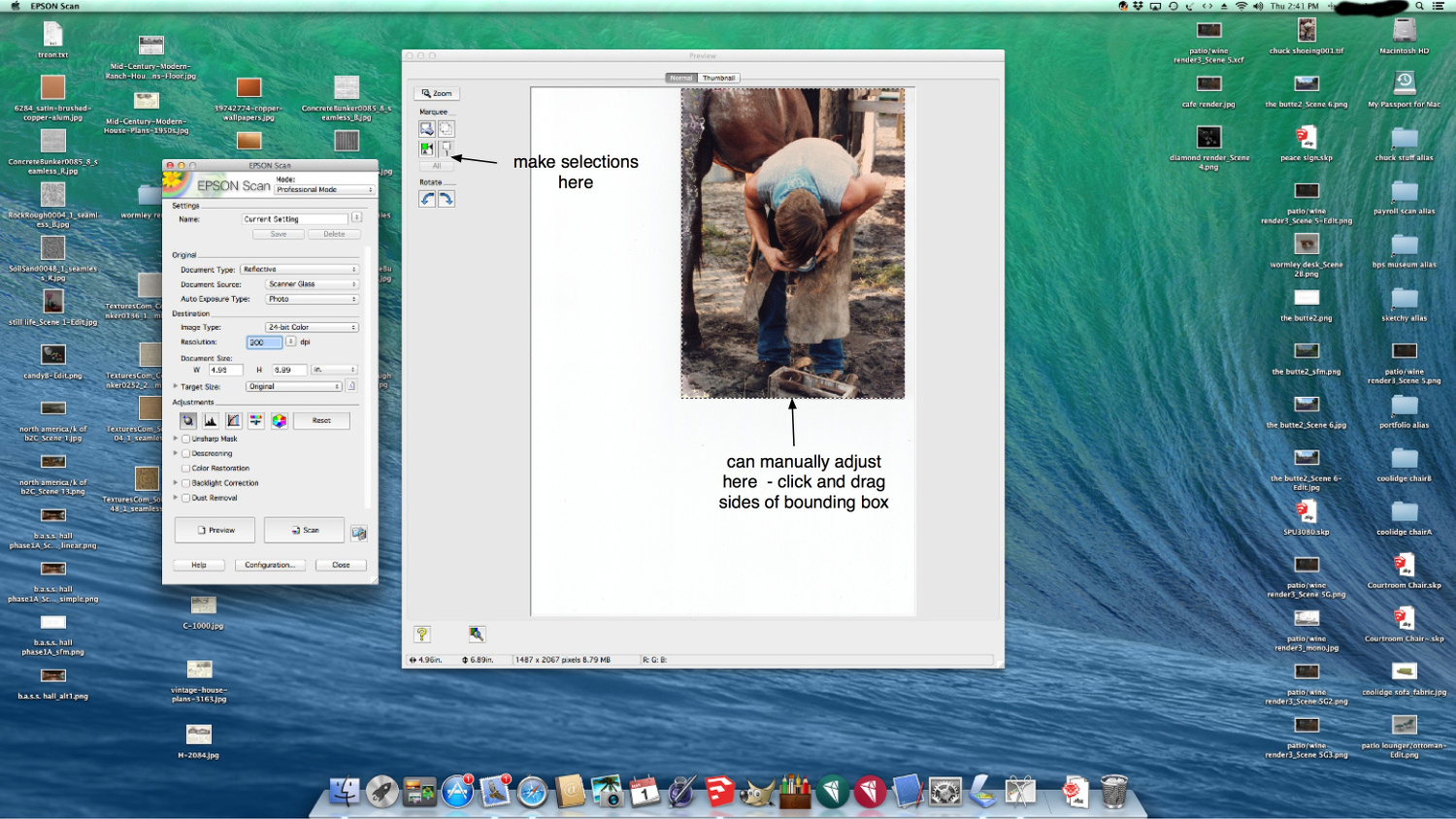
Joe , You can adjust your scanner so it only scans the image. Saves having to go back in and crop out the dead space.
-
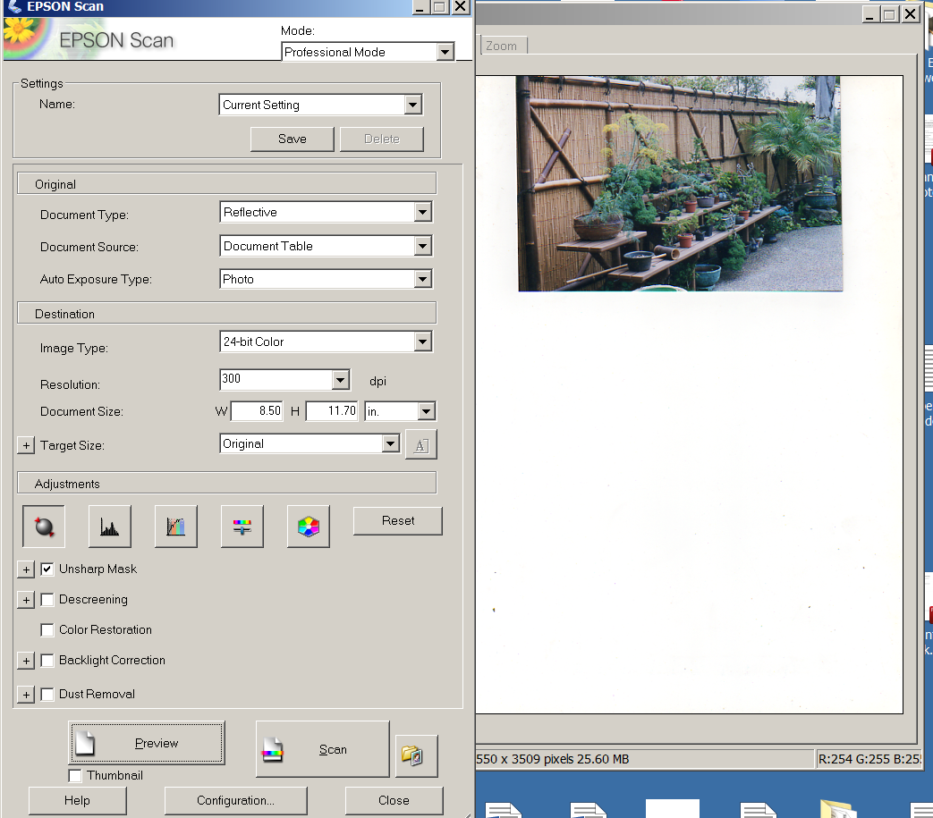
Just discovered the Professional Mode, and see some more settings but nowhere to scan only the image?
-
Joe, Took a few minutes... had to unpack the Epson scanner. Haven't used it since packing up from the museum job I was on. You make your adjustments in the preview window. Attached screenshot, hope it helps.
-
Definitely use "curves" adjustment. Brightness/ contrast is an older mode and gives you much less control. I would highly recommend Lightroom. It's non-destructive and has a really great set of controls for color adjustments. When you scan - set the bit depth as high as the scanner will let you - that will give your image editing program more information to work with.
Hello! It looks like you're interested in this conversation, but you don't have an account yet.
Getting fed up of having to scroll through the same posts each visit? When you register for an account, you'll always come back to exactly where you were before, and choose to be notified of new replies (either via email, or push notification). You'll also be able to save bookmarks and upvote posts to show your appreciation to other community members.
With your input, this post could be even better 💗
Register LoginAdvertisement


