Another Exhibit Space - More Stuff+
-
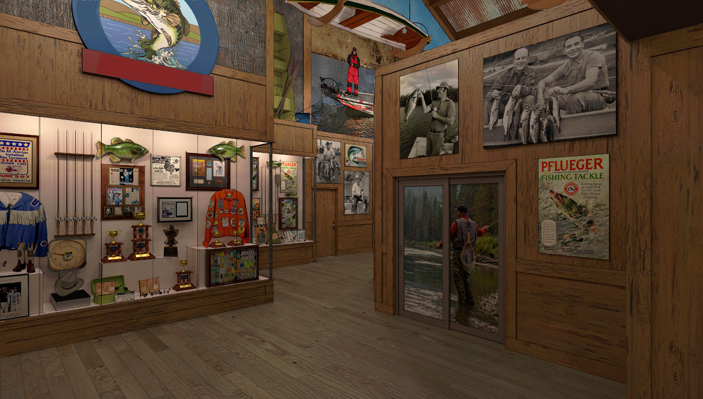
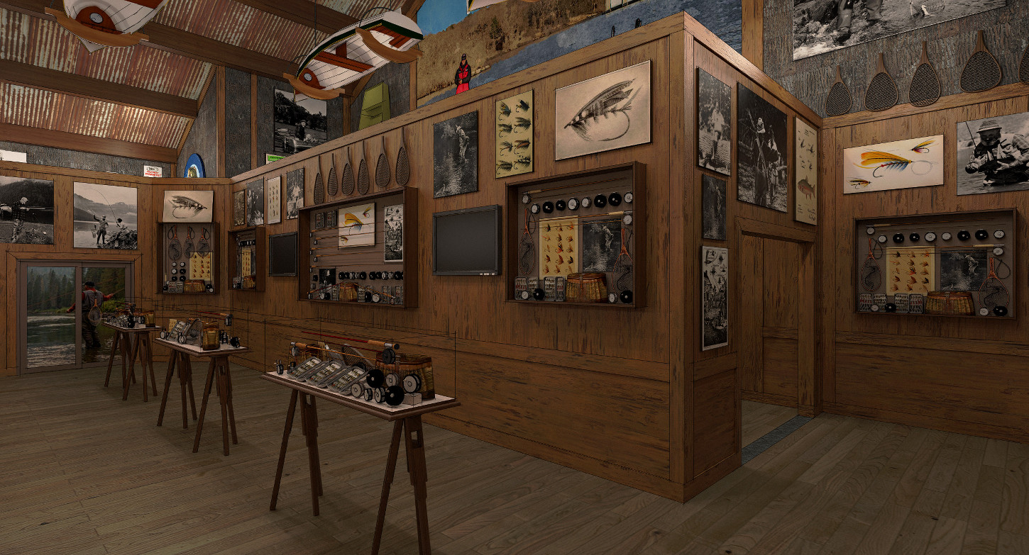
A couple of renders of the last exhibit space I worked on for the "museum" project I've been on. Weird space, owner wanted to divide what was one space into two separate exhibits. As usual last minute "can you do this" deal.
Rendered in Twilight, minor post pro and did a Sketchy line overlay..... Also killed the reflections in the glass, spaces so tight the reflections were looking horrible.... One more thing , after the fact "Gimped" out a name on the sign upper left in the one image so I can post it.
-

 What a cool and probably also unusual "last minute project" this is - besides all these circumstances I'm amazed about the immense amount of equipment details, which makes your render very believable btw! - hopefully the 3d warehouse was helpful here? I would be interested in the skp file size here.
Even if I don't understand anything about fishing - that's how I imagine a museum on this subject

-
Thanks HornOxx. Very few models out of the warehouse.The boat hanging from ceiling, largemouth bass ( fish ) and trophies in first image and the t.v./monitor in second image. Everything else are my models and 2D face me cut outs from pictures I took of actual artifacts that were going on display. I've created quite an unusual "parts" file working on this project.
Almost forgot your question about file size. The .skp is 162.4 MB. The model is just a shell of this exhibit area , no exterior detail and none of the rest of the very large building. Somewhere around 125 textures in the model.
-
Stunning result and highly realistic. On the first render, is the (It looks like an image on a patio type door) angler meant to be an angler fishing or just an image on the wall?
-
@mike amos said:
Stunning result and highly realistic. On the first render, is the (It looks like an image on a patio type door) angler meant to be an angler fishing or just an image on the wall?
Haha yes my thought as well, but great scene by the way!
-
Mike A, liam, Thanks gentlemen. Your pretty close in your guess about the "patio" doors. It represents an automatic sliding door. The image would be a graphic applied to the glass to block your view down that side of the space. This entire project at owner request was built so the customer has to walk a predetermined path through the entire project. It's pretty much "go this way and no turning back" In this space it's broken into a "U" and you walk down the back side turn the corner and come back the opposite side and through the slider and back down a wide hall you first came down to continue "the journey".
-
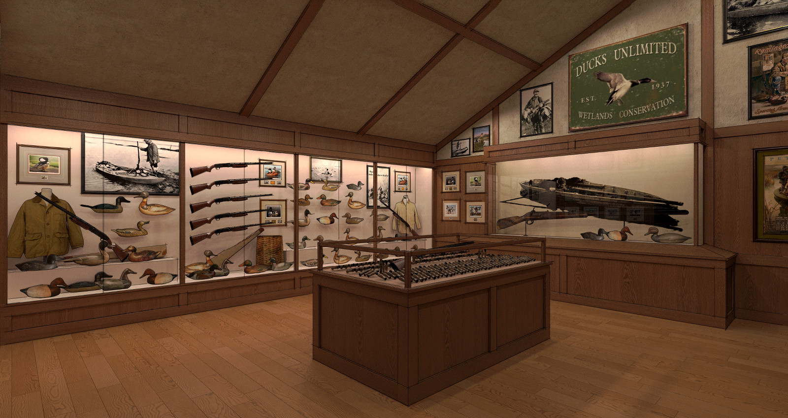
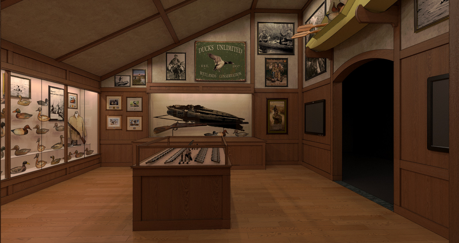
Another exhibit space..... Space is only 20' x 20' with weird ceiling line. Another proposed area I was asked to work out a concept for. Have know idea if it will end up being done. Same treatment as the other ,rendered in Twilight with a sketchy line overlay.
-
Amazing.

-
Bryan , Your reply is much appreciated. Thanks.
-
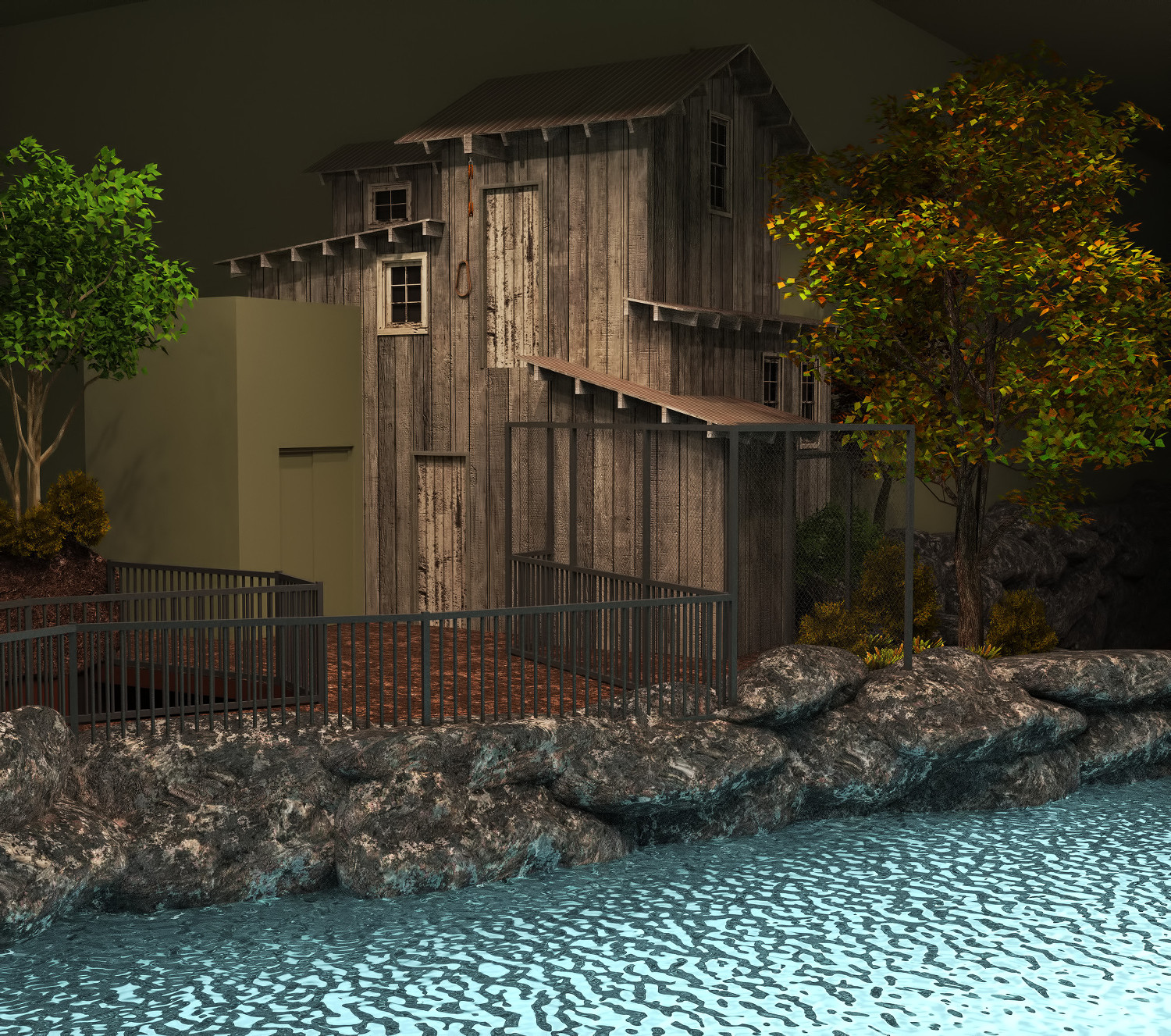
One of my earliest SU models for the museum project I was on. Went back in to it an re-rendered it. Swapped native SU materials for better textures I've amassed over time. Brought in some better Form Font trees.
Structure design is in keeping with the overall theme of this area of the project. It's main purpose was to hide a mass of aquarium plumbing, electrical and HVAC stuff that ran down the wall. Small metal structure attached is a place marker for a proposed songbird aviary. It got "value engineered" down to the size of a garden shed !
!
Hello! It looks like you're interested in this conversation, but you don't have an account yet.
Getting fed up of having to scroll through the same posts each visit? When you register for an account, you'll always come back to exactly where you were before, and choose to be notified of new replies (either via email, or push notification). You'll also be able to save bookmarks and upvote posts to show your appreciation to other community members.
With your input, this post could be even better 💗
Register LoginAdvertisement


