20' Property.
-
Only a few feet difference and the interior is harder to package. Using a sliding partition so the greater part of the level can change between a kitchen diner and a living room depending on what you need.
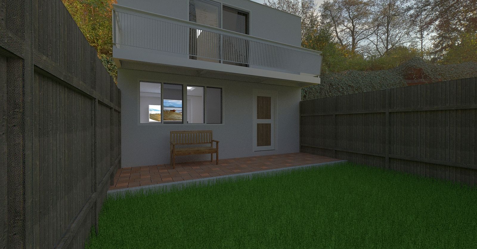
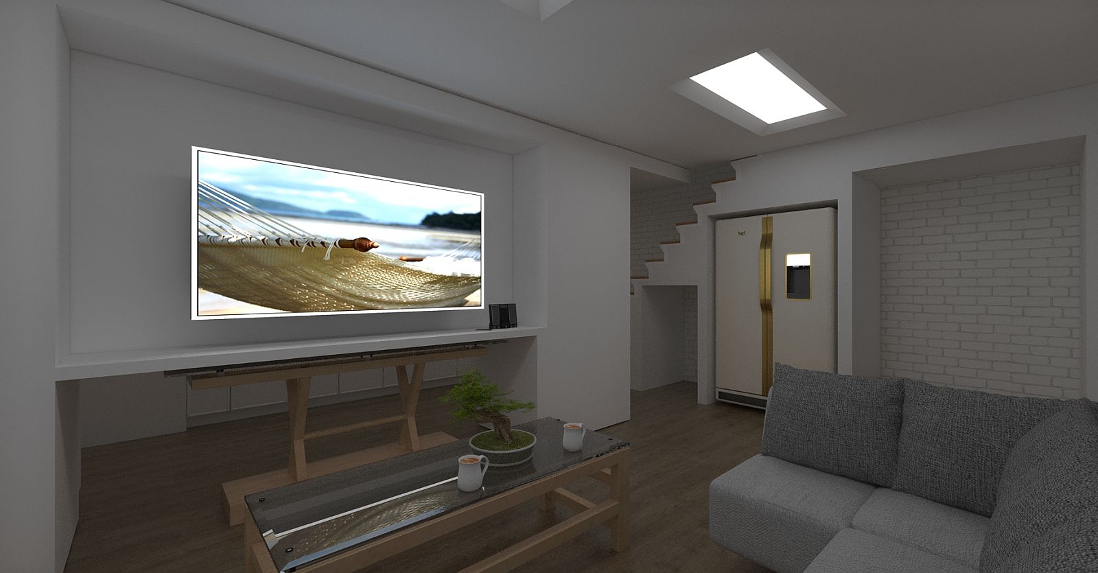
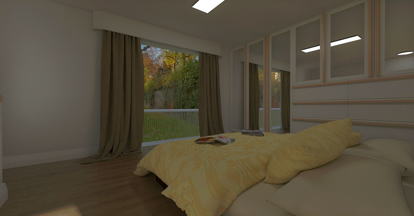
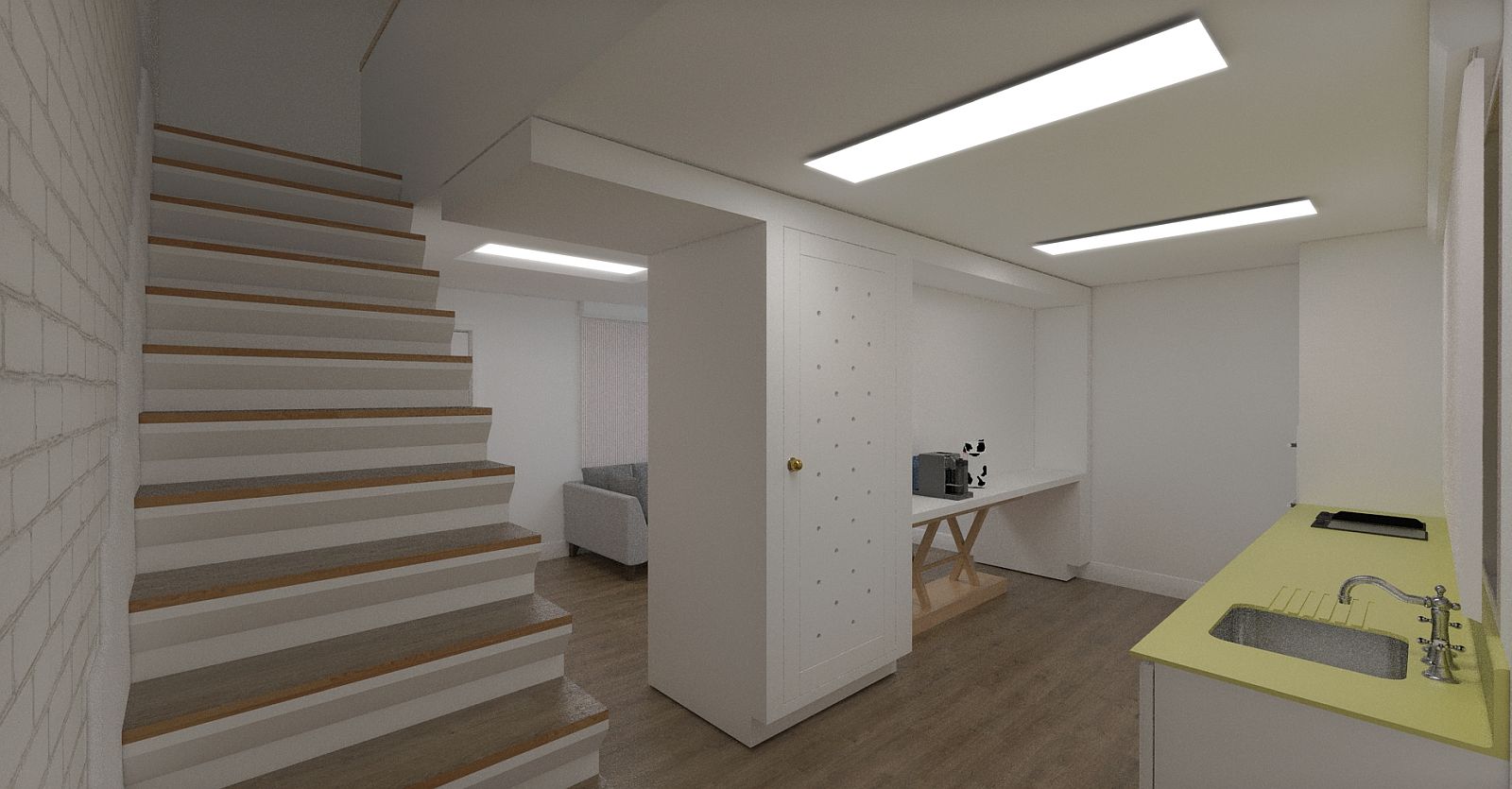
-
Looks really good! Kinda dim, but that may be my monitor.
-
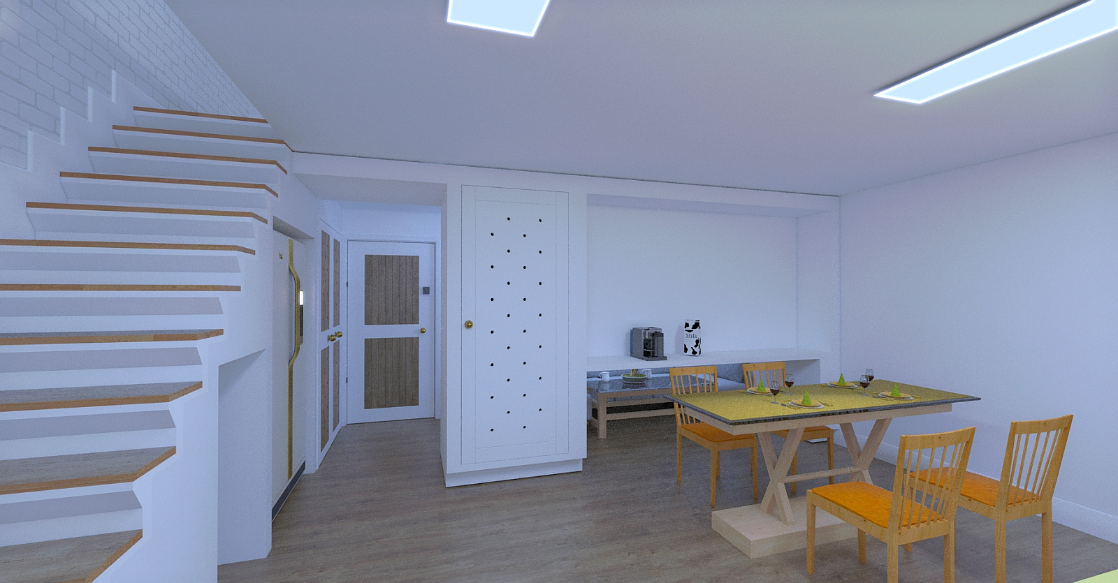
Thanks dood. Some of the dimness is my being inept at the post pro tools in Twilight, they will be adjusted. The last image is better imho.
-
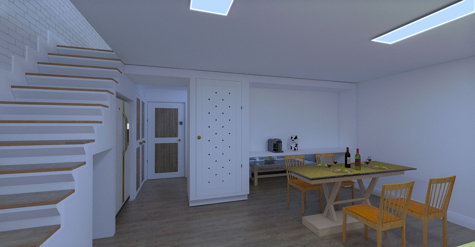
Dining room layout.
-
To fix the dimness I think you have to think like a photographer.
You don't use the same ISO settings for exterior daylight images (ISO 100) as in interior or nigh time shots.
Try changing ISO to 400 or 800 that is quite common when photographing indoor. -
Thanks, it's been at least 20 years since I took photo's and my trusty OM-1N is sitting in its box unused.
-
Nothing new but, I cannot find a way to change that setting in Twilight render. Clues anyone?
-
I don't use Twilight, but I hope this helps.
https://www.twilightrender.com/index.php/tutorials/67-tutorials-v2/163-post-processing-tutorial-v2
-
Thanks Bryan, I missed that.
-
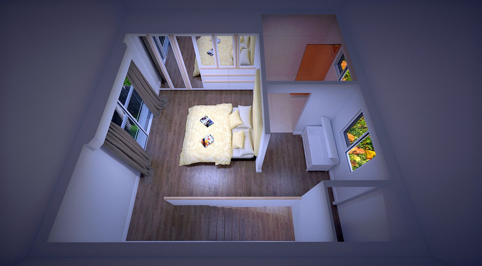
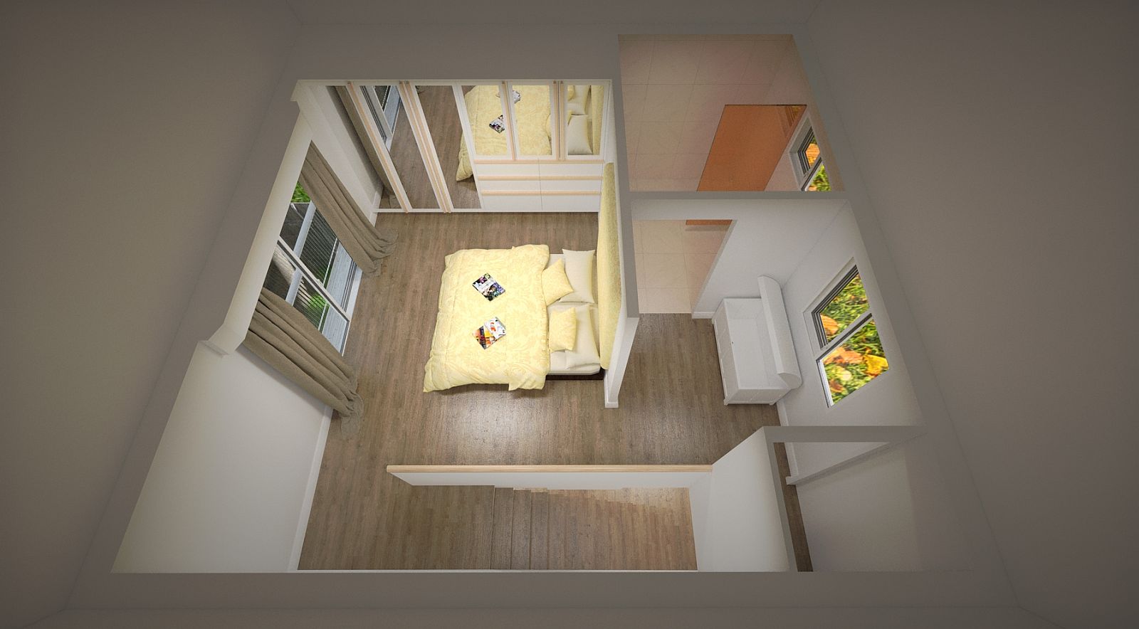
I must have altered the temp of those, trying to adjust.
-
Both of the new ones look great!
-
Thanks Bryan. Learning Maxwell now.
Hello! It looks like you're interested in this conversation, but you don't have an account yet.
Getting fed up of having to scroll through the same posts each visit? When you register for an account, you'll always come back to exactly where you were before, and choose to be notified of new replies (either via email, or push notification). You'll also be able to save bookmarks and upvote posts to show your appreciation to other community members.
With your input, this post could be even better 💗
Register LoginAdvertisement


