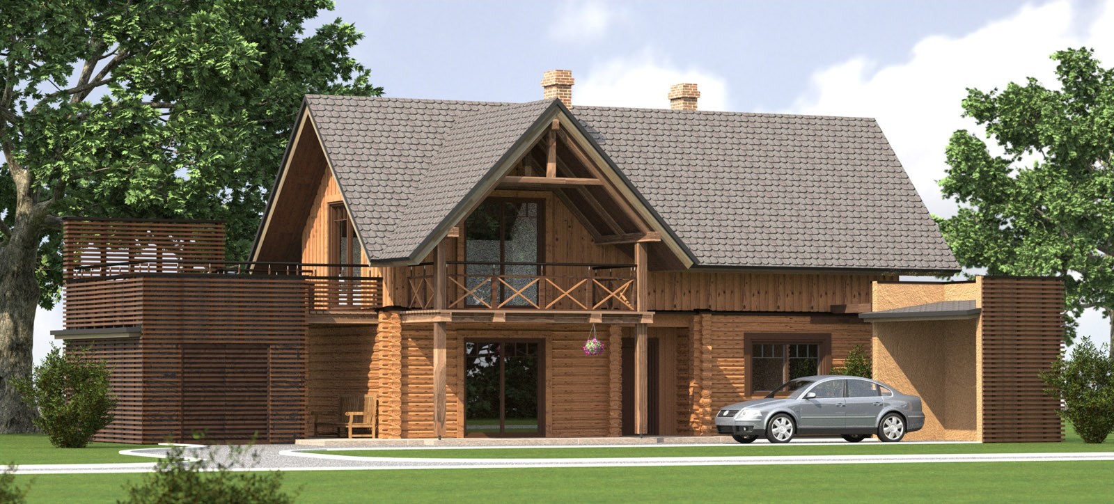
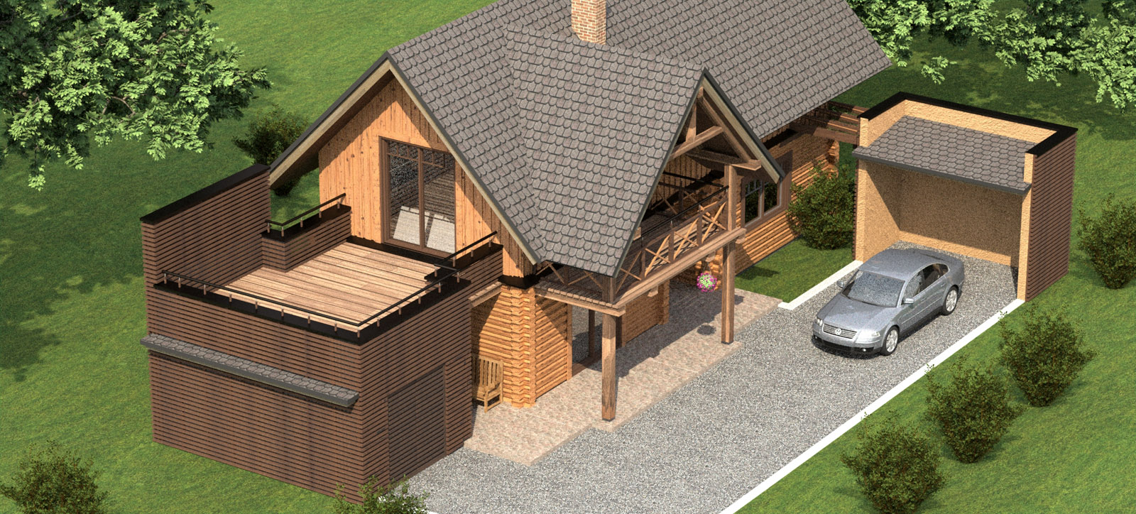
Small Log House.
-
Hi! This is SU + Maxwell work. Only problem I have with this render is log textures. I will somehow figure out how to fix that stupid tiling problem.
Any way comments are welcome.
PS. There is no photoshop used yet.


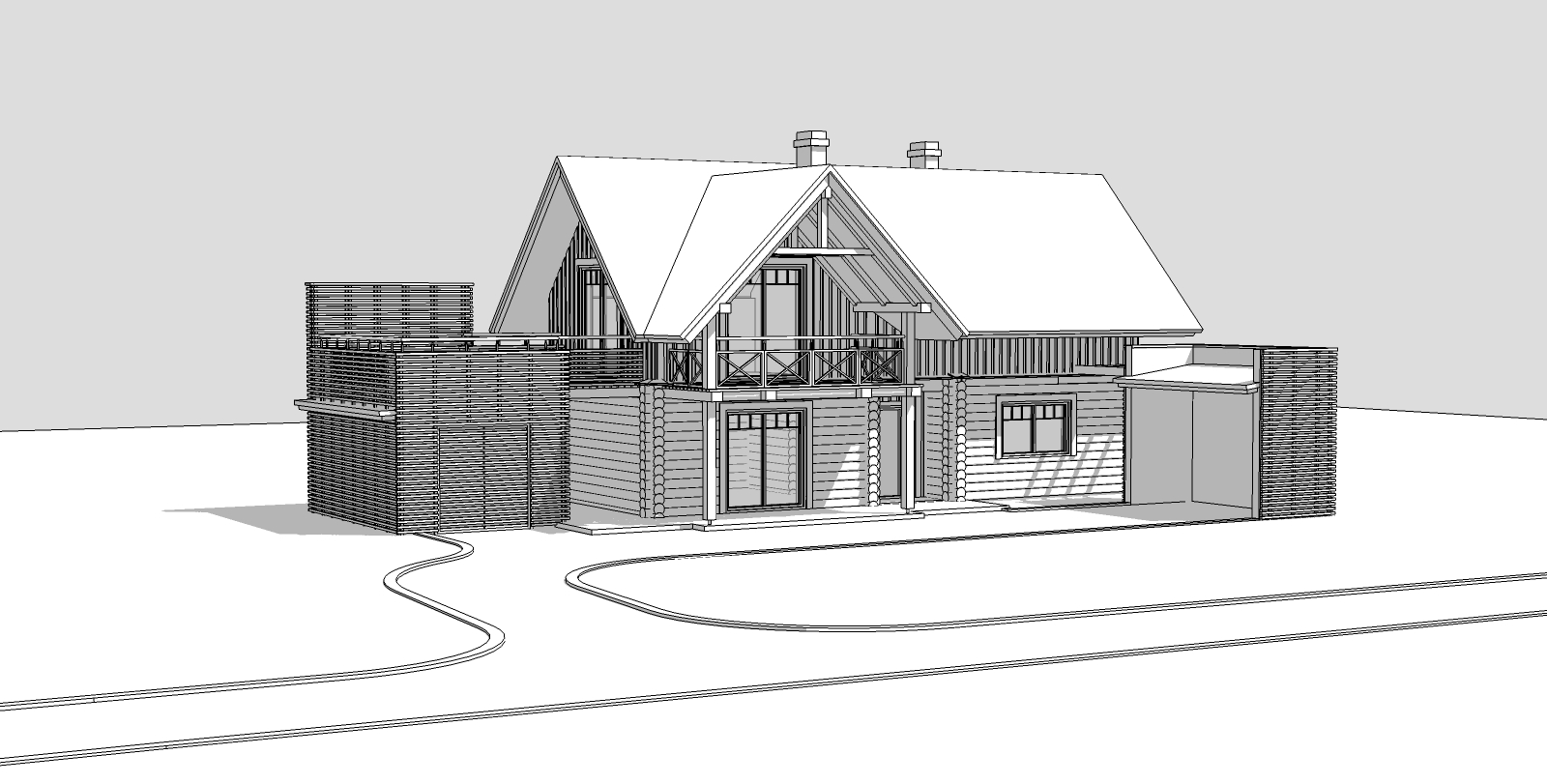
Sketchup:

-
Nice model and lighting. How are you finding Maxwell with regards to render times? I notice the car still needs time to clear up.
Very nice vegetation though, where did you pick them up from? -
cadmunkey thanks for comment. Yes maxwell is still very very slow but everyone is hoping on version 2 which is comming soon.
First image has SL ~ 12 and still noisy, second I have stopped @ SL ~8.
Car and trees are evermotion, but they ar made for vray and i needed to adjust all materials for maxwell. -
Do the evermotion models come into sketchup ok, or are you using Max then exporting to sketchup?
-
Long story short:
Evermotion max model exported (not allways correctly) to mxm then everything setup in maxwell studio. -
@aidus said:
Long story short:
Evermotion max model exported (not allways correctly) to mxm then everything setup in maxwell studio.Ah yer, I remember about maxwell studio now. Thanks for clarifying, I think the evermotion stuff looks very good in your render.
-
Evermotion stuff is great but it needs to be adjusted for maxwell.
-
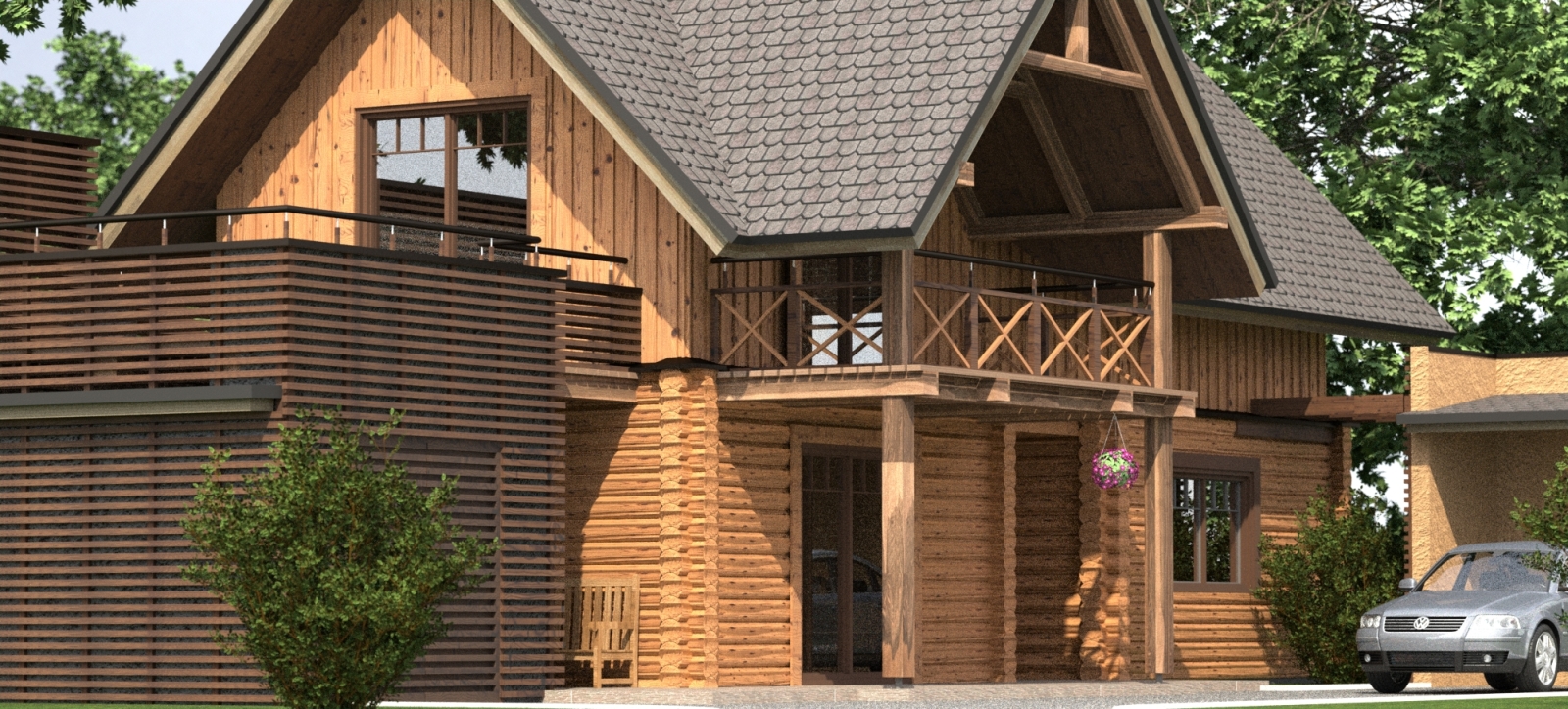
Small update:

Log textures not corrected. -
Really nice stuff- i love the wood texture on the columns and railing.
-
WOW

 This is great, you should be please with this one, especially the textures.
Stan
-
Thanks for comments!
I'm still thinking how to place that log texture. This is the same texture I have used on second floor. But the problem is that texture tiling on round surfaces
-
Dear Aidus, use the Texture Randomizer plugin by TIG.
-
I like the design of the main home/cabin. In my opinion the garage and free standing... garbage can hut...? do not fit style-wise with the home. That is just an opinion and of course everyone has their own:)
The thing I notice about your render is the composition. It feels a bit flat. as if the building were sitting on a perfectly flat plane and just rotated a bit. I would suggest rotating the view a little so you are looking slightly up at it. It feels almost as if a 2d view was just spun on the vertical axis.
Nice curb and driveway. Although I think the asphalt is too light.
Another thing that would help the composition would to be to add some foreground plants or bushes and plant some trees behind the camera to cast some shadows on the lawn. The lawn as it is, is too flat and too lime green to be convincing.
How about some furniture on the upper deck?
The roof texture is not great.
The bench is kind of in an odd place. Would you be staring at the garage wall with your knees under your chin if you were sitting on it?
The bushes look like photos of bushes sitting on a flat plane. If you add some bushy small plants at the base of those bushes it will help them feel grounded.
Do not be afraid to add some more plants and shrubs. The very limited amount you used feels like the home owner ran out of money before finishing the landscape:)
The planter thing hanging from the deck looks lonely. Such a symmetrical form, one would think maybe hanging two of them.
I have never been a fan of cars parked in front of houses, unless I am selling cars, not homes.
I hope you take all of that as not just criticism, but as a constructive critique.
paul
Hello! It looks like you're interested in this conversation, but you don't have an account yet.
Getting fed up of having to scroll through the same posts each visit? When you register for an account, you'll always come back to exactly where you were before, and choose to be notified of new replies (either via email, or push notification). You'll also be able to save bookmarks and upvote posts to show your appreciation to other community members.
With your input, this post could be even better 💗
Register LoginAdvertisement


