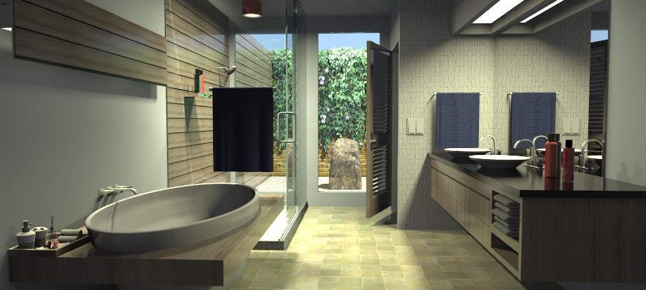
Bathroom this time
-
Thanks pbacot!
Yeah, that foliage gave me fits. The outdoor lighting is also not quite right and the raked sand is bleh. I need to work on it.
-
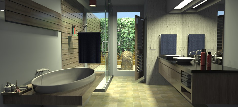
Again, thanks for the suggestion pbacot. Hope this looks better. I certainly like it better.

-
So what the dimensions of this room? 10' ceilings?
...... joe -
@joewood said:
So what the dimensions of this room? 10' ceilings?
...... joe9ft ceilings. 11ft wide by 13ft long. It's pretty big. The water closet has both toilet and bidet.
-
Nice, the exterior is much better. Possibly a bit more shine on the tub.
-
Nice Bryan
-
@mike amos said:
Nice, the exterior is much better. Possibly a bit more shine on the tub.
Thanks Mike.
Yeah, the tub needs some work. I also think I've got the outdoor lighting a little too bright. Not much, but I'll knock it down a tiny bit and see if that makes a difference.
-
@mwm5053 said:
Nice Bryan
Thanks Walt.
I feel I'm having really good success with Raylectron. The UI seems to suit me. Render times aren't bad either. This one is taking about 20 min on my 5 year old laptop and I stop it at 200 sample/passes.
-
Well the tub won't go real shiny. I doubled the shiny on that material. I think it's due to the overall lighting of the bathroom. I did knock down the outside sunlight and it looks better, but it's very subtle.
So here's the very last one and I'll do better on my next model.

Thanks again for everyone's suggestions and compliments.

-
The outdoors looks nicer!
-
@bryan k said:
@mike amos said:
Nice, the exterior is much better. Possibly a bit more shine on the tub.
Thanks Mike.
Yeah, the tub needs some work. I also think I've got the outdoor lighting a little too bright. Not much, but I'll knock it down a tiny bit and see if that makes a difference.
I can see you want to show off that wall, but the bright sunlight would, in reality, create a huge glare in contrast with the interior. So yes, maybe less brightness would be fitting.
-
Thanks pbacot.

Hello! It looks like you're interested in this conversation, but you don't have an account yet.
Getting fed up of having to scroll through the same posts each visit? When you register for an account, you'll always come back to exactly where you were before, and choose to be notified of new replies (either via email, or push notification). You'll also be able to save bookmarks and upvote posts to show your appreciation to other community members.
With your input, this post could be even better 💗
Register LoginAdvertisement


