FlexWindow 2.1 - dynamic component
-
Simple and interesting..
-
what's the difference between the lite version and the full/pro version?
-
@juju said:
what's the difference between the lite version and the full/pro version?
Basically everything above where it says "Additions in the full version:" is in the lite version. And everything below that is in the full version - including the latest addition of pillars in v1.1 .
Maybe my description isn't clear, I'll try to rewrite it to make things clearer.
-
This looks good but I have had this error come up
Followed by this one..
-
Try to explode the component once and see if it works...
Sent from my iPhone using Tapatalk
-
Thanks. Yes that works now. I notice several of the parts overlap and do not automatically trim, such as the glass and horizontal profiles. Is that to make it quicker?
-
@nickchun said:
Thanks. Yes that works now. I notice several of the parts overlap and do not automatically trim, such as the glass and horizontal profiles. Is that to make it quicker?
.Yep. I kept the glass as one component to keep things as speedy as possible. I'll mention that too in the description...
-
@halroach said:
@nickchun said:
Thanks. Yes that works now. I notice several of the parts overlap and do not automatically trim, such as the glass and horizontal profiles. Is that to make it quicker?
.Yep. I kept the glass as one component to keep things as speedy as possible. I'll mention that too in the description...
That'll make it terrible to have a section run through...
-
@juju said:
@halroach said:
@nickchun said:
Thanks. Yes that works now. I notice several of the parts overlap and do not automatically trim, such as the glass and horizontal profiles. Is that to make it quicker?
.Yep. I kept the glass as one component to keep things as speedy as possible. I'll mention that too in the description...
That'll make it terrible to have a section run through...
I guess it depends what you're using the section for. In the 2 section images above, I used the "section cut face" plugin, it worked perfectly.
The calculations for separate glass panels pretty much defeats the whole idea behind Flexwindow. Over a certain amount of divisions it just slows down to a crawl. I could try to make an option to toggle between one glass panel for speed, and separate panels for finalizing... I'll think about it.
-
Flexwindow 1.1 is out! - [highlight=#ffff80:14yns36y]Dynamic pillars added![/highlight:14yns36y]
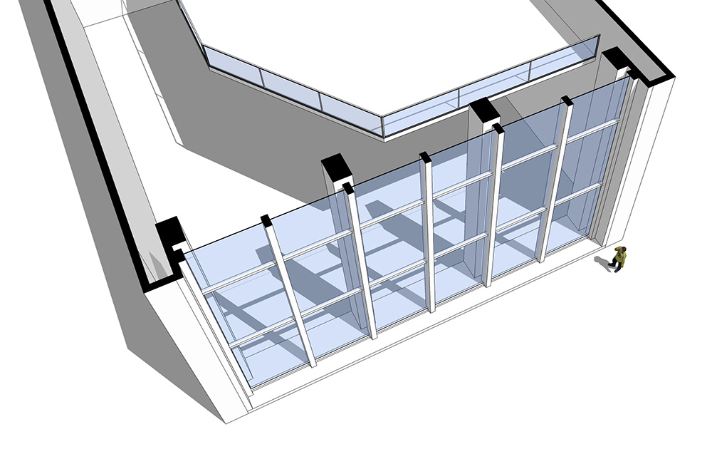
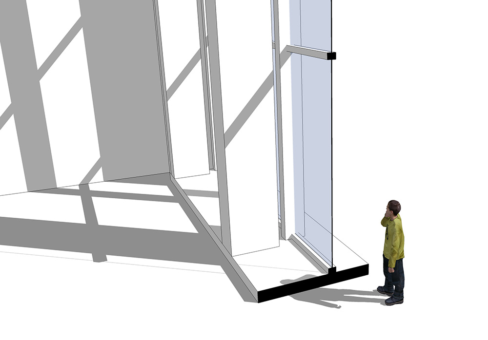
To make Flexwindow a 'little closer' to reality when creating large facades, there is now an option to add pillars. (vs. the earlier version in which I used the vertical profiles as pillars).
Pillar options:
- (a) pillars are centered with the vertical profiles.
(note: If pillars are larger than 2*framewidth, they are no longer centered exactly but distributed in an equal distance between the boundaries of the component. - (b) freely specify number of pillar divisions between the frame.
- (c) pillars OFF.
Additional features:
- frame width can be set to 0 - and it disappears!
note: **1.**It will affect how pillars are centered in option (b). **2.**frame depth still affects component boundaries. - Using the interact tool:
on profiles - adds divisions
on frame - subtracts divisions.
note: You can click as many times as you want on the frame to subtract and it will always stay with the minimum of 2 - don't worry about clicking too much.
note for those who have purchased flexwindow 1.0, you should be able to use the same links to download the updated flexwindow 1.1. If there are any problems, let me know.
I'll be glad to hear some feedback, opinions, suggestions for additional/better/easier/clearer features...
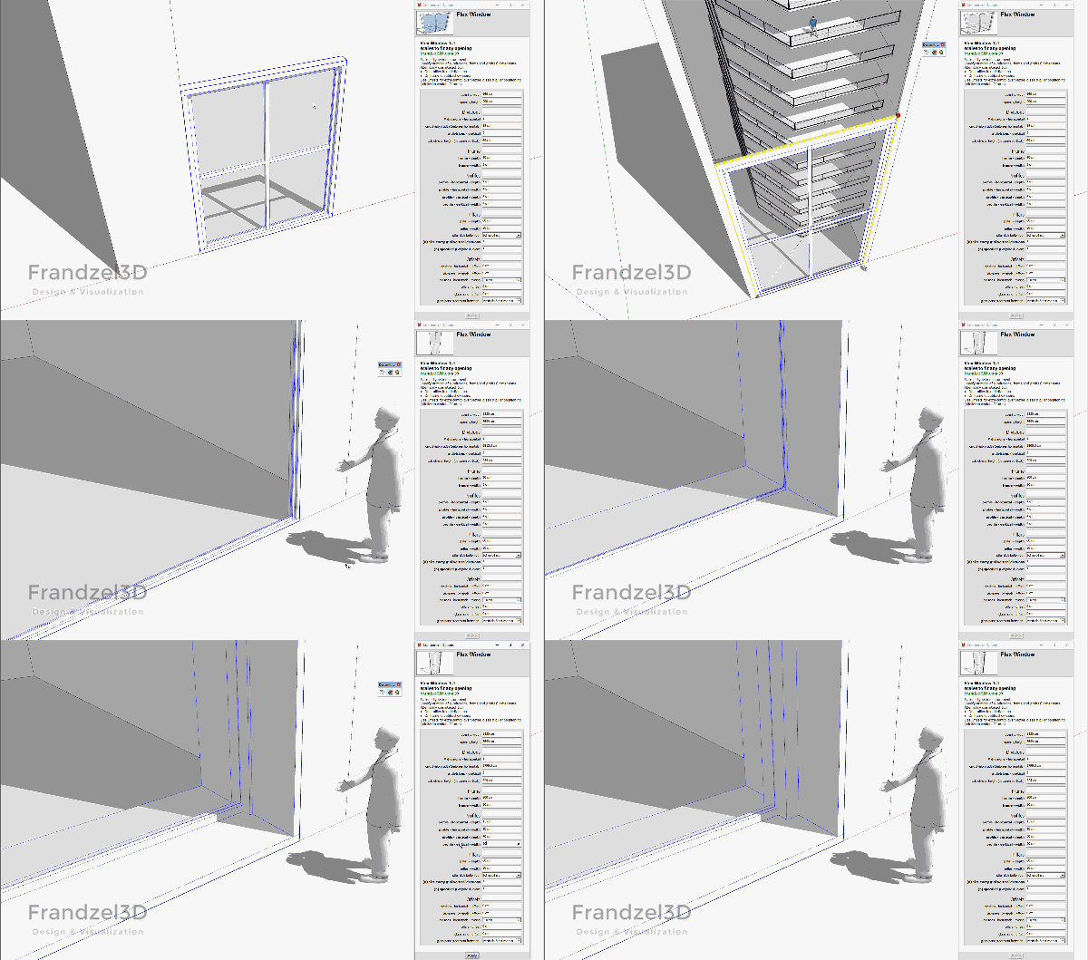
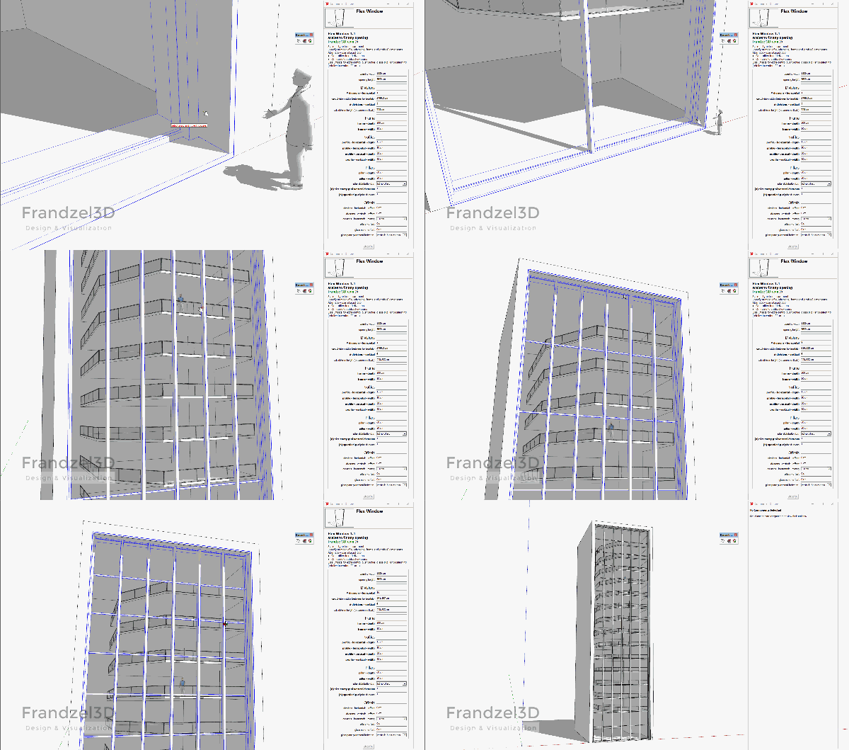
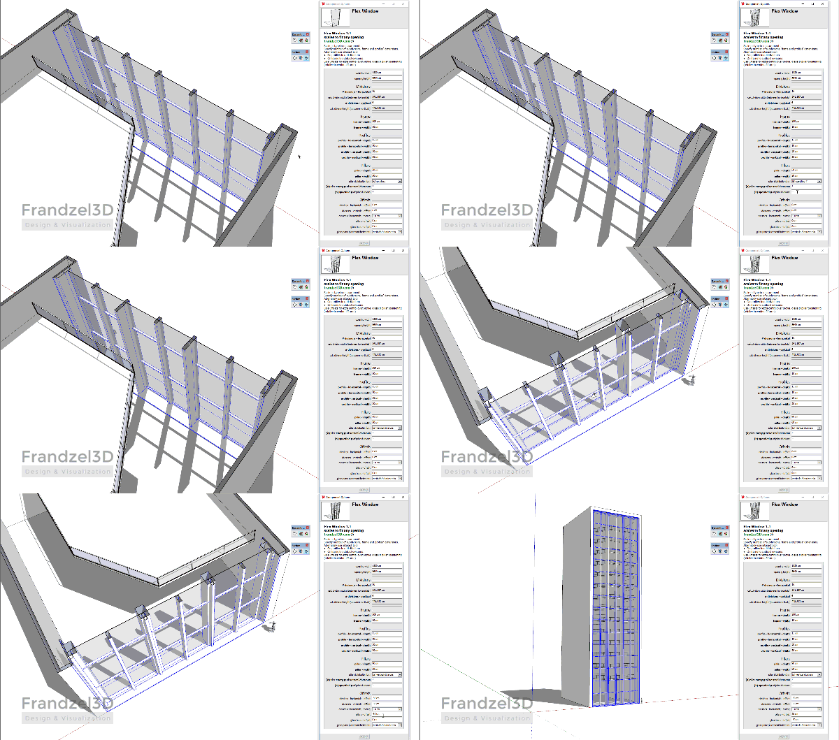
- (a) pillars are centered with the vertical profiles.
-
Flexwindow 1.2 is out! - [highlight=#ffff80:be77ejqe]Window sill added![/highlight:be77ejqe]
New in this version:
- window sill added
- specify sill width, depth, protrusion to the sides.
- set sill width to 0 makes it disappear.
- interact tool on sill - toggles side protrusions. note: protrusions should be toggled to off when scaling the component.
- improved pillar positioning in relation to frame width minimum - (option (a))
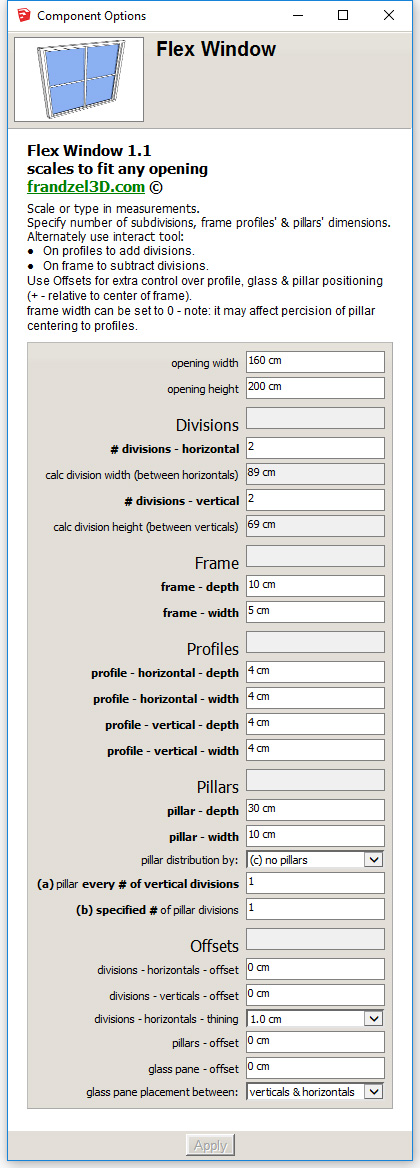
- restyled options window to take less real estate.
- rearranged options to make them more comfortable.
- totally rewritten to accommodate further development...!
Those who have purchased previous versions can now download this version as well.
Enjoy!

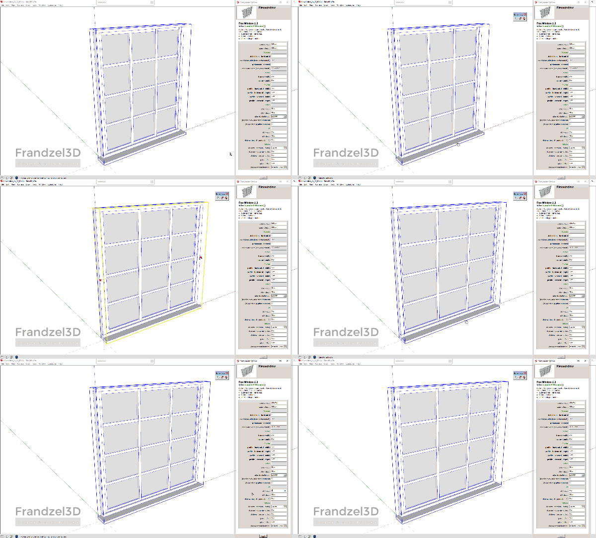
[attachment=1:be77ejqe]<!-- ia1 -->flexwindow 1.2 component options window<!-- ia1 -->[/attachment:be77ejqe]

-
Very handy dynamic component for quick and easy use. Especially with the new feature (window sill).
Concerning the glass. As far as I am concerned I do not mind it running trough the mullions BUT speaking for myself there even should not be double panes. It is hardly visible in a sketchup drawing (only with a close-up) and when rendering (p.e. thea) double panes are rarely used because it only creates extra time and no significant difference in the outcome.Come to think off it in sketchup the double panes also gives a extra thick line when using a section cut.
But all in all, congrats for this very useful component,erikB
-
By Double panes--is each glass component two surfaces or insulated panes that are two surfaces separated by 1" or more...or four surfaces?
-
No, I mean the glass is draw as 2 planes (representing the two panes I suppose, or perhaps giving the one pane some thickness? Either way for my the use a simple plane (1) (representing 2 separated glas panes or thickness if one pane was intended ) would have been enough. (cfr. windowizer here the glas is also only represented by a simple plane.
erikB -
@erikb said:
No, I mean the glass is draw as 2 planes (representing the two panes I suppose, or perhaps giving the one pane some thickness? Either way for my the use a simple plane (1) (representing 2 separated glas panes or thickness if one pane was intended ) would have been enough. (cfr. windowizer here the glas is also only represented by a simple plane.
erikBHi Erik,
Yes, the window is simply a 1cm wide box. You can easily convert it to a single plane by double clicking your way into it, selecting all the geometry and deleting the "thickness" - basically replacing it with a single face. Just make sure to place the face right on the axis of the component!
Let me know if there is any problem with it... it should work just fine!
-
You could perhaps make a setting for glass thickness where 0 is just a single plane.
-
@pixero said:
You could perhaps make a setting for glass thickness where 0 is just a single plane.
Yep, that could easily be done. I'm just afraid of having too many settings on the 'component options' window. And it will add yet more hidden geometry which I'd like to keep to a minimum.
As it is now, I feel there are too many settings. The window barely fits on my screen (1200 pixels vertically), and I'm thinking of adding even more features and setting in future versions... Like beams between the pillars (they are kind of missing I think) I'm not sure where all the settings are going to fit...
suggestions for real estate optimization methods are welcome!
How about, if I make the glass one surface to begin with. And if anyone wants it to be think, just to push pull it in the 'natural' direction and it will center itself (like it does now)? It's a small difference than how it is now, but easier for the end user I think.

-
For rendering it is better with glass who has thickness.
-
Very useful fast windows creator. Thank you. I only miss the option to make casement windows.
-
Looks appetizing enough to buy

Please could you add some smart solution for corners (L shaped window with\without mullion in the corner).
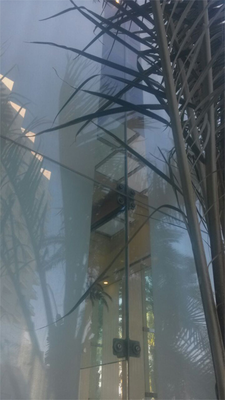
2. Mullion-less window: only large glass panels with thin layer of sealer between plates. With option to add glass ribs in the interior side. The columns behind the window you've already have.. are they created as components? It could give us option to add some details afterwards.
3. Most mportant: LMM! Special Lock Module (between mullions) Mode. Thus only first and the last portions of the window will diverge from defined module.
Hello! It looks like you're interested in this conversation, but you don't have an account yet.
Getting fed up of having to scroll through the same posts each visit? When you register for an account, you'll always come back to exactly where you were before, and choose to be notified of new replies (either via email, or push notification). You'll also be able to save bookmarks and upvote posts to show your appreciation to other community members.
With your input, this post could be even better 💗
Register LoginAdvertisement


