Layers and Image clipping
-
I found a new oddity while setting up an NPR rendering today. I can't figure out what is going on.
I have a school model inside a sky dome.
- If I place the sky dome on certain layers I get this result with the birds and some trees.
2. If I place the sky dome on other layers I get this result.The only change between the two images is moving the sky dome between layers. I can't figure out what the difference is between the layers other than the layer colors and the names. And if I set the layer colors the same(which should not matter) I still get the difference in views.
Surely I am missing something basic.
-
A new issue regarding layers and visibility popped up yesterday that I thought should go here as well. This is odd and I don't know what is going on.
Here we are doing some branding in a university student building. The architect wants semi-transparent letters on the glass entering various suites. If I put the lettering on layer 0 this is what I see:
If I put it on a separate layer (Branding 1) this is what I see:
No change in color or opacity at all, the only change is what layer the letter group is on.
The storefront doors are on a First Floor layer and the geometry inside that storefront group is on layer 0.Any thoughts?
-
I am surprised nobody has encountered this.
-
just thinking out loud here but...
If I remember well, transparent objects often cause some trouble.
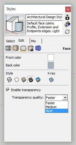
Does changing the transparency quality to 'nicer' improve the results?Maybe SketchUp is actually treating layers as stacked (transparent) layers?!??
By putting something on another layer, it ends up in a different context / different z-buffer so to say?Just wildly guessing here...
-
Thanks for the reply.
@kaas said:
just thinking out loud here but...
If I remember well, transparent objects often cause some trouble.
Does changing the transparency quality to 'nicer' improve the results?Not sure what you mean by Nicer.
The letters are "cut" out of a flat plane then painted with a solid color and changed to Opacity of 68.
The birds are a png image without opacity. Just the transparent edges around the birds.@kaas said:
just thinking out loud here but...
Maybe SketchUp is actually treating layers as stacked (transparent) layers?!??
By putting something on another layer, it ends up in a different context / different z-buffer so to say?Could very well be. As far as the lettering goes, the darker one is on Layer 0 along with all the surfaces it is interacting with. The lighter one (desired) is on a separate layer altogether.
I can get it to look like I want it but there seems to be no logical reason for the difference. If I put the lettering on other layers the results vary without regard to naming or position. It seems random.
-
Nicer -> see image

-
Oh, in the style. Sorry I thought you meant the material.
Medium and Nicer work for the birds. Thanks.
Changing the transparent quality for the lettering makes it even more odd. The color shifts back and forth while orbiting on one of them but the other stays the darker. Odd indeed.Thanks again for the reply, I learned something new today.
-
if the birds look nice like this, maybe you could make semi transparent textures for the letters as well.
In Gimp / Photoshop, create a 128x128 image with the color of the letters and add a 68% alpha channel layer to it. Save as image with alpha channel and use as texture in SketchUp. -
Thanks again kaas.

Hello! It looks like you're interested in this conversation, but you don't have an account yet.
Getting fed up of having to scroll through the same posts each visit? When you register for an account, you'll always come back to exactly where you were before, and choose to be notified of new replies (either via email, or push notification). You'll also be able to save bookmarks and upvote posts to show your appreciation to other community members.
With your input, this post could be even better 💗
Register LoginAdvertisement


