Npr home exterior
-
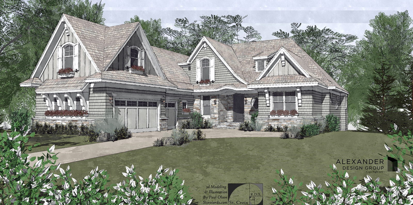
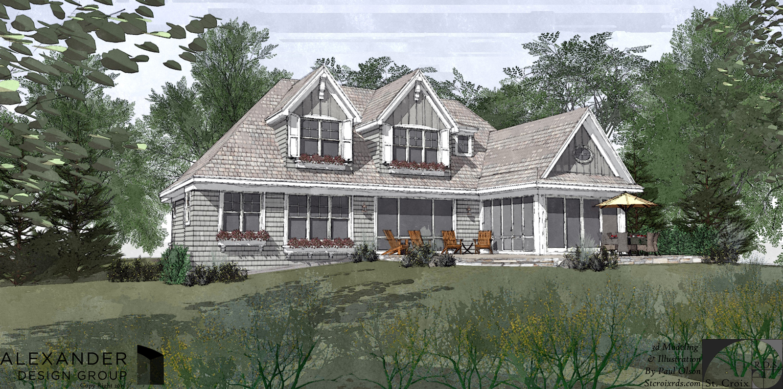
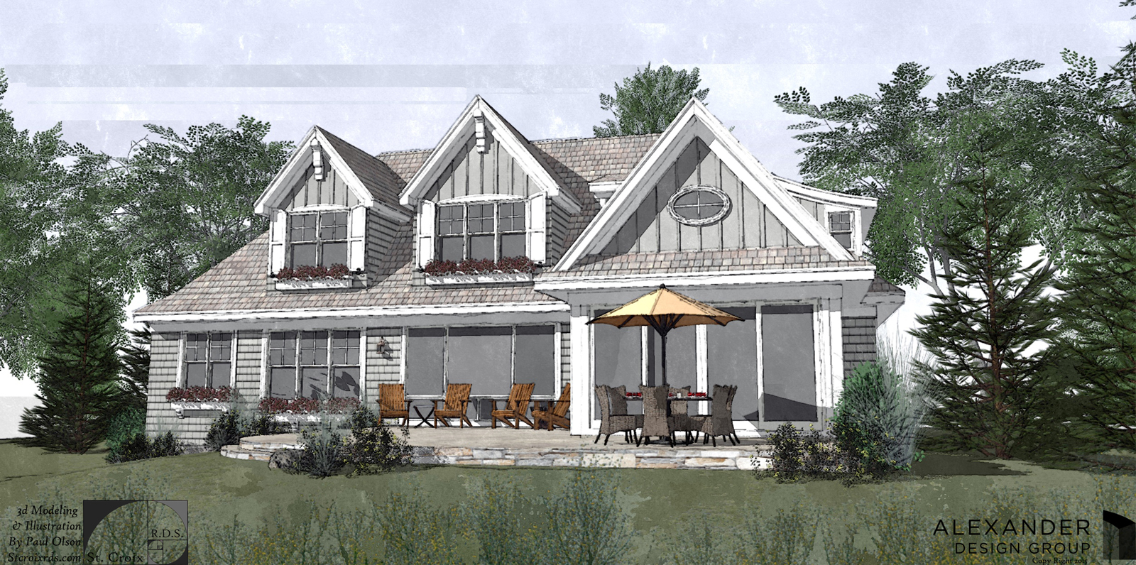
This one just finished.
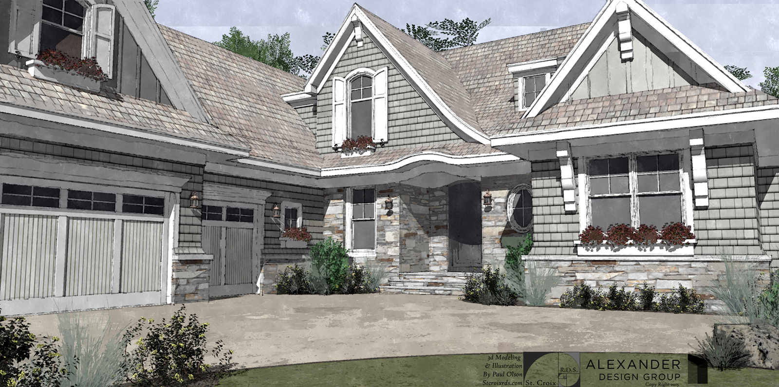
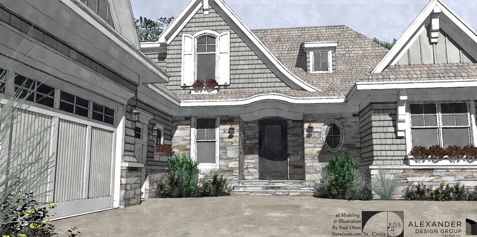
Wondering, anybody have an idea (that is not too labor intensive) for making outside corners (stone and siding) have a bit more realism. making a stone pattern turn the corner seems to require a lot of fussing, same for giving a shingled corner some depth.
Probably too much work when I can easily plant a bush and hide the corners.
toodaloo
-

Spectacular work again!
I have no idea how to beat this shown quality or how to
improve this amount of detailing.please let me know immediately if you ever make a tutorial
about your work process...


-
Stone corners should be relatively easy with a vertical stone wall - just make sure the texture continues seamlessly around the corner. Easily doable with the eyedropper.
Your siding corners look fine to me. The only thing "missing" is that sawtooth profile one would see in reality, but honestly I don't think anyone would really notice (until now that I've pointed it out!
 ). I've modeled a few simple roofs with wood shingles and physically modeled the profile to see that sawtooth profile at the edges. But that would be too much work for something other than a simple rectangular building, and I think the effect would be lost, too (I once modeled lap siding to try to get a more realistic effect with the trim; the end result was not very satisfying, especially for the amount of work involved. So I reverted to a good lap siding texture).
Your roof texture could use some work. Shingling starts at the bottom and works up, so you should see full shingles at the bottom edge. Also, at hips, if the same roof slope is used on both planes, the bottom edges of the shingles should align. If those are asphalt shingles, the hips and ridges would be capped with shingles.
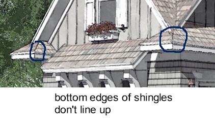
On a related note, I wonder if darker shadows wouldn't give these images a bit more punch. The images seem too neutral - the same tone (color-wise) is used throughout.
Horrible siding corners aside, nice images as usual.
-
Reminds me of Tademas images, mayb you can ask him about this too?
-
Pmolsons Glaring mistake


As always Daniel you are a wisenhimer...translation-"wiseguy" for those not in Wisconsin.
I have always been lazy about re positioning the roofing texture. Now you made me think about it and I guess I will have to do that in the future. Thanks again...More bleeping work..
The tones are kept neutral on purpose because these are early design studies and color has not really been discussed so I tend to keep things pretty grey so I don't turn anybody off with boldness.
Thanks for the link Cotty.
Hornox, My work flow is pretty simple. Are you ready? Here it is...
Spend way too many hours and charge way too little. Thats it.
p
-
Please always remember my criticism, for what its worth, is always meant to be taken constructively, and never-spirited.
I didn't explain myself very well in regards to the neutral tone. I wasn't referring to the colors themselves, but rather the tones - all the colors seem to be within the same tonal range. Not enough variation with light and dark tones. Does that make sense? I was just wondering if darker shadows would give it more depth.
Most of this is nitpicky, and only noticeable to those of us who actually model and render. Most people, when they look at your work, probably respond "OH MY GOD THAT'S FRICKEN AWSOME!!!!"
-
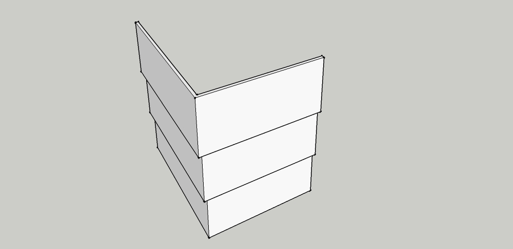
I think the only way is to model a corner element that skews out from the face. Tedious to make but maybe once you've made a couple that's all you need. Otherwise draw some lines in post-pro to suggest the profiles.
-
@daniel said:
Please always remember my criticism, for what its worth, is always meant to be taken constructively, and never-spirited.
I understand and actually look forward to the "knit picking" aspect of your responses.
I think I sense a slight sarcastic sense of humor mixed in to your responses and also appreciate that.
No worries.@pbacot said:
I think the only way is to model a corner element that skews out from the face. Tedious to make but maybe once you've made a couple that's all you need.
I may do that for close ups. a re-usable component would be just the ticket.
Thanks.
-
these are really great.. I dont think it needs it, but I've gone to the trouble of modelling siding before, to get the corners right. model one row, copy it up a bunch of times.
*edit.. guess i should've read the last posts!
-
Paul, Just love seeing your home npr's. Your work is excellent. Even if the home style is not quite my cup of tea ( hard core Eichler fan ) your work is always amazing !
-
Thanks Marked001!
Tuna, My philosophy on style or tastes is that I love whatever style my paying clients like.

Thanks for the comments.
I actually have a couple "modern style" or "contemporary projects" in the works right now. If they turn out ok I will post.
p
-
Er, there was problems with the render? I guess I was blinded by the rest of its brilliance.
Seriously, great render.
-
I was fortunate enough to be asked to do a
Video fly around of this project. -
Nice! Looks great and good job completing the scene with trees and plants. What resolution did you use for SU output?
-
Thanks pbacot
exported image set at 1080p full hd - 30fps -
Good work, I like it
-
Very good work.

-
Thank you gentleman.
-
Looks great, Paul. I like those ornamental grass spike components. Where'd you find them?
-
O, mate , these are really great..... I wish I had time to do such modelings... and also some renders...

Hello! It looks like you're interested in this conversation, but you don't have an account yet.
Getting fed up of having to scroll through the same posts each visit? When you register for an account, you'll always come back to exactly where you were before, and choose to be notified of new replies (either via email, or push notification). You'll also be able to save bookmarks and upvote posts to show your appreciation to other community members.
With your input, this post could be even better 💗
Register LoginAdvertisement


