Coffee Table Bench and Sideboard
-
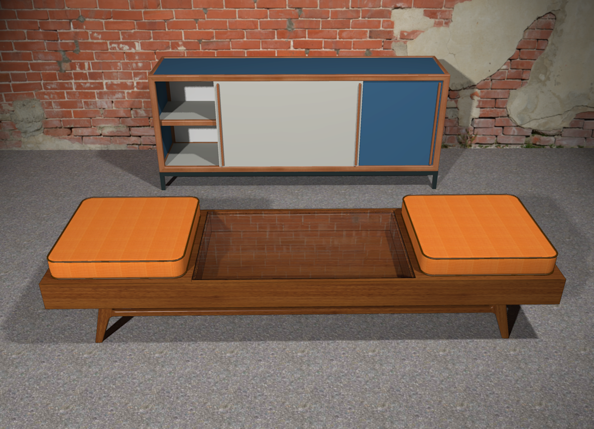
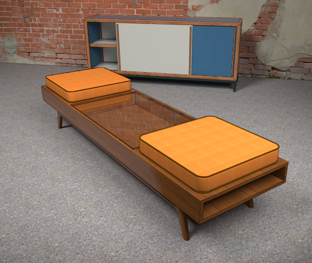
I've been experimenting a little. Few of my projects have glass in them so I've had little opportunity to play with rendering it. I think I've got a ways to go. I like that I appear to be getting a double reflection of the bricks indicating there's a reflection from the inside of the bottom surface as well as from the top surface of the glass.

And an earlier attempt.

-
I really like that wooden stool. I don't understand the glass though. Why is it there?
-
It's based on a piece from the 1950s. The cushions can be stored in the open ends so it can be used as a coffee table. The recess below the glass is space to display items like your seashell collection.
-
Nice! How do you open the glass?
It would look really cool if you'd work a bit on making the pillows softer and if the tops of the bench would have joints. Right now it seems to me the wood grain texture position is on a single top face and wood should behave differently on each board...
Of course I'm probably wrong as my knowledge of woodworking can't compare to your own and I'm probably seeing things differently as they really are.
-
I wanted the cushions to look new. Making them look softer would also make them look used. There is a crown on the cushions so they are a bit thicker in the middle.
As for the wood, it's supposed to look like it does. Like most case pieces from that period, the box would be built of plywood and then veneered. The joinery would not be something you'd want to show off. The veneer would be rotary cut. That is, it is cut off the log like you'd pull paper from a roll. Since it isn't cutting across the annualar rings of the tree, you don't get the "flames" in the grain typically seen in solid lumber. Even the ends of the box would be veneered so the grain appears to wrap around.
It's certainly easy enough to show when several boards are edge glued as on this table or the seats on these stools. That doesn't work so well if you use those lousy little square wood grain textures that are so common, though.
-
There you have it. I have a piece from this style and it is venneered in parts while others are solid.
The veneer you're talking about certainly makes sense.
-
Yes, the legs and stretchers underneath the box would be solid wood. Remember that back in the late 40s and up through the 60s plywood was the miracle product. Designers and manufacturers were looking for ways to utilize it for reducing costs (cheaper, lower grade wood under the veneer layers) and streamlining production. Of course in the 70s and up through today, plywood has mostly given way to termite poop and petroleum by-products for furniture construction.
-
@dave r said:
Making them look softer would also make them look used. There is a crown on the cushions so they are a bit thicker in the middle.
You should provide the link to the excellent making of...

http://www.finewoodworking.com/item/120265/using-follow-me-some-setup-considerations -
intresting object
-
Can't help but think that wall needs rendering

-
-
Mid-century classics!
-
Really very nice Dave!! I love the idea of the stow away cushions, and although the glass top is period representative I'm just not certain if that's grabbing me!
I just thought of an option to the overall purpose of this piece. If the whole top hinged up to expose the seat cushion, while itself has a thin padding for the back.
Love where it's going though!!
Hello! It looks like you're interested in this conversation, but you don't have an account yet.
Getting fed up of having to scroll through the same posts each visit? When you register for an account, you'll always come back to exactly where you were before, and choose to be notified of new replies (either via email, or push notification). You'll also be able to save bookmarks and upvote posts to show your appreciation to other community members.
With your input, this post could be even better 💗
Register LoginAdvertisement


