Bounding box offset annoyance
-
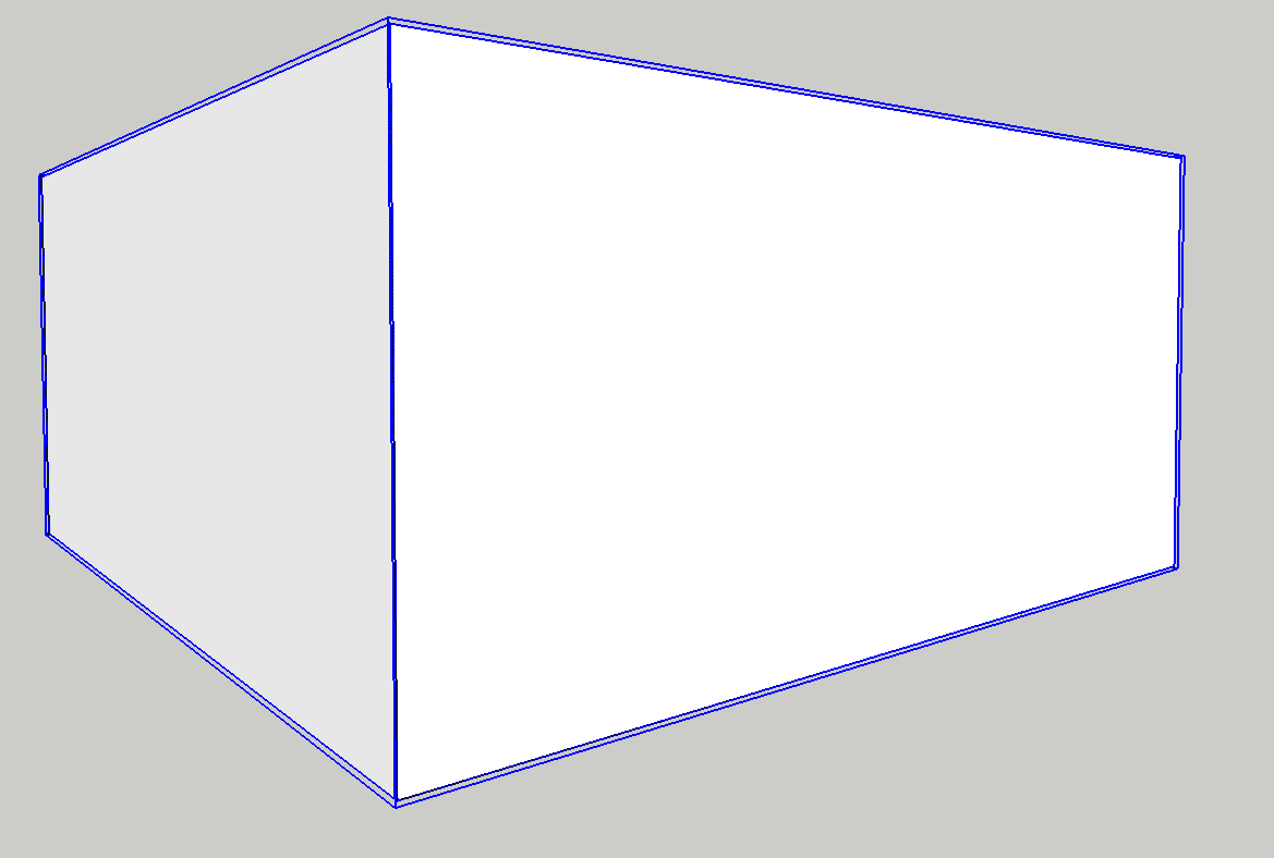
At the risk of being banished to the doh! thread, I'm having an issue with bounding boxes. I'm not sure if this is something new, but I never remember there being any offset between outside component dimensions and the bounding box borders.
Of late it seems all components have a small offset to the bounding box — which is incredibly annoying (this is the case even when all guides are erased in the model)
Example below: draw new rectangle / push pull / make component =

So my query is this:
has it always been thus, and I just didn't notice (don't think so)
or, is it new behaviour with the new version (2015)
or have I inadvertently changed some setting that affects the bounding box behaviour / display?or some other explanation?
It's not just a visual distraction, but it also makes it tougher to see/find/pick/inference the various reference points between components, especially in a complex model.
Anyone have a solution?
-
In the Face setting for the style, change transparency from best quality to medium or fastest or whatever they're called.
It has been a thing for a long time.
-
Thanks Dave — that was it.
I thought I must have changed a setting that affected the behaviour. I guess I've never run into it before, because I had never messed with the transparency settings for my default drawing style, but did so recently for a scene used in a layout document. Should have cloned the style and made a new one.
Figured it was something basic, but didn't connect the two. Thanks for short-circuiting the source of annoyance for me!
-
Glad to help, Doug. Sometimes it's just asking the right question that gets it all sorted.
Hello! It looks like you're interested in this conversation, but you don't have an account yet.
Getting fed up of having to scroll through the same posts each visit? When you register for an account, you'll always come back to exactly where you were before, and choose to be notified of new replies (either via email, or push notification). You'll also be able to save bookmarks and upvote posts to show your appreciation to other community members.
With your input, this post could be even better 💗
Register LoginAdvertisement


