After Rob Mills
-
Few months ago saw this website and found some of spaces, inspiring to be remodeled and rendered:
http://www.robmills.com.au/
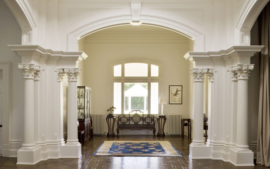
Here is the real space:

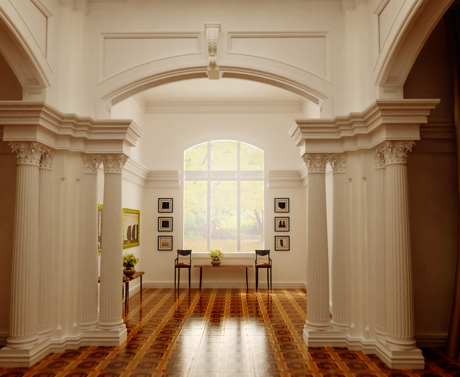
And this is remodeling, I prepared for my ebook.

You may find the fast start book, on my signature.
You are also very welcome to visit corresponding facebook page:
https://www.facebook.com/groups/417369451756347/ -
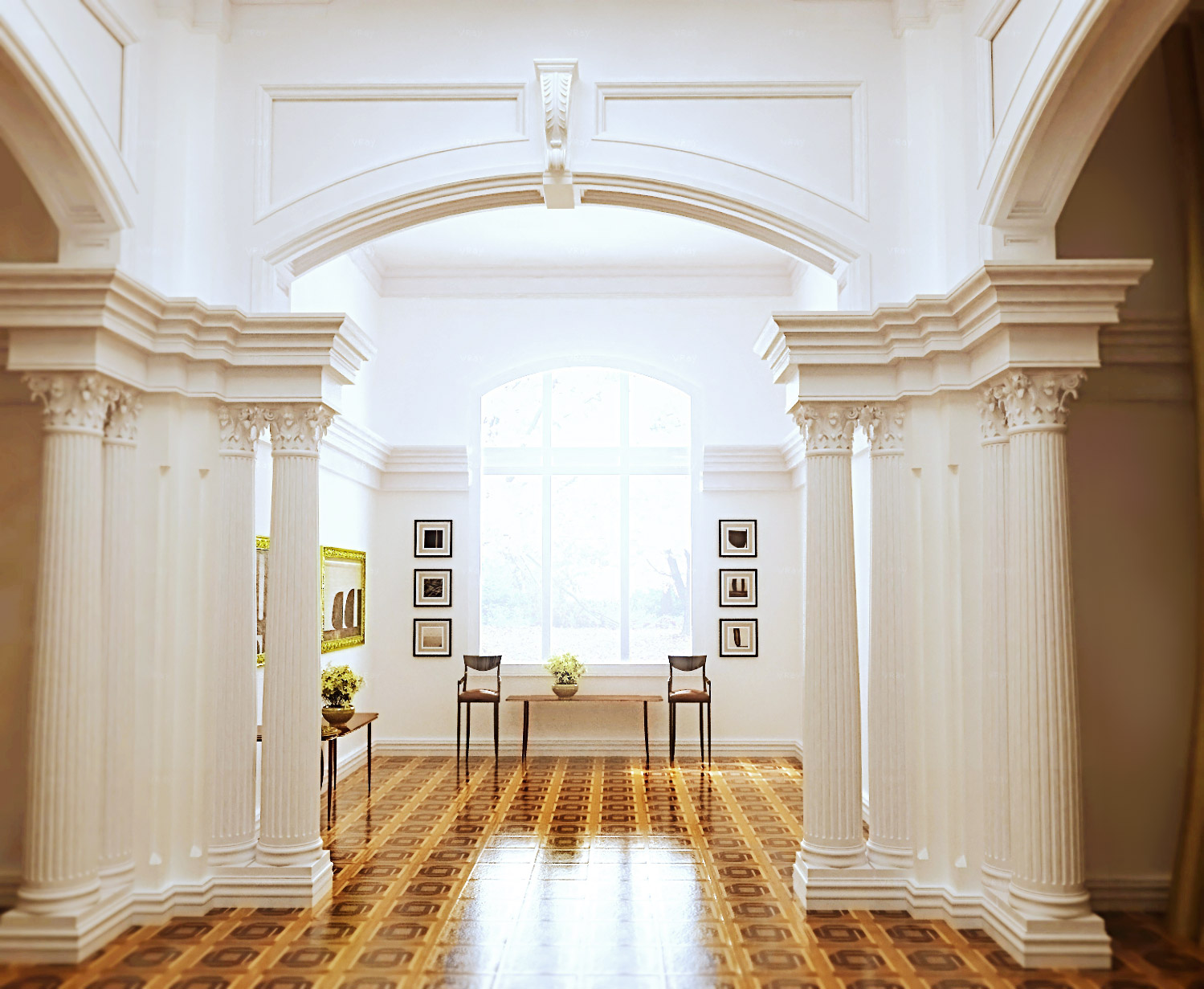
Same render with some post pro

-
Your a Master! Great work

-
It is of your kindness, Mike.
Just tried to be honest to the original space, but did some changes due to the textures, that are available with the default SketchUp. -
Beautiful

-
Masterful light and texture work. Beautiful columns!
-
Looks good, Majid, but you have the architrave beyond the abacus of the Corinthian capital, which is incorrect - and just looks weird, IMHO. In the classical orders, the architrave should line up with the neck of the column below.
Kudos, though, in that your columns themselves appear better proportioned than those in the actual space.
-
Good quality of light and modelling.
-
I think there's a room somewhere in my house just like that.
Amazing work, majid

-
@daniel said:
Looks good, Majid, but you have the architrave beyond the abacus of the Corinthian capital, which is incorrect - and just looks weird, IMHO. In the classical orders, the architrave should line up with the neck of the column below.
Kudos, though, in that your columns themselves appear better proportioned than those in the actual space.
You are right,.... I have ignored rules in my taste...but this is a really classic space... you are right

-
excellent work, great lighting and modelling
best
V -
Very nice!
-
STUNNING WORK! Majid, you are certainly the artist!
-
@richard said:
STUNNING WORK! Majid, you are certainly the artist!
 If you say, I certainly must consider, kuz you rarely endorse

-
the render is more believable than the photo.
-
Holy smokes! Wow.
-
Thanks mates
 , you are making me feel shy
 -
Wow, beautiful photo-realistic render, Majid.


Have a great weekend!
_KN
-
Thank you KN
Two more renders, same space ( I mean no change in modeling faults) two different mood.


-
Another post pro

Hello! It looks like you're interested in this conversation, but you don't have an account yet.
Getting fed up of having to scroll through the same posts each visit? When you register for an account, you'll always come back to exactly where you were before, and choose to be notified of new replies (either via email, or push notification). You'll also be able to save bookmarks and upvote posts to show your appreciation to other community members.
With your input, this post could be even better 💗
Register LoginAdvertisement


