Swedish Inspired Living
-
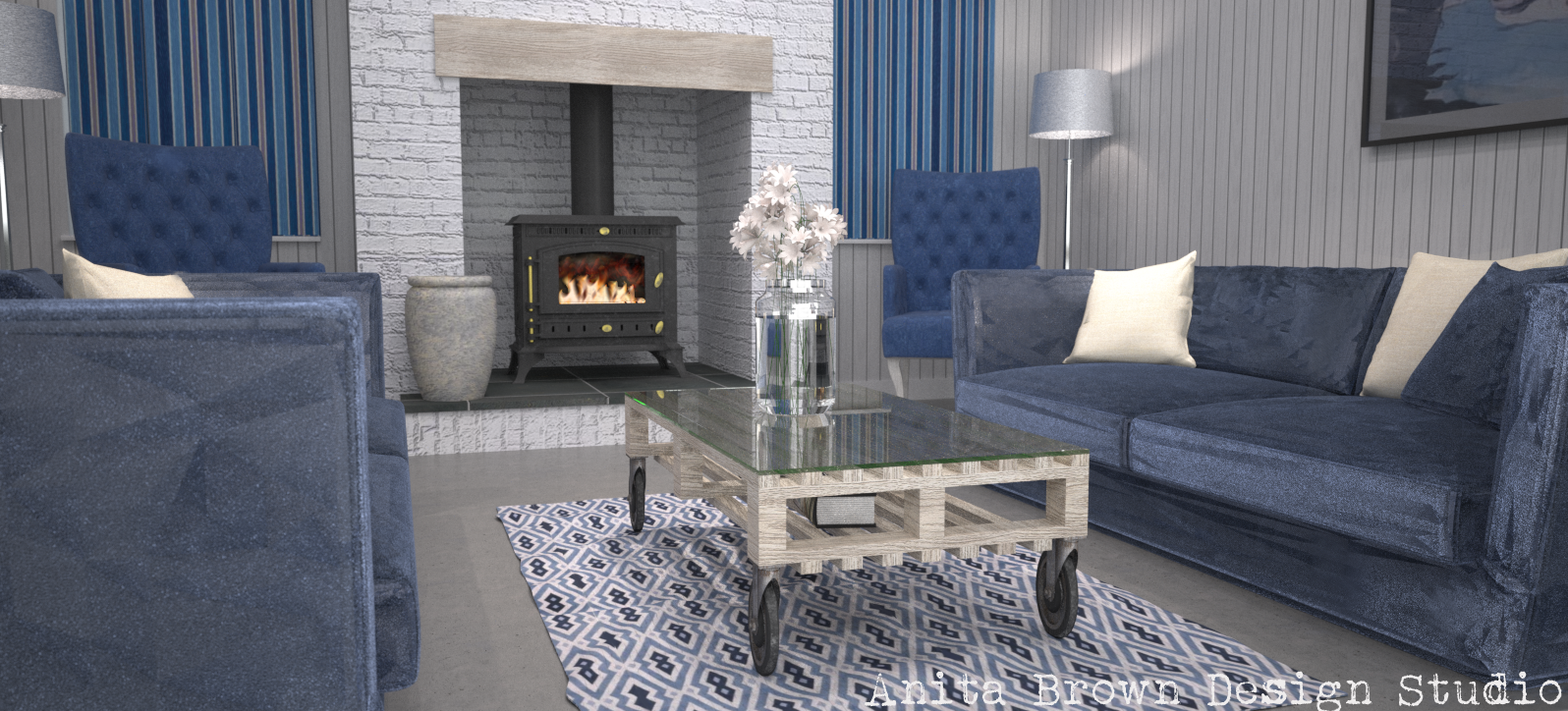
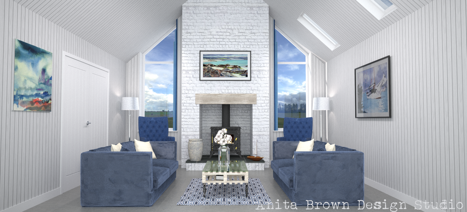
Thought I'd post 2 3D Visuals I've recently completed for a commission. I focused on trying to get the look of velvet and water in a vase with these particular renders. Velvet is extremely difficult to convey, as is water!! The client wanted the window shutters closed for the close-up which I didn't agree with (I might render that scene again with the shutters opened!)but the artificial lighting and lack of sunlight actually helped to boost the reflective qualities of the velvet, so that's good I guess.
Anita


-
Will you stop this please? I will have to go out and buy Maxwell or something.
Your renders convey the feeling for a room not just the light and reflectivity etc. I remain inspired and envious.
Dood, you rock.
-
Mike! Haha, I'm sorry that I've angered you but thank you so much for your positive vibes! I try very hard to convey atmospheric qualities in my renders, so I'm glad you liked them for this reason.
Do you use rendering software?
-
Excellent as always.
-
nice work Neets,
may I ask are you using the standalone plugin or the Maxwell Suite?? -
Thanks Bryan

Victor, thank you. I'm glad you like it. I use the Maxwell Render suite.
-
Most welcome, I use renditioner for rendering, currently v3 pro. It has some plus points which are mainly in the drag and drop short setup area.
-
Nice images but...being a swede, they don't look very swedish to me.
-
Just a quick observation of something I missed before, the wheel units on the pallet coffee table are quite over sized. Or it might be me.
-
@pixero said:
Nice images but...being a swede, they don't look very swedish to me.
Thanks. I'd be inclined to agree to be honest. Not my design but the Designer apparently drew inspiration from Scandinavian design. It may not be a literal interpretation but I can see where she was coming from.
-
@mike amos said:
Just a quick observation of something I missed before, the wheel units on the pallet coffee table are quite over sized. Or it might be me.
Hi Mike, thanks for your input. These coffee tables are available in wide range of styles; from quite small wheels to large ones. I actually prefer the larger wheels

-
Hi Neets,
Nice room and render. I have to agree with mike. some of the models in the scene need some attention. If your goal is to achieve a photo realistic level then you have to take your scene's and models to the next level. Detailed models are one of the essentials in my opinion. Models can make or brake a render/scene.
Like the idea of the coffee table BTW!

http://sketchucation.com/forums/viewtopic.php?f=81%26amp;t=52856
Greetz Twan
-
Thanks for your input! Yes, my goal is to make the renders look as real as possible. Mike's only critique was on the size of the wheels. what exactly are you referring to in these scenes that you don't feel makes the overall images look real?? I'm asking purely to get a better understanding of your feedback

-
do you want any other criticism to improve the images?
-
Sure, why not! Go for it

-
If I was to give some constructive criticism, I would say:
• The sofa could do with some more details. it looks too solid and perfectly shaped.
• The texturing on the sofa looks a bit off. Especially in the close up, on the arm rests
• I would add a lil bit more reflec/gloss and bump on certain materials. It looks a bit flat. -
I agree with the above. While it does convey the design, the materials are really flat. More gloss/specular variation will make the image much more realistic and help the light bleed into the room better. Brick also needs way more bump.
The background sky image is quite stormy/moody. While it can work in certain circumstances, most clients want to see a design in glorious bright blue skies with no uncertainty to the weather. It sounds bizarre but a guru called kwistenbiebel told me once and he was 100% correct, a client even commented that my image looked too moody as well. All because some clouds were slightly grey.
I believe how the light enters the room can be improved. At the moment things are quite washed out, there's a very general fill-light in the room. I believe you can achieve much more dynamic lighting where the light enters the windows, it's almost as if no light at all is coming through them. The light needs more depth and possibly some more AO-effect to the corners of the room. Can you do AO passes in maxwell?
More reflection and attention to specular in some materials would help the lighting. Even carpets interact with light but many people ignore most of their fabrics. I actually think what you did with the velvet is cool, but the sofa model is unrealistic and the scene is a bit too neat/clinical to be realistic.
Have you tried a render with your vase in the foreground? Might look great?
I hope this helps, interiors are tricky beasts! You are probably better off getting the lighting to be dynamic and then move onto materials and finer details. The lighting can literally make or break an interior, so I'd always start with that first and make sure it's perfect before moving on.
-
Guys, thanks for the feedback. I'll consider these points when completing my next project.
Anita
-
Thought I'd have a little fun in my downtime...yes. I consider this fun. Clearly, I have serious problems!
Anita
Hello! It looks like you're interested in this conversation, but you don't have an account yet.
Getting fed up of having to scroll through the same posts each visit? When you register for an account, you'll always come back to exactly where you were before, and choose to be notified of new replies (either via email, or push notification). You'll also be able to save bookmarks and upvote posts to show your appreciation to other community members.
With your input, this post could be even better 💗
Register LoginAdvertisement


