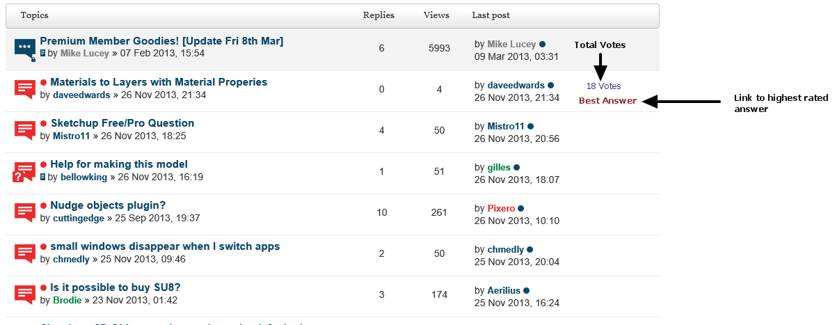
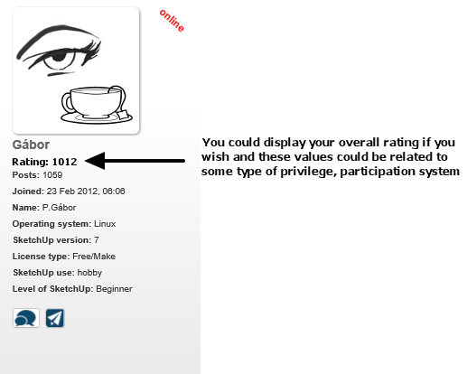
Topic Voting Anyone?
-
Good addition. I guess some more design work is needed to make it part of the whole. Smaller numbers, simpler and one color up and down signs, more like the rest of sketchUcation symbols...
-
@olishea said:
Emptied caches and it still doesn't work. I'll update Safari and try again.

Thank you Olishea for letting me know. As I mentioned you in PM if you have the time and wish to participate in a step-by step debugging, we can do that. Maybe Skype or gmail voice chat could make it more effective. Let's discuss it in PM if you wish.
-
One thing to note, to make the votes meaningful you really need to see both numbers.
Showing only the combined result gives you a skewed perspective.A post might be very controversial and 500 people vote it up while 499 people vote it down, leaving a lame 1 vote up which suggests indifference rather than a divided community.
-
Still looking for Mac users to test? I just voted one up and another down.
-
@dave r said:
Still looking for Mac users to test? ....
Thank you Dave,
Yes, we are looking mainly for Mac users who are unable to vote and have the time to make some online testing with us.
Thank you for letting me know your results.
-
I just voted with my MAC Mini [Mavericks] and it seems OK to me

-
Here too, voting thumbs working but not seeing any squares like WB reported
-
@mwm5053 said:
Here too, voting thumbs working but not seeing any squares like WB reported
Gabor and I resolved my issue

-
-
-
What about that old saying from Chicago? You know, "Vote early and vote often."

-
@tt_su said:
like on StackOverflow
Precisely....
Showing who's voted requires a changes to the TOS ond PP of the site which would mean asking everyone to agree to these changes using some type of pop-up blah blah blah...
IMO...and this is with the Admin hat off...
I don't want to know who rates + or - on my posts. The system is about getting the best answer earmarked through voting and delivering that answer in a manner like this...

Then this could be toggled on and off...

These are just ideas that will help current and new members know where great answers are and who good members are.
-
The system is working for me. Just gave Dave a vote above.
-
@mike lucey said:
The system is working for me. Just gave Dave a vote above.
And I wasn't even standing for office.

-
love the stack overflow approach. like the totaling vote count on profiles too.
-
@rich o brien said:
@tt_su said:
like on StackOverflow
Precisely....
Showing who's voted requires a changes to the TOS ond PP of the site which would mean asking everyone to agree to these changes using some type of pop-up blah blah blah...
...
I don't want to know who rates + or - on my posts. The system is about getting the best answer earmarked through voting
Ah, thanks for the explanation. I still think some people's upvote is more valuable than others, so it would be good imo to differentiate.
For a specific example, in the vray forum there was a time when many people were saying explode all your groups and components to get a scene to render properly. Numerous "lesser-informed" users kept agreeing and seconding the advice, even though it was no longer necessary and just caused more problems. I'd rather see one well-informed downvoting user than 15 lemmings upvoting... jm2c
Edit: Took a look at the StackOverflow site, seems like a nice clean approach. I can get behind that

-
thumbs up from a mac user, seems to work OK!
PS And I could up vote my own post
-
@sally said:
... And I could up vote my own post ...
Thank you to all Mac users who tested. Yes, you can vote on your own post as well. But only once! So be careful which thumb you choose on your own.

Edit: UPPSSS.... The red one....

-
Against the suicides : Why not block the result to 0 when negative result arrives?

Benefice of doubt can save many souls!
And keep this gadget only for the corner bar?

For me impression is that!

By Jean Léon Jérôme

-
A fair play thing will be the possibility to disable it inside the User Control Panel!

Hello! It looks like you're interested in this conversation, but you don't have an account yet.
Getting fed up of having to scroll through the same posts each visit? When you register for an account, you'll always come back to exactly where you were before, and choose to be notified of new replies (either via email, or push notification). You'll also be able to save bookmarks and upvote posts to show your appreciation to other community members.
With your input, this post could be even better 💗
Register LoginAdvertisement


