New Floor Plan Style using LO
-
Nice!
The shadow from the walls bring some depth to the 2d view. Also separates the walls from plane which makes things clearer, in my point of view. -
I also like the style, Richard...

Are you going to share how you achieved this...? -
Richard, that's very nice. How are you putting in the shadow? Does this require post processing or are you doing something that maintains the direct connection between SU and LO?
-
Need more contrast IMO, to be more readable. Gray is too dark.
-
Technically sharp
 but too much grey background for my old eyes.
-
I like it. i think the outline of the hardscape areas and the doors and windows could be harder. The line weight is too close to the tile work. If all the tile work can be made to receed a little (gray line?) or the rest pop a little it'd be better IMHO. I like to see the whole house come up from the background and to see the definition of doors and windows etc. come up off the floor.
But it works well already! Thanks.
-
Richard, I think it needs more punch. The above comments are quite constructive also.
I'm putting something together that I hope will work for folks. I'm doing all 2D design work (plans, sections) in SU then using striped out sections to produce 3D shells.
I will be putting the presentation design and planning application / approval / consent drawing together in Layout.
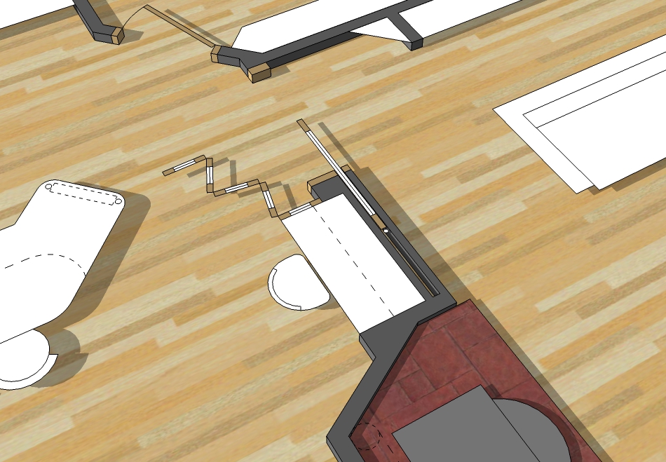
I know you have your own style developed and will more than likely be sticking to it but I think the client gets a better understanding of the plan if viewed from an over off centre rather than a straight over postion. The below example explains what I am talking about.
![SOLAR HOUSE [TIMBER SLATE]-3BDRM-GFP.jpg](/uploads/imported_attachments/0zOO_SOLARHOUSETIMBERSLATE-3BDRM-GFP.jpg)
To create a bit of depth / interest, I have just dropped the floors by 100mm and let the simple furniture 'float' casting shadows, same the doors etc. Here are a few detail views which show this better.

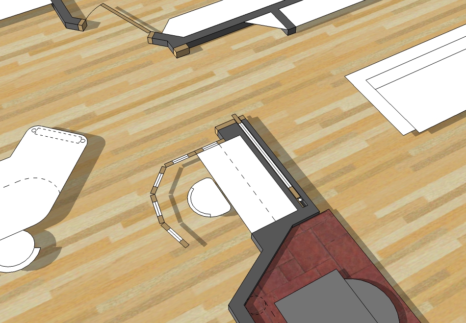
I will also be including, what I like to call, 'Living Flow Guides'. These are basically guides that explain the flow from room to room. I find if I am presenting a plan, I can point out how things work. If the client has to figure things out for themselves the 'Living Flow Guides' help.
![SOLAR HOUSE [TIMBER SLATE]-3BDRM-GFP-LF.jpg](/uploads/imported_attachments/HC3P_SOLARHOUSETIMBERSLATE-3BDRM-GFP-LF.jpg)
If anyone is curious as to what the overal form is going to be, this sketchy perspective will help.
![SOLAR HOUSE [TIMBER SLATE]-3BDRM-SPER.png](/uploads/imported_attachments/LrOL_SOLARHOUSETIMBERSLATE-3BDRM-SPER.png)
-
Hey thanks guys for the feedback, it's always nice to get the thoughts of others to either support or oppose your own views so one can make improvements.
@frederik said:
Are you going to share how you achieved this...?
Yes mate, still putting that book together on achieving a range of styles and presentations.
@dave r said:
How are you putting in the shadow? Does this require post processing or are you doing something that maintains the direct connection between SU and LO?
Yes mate it's post pro, I don't link it at all to SU, in fact I start designing any design in Layout first rather than SU. I find it light years faster to work the opposite way around. Plus the other obvious benefits of Print Ready artwork, no issues of linking SU files etc.
@srx said:
Need more contrast IMO, to be more readable. Gray is too dark.
Mate I wonder if you may have your monitor contrast set low. If I adjust the contrast only just a bit the plan becomes nearly black and white. I'll certainly take this on board though!!!
@arcad-uk said:
Technically sharp but too much grey background for my old eyes.
Thanks mate, After a few suggestions this way I will play with the background a bit to tone it down!
@pbacot said:
I think the outline of the hardscape areas and the doors and windows could be harder. The line weight is too close to the tile work. If all the tile work can be made to receed a little (gray line?) or the rest pop a little it'd be better IMHO. I like to see the whole house come up from the background and to see the definition of doors and windows etc. come up off the floor.
I'm hearing you mate!! Yeah I thought too the tile hatch was too heavy, I can adjust that fairly easily as it is actual line work rather than a hatch pattern. I cant rely on image hatches as I'm WAY TOO ANAL!! I would never be able to handle for eg: a tile line being just out of line with a bench top or wall.
I do have one issue though that as most of my work goes to print I have to ensure the lines are thick enough not to get lost in offset. A nice looking plan can turn to crap really fast if half the tile hatch breaks up!
You are right too that the windows need to be heavier to help define the outer limits of the plan!!!
@mike lucey said:
I think the client gets a better understanding of the plan if viewed from an over off centre rather than a straight over position. The below example explains what I am talking about.
Thanks for the example Mike, I probably couldn't disagree with you more about a plan in perspective being clearer to the client. Probably for many reasons but mostly that of correct proportions and reading those proportions correctly.
Example is from architectural forums, where a 3D plan posted to support discussions and where most respondents will ask for a "true" plan to enable proper reading.
The other is where one reads the plan of a "well rationalised" design - the initial moment we view the plan and before we begin to absorb the design we recognise quickly this rationalisation through the visual alignment of main elements. ALL this is lost once the plan is off true. One has to start figuring rather than just viewing. This could be why you are having to resort to the marking paths of circulation? My honest opinion is these should read clearly without annotation.
That said I do see value in such approach in the case you have posted regarding the movable screen to the office nook in that case it is very descriptive!
Thanks again ALL!!!!
-
Hurry up with that book of yours Richard!
-
Hi Richard,
I like your presentation style. Would agree with above, about line weight of hatches to fade a bit, the post production of the drop shadows sings! I am Keen to know how? Was wondering if the furniture like the dining table need half the shadow you put on the walls? Just for instant readability, floor(hatch) light , furniture next depth then walls?? Just my 2bobs worth. I check your web site weekly, waiting for your book! Clearly as you trawl the web, for sketchup the most talked about issue is the layout and its link to the documentation process. Clearly we have 3d developed with numerous programs, but its the printable documentation side which lags, only because we still use printing media! I am sure as we slowly kick the bucket, that print will disappear, but for now we need it! While there are some good updates with the latest layout, it still hasn't bridged the gap between 3d and the paper printer. Or maybe its me who hasn't bridge the gap, in short, looking forward to your book to help with my own work process of the bridging of sketchup and layout to produce printable communication!
Cheers, P.
-
@circus said:
Hi Richard,
I like your presentation style. Would agree with above, about line weight of hatches to fade a bit, the post production of the drop shadows sings! I am Keen to know how? Was wondering if the furniture like the dining table need half the shadow you put on the walls? Just for instant readability, floor(hatch) light , furniture next depth then walls?? Just my 2bobs worth. I check your web site weekly, waiting for your book! Clearly as you trawl the web, for sketchup the most talked about issue is the layout and its link to the documentation process. Clearly we have 3d developed with numerous programs, but its the printable documentation side which lags, only because we still use printing media! I am sure as we slowly kick the bucket, that print will disappear, but for now we need it! While there are some good updates with the latest layout, it still hasn't bridged the gap between 3d and the paper printer. Or maybe its me who hasn't bridge the gap, in short, looking forward to your book to help with my own work process of the bridging of sketchup and layout to produce printable communication!
Cheers, P.
Hey thanks mate! I'm hearing you around the shadowed furniture and hatched weight! I've previously used a shadow under the furniture (putting them on the same layer as the "fitout" ie: kitchen benches, vanities, WC etc. However what I've found tends to happen is the room visually gets smaller (more cramped) if the furniture is highlighted this way!
As this particular floor plan is for marketing purposes this visual "enlargement" of the spaces is quite advantageous! Mind you even if presenting the design for a one off client I'd still probably choose a similar treatment to demonstrate how effective the solution is at maximising spaces! I also like that the "included / not included" items are more clearly defined!
Mate I hope i don't disappoint with the book (when I get my finger out) - it is more aimed at demonstration of the use of layout as a design and presentation tool on it's own with NO reliance on SketchUp! I think others are more qualified to cover this aspect. I only elect to work the other way around as I'm a one man show need to work faster, and I prefer much more crisp output!
Hello! It looks like you're interested in this conversation, but you don't have an account yet.
Getting fed up of having to scroll through the same posts each visit? When you register for an account, you'll always come back to exactly where you were before, and choose to be notified of new replies (either via email, or push notification). You'll also be able to save bookmarks and upvote posts to show your appreciation to other community members.
With your input, this post could be even better 💗
Register Login


Advertisement