Learning to Render (using Twilight)
-
I must say the exposure business is driving me nuts, but I'm choosing it ignore it for now as I will be replacing my screens fairly soon, Seems no matter how well I balance/calibrate these they are still very different.
As I will be relocating across the world again soon I will wait till then to replace them.
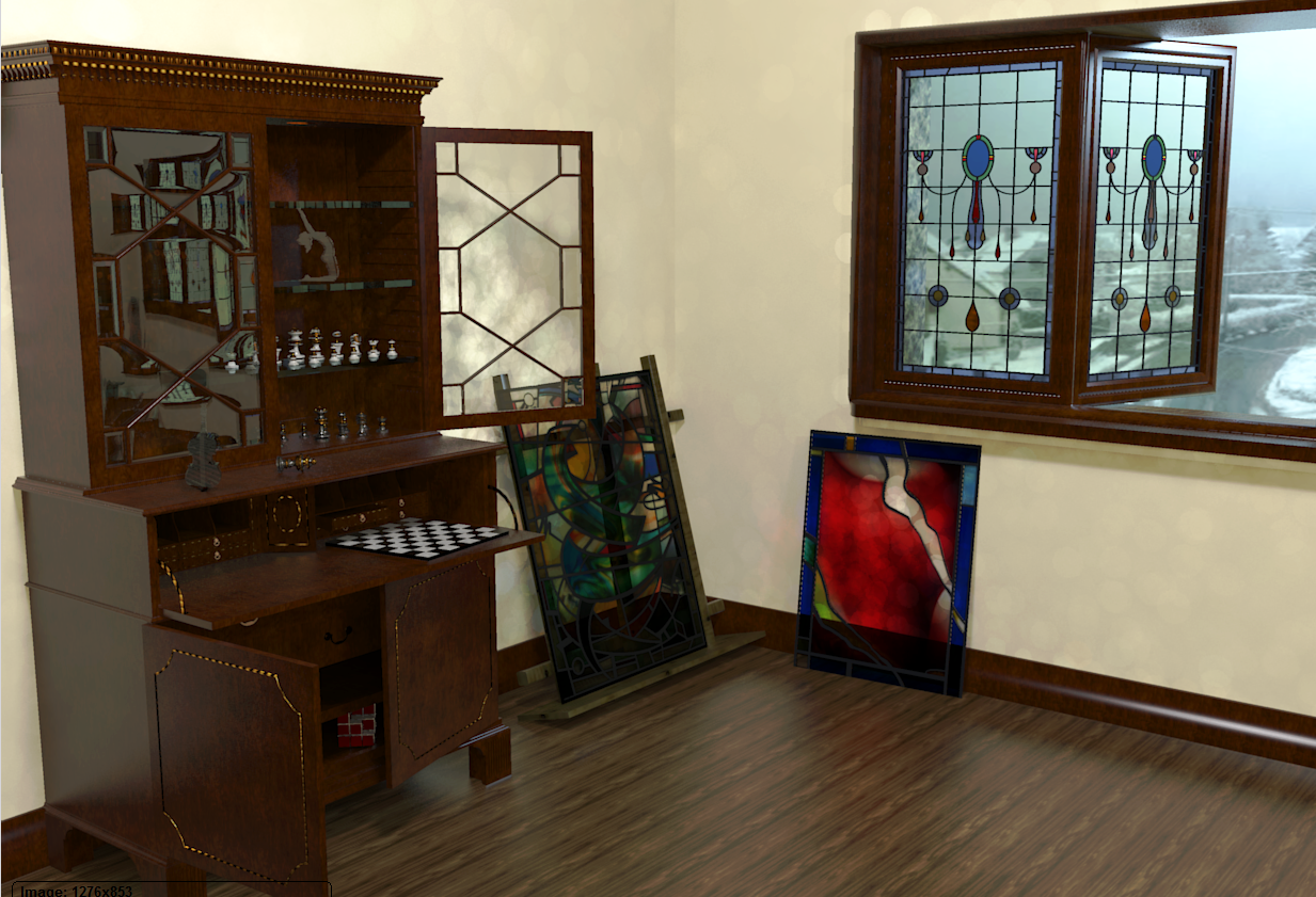
I worked out what the circles are, reflections from the distorted glass. I had lights in all the wrong places so they were throwing randomly. I placed lights in what would be the correct place in reality and who would have thunk it but you can sort of control things properly, D'oh.
So anyway, with a bit of plastic as you mentioned things look a bit more interesting. I'm sure on some screens this will be dull and on others washed out, but it is here anyway.

-
@olishea said:
:lol:
I have found render previews look lighter than they actually are. As soon as you click save, the saved image goes dark. So good idea to check the saved image and then increase exposure and save again. I get the same issue with Twi and Thea.
I second that! Took awhile to catch that for me though.
-
@box said:
I must say the exposure business is driving me nuts, but I'm choosing it ignore it for now as I will be replacing my screens fairly soon, Seems no matter how well I balance/calibrate these they are still very different.
As I will be relocating across the world again soon I will wait till then to replace them.
I worked out what the circles are, reflections from the distorted glass. I had lights in all the wrong places so they were throwing randomly. I placed lights in what would be the correct place in reality and who would have thunk it but you can sort of control things properly, D'oh.
So anyway, with a bit of plastic as you mentioned things look a bit more interesting. I'm sure on some screens this will be dull and on others washed out, but it is here anyway.Now that is nice , but I really don't like floor texture at all.
-
I agree on the floor John and that highlights why I was reluctant to learn rendering.
Each little imperfection becomes a glaring error.
It's not a criticism of your comment it's just the nature of the beast. You concentrate on tiny details of something and ignore the unimportant, and it's the unimportant that everyone notices.
I started this render to get an understanding of how the curved glass would work, throw in a few bits to make it interesting and I find myself trying to get the chess set to show up and then add some gold leaf to the secretaire oh and the window frame looks crap, hang on that's changed now that I have moved the light, should I bump up the lights inside the cabinet ................
Which is why I'm happy to post them, I'm content to show my flaws, errors and frustrations, it is a WIP thread after all, and I've never been afraid to look like a loon.
Thanks for the comments, I need them all. -
Now that looks a million times better!! I'd say exposure is bang on there. It really is a great scene and your glass models are fantastic.
 Which preset are you using?
@box said:
You concentrate on tiny details of something and ignore the unimportant, and it's the unimportant that everyone notices.
This frustrated me massively when I first started rendering. "Look at the building, not the crappy 2D trees I used!!"

It's because you are getting very close to photoreal. In a NPR image nobody cares about a repeating texture, but with a photographic render you can spot things a mile off. As time goes by your texture library will become condensed with non-repeating high res textures for example. Renders really do reveal every detail you have modelled.
The materials are looking great, much more dynamic image now. After some time you'll be able to set up an interior's materials within a couple of mins. I have favourite settings for steel, wood, glass etc, they become burned in your brain!
-
@jpalm32 said:
I second that! Took awhile to catch that for me though.
I believe it's so there's more flexibility for post-processing. You can improve an underexposed image but an overexposed image is pretty much useless. In the words of Kwistenbiebel (the legend).
-
@olishea said:
Looks pretty damn good to me. With Twilight, I have found default glass material is not reflective enough. If you increase IOR you get a better result IMO. A subtle bumpmap also works well; you can bump any flat colour by applying the bumpmap texture to your window and then link the bump and unlink the texture, then apply template as normal. You can use this to bump a flat colour, good for adding 'scratchmaps' to metal and undulations to stained glass etc.
Oli, what is the purpose of the no shadow option for glass in Twilight?
-
@jpalm32 said:
what is the purpose of the no shadow option for glass in Twilight?
-"architectural glass-->no shadow" template is a thin glass (no refractions) and you can use it on a single face with no thickness;
-"realistic glass" template is a dielectric glass with refractions and need thickness in order to work properly.
In order to understand how templates are made in TWR you can apply some templates to simple models and then export to KT.
Below you can see the differences between the two materials in KT's material editor.

 -
Thanks Massimo, you cleared up a lot of my D'ohs with that explanation.
-
Glad for that.

-
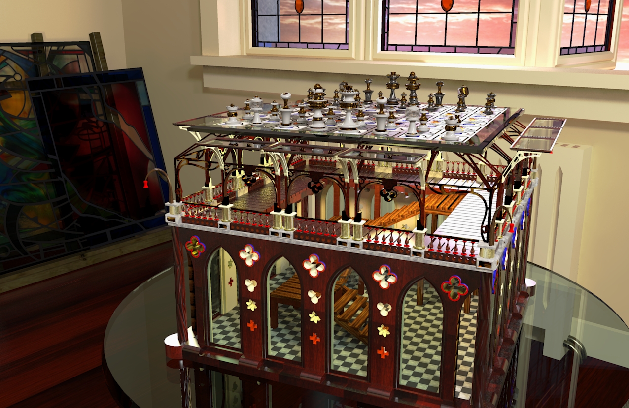
I woke up this morning with an idea for a games table. So I knocked this up as a preliminary. It needs a lot more, dedicated storage boxes for draughts etc and I'm thinking the legs would work as a storage rack for various interchangeable boards. I've built it so two sides open up giving access to the interior.
But here it is as a quick render.

-
great detail Box!!
-
This reminds me. It's great to be in this club where we meet people with such talent. Like Wow you do that too huh? Looking forward to more rendering from you Mr. Box, because then I get to see your artwork. Crazy chess board.( How about mechanisms whereby the taken pieces go down the stairs and get beheaded?)
-
Thanks Oli, the beauty of SU is that replication is so simple you only have to make a few details and then scatter them about like hundreds and thousands, (i think Y'all call them sprinkles). While the non beauty of rendering is it's addictive and time consuming nature, I make one bit now and want to see how it looks rendered. Arrrrrgh I used to be happy with just the models...........
Peter, you are a very disturbed individual and as such I will be implementing your idea immediately. Not so sure about the beheading, but certainly a gravity driven racking system. You have most certainly twisted my dreams for the next few nights.
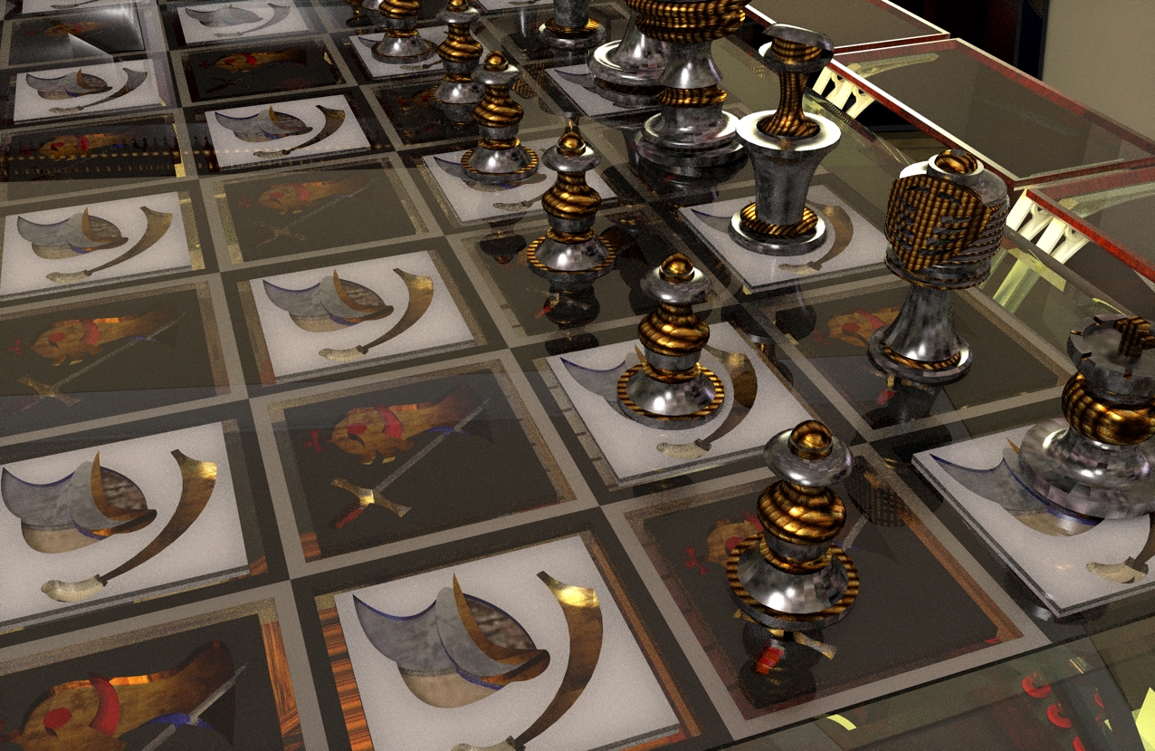
You can't see it in the render but the squares of the chessboard itself are representative of Knights and Saracens and I plan the pieces to be the two sides as well. I have only done the Knights version so far, Saracens to come with time. Time.... time.... if we only had enough of it.
-
This might help explain what I mean about the Knights and Saracens. Pretty abstract and thrown together, I will detail them more before actually making them.

-
Hello Box,

"I make one bit now and want to see how it looks rendered"
afraid you've caught the rendering bug! thankfully there's no known cure

John
Hello! It looks like you're interested in this conversation, but you don't have an account yet.
Getting fed up of having to scroll through the same posts each visit? When you register for an account, you'll always come back to exactly where you were before, and choose to be notified of new replies (either via email, or push notification). You'll also be able to save bookmarks and upvote posts to show your appreciation to other community members.
With your input, this post could be even better 💗
Register LoginAdvertisement


