A post processing experiment
-
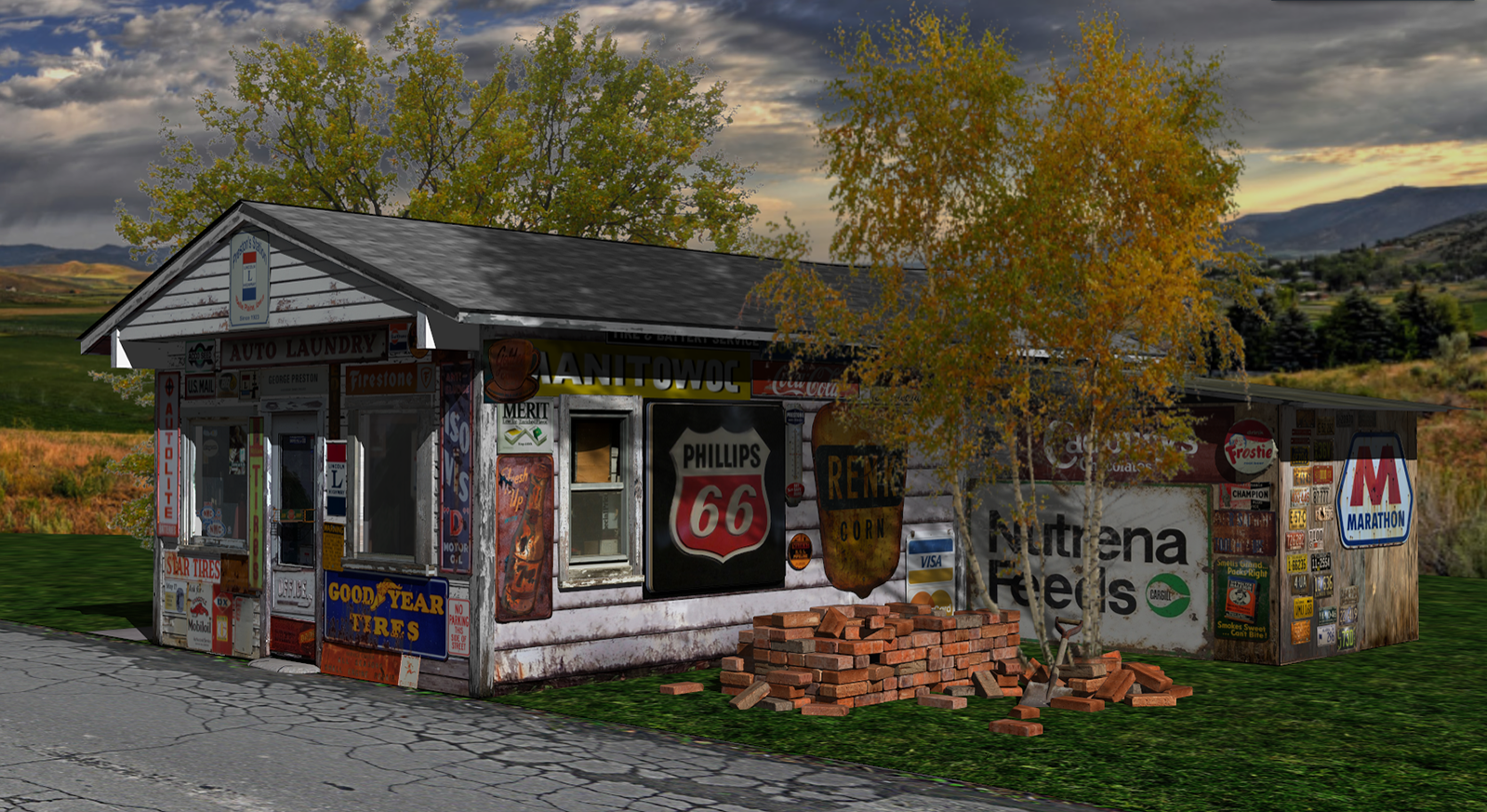
Never really done any post processing, mainly because it seemed pointless without first rendering the model. Well, I still don't render (yet) but figured I'd give it a try with a model I'm working on.
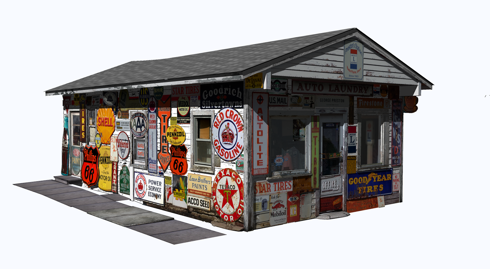
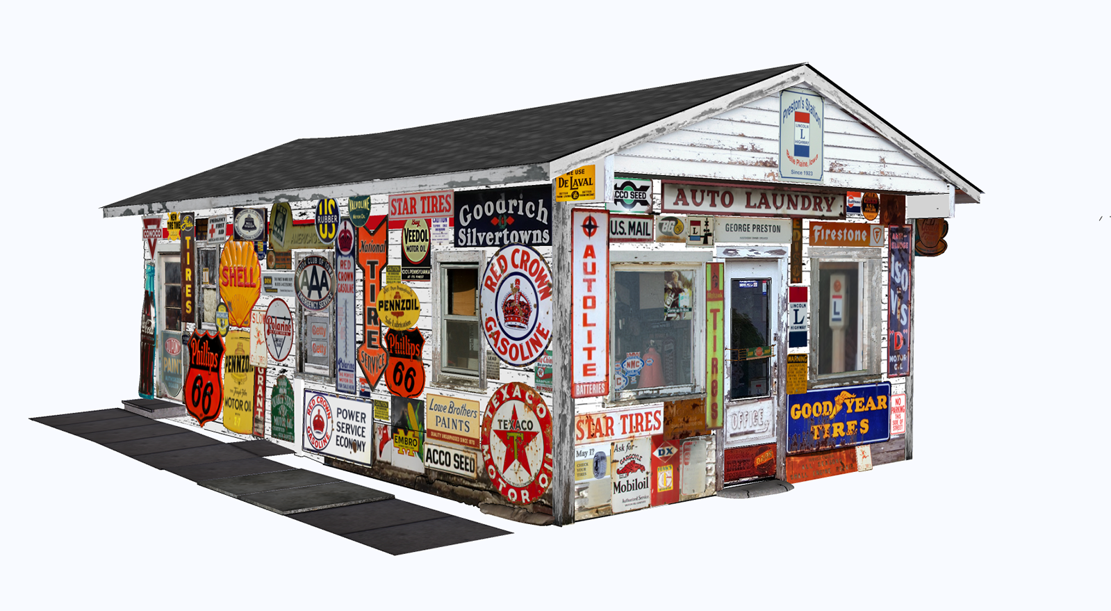
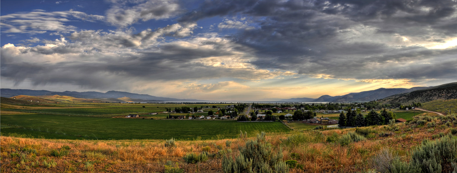
The model itself isn't finished yet. It's Preston's Station in Belle Plaine, Iowa. I knew at the outset that the model itself would still look like just a SU model and wouldn't blend in with the setting like it should, so I didn't put a lot of effort into it, just added some grass, some trees and a background (moved it into the country instead of in town like the real thing).
Anyhow thought I would throw it on here to see what you thought.
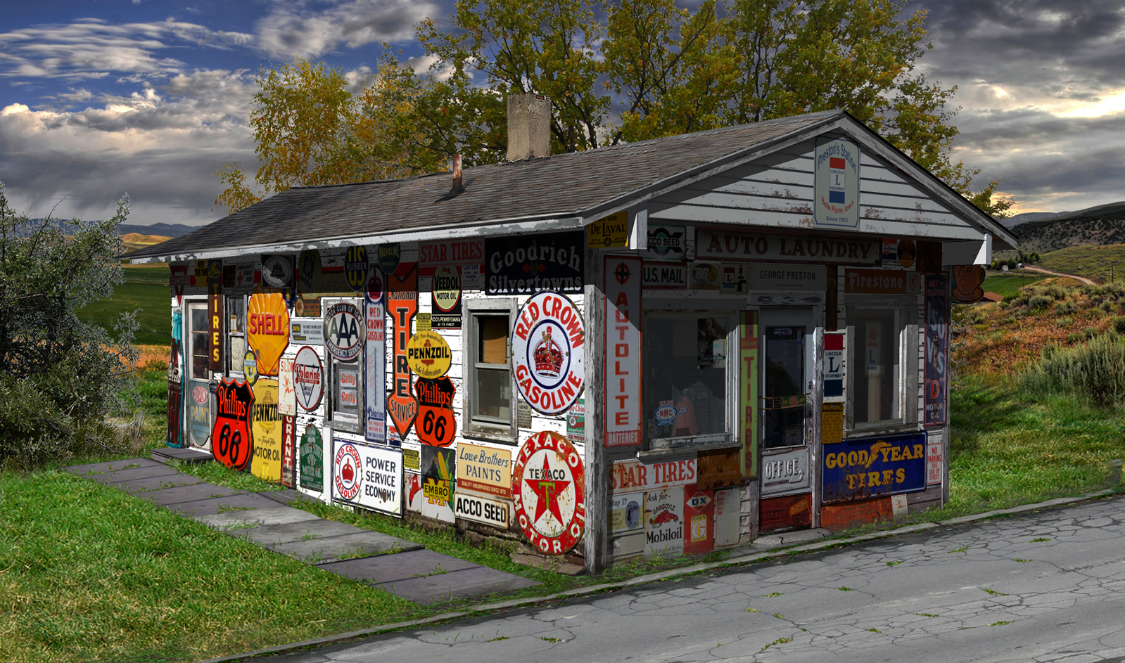
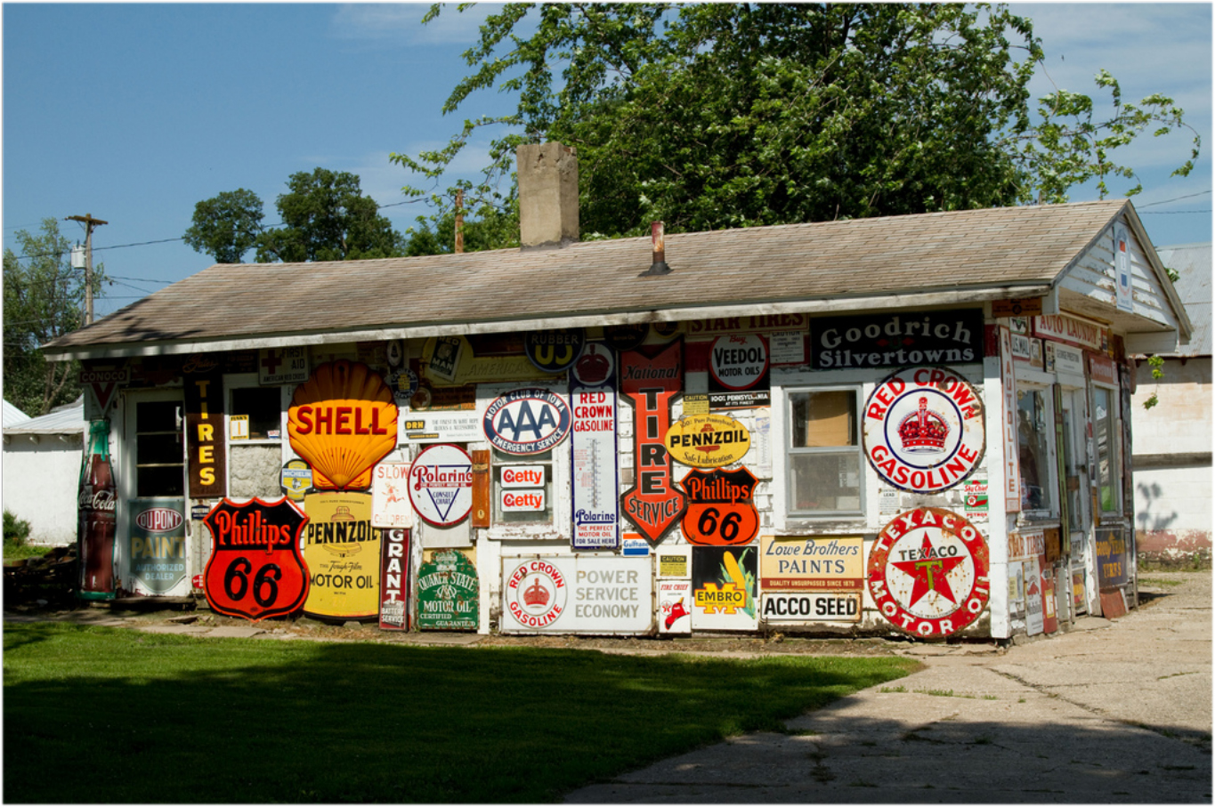
-
Looks good Steve! Your texturing is great, but I think the most CG thing about it is your sharp shadows. That's where rendering helps, you can give a softer edge to your shadows, plus the lighting under the eaves will have a more gradual fade to darker with GI lighting, rather than just the straight cutoff that you get with the SU shadows.
Otherwise, in terms of your PP, it does blend in quite nicely.
-
cant believe you dont render lol, it looks great! sun is on wrong side of sky though....thats my only niggle really!
 reminds me of american pickers!
 -
@andybot said:
Looks good Steve! Your texturing is great, but I think the most CG thing about it is your sharp shadows. That's where rendering helps, you can give a softer edge to your shadows, plus the lighting under the eaves will have a more gradual fade to darker with GI lighting, rather than just the straight cutoff that you get with the SU shadows.
Otherwise, in terms of your PP, it does blend in quite nicely.
Thanks for the critique, Andy! Yeah, I know the shadows suck, much too sharp and uniform. I played around with it a bit, just the side, not the front. I think it looks a little better. Or it sucks a little less. Played around with the levels some too, and added some vegetation.
I'm trying to relearn PS from when I last used it, years ago. My brain has a retention factor of minus 75. Have to wear a label pinned to my clothes with my name and address on it

@olishea said:
sun is on wrong side of sky though....
Should have mentioned that it is reflecting off a very large and shiny UFO off to the left, just out of sight. Trust me

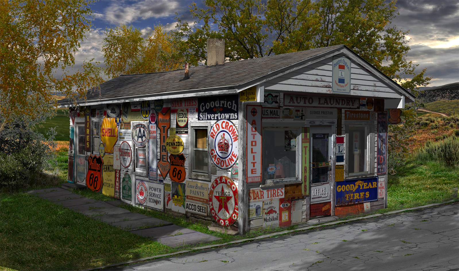
-
Very convincing!
-
Thanks Pilou. I know it's nothing great, but it was just an experiment. Actually I don't know that I'll even finish the model, sorta lost interest in it and have moved on to other things. But hey, it was interesting, and I did learn a couple of things.
-
Zerk.

-
Are you sure you DON'T RENDER ?

Great outcome !!
-
At some point you just have to admit you don't need no stinkin render engine!
Shadows on the low eave look great.
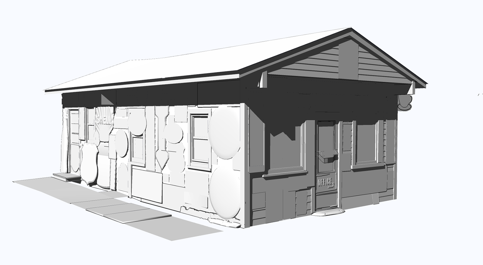
Something you might want to play with is exporting your shadows separately--or is that what you did?
-
Thanks, guys.
@pbacot said:
Something you might want to play with is exporting your shadows separately--or is that what you did?
If you mean using a monochrome shot with just the shadows, yeah, I did try that. Couldn't get it to work very well so I ended up using another, more involved, method. Like I said, I learned a few things playing with this. But I doubt I'll ever try it again, the results just aren't worth the effort. But thanks for the input, much appreciated.
-
They both look outstanding, Steve.
-
Grass is super. I can't do grass, so I stay indoors.
You need more signs though. -
@daniel said:
They both look outstanding, Steve.
Thanks. The second one is an improvement, but it still looks like a SU model. I might work on it some more sometime, maybe if I figure out the necessary techniques I can get there. Maybe.
@jpalm32 said:
Grass is super. I can't do grass, so I stay indoors.
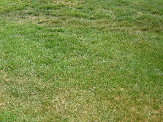
You need more signs though.Thanks John. Actually the grass was pretty easy (once you find the right photo)
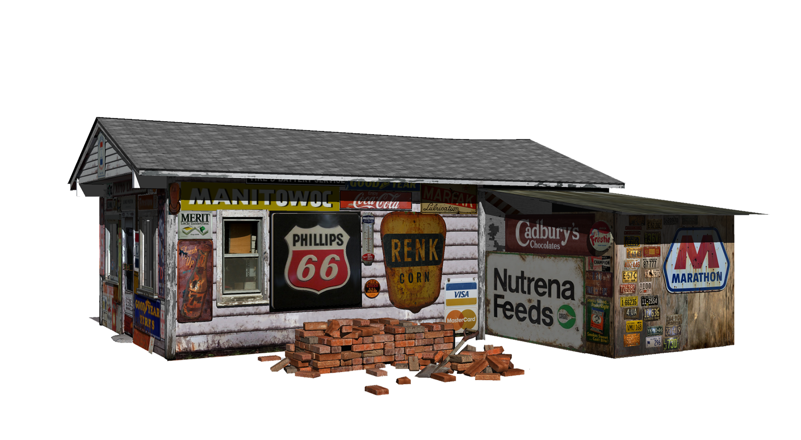
More signs huh. Well, there are a lot more on the other side...
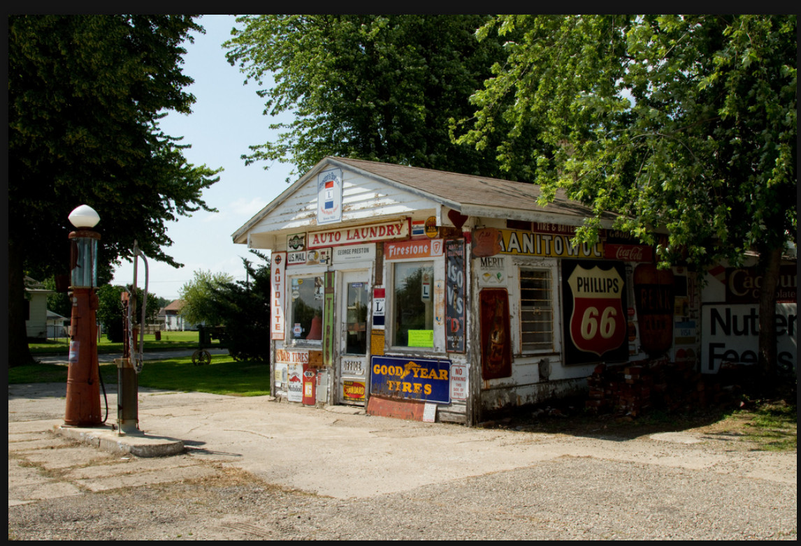
around back...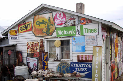
and the barn right next to it has a couple too...
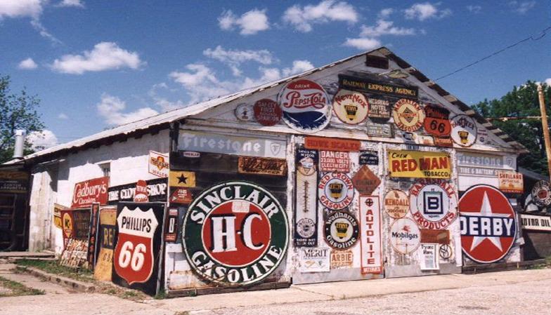
George Preston collected these signs and a lot of other gas station memorabilia for a lot of years. Both buildings are full on the inside, too.
-
@hellnbak said:
Thanks. The second one is an improvement, but it still looks like a SU model.
I think I prefer the first one, as it is in the sunlight, but they both look great. I think your being too hard on yourself - they look rendered to me, even if they are "just" SU.
-
Gosh... If I didn't have read the title I'd thought it's a picture of the real thing, except for the pictures which you already posted. Very well done !
-
Looks amazing for being directly from SU and texture work! I'm a noob at modelling but have been working in photoshop for quite a few years, would you mind if I gave your model a go in photoshop?
-
@omikron said:
Gosh... If I didn't have read the title I'd thought it's a picture of the real thing, except for the pictures which you already posted. Very well done !
Thanks, Nicholas, much appreciated. I've pretty much given up on the post processing, concentrating now on just making the SU model look halfway decent. Obviously a long way to go yet, the grass is a real problem, but I'm working on some ideas that hopefully will help.
@m625 said:
Looks amazing for being directly from SU and texture work! I'm a noob at modelling but have been working in photoshop for quite a few years, would you mind if I gave your model a go in photoshop?
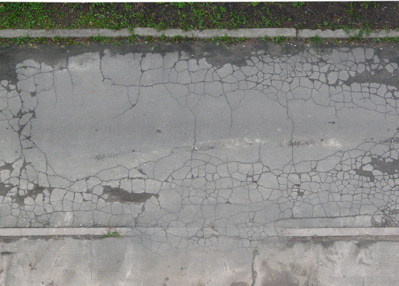
Thanks. No, I would have no objections to you, or anyone else, giving it a go. But, the model itself is pretty large, over 40mb because of all the signs and textures, plus it's not finished yet (need to do the gas pumps, some more signs to add to the right side to make it accurate, etc), so you would have to work from 2D exports of the model. Don't know if that would work for you, and don't know what all you would want for this, maybe a shot with shadows, without shadows, just shadows? I could also include the photos I used for the road, grass and background. Just let me know what you need. I'm sure you could do a better job than me, but then I'm still trying to figure out Photoshop. Hell of a program but very complex. Got some good books from Amazon that I'm studying but my brain is sooo tired

-
Sick!
The sixth brick from the back on the second layer needs some work.
So there!
How did you get so good, so fast? -
Looks fantastic! I really like the second one.
-
i like to use my glasses,,or my eyes get more minus,,,:D
you must be crazy man,,,it's oke,, no,,no,,i mean,,it's amazing,,no more then that,, can not talk,,,speechless..
Hello! It looks like you're interested in this conversation, but you don't have an account yet.
Getting fed up of having to scroll through the same posts each visit? When you register for an account, you'll always come back to exactly where you were before, and choose to be notified of new replies (either via email, or push notification). You'll also be able to save bookmarks and upvote posts to show your appreciation to other community members.
With your input, this post could be even better 💗
Register LoginAdvertisement


