3D Blueprint Style Experiment
-
Gilles, I see what you mean.

Cotty, thanks. The trees are Boofredlay's. I've had them a long time but I think he posted them here. They are cool, aren't they?
-
....interesting style.Thanks Dave for idea.

-
@dave r said:
Of the second, right?
Thanks.
right.. the 2nd
but now i'm messing around with the idea of trying a personal style.. (i really don't know why i've never done this stuff before.. i mean i often use styles for 2D output so...
i do have a question for you though if you'd be so kind..
in the sky, you'll see a watermark using a mask which shows up depending on brightness (at least i think that's what it's doing?)what i'd like to do is use another watermark which will only show up on the textures or faces of the model? do you know of any way to do that?
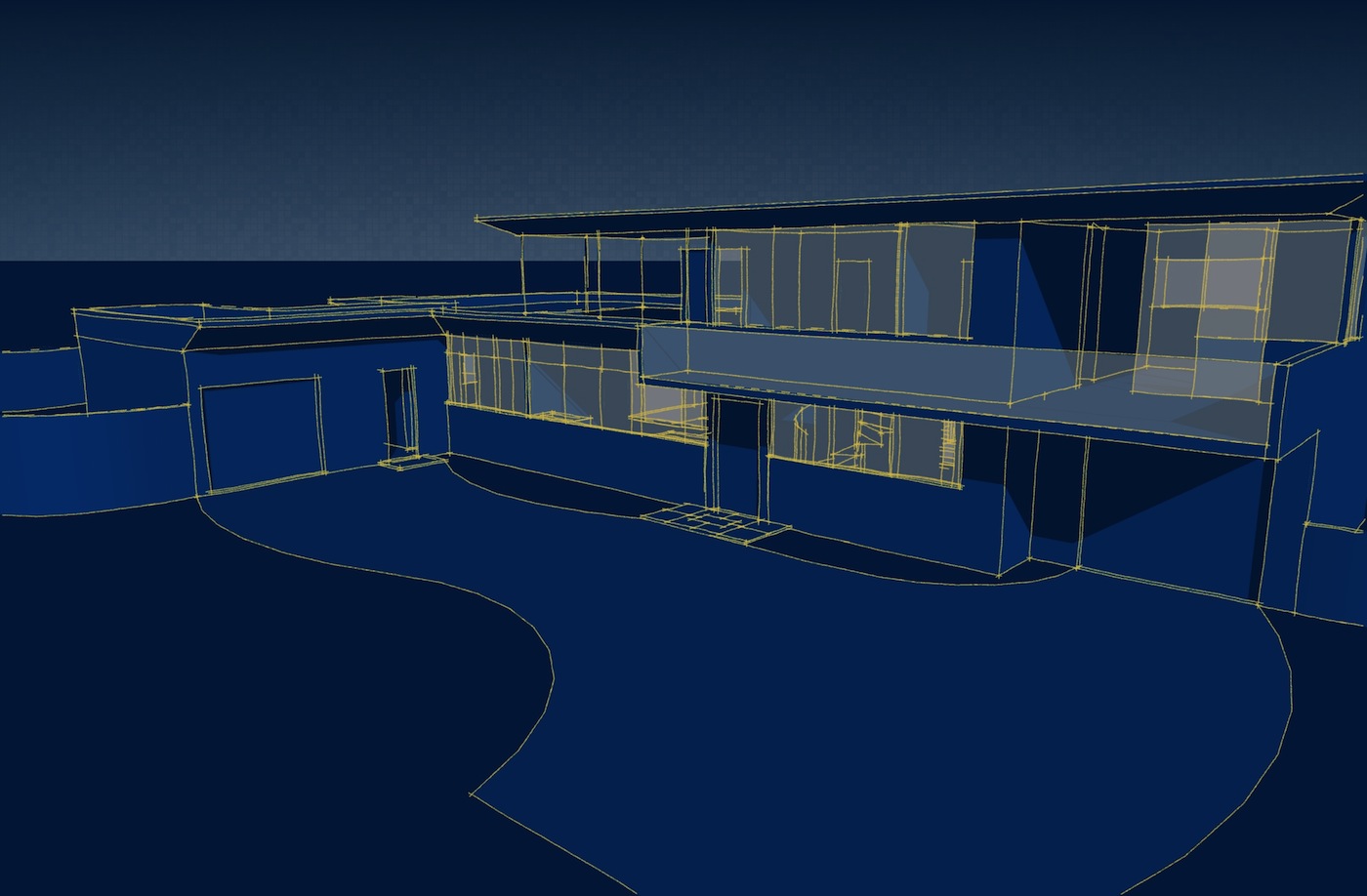
[Edit-- something like this (which i faked)]
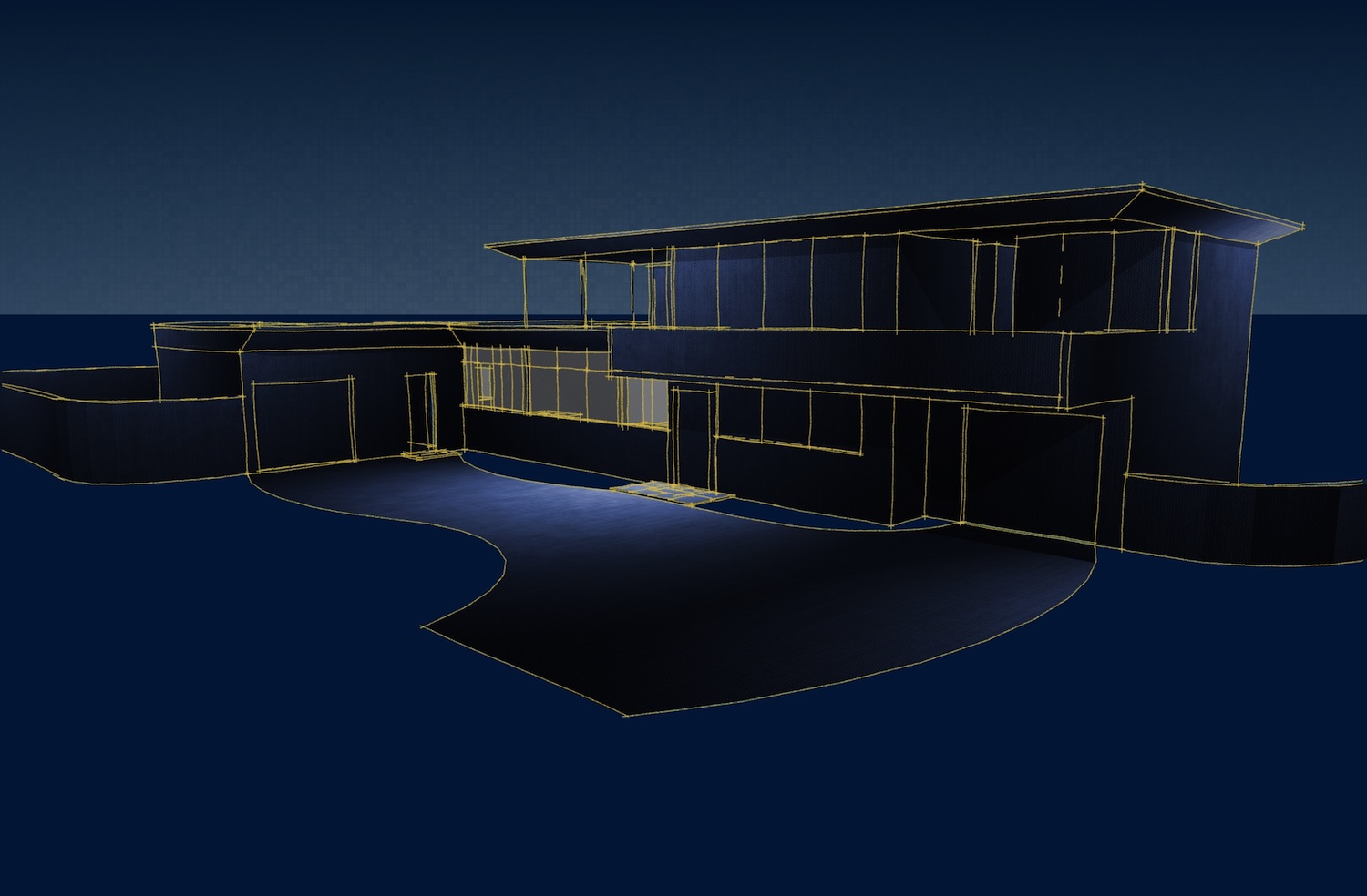
which used this as the hypothetical texture-affecting-only watermark..

[and if you know of a more appropriate thread to discuss this in, let me know and i'll move it over there.. thanks]
-
Jeff, I guess this is as good a place as any to discuss this.
That's an interesting start.
Unfortunately there is no way to have a texture image show on just the faces using a watermark. You could do it easily enough in post processing but not directly in SketchUp. You could put in a watermark image as an overlay but of course it'll also show over the background and mask the lines.
Maybe you should make a feature request for that. I put in a feature request for a face style which is a cross between Hidden Line and Wireframe. I think that would be a great addition if you want to use watermark images. Here's an example:
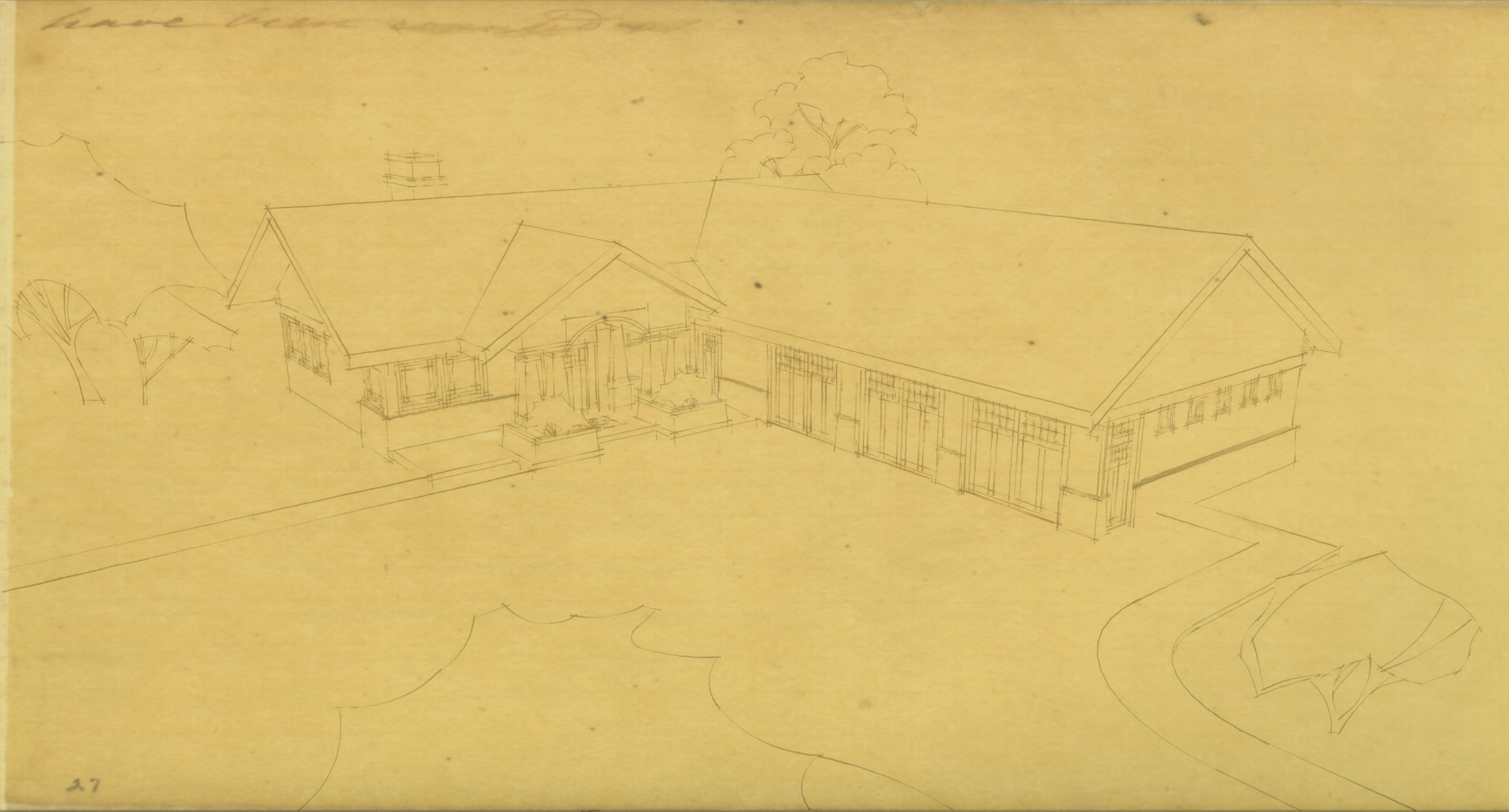
This is a style I made a long time ago. In order for the marks on the old paper to show where the model would otherwise mask it, I used an overlay image but it must be made somewhat transparent so the model shows. Unfortunately the lines aren't as dark as I'd like.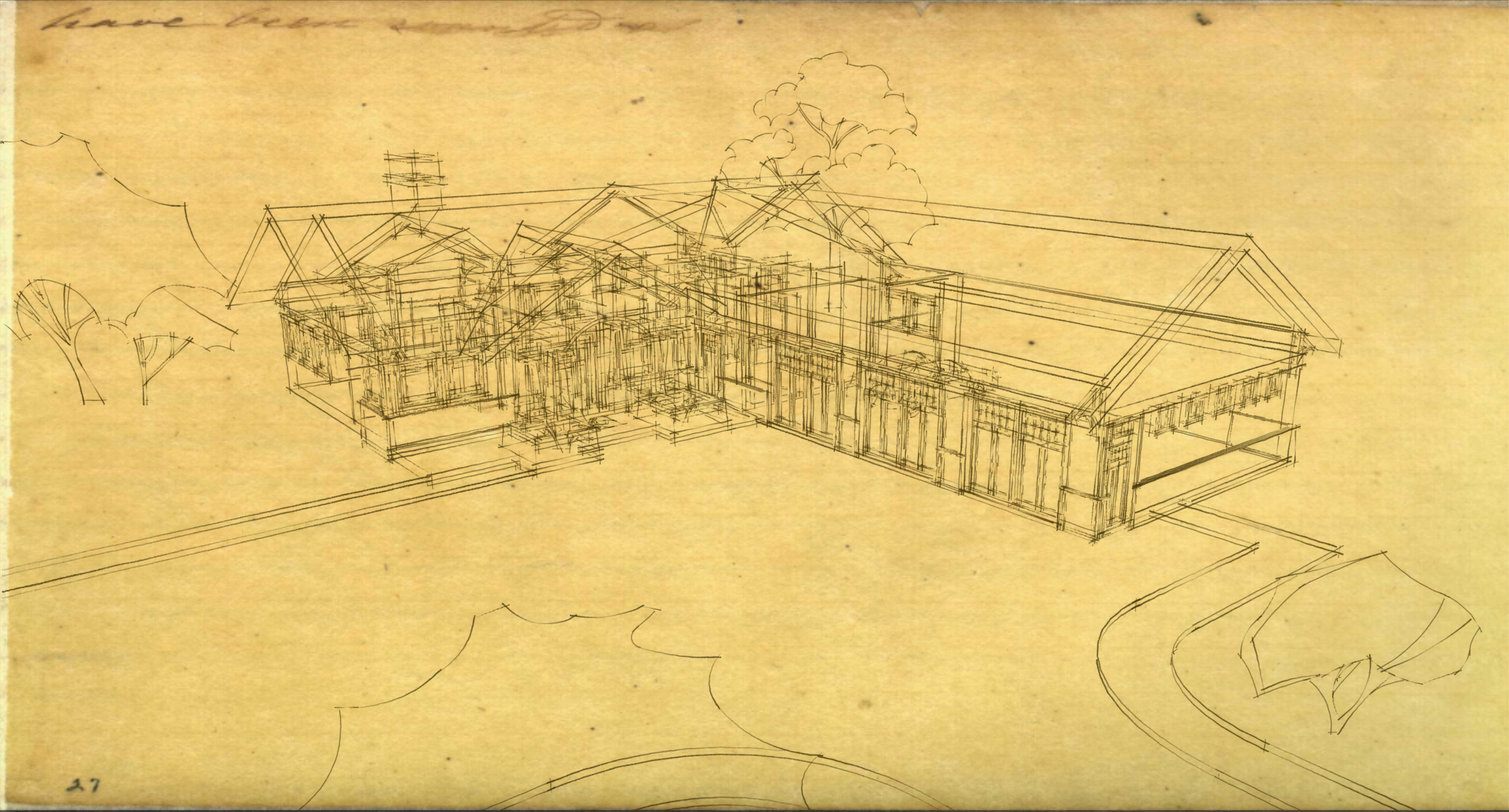
If I use the watermark image in the background and switch to wireframe, the lines are now on top and much nicer. The downside is the it gets too confusing because you see everything.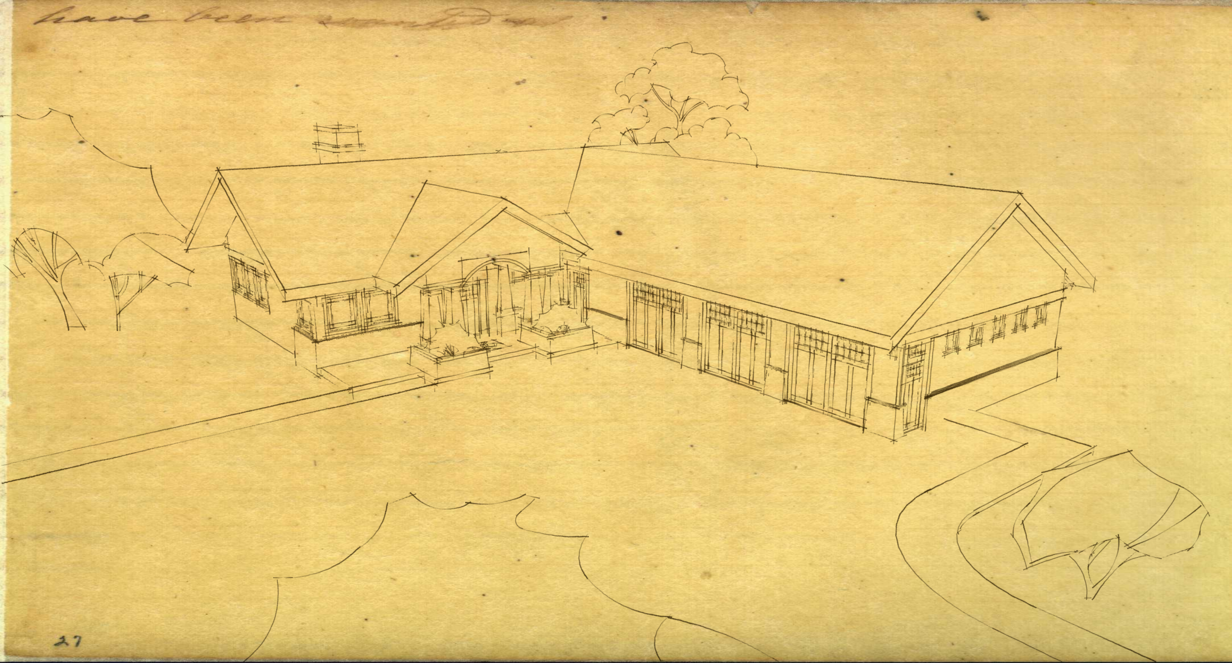
My cross between Hidden Line and Wireframe would look like this as a direct export from SketchUp. Of course I made this image from the image used for the watermark and a Hidden Line with no watermark and a white background export. The images were then combined in post. -
@dave r said:
Maybe you should make a feature request for that.
 took your advice earlier and did just that..
forgot to report back bcause i got caught up in another long winding/winded discussion
@unknownuser said:
I put in a feature request for a face style which is a cross between Hidden Line and Wireframe. I think that would be a great addition if you want to use watermark images. Here's an example:
ah.. yeah.. i see the possibilities..
dunno, this (styles) seems an area where the devs could open up the governor a little bit.. loosen their belts..i mean, how bad could they potentially screw up sketchup by adding 10 new things at once to the styles dialogs.. not bad at all..
but they need (ok.. i don't actually know what they need
 ) to have a little experimental/loose zone where they can be more playful with the developing process.. and this seems like a good place to do it..
 -
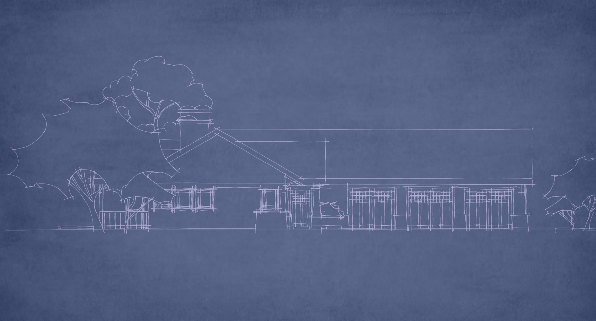
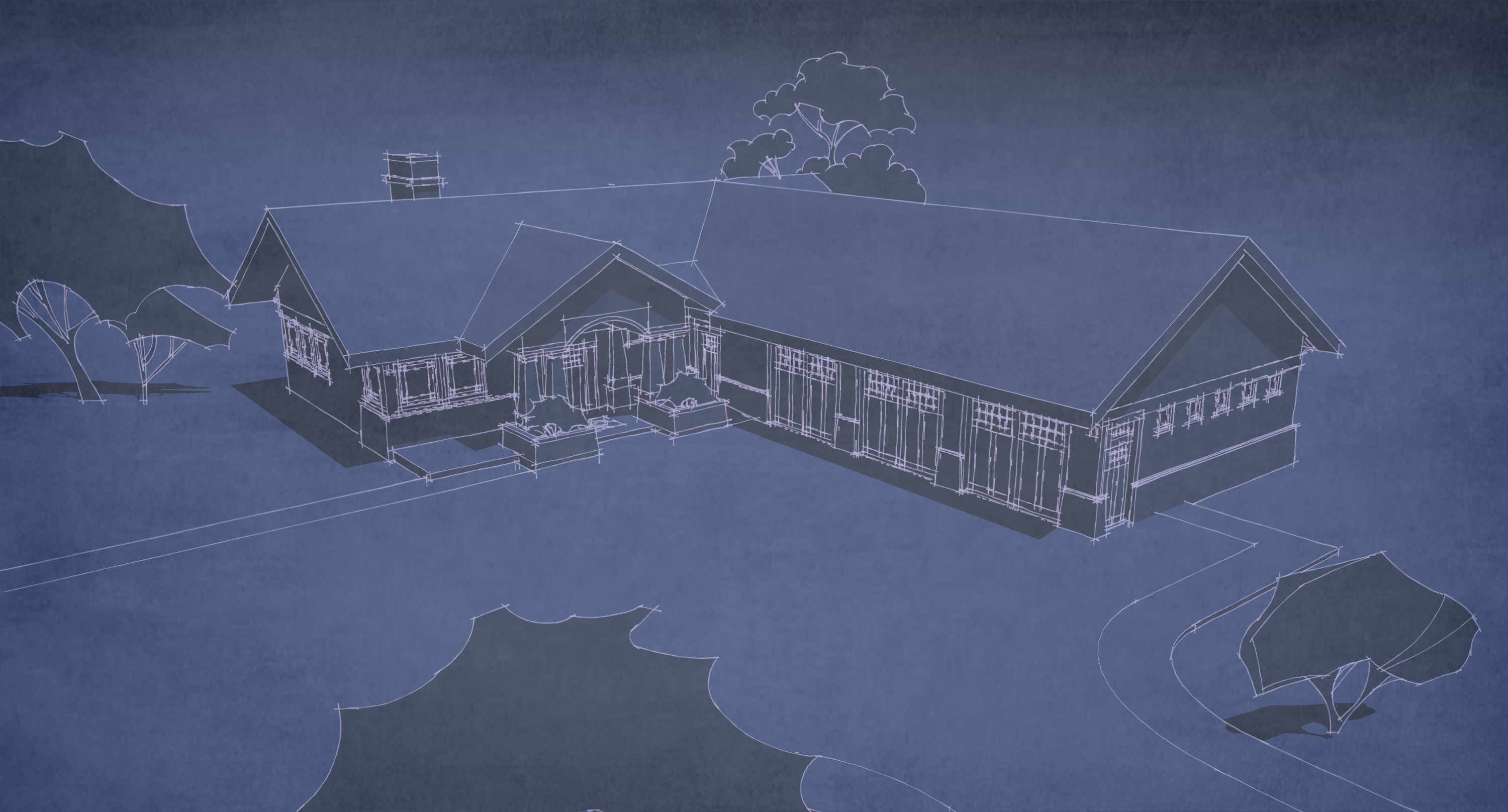
More experimentation. Different line style, subtle changes to the blue color and the overlay. Probably better exported large and resized smaller.
-
Both original images look great! the top for more 3D feel and the lower for more of a 2D feel. Great Work!
Matte -
I can smell the ammonia


-
@dale said:
I can smell the ammonia


Oh yeah, I could too. I almost saw someone pass out once, changing out a bottle.
-
@dave r said:
Gilles, I see what you mean.

Cotty, thanks. The trees are Boofredlay's. I've had them a long time but I think he posted them here. They are cool, aren't they?
Hi Dave R,
I love your Blueprint style, both really good (top one 3d, 2nd one 2d)

Are Boofredlays trees still available to download? -
Thanks.
Did you try a search? It worked for me.
-
Thanks for the link

Unfortunately the link goes to a "GONE" webpage, so not there anymore
-
Sorry. I didn't try the link. Maybe Eric will repost them.
-
No worries Dave, thanks anyway. I've contacted Eric to see if he can re-post.
Will your Blueprint style be available to download?
-
I'm not sure. At this point there's very little of it that works as a real style in SketchUp. To make the two images you liked I had to do some post processing. The texture over the image is overlaid in an image editor. Putting the image in as a watermark masks the lines and it doesn't look very good. I showed some other examples of that problem on the first page.
-
I used to run blue lines when I was a kid... We had a blue print machine in the spare bedroom. Then one of my first jobs was at A&B Blue Print. The good ole days.
Hello! It looks like you're interested in this conversation, but you don't have an account yet.
Getting fed up of having to scroll through the same posts each visit? When you register for an account, you'll always come back to exactly where you were before, and choose to be notified of new replies (either via email, or push notification). You'll also be able to save bookmarks and upvote posts to show your appreciation to other community members.
With your input, this post could be even better 💗
Register LoginAdvertisement


