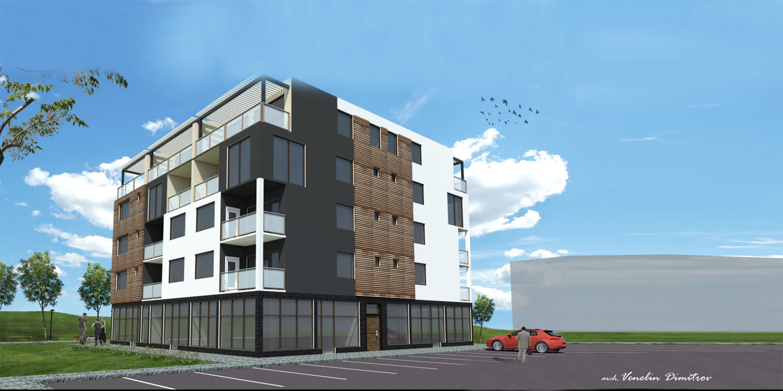
Residential building
-
Hi all.
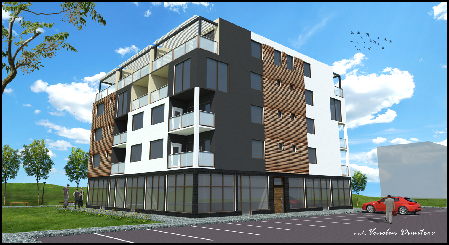
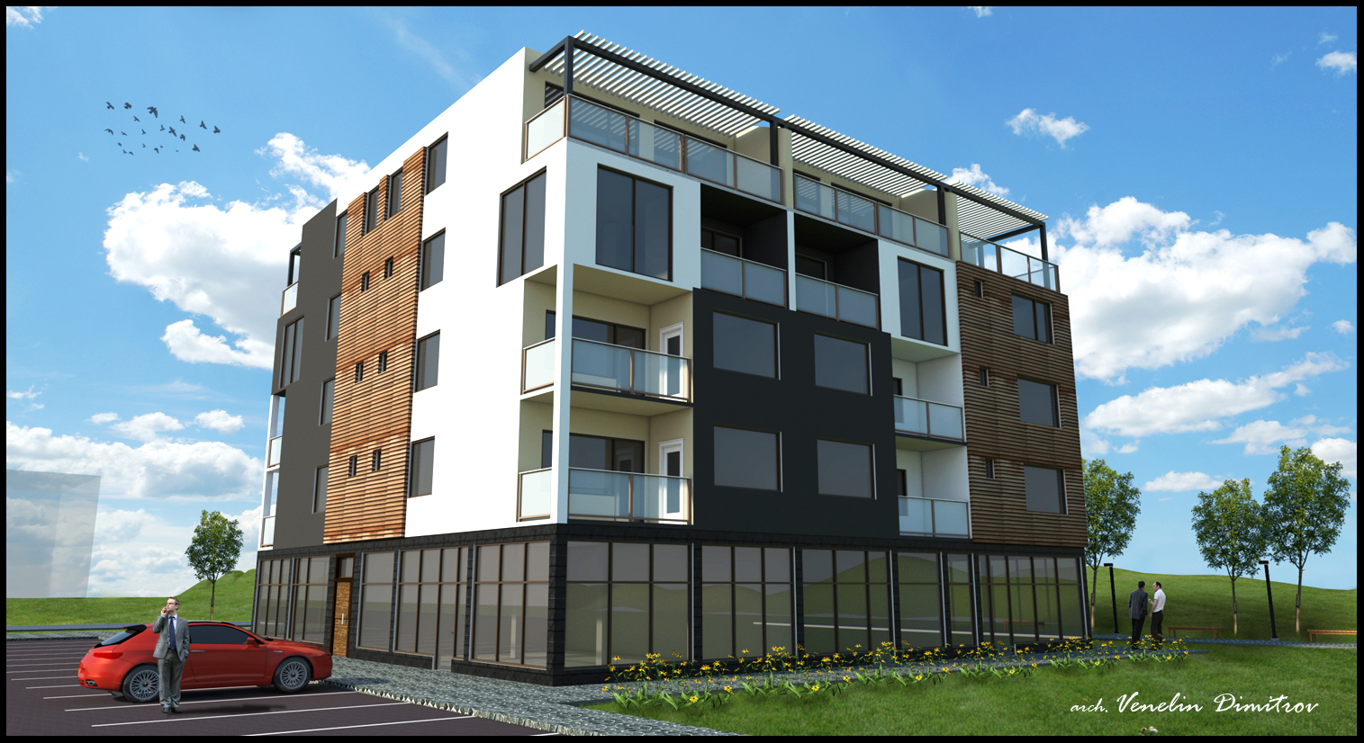
I want to show you a project I was working on the last days.
SKP 8, vray, PS
C&C welcome
-
You have all the detail & ingredients for a good render. I think the cameras could be better along with the lighting. It also seems to be slightly over saturated but this is often what developers like and is a personal opinion.Did you make some post processing adjustments ? In a window or an advertisment it's quite "punchy" like this. Others will tell you to keep your verticals straight but perhaps somewhere in the middle is best ? The building being cube (ish) shaped doesn't help in the composition either. Try it off centre and with more sky showing as i suspect it's cropped too tight. They look good to me don't get me wrong, but i think with polish they could be excellent.
-
Thanks for the comment. I am trying to improve my renders every time and that is the point.
@chedda said:
I think the cameras could be better along with the lighting.
I can't understand. Do you mean that a dark areas is too darker and I have to light up.
@chedda said:
Did you make some post processing adjustments ?
I made a lot of adjustments in PS. The sky, people , grass, flowers, trees, levels, exposure ...
-
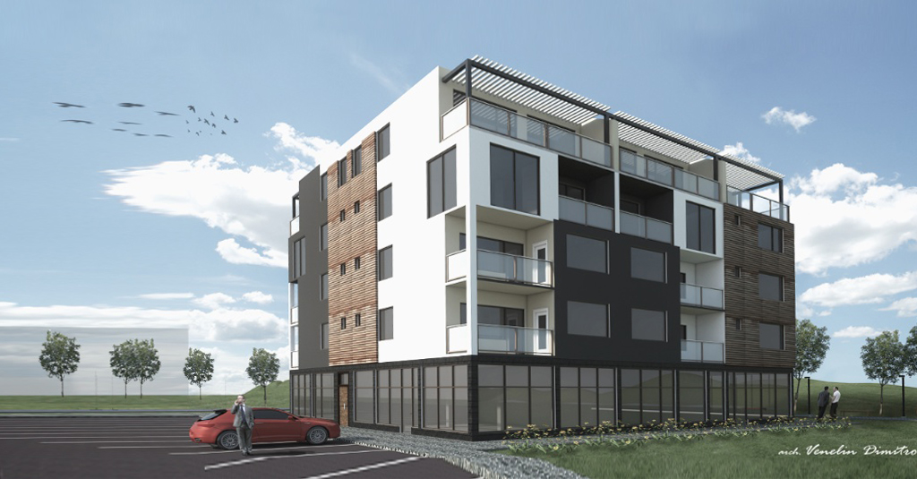
For architectural shots it really, really, really helps if you straighten the verticals. Sketchup even has a two point perspective that will do this for you.
-
I mean a different camera angle and field of view. Looking directly at the corner is perhaps not the best angle for this shape. Regarding the straight verticals i think in this case it's particulary usefull. The perspective lines now converge to a point like a pyramid they lead the eye up and to the middle. When you are drawn to this point there is no focal point in the model or sky, if they were more vertical the eye would be drawn to the centre of the building. I am no expert this is just my opinion. Regarding improvements C&C etc i agree by always saying my next render is my best render. By making images we often become quite introverted and a 3rd persons viewpoint helps for a clear view.
One more thing in this building we don't see any of the surroundings reflected in the glass perhaps because you added them in post. It's these little extras that make the difference IMHO.
-
@chedda said:
I mean a different camera angle and field of view. Looking directly at the corner is perhaps not the best angle for this shape. Regarding the straight verticals i think in this case it's particulary usefull. The perspective lines now converge to a point like a pyramid they lead the eye up and to the middle. When you are drawn to this point there is no focal point in the model or sky, if they were more vertical the eye would be drawn to the centre of the building. I am no expert this is just my opinion. Regarding improvements C&C etc i agree by always saying my next render is my best render. By making images we often become quite introverted and a 3rd persons viewpoint helps for a clear view.
One more thing in this building we don't see any of the surroundings reflected in the glass perhaps because you added them in post. It's these little extras that make the difference IMHO.
I also think the perspective is a little more than normal. Thanks
@macker said:
For architectural shots it really, really, really helps if you straighten the verticals. Sketchup even has a two point perspective that will do this for you.
I have not use this function in sketchup until now. Thanks
-
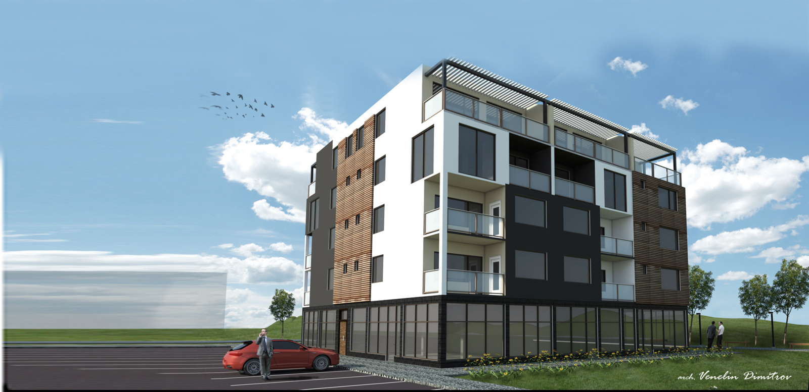
Some corrections. straighten the verticals and low saturation
-
Very nice!
-
-
definitely looking better.
have you thought about simply cropping the image? no reason to show all that empty space..i realize you have a transparent building back there, but not sure that's helping much.
-
@marked001 said:
definitely looking better.
have you thought about simply cropping the image? no reason to show all that empty space..i realize you have a transparent building back there, but not sure that's helping much.
I have to agree with this. Cropping would make a big difference.
Hello! It looks like you're interested in this conversation, but you don't have an account yet.
Getting fed up of having to scroll through the same posts each visit? When you register for an account, you'll always come back to exactly where you were before, and choose to be notified of new replies (either via email, or push notification). You'll also be able to save bookmarks and upvote posts to show your appreciation to other community members.
With your input, this post could be even better 💗
Register LoginAdvertisement


