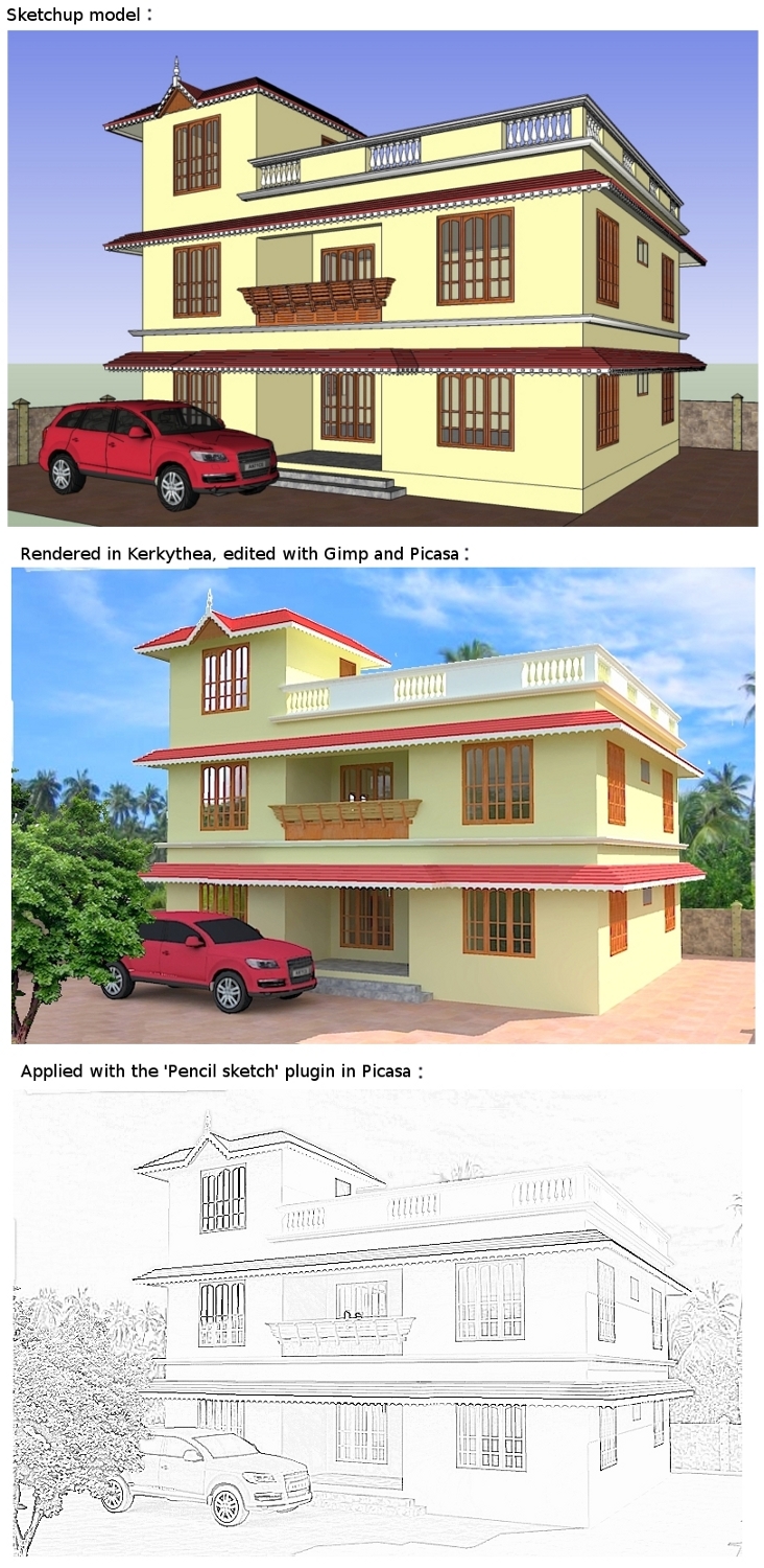
Rendered view edited in Gimp
-
Hi friends,
I made a model of a residential building in sketchup and rendered it in Kerkythea. After editing in gimp, I was playing around with it in Picasa when I saw the 'pencil sketch' feature by chance. I feel that the pencil sketch is really fascinating and I wonder how the clients might feel about it. Please give me your opinion about the images.
Thank you

-
It's kinda rubbish if you ask me. Looks like it uses some type of high pass to find edges.
It doesn't look sketchy or pleasing in my opinion.
Try using FotoSketcher instead
-
I also don't like it. The model is really good though

Have you tried the different styles already in SketchUp?There are many different 'sketchy edges' resembling pencil drawing.
Personally I like 'scribble on masonite' and the 'Chipboard with fine marker' (under assorted styles). Export as 2D.

-
The most popular, and in my opinion best way of getting pencil sketchy look is by styles in Sketchup, if you've got the model of course. If you don't have a model - FotoSketcher is much better then this Gimp plugin. It also have other great possibilities - I recommend you to play with it a bit. The best result's might be achieved by using all of this tools in the proper fields, where they fits best. There are a lot of tutorials ant tips out there if you like to experiment with non-photorealistic techniques. http://www.sketchupartists.org/ is a nice place to start.
-
I would try different views. How would a wider, ground level view look? These angles put the viewer floating in space or standing on a raised area right in front of the building. It is caught between a ground level and birds-eye view. I mean, it might suit your purpose... just a suggestion.
Also would the car be so close, and no planting on the sides? There's a lot of pavement. I agree with the others. There are better ways to do a hand-drawn style. I would not show the clients both. You can also combine linework over the color rendering.
-
Thank you very much for the suggestions. I really like the techniques given in the site posted by unrealviz. I must also try the various assorted styles inside sketchup as suggested by Adorno. I also like the view point suggested by pbacot. It gives a better view of the building. I hope to make the corrected image soon and come back here and post it. It would be better to hear all opinions before taking the drawings to the clients.
Hello! It looks like you're interested in this conversation, but you don't have an account yet.
Getting fed up of having to scroll through the same posts each visit? When you register for an account, you'll always come back to exactly where you were before, and choose to be notified of new replies (either via email, or push notification). You'll also be able to save bookmarks and upvote posts to show your appreciation to other community members.
With your input, this post could be even better 💗
Register LoginAdvertisement


