Quick NPR Church Additions
-
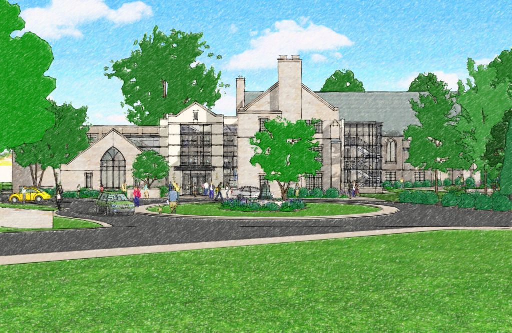
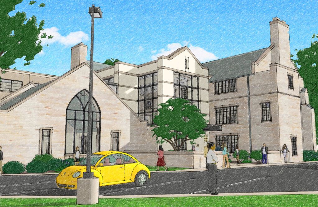
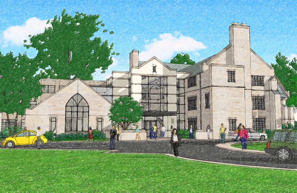
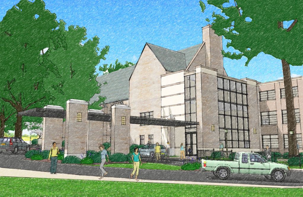
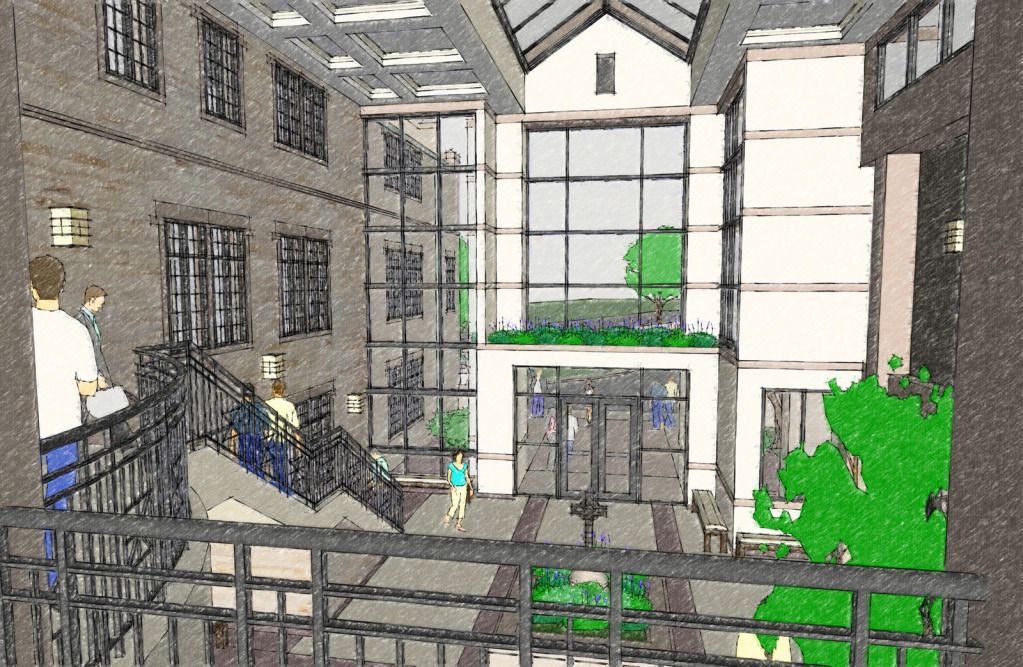
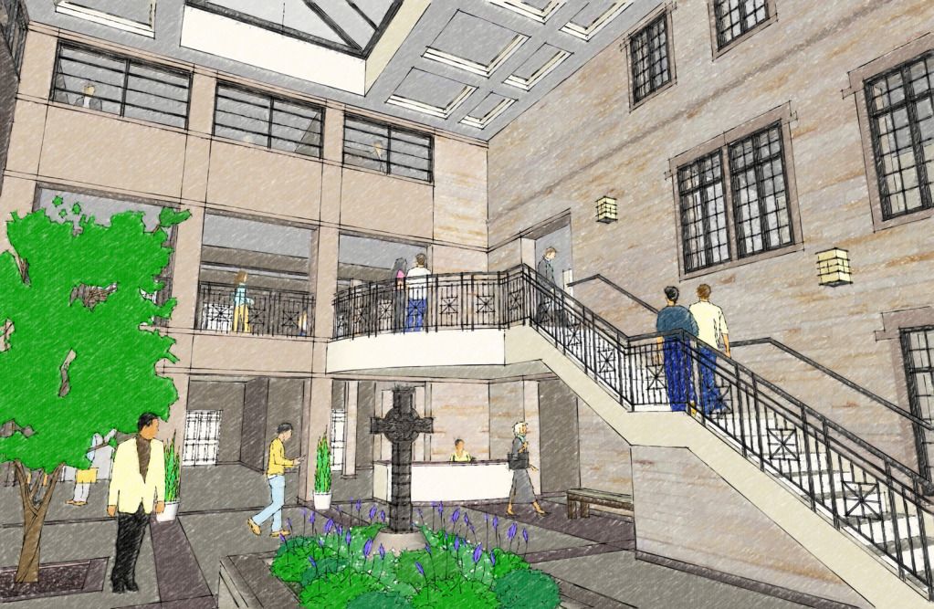
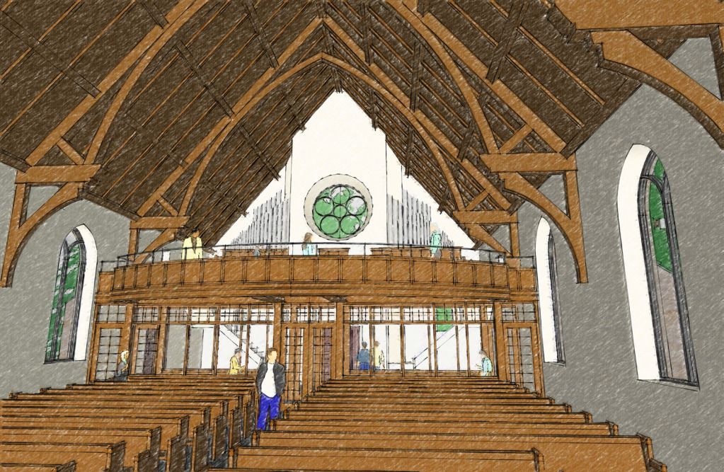
A master planning visualization for a Church addition. Needed a loose overall presentation without a focus on controversial details best described with a NPR style. Client was pleased. Comments welcome!
-
You have definitely worked hard on choosing the right camera angles to sale the project. The attention to detail on the model and populating the space with people, trees, cars, etc.… sure brings life to the scene. Nice work!
-
Congrats, nice renderings reminds me of a colored pencil rendering...
I have some suggestions that you can add to your drawings, I hope this may help...

Your vertical lines should be straight like in architectural perspectives, you can achieve this by choosing "Two Point Perspective" in the Camera menu.
You can also add some reflection in floors and some reflective objects especially in interior scenes.
Placing some highlights on a particular area in your scene will greatly improve/enhance a rendering. Like highlighting some shadows or putting real textures in some areas.
Thanks
allanx
-
Hi! Nice work! And a lot of work too! I'm quite new here, but I would like to add some tips: be careful with colours. This is always something to remember about in my opinion - no matter if you are doing NPR or photo-real. It's good to have some general colours plan for your renderings. And just to add to allanx tips on reflections and highlights - there is a great place for tutorials called http://www.sketchupartists.org, which is probably known by most of you, but it's worth mentioning nevertheless
 .
. -
I like the style. Very nice!
-
Yes very nice style...workflow for this?
-
As requested a look at my workflow for this project, the client needed very high resolution images for a congregation Powerpoint presentation
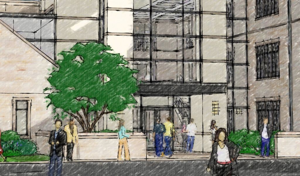
I used pure Sketchup Output at High Resolution 4048x3072 with shadows on and without lines, and a second output at the same resolution in Black and White with the Permanent Marker Heavy style no shadows. I used a Photoshop plugin called Alien Skin Snap Art 3 to apply a Pencil Sketch filter to the first color output. I then composed the 2 images together in Photoshop using multipy to overlay the B&W lines. The final result has a loose sketchy look that explains the project without committing to fine details.
This is what a section of one of the final images looks like at full resolution.
-
Thnx for the explanation...good job

-
Really nice presentation work, I like the building design too.
Hello! It looks like you're interested in this conversation, but you don't have an account yet.
Getting fed up of having to scroll through the same posts each visit? When you register for an account, you'll always come back to exactly where you were before, and choose to be notified of new replies (either via email, or push notification). You'll also be able to save bookmarks and upvote posts to show your appreciation to other community members.
With your input, this post could be even better 💗
Register LoginAdvertisement


