Old Afgan ruin
-
Looks good! It still has a certain darkness and redness, like an overcast dusk, but that may be what you're after. a very quiet mood. Where'd all those palettes come from?:enlight:
-
It's exactly the setting I was looking for, the pallets is a tutorial in the book "google sketchup for game design" I only got it last wk and tried out the tutorial, fantastic tut on how to create a pallet with the right texture applied, took just under an hr to complete but it taught me a lot on texturing in SU
-
I'll post the pallet skp file tomorrow, I won't be giving a tut on it as its in the book I mentioned and it just wouldn't be fair on the author, I strongly recommend this book, helped me a lot in understanding textures and creating textures
-
Simply Wow!
The terrain is blur on the last image. Is it due to the texture resolution?
One more thing sir, is there any reason why the terrain is not looking "alive" like the bricks? (No bump) -
I haven't worked on the terrain yet, only the building and props, will work on the terrain later

-
Thank you, Damien. Nice tut!

-
@ecuadorian said:
Thank you, Damien. Nice tut!

Your welcome, if anyone is doing something like what iv showen in the tut feel free to post your image here, and if you would like to add to it I would like to hear it here too, I'm not perfect, cheers again
-
Hi Damien...
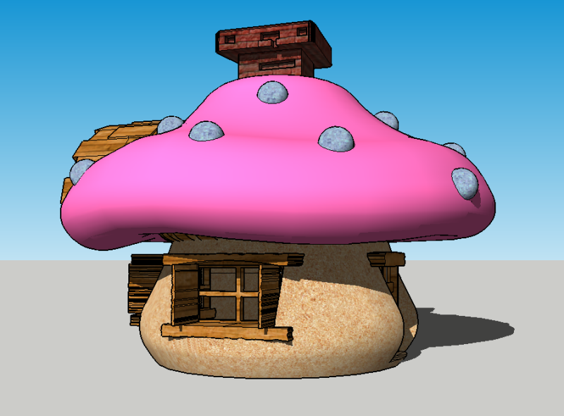
After seeing your tips & tuts, here is what I came up with. A Smurf's house.
Still pretty rough + my hand is not sturdy enough when using "free hand" tool to create those rough wood effect.Looking forward for your next masterpiece...
Thanks!

-
Amazing work.
-
Awe I see you joined us on sketchucation Paladin, about time for you, welcome to sketchucation, I'm sure you will learn a lot here to improve your SU skills

-
-
Heres that pallet i said id post up, feel free to use it
Its gameready for Unity 3D and again ill remind you this was a tutorial in "Google Sketchup For Game Design" , great book and enjoyed the tuts within it

-
Here's a shirt video showing the ruin I created in the famous cryengine.
Hello! It looks like you're interested in this conversation, but you don't have an account yet.
Getting fed up of having to scroll through the same posts each visit? When you register for an account, you'll always come back to exactly where you were before, and choose to be notified of new replies (either via email, or push notification). You'll also be able to save bookmarks and upvote posts to show your appreciation to other community members.
With your input, this post could be even better 💗
Register LoginAdvertisement
 ...
...  ...
... 


