Burt's WIP
-
Here's today's effort.
I'm thinking I will render some 3D icons for a small carousel I have on my main page. This will be the 'job page' icon if it works out.
Looks like a simple box but fiddling with this took me about 4 hours.

-
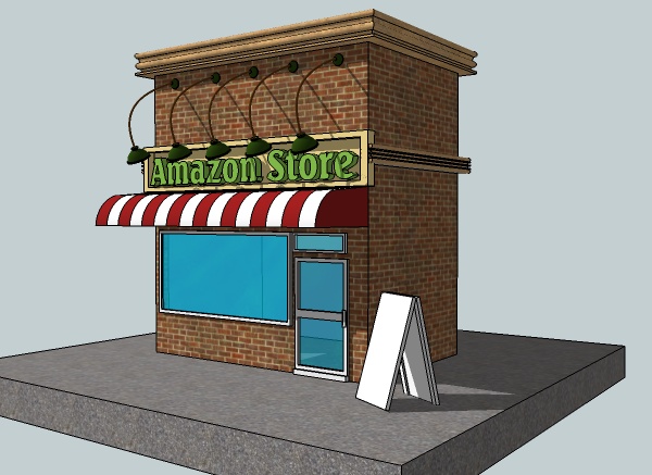
Next effort is to make a 3D store icon for my site. Still squarish stuff but getting practice anyway. I want to add some products, signs and other stuff yet.

-
Trying out the 3D icons with SketchUp idea. Here's a shot from the first 3 on a carousel on my site's main page.

-
nice idea
-
@designerstuart - thanks.

Here is my current wip. I wanted to try something a bit larger so opted for a 'medieval-ish' store (the rare times I play a game I favor RPG's with medieval or apocalyptic settings for some reason).
It's mostly square boxes so far but I hope to fill it up with items and texture it so should be a good learning experience.

-
Still tinkering with this - maybe a fortified tavern of sorts. Making all sorts of mistakes (including somehow deleting - instead of hiding- a couple huge sections). Hopefully that's a good sign.

I hid the second floor for this screen shot - not much to see there yet anyway.

PS. You know you're spending a lot of time in SketchUp when you keep trying to pan the browser window by pressing H and dragging.

-
@unknownuser said:
PS. You know you're spending a lot of time in SketchUp when you keep trying to pan the browser window by pressing H and dragging.
or centre button orbiting in Word.

Keep going...practice makes perfect.

-
looks like you are enjoying it anyway!
-
Well I think I am done with this one - not that it's complete. I just slaped on some colors to seperate basic elements. I didn't really start with a plan and grew it organically. Of course then the stairs didn't fit quite rightand there were other design problems - so going to try something much smaller (maybe a single room or elements like a medieval chest or piece of furniture).
I am having fun anyway.


-
I found two videos at The Art Department Org by Whit Brachna that demo some environmental concept art techniques.
He uses SketchUp to do a basic layout to get perspective, basic lighting and values sorted out. Then he renders and paints over with Photoshop.
(Watching him work on his thumbnails I was reminded of how important thumbnailing can be as he quickly works out 4 thumbs and selects one that meets his criteria.)
These aren't hand holding lessons where Whit explains Photoshop and SketchUp in a step by step way but they do provide a 'live' view of a talented artist's workflow, with comments and some tips.
I just completed video 1, made a couple renders of the SketchUp model I've been poking at and tried a quick paint over tonight.
Lot's of mistakes but here is a relatively quick first effort (might also be a little dark).

I'll start on video 2 tomorrow.
-
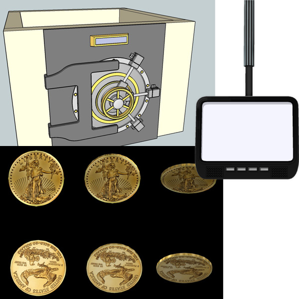
Hey. Been a little less active the past week or so as I try to line up some work. I have been trying to use SketchUp to do a few concepts for a Flash studio I use to work for. Here is a monitor concept, a couple of frames of a rotating gold coin (I did 12 positions in Kerkythea but only low setting as my PC went to sleep on the better ones) and a safe. Be back tomorrow to catch up.

Hello! It looks like you're interested in this conversation, but you don't have an account yet.
Getting fed up of having to scroll through the same posts each visit? When you register for an account, you'll always come back to exactly where you were before, and choose to be notified of new replies (either via email, or push notification). You'll also be able to save bookmarks and upvote posts to show your appreciation to other community members.
With your input, this post could be even better 💗
Register LoginAdvertisement


