[WIP] Renovation of an 70ties Bungalow
-
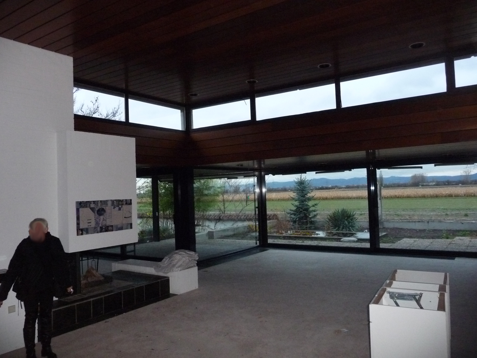
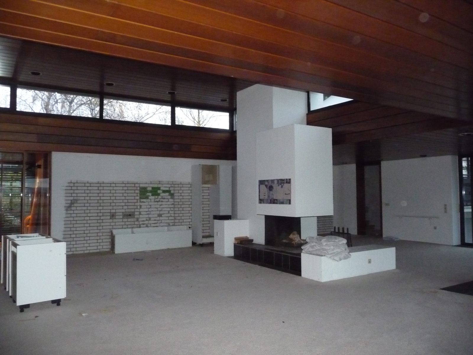
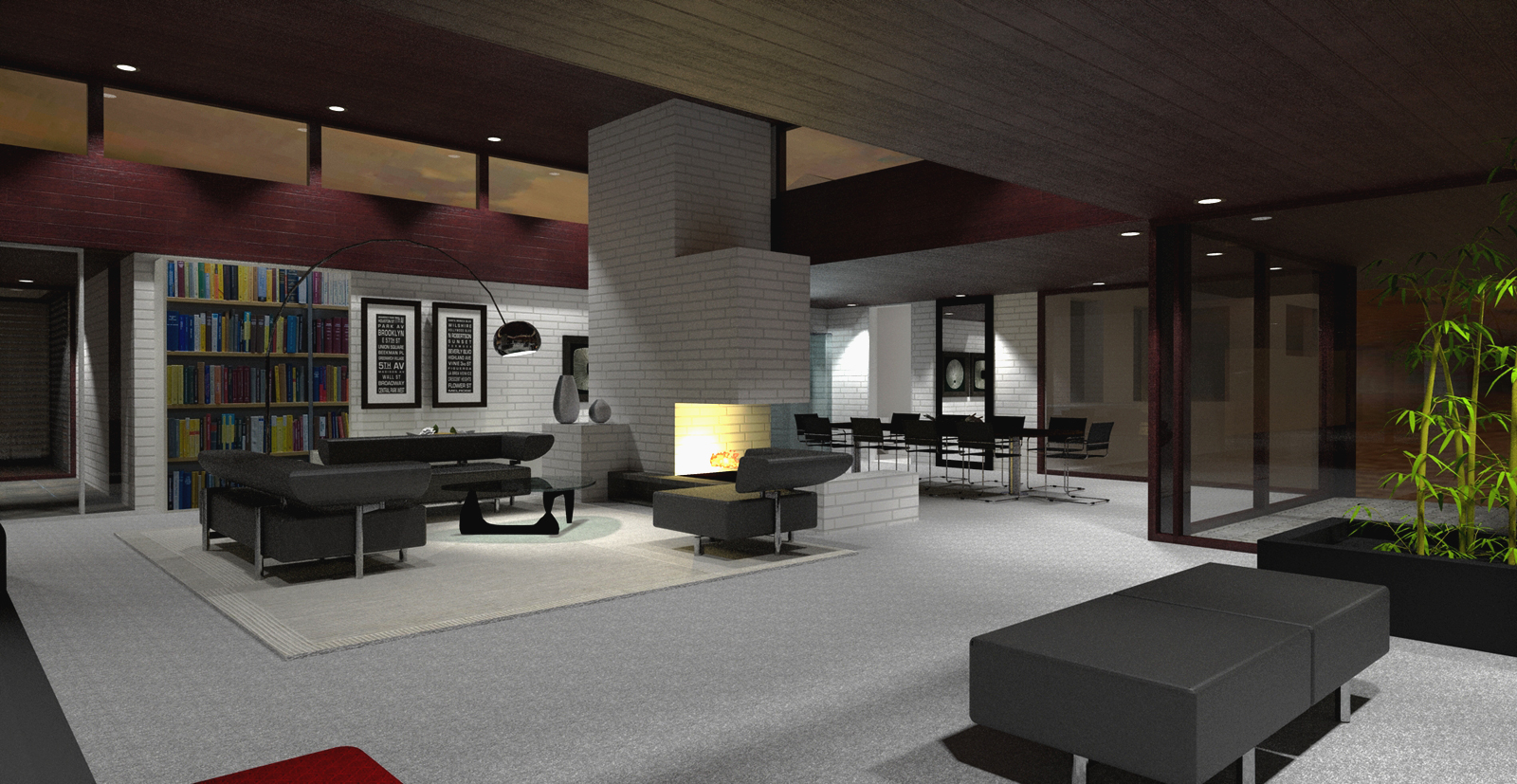
I didn't post renders for some weeks because I'm working on a project and I was still training modelling and rendering.
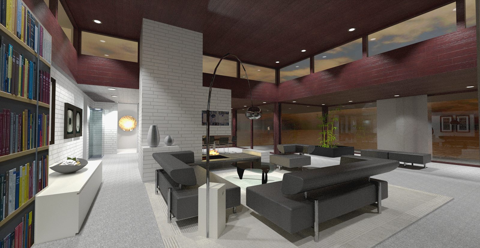
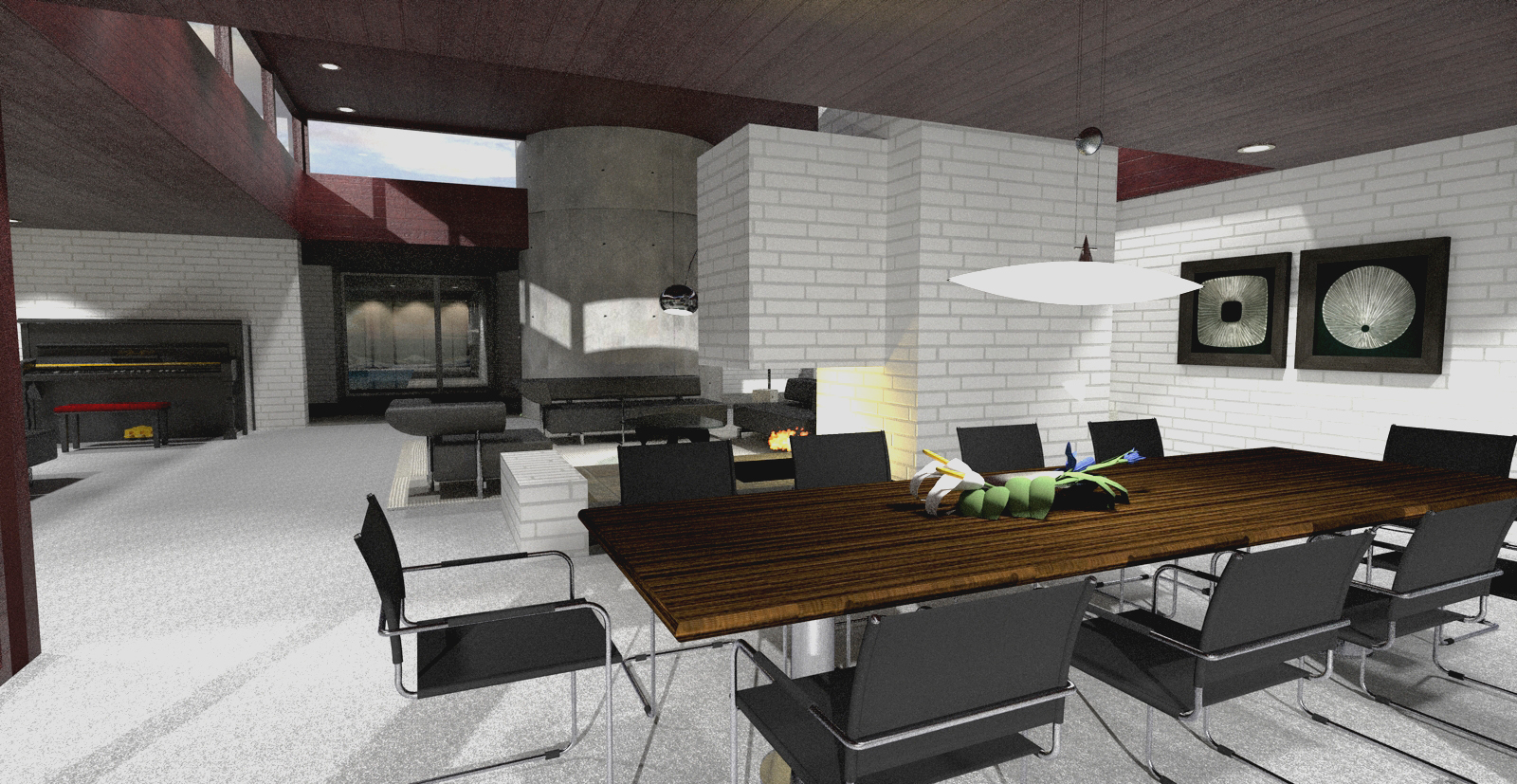
furniture is by warehouse or modelled by myself. rendered with twilight
here are the first pictures of the project. c&c are wellcome.
Thank you
-
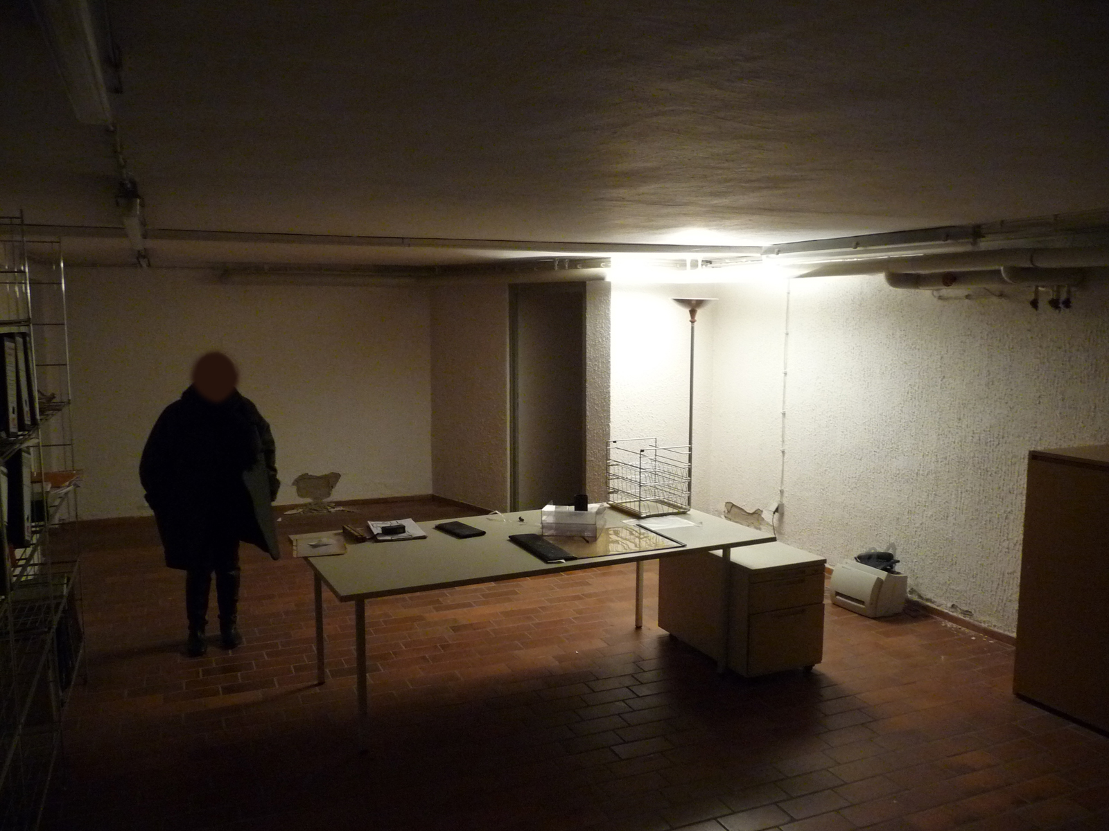
The lack of a face in the first image is a bit creepy.
Scott
-
That's for privacy reasons, Scott, you now. Like in GE Street View where faces are blurred out.
Jo-ke; I like the building actually. Would be a cool place for big partying!

-
I love the openess of the space. The wood color in your rendering is rather red. Is this what you are trying to archive? Thus the space is rather large, the red wood color makes the space really cold. I would like to see the original wood color to warm up the space. That's just my 2 sense.
-
Love the space, would like to see more renders.
-
Love the place.
I ll be watching to see final renders to check out materials. -
Looks good. Some constructive criticism:
The bookcase on the left in the first rendering looks flat - you might want to consider outlining the books and extruding them, so it has some depth.
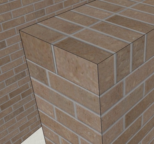
Your brick textures need adjusting - fireplace opening is inthe middle of a course; you have vertical mortar joints on the exterior corners; the lower brick structure next to the fireplace (seat?) ends with a mortar joint on the sides, but the top shows brick running horizontally - should see a rowlock course on the ends, and a full face on the length.
-
Just some thoughts that have nothing to do with the images.
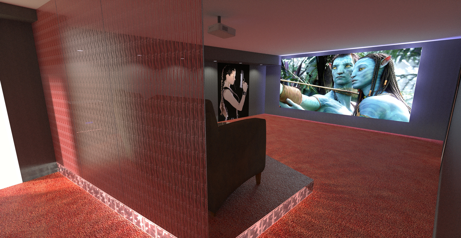
Why only three possible viewers? Will they never have guests? And why is the projector placed right above the seats? There is always noise from projectors and with a placement like that it will disturb the experience of the movie, right? -
Good thoughts!
perhaps they should place the projector with a wide angle near to the wall.
-
Thank you Daniel. I didn't pay attention to the bricks. You're absolutely right. My focus was on the placement and style of the furniture.
The person without face is my staff

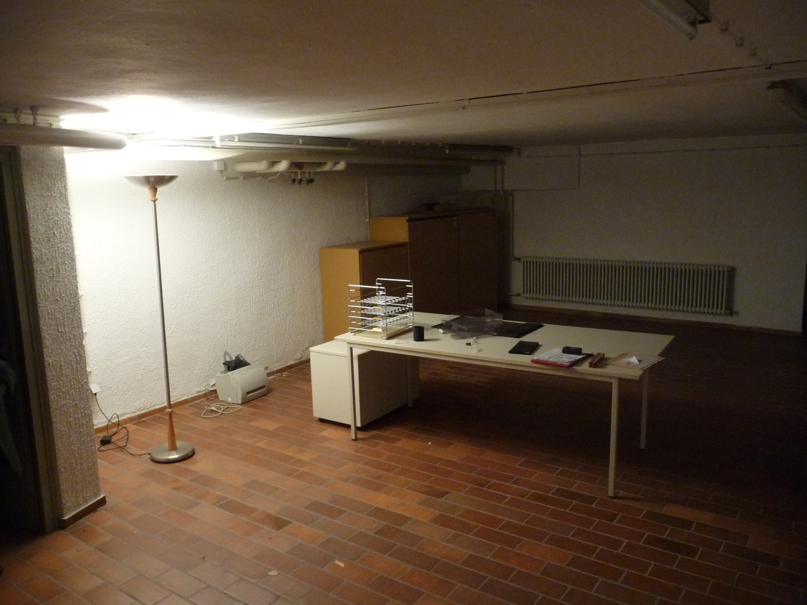
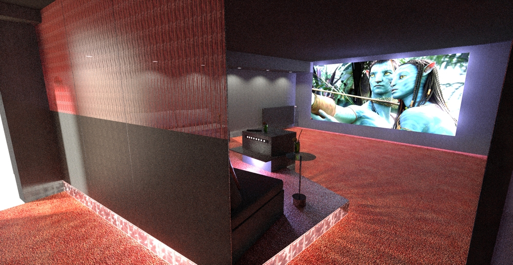
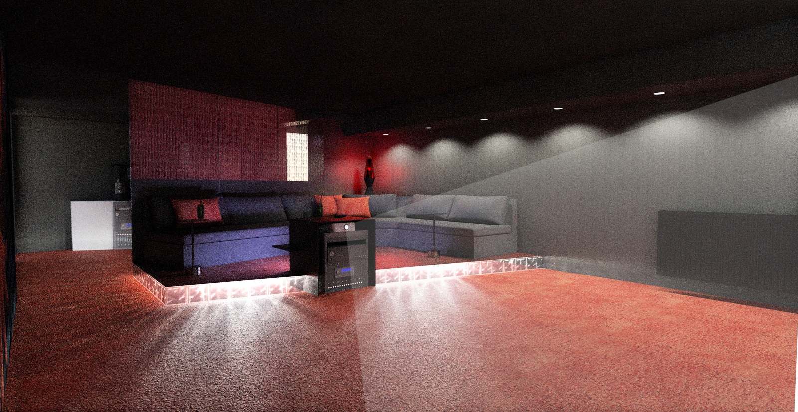
This is the concept of the homecinema of the same project:
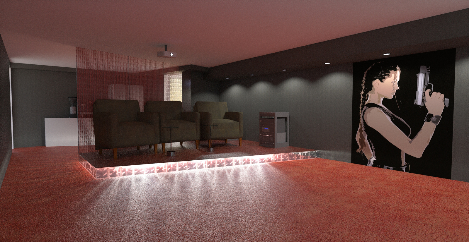
-
I am not sure about the view angle from home theater seating, I believe recommendation is 36 degrees. Maybe just the used FoV but for me view angle looks smaller. Anyhow, worth to recheck.
-
Bungalow? That's one nice Post Modern bungalow! (or was it Modern? I lose track after Le Corbusier, Van Der Rohe, Bauhaus, Wright, Johnson, Pei, Echler... you get the idea
 )
)The remodel looks excellent. Good job!
-
update to the homecinema- project. Unfortunately, I didn't have any time to let all the renders cook long enough, so they are still grainy. But never the less, the customer is very happy with the result.
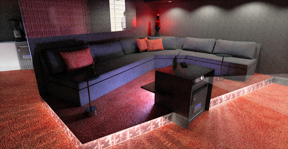
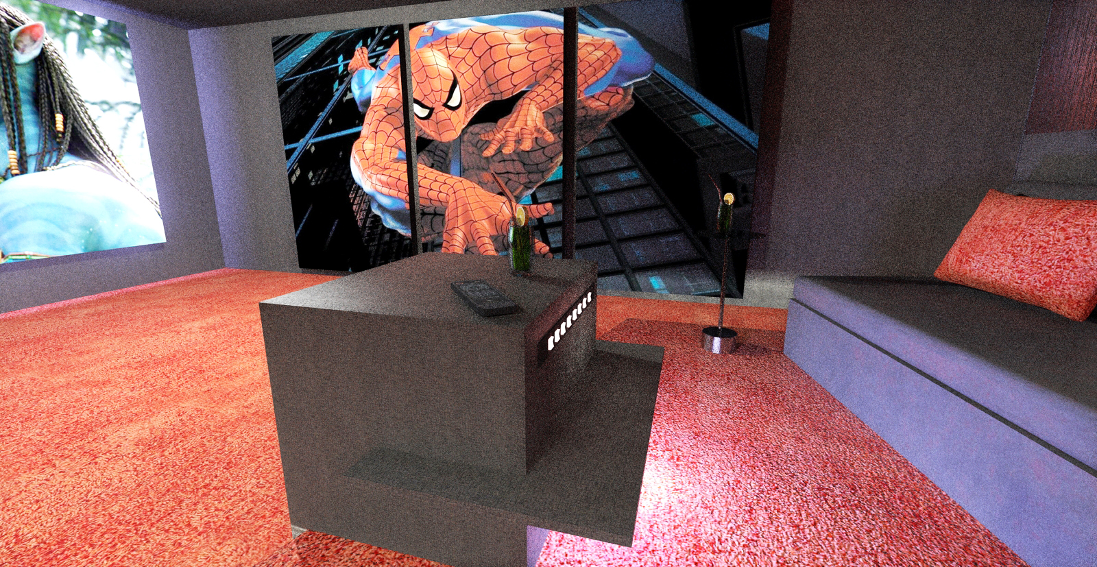
Hello! It looks like you're interested in this conversation, but you don't have an account yet.
Getting fed up of having to scroll through the same posts each visit? When you register for an account, you'll always come back to exactly where you were before, and choose to be notified of new replies (either via email, or push notification). You'll also be able to save bookmarks and upvote posts to show your appreciation to other community members.
With your input, this post could be even better 💗
Register LoginAdvertisement


