Very cheesy render
-
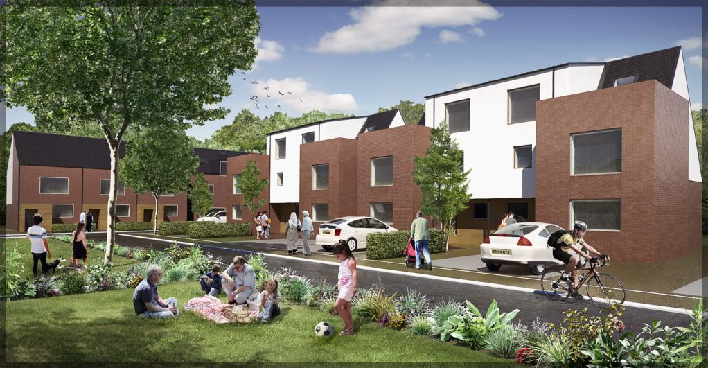
A marketing image I made for a housing association representing their zero-carbon eco homes.
I was specifically asked to make it cheesy....like a street carnival-type atmosphere.... children, picnics, birds, flowers, bushes....oh and ethnic diversity, apparently my entourage was too white :doh:

I added horizontal venetian blinds by request, I wouldn't normally due the dreaded moiré effect but in this case i think it looks kinda cool.
AutoCad, SketchUp, Twilight, Photoshop....the usual culprits

Rendered at 2000 pixels.
Exterior Progressive Preset
Physical Sky (0.9 brightness)...sky image insterted in photoshop.
Turbidity 1.9
Sun Strength 4.95
Sun blur: 7Higher res version here:
http://twilightrender.com/phpBB3/viewtopic.php?f=16&t=1860

-
Nice one Oli!
 My only little crit could be that 2d people and bushes&trees are a bit sharper and have a higher contrast in comparison with the render. But it's only a detail...
-
oli,
I like it. my only crit would be about the entourage: people do not quite blend in.
in order to solve this problem I have started to introduce cutout people in the sketchup model and am quite content with the results.
-
Looks good.

Knowing your sense of humor, I was expecting to find a render of a slice of cheese.

-
I like the hedges on the opposite side of the street, as its something I have problems with. I especially like the integration of the lawn and the people. Is the grass texture on the far lawn the same as one on the near one on this side of the street?
-
What, nobody playing Hacky Sack? You don't know your cheese man

Here, use this image:
http://www.boston.com/news/local/breaking_news/Hackysack_Carson_072909.jpg
View at own risk
-
Hi Miguel, long time no see.....get your render hat back on!
 Thanks
Eric: I didn't know you liked to play hacky sack
 you look very professional in that photo
Honolulu: Cheers
 I will post the raw render on Monday as it will explain how I did the bushes. Basically I rendered just a PNG of a hedge (cuboid made up of PNGs) and then replaced it with a photo in photoshop. came out better than I expected. No 3D hedges are worth the price of the vast geometry (in sketchup anyway)
The grass texture was added in photoshop....its from the twilight forum, I cannot share. I render with a normal seamless grass texture and then always replace with a high res photo of grass in photoshop. If the photo is too small I just clone stamp some more. All the people were in the SU model and rendered....I just used the grass brush in photoshop to mask away some blades of grass. easy to go over the top though...
-
Oli, Thanks.
-
Oli, its great...I never realized you could get such good results rendering 2D people

-
Looks really good


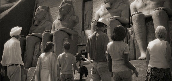
2d people are fine, I've met one of them in Egypt one year ago, a nice guy.
2d trees look like 2d though.

-
I know, I thought of you when I was placing the man! I really can't make 2D trees look 3D! and most 3D trees look even more fake!
thats one of your best images IMO very well executed

I saw your banner on blender website.....is this a self portrait?
-
A self portrait? I'm not so old

These 2d trees have wrong shadows, this is the problem. The 2d cutouts in the 'egyptian' scene are Ps layers, its easier to edit shadows and levels this way. Not always handy. Some painting for fun.

-
very cool
 white vignette looks better doesn't it. I think my image needs brightening a bit looking back at it.
In twilight you can click on the people and render only them.....as an alpha mask or as a render, its a very handy option....just ignores all the other geometry, so it makes editing shadows a bit easier.
-
There is no problem of Size of perspective with all personnages between them on left side of the road?
-
Oli, IMO, what makes Michal... image great, is the almost imperceptible focus on the people. The architecture is background. Wounder if your mission could be accomplished in a similar way? I am a 2d perspective person, but really like his "dog's eye view".
-
@Pilou, I think you're right.
@honoluludesktop
The dog's eye view OK, the photographer used exactly this view and wide angle lenses , what else could I do? This is the problem with 2d cutouts. We need hundreds of them. -
Flying baby pushchair


-
Nice scene, but why don't have the windows any reflection?
-
pilou: I corrected this in final image, its because the PNG is in perspective so either the push chair floats or the man's legs are in the ground! it was a quick photoshop job to correct this. the picnic people are floating too, can't stop it for the raw render.
jo-ke. I am not certain that the windows would have much refelction at this angle. look at the pitched roof lights.....they have blue reflection due to the sharp view angle, fresnel effect etc. if you look at a window straight on, you will not see any reflections unless its a high-reflection window with lots of iron such as with commercial office blocks. If your curtains are open, most windows look very dark during the day, thats why I placed blinds behind the glazing.
try placing a sky/treeline image over the windows to fake the reflections....it just doesnt look right.
-
Oli, these are nice renders.
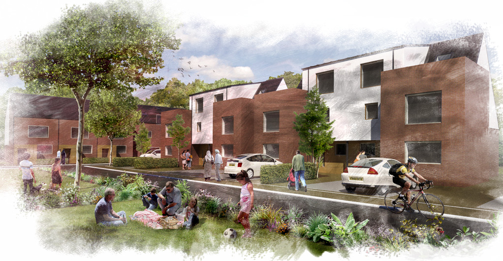
 For a reason, I like the raw render too (even with the flying baby pushchair)
It has a pop-art or impressionistic style somehow.
BTW windows have reflections always. We expect to see reflections or just some specularity in any case. Art is tricky.
Hello! It looks like you're interested in this conversation, but you don't have an account yet.
Getting fed up of having to scroll through the same posts each visit? When you register for an account, you'll always come back to exactly where you were before, and choose to be notified of new replies (either via email, or push notification). You'll also be able to save bookmarks and upvote posts to show your appreciation to other community members.
With your input, this post could be even better 💗
Register LoginAdvertisement


