Simple Elevation Illustrations (WIP)
-
nice style, Robert. works best with the elevations... I saw some perspectives on your facebook, they weren't as nice (though still fine)
and uhm what's that fence-kind of thing behind the chimney of the first one? Is that for birds to sit on?? -
PL ~ That's likely a fabled 'widow's walk' beyond the chimney, and, yes, a place for birds and water-colorists.
-
Hi Pyroluna,
Brooke is correct, it's indeed a functioning "Widows Walk" with access through a trap door.
Here's a little history on this element if you're interested:
http://blog.oregonlive.com/homesandgardens/2007/11/widows_walks.htmlBTW...I do agree the projected elevations are better served with this style than the perspectives.
Robert
-
fascinating bit of information

-
Very nicely done, Robert. Two comments: the wood texture used on the doors in the second and third image could be improved; and, the third image is cropped too closely (IMO), it looks crowded ('specially on the top).
That's interesting that you model in DataCAD (and import into SU?); I'm just the opposite - model in SU and import into DataCAD, to generate elevations. Have you tried DataCAD X3?
-
Hi Daniel,
Thanks for the comments. Image three always looked a little odd to me a bit...I indeed think the cropping is the problem.
Wood textures on house has been and continues to be an area I'm not happy with. I downloaded a ton of textures last night and I'll post some updated images as time allows...might have a few questions for you too
DataCAD...it's really becoming more of a back and forth work flow but yes I do most of my modeling in DC. I have a collection of symbols I commonly use, love the layer control and with 12 years on Datacad much faster than in SU. I'm currently on V11...V12 is loaded but until some of my major clients make the jump I have to keep working in both versions. I suspect that jump will be directly to X3. I plan on downloading the X3 demo this week and giving it a go.
I'm hoping X3 will play nicer with SU pro 7...have you tried it out yet?
Robert
-
Robert,
I never got the hang of 3D modeling in DataCAD. I tried it back in version 8 or 9, but it seemed complicated; we pretty much stick to the 2D menus. Except when I import SU models and generate orthagonal views. I have the update for version X3 at home, but haven't had the time to try it out yet. From the description, it appears to have some nifty features (including import/export of SU7).
-
I like the style. Very nice.
-
Really like this style, and agree with you about balance on the perspective view, but I think it also may have something to do with the grass. I find the textural patchiness of it distracting. Otherwise it is a very elegant rendering.
-
Dale,
Thanks for the feedback and comments...much appreciated!
The grass is still a work in progress so I find that particularly helpful. I'm still trying to define a style that I can produce quickly without PP and/or rendering.Robert
-
I think the white on the left and right (in the middle) is bugging me - it seems like you need something (shrubs? sky?) to soften it up.
-
Hi Alan,
Good to see a familiar name from the DBUG forum here!
Thanks for the suggestion...I'll give it a try.Robert
-
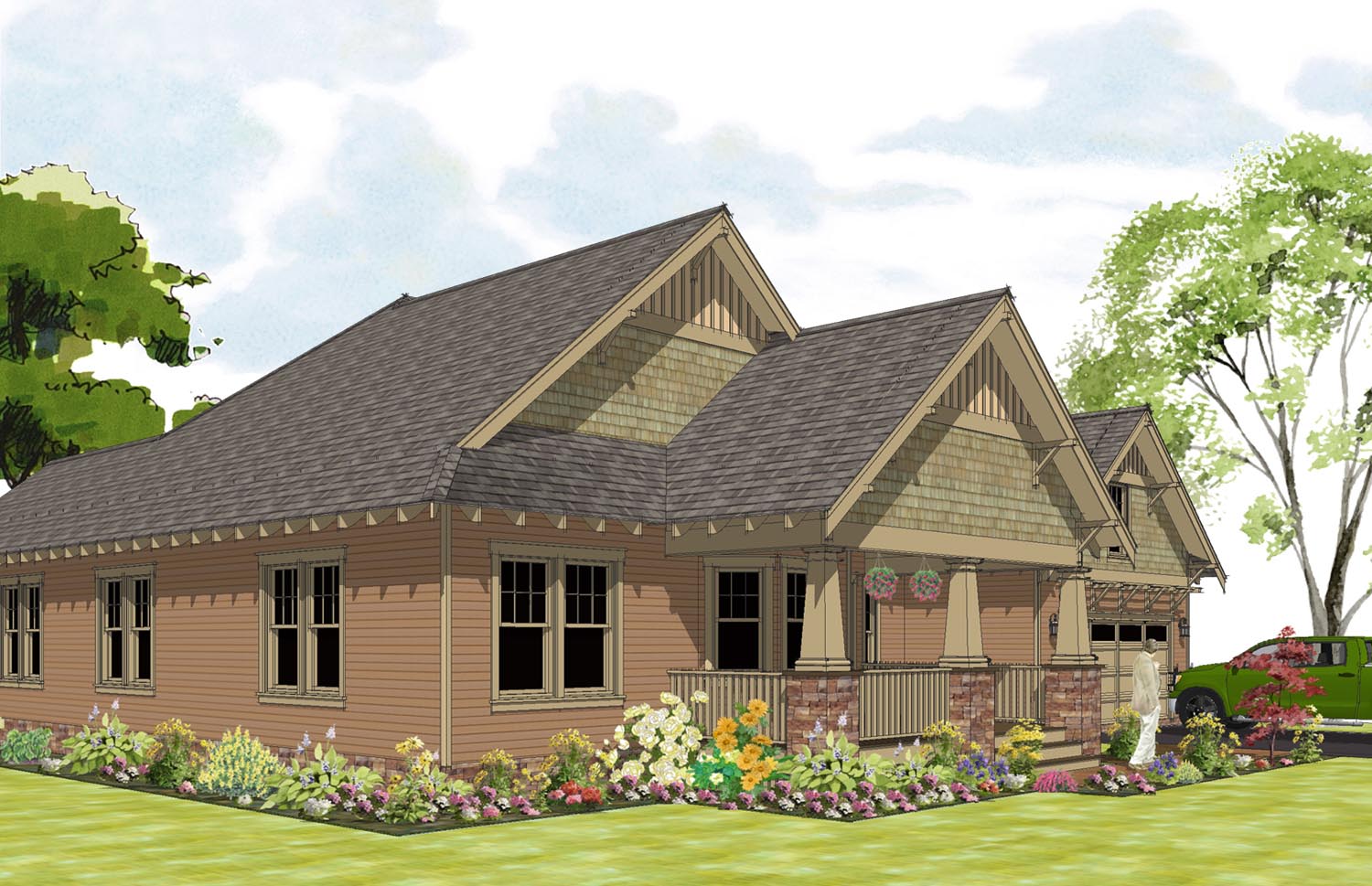
Perspective view using pretty much the same style/methods. Cropped the back off...big ugly deck with more foundation plants and this view is more of a front porch/entry garden study. Changed the line style up...I thought the sketchy pencil was too loose for a perspective. The foundation plantings may be a little over the top...the client is looking for a cottage garden look.
Although not as simple as the ortho projections, this is still pretty easy to produce during design development.
Feedback appreciated!
edit: Looking at the photo posted I need to rethink my cropping...it feels out of balance to me. Possibly include part of the deck to the left and less of the drive/tree to the right. I'll leave it for now and wait for C/C on this.[attachment=1:wcxrpji3]<!-- ia1 -->Gamble Final 8JULY10.png<!-- ia1 -->[/attachment:wcxrpji3][attachment=0:wcxrpji3]<!-- ia0 -->RSRD_9JULY10.png<!-- ia0 -->[/attachment:wcxrpji3]

-
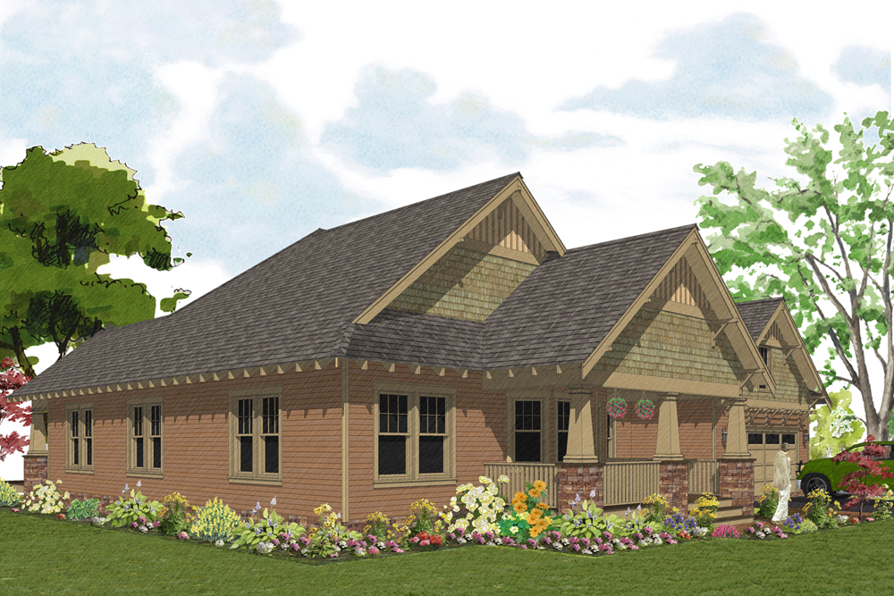
Here's my "final" submission...time to call it a weekend!
Thanks everyone for your suggestions, the advice has been very helpful.Robert
-
Hi, Robert -
Yep ... looks better to me! Have a great weekend!
Hello! It looks like you're interested in this conversation, but you don't have an account yet.
Getting fed up of having to scroll through the same posts each visit? When you register for an account, you'll always come back to exactly where you were before, and choose to be notified of new replies (either via email, or push notification). You'll also be able to save bookmarks and upvote posts to show your appreciation to other community members.
With your input, this post could be even better 💗
Register Login


Advertisement