sketchucation logo sketchucation
    • Login
    ℹ️ Licensed Extensions | FredoBatch, ElevationProfile, FredoSketch, LayOps, MatSim and Pic2Shape will require license from Sept 1st More Info

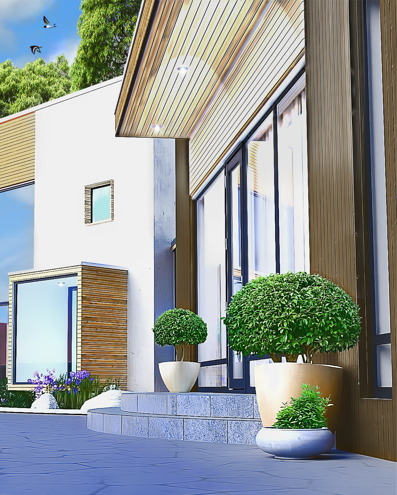
    Second picture; downing house

    Scheduled Pinned Locked Moved Gallery
    22 Posts 13 Posters 1.6k Views 13 Watching
    Loading More Posts
    • Oldest to Newest
    • Newest to Oldest
    • Most Votes
    Reply
    • Reply as topic
    Log in to reply
    This topic has been deleted. Only users with topic management privileges can see it.
    • F Offline
      flipya
      last edited by

      Cool style guys (Pugz' tropical house as well)!
      I wonder if this will evolve to your own signature-style 😄
      👍

      1 Reply Last reply Reply Quote 0
      • K Offline
        KarinaGM
        last edited by

        I absolutely love it. 😍
        And the best part of it, is definitely the composition and reframing (not sure if it is the correct word...)

        **"Aquel que sacrifica un poco de libertad por seguridad, no se merece ninguna y terminará perdiendo ambas"

        -Benjamín Franklin.**

        1 Reply Last reply Reply Quote 0
        • Bryan KB Offline
          Bryan K
          last edited by

          That is a great style and reminds me of some famous illustrator whose name escapes me, but whom I really admire.

          See my portfolio at https://delphiscousin.blogspot.com/

          1 Reply Last reply Reply Quote 0
          • S Offline
            sketchnl
            last edited by

            Hi guys,

            This is a second render from another view. It's hard to create the same style. 😲 but I'm very close to it, 😕 hopefully.


            downing 1111 copy 2.jpg

            http://www.sketchimpressions.nl

            1 Reply Last reply Reply Quote 0
            • soloS Offline
              solo
              last edited by

              Jeremy, it is close but lacks the vibrance of the original, maybe it's a little too saturated and sharpened.

              http://www.solos-art.com

              If you see a toilet in your dreams do not use it.

              1 Reply Last reply Reply Quote 0
              • daleD Offline
                dale
                last edited by

                Well I have to join the chorus. Great illustration style on the first image. I tend to agree with Solo though the last one looks a little over saturated. The clarity and sharpness of the first image gets lost.
                Great work .

                Just monkeying around....like Monsanto

                1 Reply Last reply Reply Quote 0
                • F Offline
                  flipya
                  last edited by

                  I like this one even better. It's a more subtle effect than the first one 👍

                  Great composition on both images btw!

                  1 Reply Last reply Reply Quote 0
                  • S Offline
                    sketchnl
                    last edited by

                    @solo said:

                    Jeremy, it is close but lacks the vibrance of the original, maybe it's a little too saturated and sharpened.

                    Pete & Dale,

                    Thanks for the comment. I'll give it another go. maybe more plants and vases.

                    http://www.sketchimpressions.nl

                    1 Reply Last reply Reply Quote 0
                    • pyrolunaP Offline
                      pyroluna
                      last edited by

                      must say though.... it doesn't look very Dutch!

                      1 Reply Last reply Reply Quote 0
                      • S Offline
                        sketchnl
                        last edited by

                        @unknownuser said:

                        must say though.... it doesn't look very Dutch!

                        What does it look like?

                        http://www.sketchimpressions.nl

                        1 Reply Last reply Reply Quote 0
                        • J Offline
                          joppermann
                          last edited by

                          I'm with everyone on the second one. It's close but missing some of the magic of the first. Don't get me wrong it's still beautiful...just missing something.

                          Oh...and the ground material looks alittle flat. Needs a little variation between the grout and the pavers.

                          Keep em coming! I love seeing these.

                          1 Reply Last reply Reply Quote 0
                          • pyrolunaP Offline
                            pyroluna
                            last edited by

                            I'd say mediterranean...

                            1 Reply Last reply Reply Quote 0
                            • 1
                            • 2
                            • 1 / 2
                            • First post
                              Last post
                            Buy SketchPlus
                            Buy SUbD
                            Buy WrapR
                            Buy eBook
                            Buy Modelur
                            Buy Vertex Tools
                            Buy SketchCuisine
                            Buy FormFonts

                            Advertisement