Cinema
-
Hey!
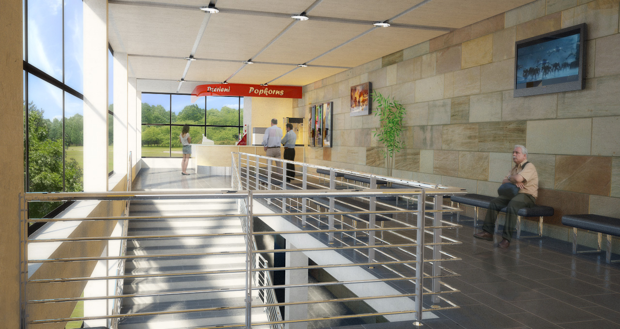
I have been working on my school project for the past few months and finaly it's done. The assingnment was more oriented around the draftings but as I had a lot time on my hands I figured to go further

-
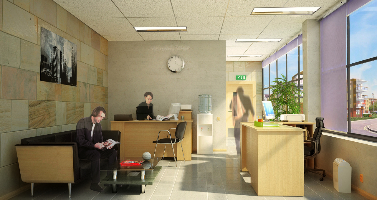
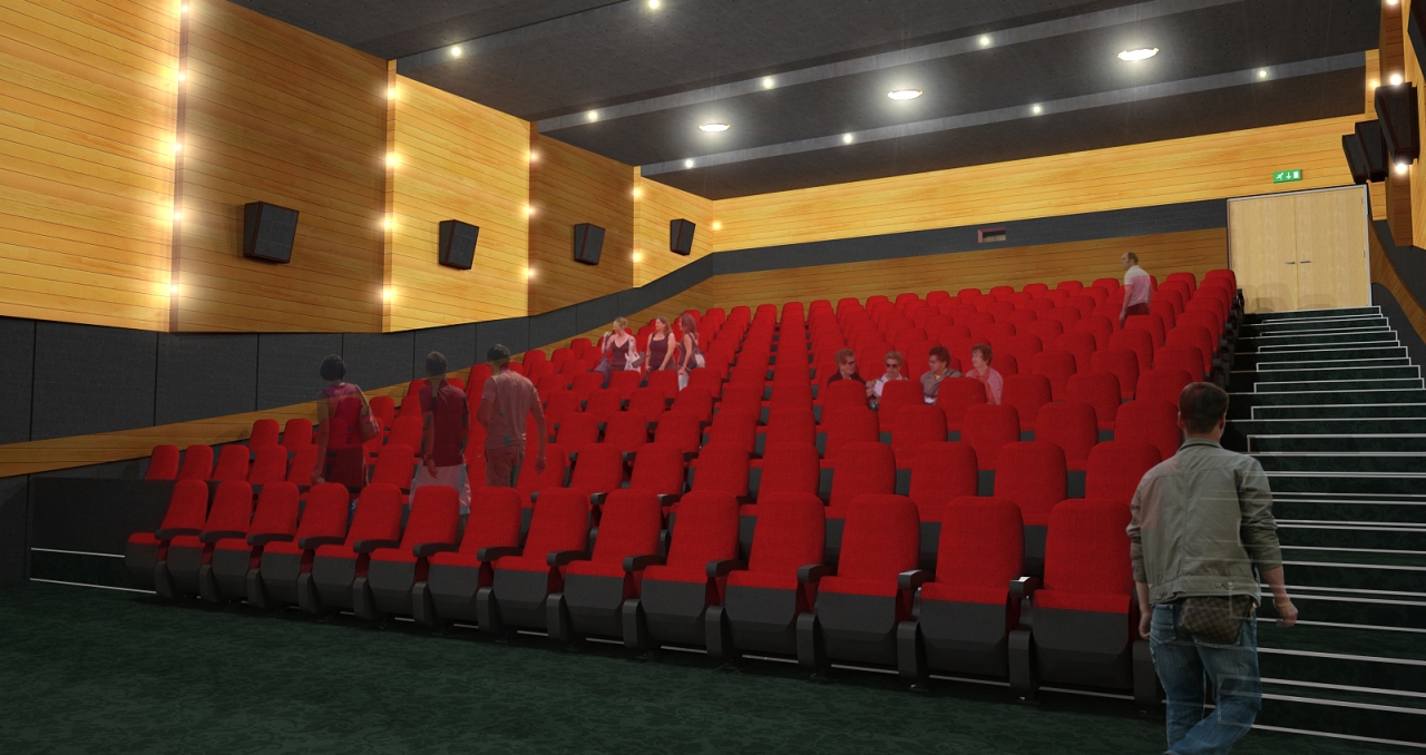
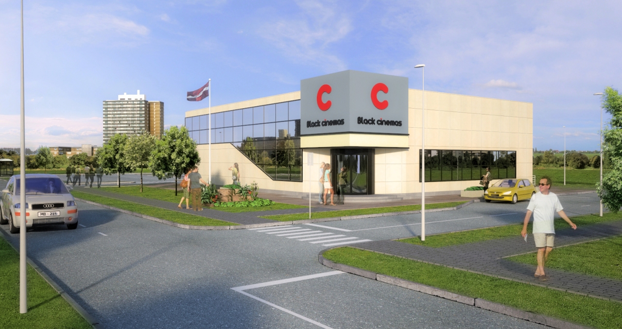
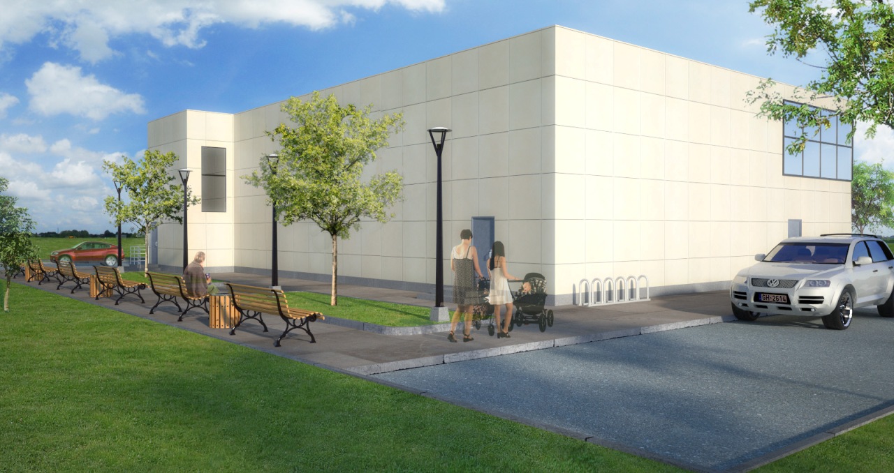
Those look great, Speaker. Although, personally, the semi-transparent people don't work for me.
-
Cool renders, I like the streaming sunlight in the first one. I understand the transparent people as more of an architectural flourish and see it used often.
If the people were solid, you may look at them more than at the architecture, which is supposed to be the star of the show.
Pretty nice.
TBG
-
dont worry about what people say about the translucent entourage. its purely a matter of opinion. no matter if you have silhouettes, ghosts or opaque people someone will always have a problem with it. if it works for you.....and your client can comprehend the movement and scale then the entourage has done its job.
love the internals.

-
Great attention to detail and lively well lit and well textured renders. My only comment(and I only mention it because you have been so very detailed) the recessed flourescent lights and the ceiling grid need to be lined up better.
-
Thanks for the coments!
I hadn't tried to use cutout people before, so I'm still on the way to figure how they look best. For these scenes I wanted them to be there but also merge with the background a bit with the semi-transparency.
-
Really nice renders...

I agree 110% with Oli and I actually like the semi-tranparent people in these renders...What render application did you use...??
-
Beautiful images, congrats...

-
I find that non-architects/designers have problems with anything other than photo-realistic people in a photo-realistic render. They tend to focus on the people and not the building with comments such as "why are there ghosts in the building?"
I personally like the white or grey silhouette people (solid or transparent) but stopped using them because of this.
-
I see your point. Had such a question from someone just today when I gave in my work, but most of peaple liked it, so I don't care

Rendered with Vray, PP with photoshop
-
Excellent. (I'm running out of adjectives, here)

Hello! It looks like you're interested in this conversation, but you don't have an account yet.
Getting fed up of having to scroll through the same posts each visit? When you register for an account, you'll always come back to exactly where you were before, and choose to be notified of new replies (either via email, or push notification). You'll also be able to save bookmarks and upvote posts to show your appreciation to other community members.
With your input, this post could be even better 💗
Register LoginAdvertisement


