Twilight Render - Regas Challenge
-
@olishea said:
OK i reduced the motion blur very slightly and reposted, i think it looks more realistic...
I really did not mean to cause such a big problem with my comment!

(But indeed it looks better to me at least now)
-
@unknownuser said:
nooo! its dirty and raw! well it was supposed to be!

Well I meant that the whole image looks very clean to me (it has the peaceful mood of a limpid twilight
 ), but, don't worry, the concrete is really veeeerrrryyyy dirty and raw...
-
@unknownuser said:
Oli, great lighting and the grass looks awesome
Pete, off-white omni lights for the interior. emitters to the exterior lights. + dosch sky probe set 0.2 brightness.
Grass is from the twilight render forum....dodged and burnt in photoshop. and thanks for your kind words, means a lot coming from the master.
@unknownuser said:
personally I do not care much for people in an archvis scene, I think they distract from the scene, I have noticed many artists use fast people (blurry motion)..no offense but I do not like it.
You are absolutely entitled to this opinion. I prefer not to complicate a scene too. I was, however, taught to include people to present a sense scale. Especially in section/elevation drawings. occasionally I think it works i suppose it depends on the scene. anyway, i like this guy. he's just been on a night out and he's staggering back home, ok?!
-
@unknownuser said:
i like this guy. he's just been on a night out and he's staggering back home, ok?!
Boy is he in for a sobbering surprise...he has been robbed, completely cleaned out, not a morsel of furniture left.

-
@unknownuser said:
I really did not mean to cause such a big problem with my comment!
lol it wasn't a problem. sometimes you need someone else to look at your work before you notice something is odd. so cheers


@unknownuser said:
but, don't worry, the concrete is really veeeerrrryyyy dirty and raw...
fantastic!! I posted the textures over at the twilight forum if anyone wants them.
@unknownuser said:
Boy is he in for a sobbering surprise...he has been robbed, completely cleaned out, not a morsel of furniture left.
minimalist!
-
Thanks for the maps and I agree with you: in this particular image the walking man seems to add something necessary to the scene.

-
Pretty cool render & nice post-pro.

I was thinking about render time whenever I see your post. (Reminds me of those long caustics hrs actually..esp with massimo around.)
Have you tried those stuffs in Thea? Just curious?
-
Great renders, Oli...!!

@olishea said:
sorry frederik, i changed the lighting in the model a bit. I like emitters!
No need to apologize...!

You are free to do whatever you want with this model... -
Oli,
i think the dude looks perfect in the render.
Usually i don't like people in the render, but if someone does it perfectly like you,
then it's nice to look at it and it enhances the picture... -
@solo said:
personally I do not care much for people in an archvis scene, I think they distract from the scene, I have noticed many artists use fast people (blurry motion)..no offense but I do not like it.
As a young architect, (in love with my work ha!, ha!) I drew most of my renderings without people. But in time I realized that unless my render has an way of communicating scale, the image would be lost on the client. Lots of people still have problems looking a perspective renderings and relating it to the actual product:-)
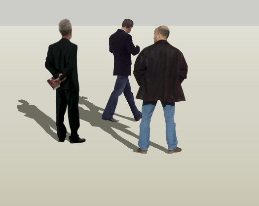
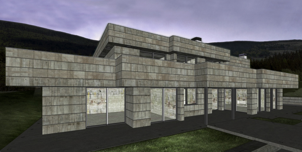
As nice as the render is, I would sometimes get a comment like "the concrete looks old", etc. Sigh. Btw Oli, I have that same face me people, but often have difficulty finding a place in my images for them. Of the attached I like the fellow with the book, but he's a little too old for most of my clients. Got to find better sources, with front views


-
Hey Oli, It's awesome!! Very clear render, and the lighting is just perfect...

Bravo...
-
thanks guys! comments always welcome! im glad you like the lighting Fred, very simple really.
I added an early morning shot to the original post, just different post process really.

-
Great images, Oli!

Regarding people, as another person mentioned, clients need them. Really... in fact, if they don't see people no matter how good the render most of my clients say "where are the people!? fill it up with people!!!"I think the motion blur is very appropriate considering the exposure time on the cam needed for this shot.
Wish there were a ladder, bucket, and some tools on the floor inside that made it look like he just bought the place and is coming to inspect the work progress before they come in the morning.

-
Thanks Gaieus, very kind of you!!
@unknownuser said:
am not very fond of these "hazed" (moving) people however but that may be a personal taste
yes its personal. I tried greyscale, colour and transparent but a moving figure suited this image better. I have found that 90% of architectural photos with people have emphasized motion blur. seems to add more life maybe, a kinaesthetic.
i added the SU view too....
and a version without the man (just for you gai!)
@unknownuser said:
Nice work Oli.
Thanks Eric, I think it's one of my better ones.

-
very interesting images...U did a very good job at making a fairly bare scene come to life. Congrats at accomplishing a lively scene without having to clutter it with accessories to bring it to life. The background you used is also very nice. Good work bud.
-
Cheers mateys!
@unknownuser said:
The background you used is also very nice
I have shared the background here if you like it. It is number 4 of 6:
http://forums.sketchucation.com/viewtopic.php?f=40&t=27540
@unknownuser said:
Wish there were a ladder, bucket, and some tools on the floor

@unknownuser said:
"where are the people!? fill it up with people!!!"
Man I've heard that one before!
-
i kinda dig the SU textures too.

-
I know Thea is amazing, but I do not need it. Twilight is more than enough for me. I would rather totally perfect my twi skills before moving onto anything else. [edit] i also prefer a totally integrated rendering solution. Twi's power lies in the ability to render hidden layers, so its possible to render massive models without slowing down sketchup.
I used unbiased interior + preset (as its a dark scene) and let it cook overnight. But a coupe of hours would have been enough (the resolution is around 2000 pixels wide, so its a quick render to be honest). There are about 10 omni lights for the interior and a several emitters (for the downlights and little LED ones),
sorry frederik, i changed the lighting in the model a bit. I like emitters!
24 inch, dual core imac, 2.8ghz, 4gb ram. Rendered via windows 7 via vmwarefusion. needless to say im waiting for the mac version

i would also kill for quad core

-
Hi Oli. I really like the early morning version. Maybe I'm not up to speed but what is the Regas Challenge?
As for people motion blurr etc, have you seen Iain Denby's work. He put's that to great effect and I think it adds a huge amount to an image. Especially exteriors. For me Architecture is as much about the use as the form. I'd have a party in full swing inside and this guy is a late arrival.
Really good work Oli.
-
@landie said:
Maybe I'm not up to speed but what is the Regas Challenge?
If only you had taken a few minutes to read the first post of this thread...

@olishea said:
Download the original model here:
http://twilightrender.com/phpBB3/viewtopic.php?f=13&t=1461
Hello! It looks like you're interested in this conversation, but you don't have an account yet.
Getting fed up of having to scroll through the same posts each visit? When you register for an account, you'll always come back to exactly where you were before, and choose to be notified of new replies (either via email, or push notification). You'll also be able to save bookmarks and upvote posts to show your appreciation to other community members.
With your input, this post could be even better 💗
Register LoginAdvertisement


