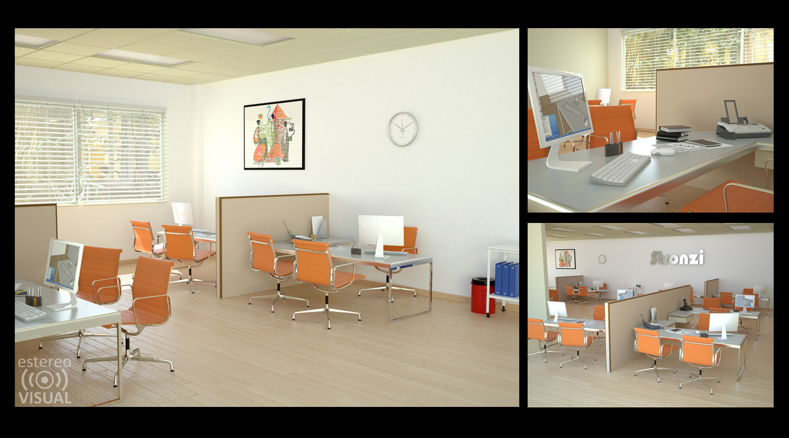
An Office
-
Charles and Ray Eames aluminum collection is fantastic.
i absolutely love the orange color.

-
Beautiful render!
 Great colors!
 -
@nektares said:
Charles and Ray Eames aluminum collection is fantastic.
i absolutely love the orange color.
[attachment=0:1ww6hq2l]<!-- ia0 -->office_SCF.jpg<!-- ia0 -->[/attachment:1ww6hq2l]Eames is 'classic' !

Well done. -
As usual you don't disappoint nektares. A beautiful job. Did you model all the furniture yourself - the chair frames are fantastic. Very well done!!


-
Well done.
-
I like the illumination of the scene, and the render and the models.
Just something bothers me in the first image... My eye wants to see more to the left and finds the right a bit empty. -
As usual - perfect

Keep posting. -
Cool office..., nice render...

-
Thanks Artysmedia, TIG and Boofredlay.
Dermot: Thank you! i modeled the tables only, chairs are from evermotion i believe.
that´s why they are so well done n_n.
KarinaGM:
I never noticed that, i think indeed the camera could be improved.
jarynzlesa:
hehe thanks alot!
Frymoro:
Im very glad you liked it! -
Very nice renders.


Even I don't really like this idealistic softness of light that some very popular engines produce. It's not photoreal.
Real light is 'cruel' in most cases. But customers never like reality. -
you've definitely got a recognizable style.. all of your images have a similar 'feel' to them..... nice stuff.
-
@unknownuser said:
Even I don't really like this idealistic softness of light that some very popular engines produce. It's not photo-real.
Real light is 'cruel' in most cases. But customers never like reality
.As much as I understand what you are saying and agree that reality is never as pretty, the point IMO of a render is to sell a product/concept. Sometimes one can "fake" additional subtleties and still be photo-real.
Nektares has some awesome recent renders that certainly does sell the product.
-
I agree pete, these are good renders, not easy to do it. But real or photo real is something else. New render engines are coming. And the need of better modelers is obvious. More details, more vertices etc etc. This comment is for our 'hobby' here. Its not about 'real' reality lol.
These renders are beautiful, once again.
-
What is real? A photo is not real, it is a 2d image of reality. IMO all images are representations of reality, so architectural or any other illustration is to represent a notion as a image in a manner that conveys the final thing


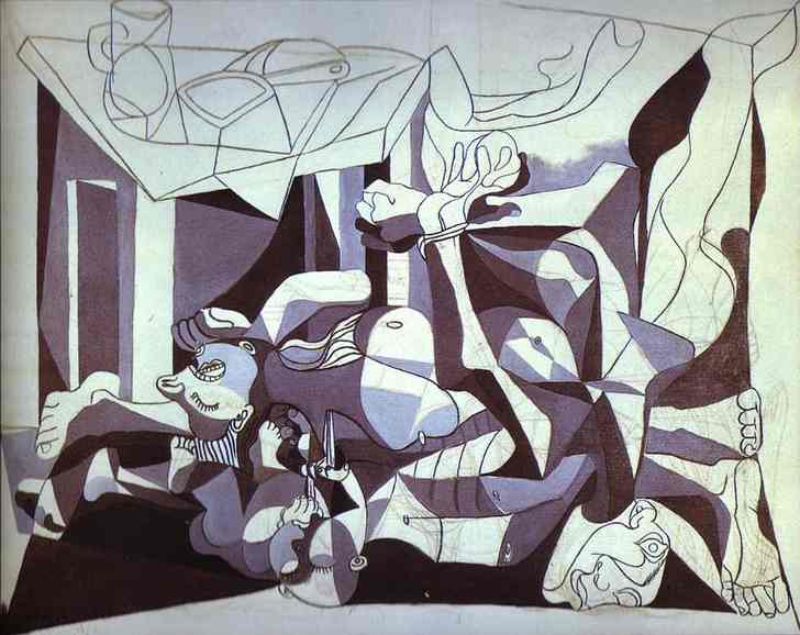
Picasso "The Charnel House"

I failed to find a realistic oil painting of a house, so.....
[flash=640,385:3ewsd71n]http://www.youtube.com/v/DKf5jRCxCD4&color1=0xb1b1b1&color2=0xcfcfcf&hl=en_US&feature=player_embedded&fs=1[/flash:3ewsd71n]
Or this...... -
I really understand your point honoluludesktop.
I love the picasso's painting. Its funny because I wrote something similar in another thread here. Its the modeling that makes the difference not the renderer. Renderer is a trick, a good one. Its in the second page of this one: http://forums.sketchucation.com/viewtopic.php?f=81&t=27515
"I failed to find a realistic oil painting of a house" You could try 'Ver meer' or 'Edward Hopper' or why not, some frames of this one: http://en.wikipedia.org/wiki/Whisper_of_the_Heart_(film
Have you seen this japan, studio ghibli animation? A Hayao Miyazaki and Isao Takahata film. -
michaliszissiou:
Light travels at 299,792,458 meters per second its fast and it may be cruel sometimes but, i love light. And i really don´t know much about reality, ¿what is reality? our brain tells us what is real, in a dream we can touch something and "really" feel like we are touching it, people listen voices in their heads that tell them to do crazy things, and the do them because they believe that´s what is real, reality depends on the perception of every person, so we are, in fact, living different realities, but sharing one since we are all connected (or not), since we are not solids and are just sticked because of the electromagnetic force and gravity and all those universal laws. I think we are all living a dream, and transform reality so we like it better.
As Solo says, we have to make them look pretty, a render delivers perfectly the idea, in the old school they used watercolors, pastels and pencils, sometimes ink, and if it transmitted the idea, they were all right, now that we have this amazing tools, is just a question of our wish to always be better at something, the need of even more real images every time, so yes, they are fake, but they deliver this idea of space and colors, that in my humble opinion is what matters the most n_n.About the models, i LOVE modeling as well, but i think everything is important, specially textures and light, an excellent model could be easily ruined by a crappy texture and a poor light configuration, of course is easier to make a good model look good, and it´s also inspiring, i´m working on something pretty big right now
 modeling every single thing of it. I don´t know when i will have time to finish it, i hope you like it
honoluludesktop:
Our points of view are very alike n_nmarked001:
Thanks! i really appreciate your comments! -
yes, agree with Pete, clients don't actually want photorealistic, they want photoartistic.
I have shown a client a super-photorealistic image, and they hated it. I turned it into a pretty digi-water color and they loved it.
 I had one prefer the sketchup over photorealistic. While others, love the photo-artistic where it may make it prettier than it actually would be, but they don't want 'real'... that's pretty certain.
-
I am totally agree with Pete and Fletch, Photo realistic renders are good for some kind of stuff, but in architecture, interior design, and especially refurbishment (what I am doing), If I show a photo realistic render, the result on site, will never match the render, not worse nor better, but just different.
So the best way for me is a more artistic render as Fletch and a great sample board...
When I was in Vietnam working in architecture an Interior design, the staff there always used 3ds max and Vray, it is true that they done really really nice renders, but when I was on building sites to followed the projects, It was really hard to match the original renders as the clients thought the their house or projects should be matching the originally renders....
-
So, I only agree with all of you, its an interesting subject of discussion.
The art of making a renderer.
In my point of view, vray for example is really good on rendering plain colored walls, not textured, yet magically 'photoreal'. This makes things easy. 'Real' photo-real renderers need huge detailed models, large texture maps (not tailed as possible), a sophisticated and complicated way for lights, even so, some clever hidden lighting solutions.
In every case, rendering looks as another way of painting.
I may spoiled this thread, its that nektares is a talented man, great renders always, it was an opportunity for me to express some ideas about render engines. I always love to see perspective (wide angle) distortion but for this kind of presentation it seems to be problematic... -
Light is one of those things that drive me mad when rendering... I figure I have to play with it a bit more.
Nektares, just a question... is "Stronzi" the name of your client?
Hello! It looks like you're interested in this conversation, but you don't have an account yet.
Getting fed up of having to scroll through the same posts each visit? When you register for an account, you'll always come back to exactly where you were before, and choose to be notified of new replies (either via email, or push notification). You'll also be able to save bookmarks and upvote posts to show your appreciation to other community members.
With your input, this post could be even better 💗
Register LoginAdvertisement


