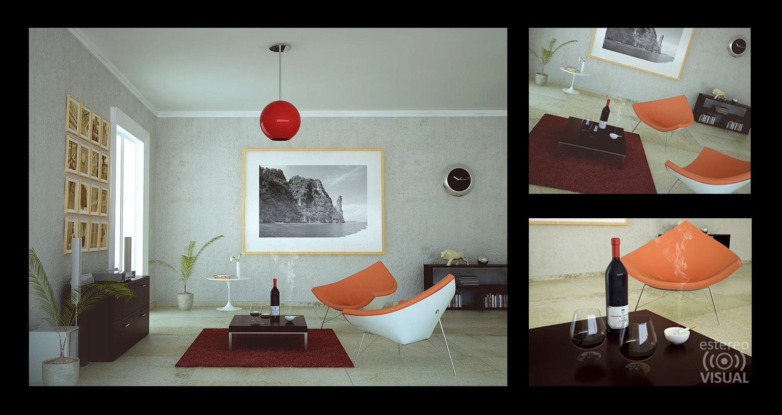
50's Living Room
-


-
Wow, pretty cool image, back to 50's...

-
@john.warburton said:
@3eighty said:
I remember we used to look at pictures like that in Playboy and say.."Right, who lives like that"?

THAT is what you thought when you looked at the pictures in Playboy...?

Ah.. beats getting your thrills from the old National Geographics

Great feel, I swear I've been there.
-
dermotcoll:
Thanks! im glad you liked it.3eighty:

KarinaGM:
yes, the plants are 3D and thanks.
I know its a bit hard to see u mean
its too rough, but i took a chance n_n
yes it´s a brush from PS you have an eye ...
john.warburton


Stikie:
Thanks!!Stefanq:
ThankYou!fymoro:
Thanks mate! i Love the 50'sdale:
ThankYou, i think we are living a dream.. so perhaps you have been there!
-
very very nice!
although I can only suggest to play with the levels in photoshop. it seems quite flat at the moment, you have lost the highlights and deep shadows. maybe I'm wrong but it looks a little 'grey'
-
picture says a thousand words!!
I only made very slight changes to the levels. I hope you do not mind.
up the whites
lower the blacks/midtones

-
Olishea:
Thank you!
yes! i can tell you why it looks flat, first of all
the marble floor makes it look flat because the reflection
es very low, so the depth feeling those reflections cause
cannot be seen, the light is very important too, you see
there is no angle in that lighting, its like 12:00 pm light
so it bounces oddly, this was a test i did to see if i could
light up a room with a very little light source.
you can see the example in this shere, only 2 windows.

-
haha! that looks much better indeed! thanks Olishea.
-
i thought it was intentionally flat to get that feeling you get with old, washed out photographs....haha.
looks awesome.
-
hahahaha oh oh yeah.. that was what i wanted

completely intentional
thanks Marked001
-
Great render...
but "50s" ?
I was there... it looks more like very trendy early 60s.
Just because someone made a chair in the late 50s it doesn't mean it filtered down to anyone else for a good few years...
History ! Some of us lived there...
-
I was born more than 30 years later

it´s a bit hard to tell the difference to me.
I think the best furniture was designed between
50's and 70's im glad you liked it despite of its
style mistakes n_n.
By the way, your scripts and plug-ins are amazing and they make me happy. -
No criticism intended - just praise...
Trying to set history a bit straighter...
-
@tig said:
Great render...
but "50s" ?
I was there... it looks more like very trendy early 60s.
Just because someone made a chair in the late 50s it doesn't mean it filtered down to anyone else for a good few years...
History ! Some of us lived there...
Have to agree! Looks actually a tad later sixties! Though then that would have been a big fat scooby burning and not a cigarette!
The references to Playboy brings back memories of when I was about 13 - there was a second hand bookshop around the corner that was happy to sell me second hand porn mags for 40cents then I could take them back and as long as I hadn't stuck the pages together, get a 20cent refund and put that toward another! Ah the days of unlimited age to buy stuff!!
-
I know "if you remember the sixties you weren't there"... but I do - then again I was young enough not to be completely zonked through most of that decade...

-
60's... what 60's

But I suppose if it was the 50's that would have been a bottle of whiskey, at least out here in the colonies.
-
very nice render , i like your works , how you doing for Lighted cigarette , can you sharing your nice scene with your visoft , juste to know your nice textures , lignt and render
-
What were you doing with the woodglue Richard???!!!!

-
-
Works well that Gel.

Hello! It looks like you're interested in this conversation, but you don't have an account yet.
Getting fed up of having to scroll through the same posts each visit? When you register for an account, you'll always come back to exactly where you were before, and choose to be notified of new replies (either via email, or push notification). You'll also be able to save bookmarks and upvote posts to show your appreciation to other community members.
With your input, this post could be even better 💗
Register LoginAdvertisement


