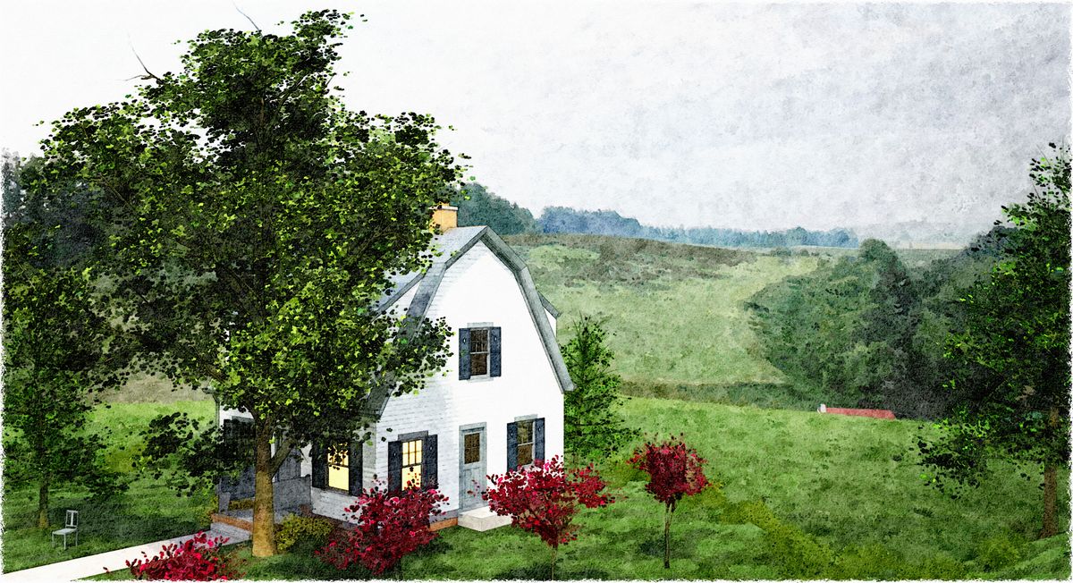
A couple new DWC's...
-
...in a little bit different style: some gritty C&C requested, please?
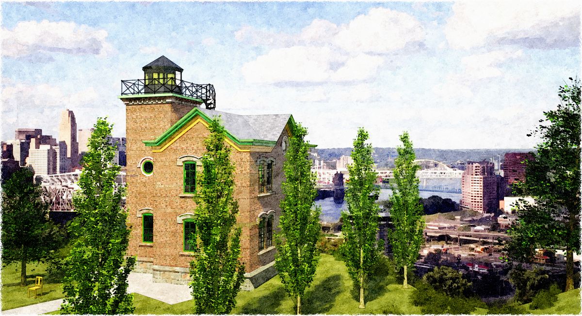
(BTW can you identify the city in the second one? :`)
-
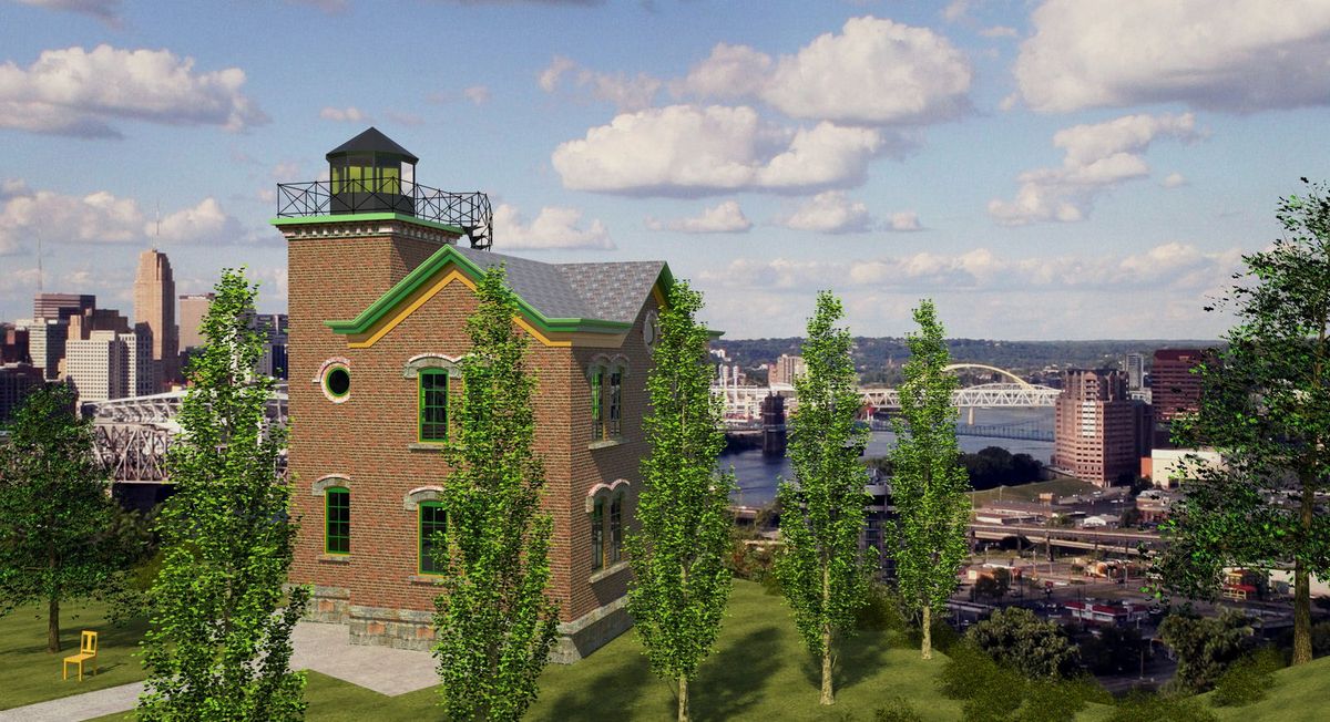
As you know, I really like this style of presentation, and both of these are well done, especially the second one..my comment on the first one is: what are you trying to portray, the home or the countryside? If it is an architectural render I would expect the home to be more prominent. In the second one, perhaps you could make the foreground trees more transparent to allow the foreground building to be seen better. Did you render the background as an HDRI or insert it in post?
-
I think they're both good but somehow like the first one better, don't know exactly why though. And the city, Pittsburgh?
Mike
-
Tom,
Lovely as usual - these both mix really well with the backgrounds. I too would like to know how you (or more appropriately when) you add these in. The only crit I have of the first one is that the style of house itself just doesn't seem to convince as a "country home". I think it is more fitting in the urban setting you had it in from your previous series.
The second one is very nicely integrated. My guess on the city is Cincinnati, and if this is an actual building - I would be curious to know the history? BTW - I really like the foreground trees in the second image - what collection are they in?
Regards,
Dean -
Hi Tom,
Haven't posted in a while (me that is not you) but these just required a comment. They're truly beautiful.
My only comment, a minor one, is that the trees are too repetitive which isn't natural.
Other than that, they're terrific.
Inspiring,
Allen
-
First off, thanks for all the kind comments and interesting crits...very helpful: I was thinking I'm finally on the way to something, glad to hear it's not just me.
Dean, you win! Cincy's the city...pick up your prize (those foreground trees) here: http://forums.sketchucation.com/viewtopic.php?f=40&t=26618
Allen, please explain "repetitive"...I really want to understand this, thanks.
I'm seein' the comments about the cottage not really being rural, and the focus not being obvious: 'cause it's true...afraid I was just throwing together stuff I'd built to see how the new trees and new spherical skys work and work together, plus practicing the technique. The real focus for me, I guess, was the integration...?
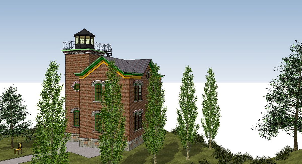
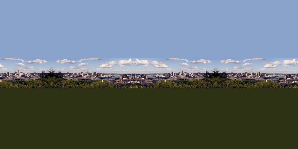
Here's how the last one was built:

-
Tom,
Cool - thanks for the link! I missed these somehow. The explanation of how you set the last one up is great. I would say the integration of the trees and the spherical skies in the DWC style are just great! Twilight does such a great job with light and tone balance that it is IMHO an invaluable tool for NPR work.
Thanks agaion for the trees and keep up the great work!!!!
-
love the second image from the original post...always a pleasure to see your various styles my friend
-
Hi Tom,
Sorry for the delayed response. By repetitive I mean that the trees of a species appear to be identical one after the other of if different too subtle a difference. So they appear cloned and therefore un-natural.
Small point but when you exist in your rarified layer of great work I thought it worth mentioning. For me I'd be happy to do half as good.
Enjoy the weekend,
Allen
Hello! It looks like you're interested in this conversation, but you don't have an account yet.
Getting fed up of having to scroll through the same posts each visit? When you register for an account, you'll always come back to exactly where you were before, and choose to be notified of new replies (either via email, or push notification). You'll also be able to save bookmarks and upvote posts to show your appreciation to other community members.
With your input, this post could be even better 💗
Register LoginAdvertisement


