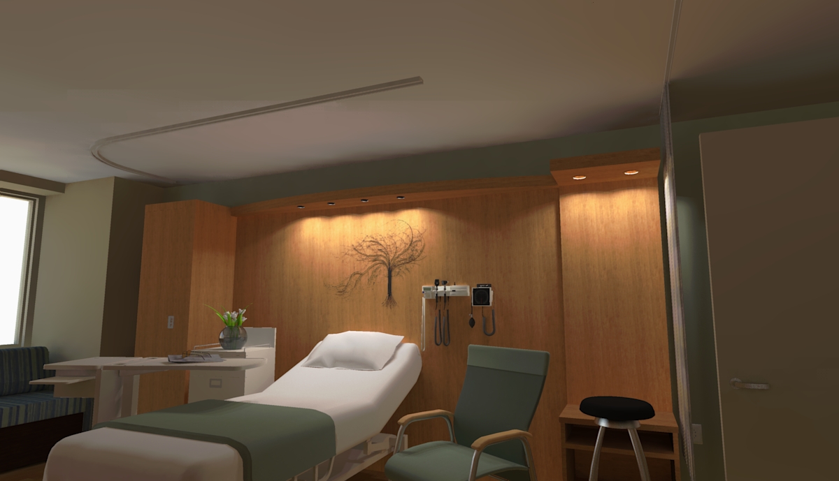
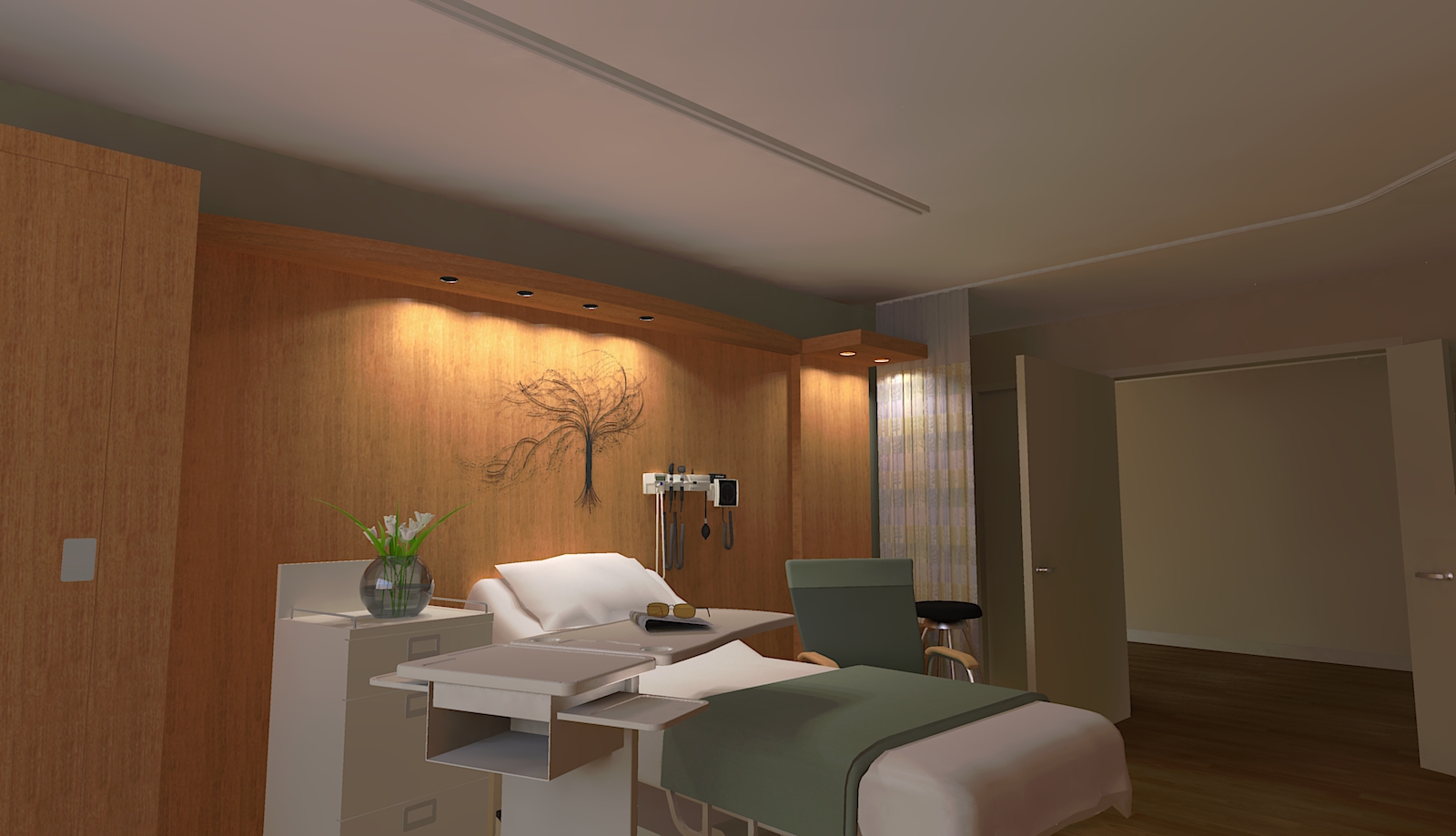
Hospital room render
-
A quick modeling job and render for a design firm. Total time from CAD drawing to final render 8 hours. Comments welcome. I know the renders are not perfect. I have to say I am really hooked on twilight render. Extremely quick!!
Scott


-
Great work Scott, looks very comfortable
-
Scott - Really nice design and render. I like the looks of Twilight.
Having just gotten out of the hospital (broken leg + surgery
 ) I must say that I might have stayed an extra day in a room like that. Any word on the quality of food served there?
Jim
-
Great job Scott.
-
Thanks for the kind words Guys. I have to say only having used Twilight once before I am extremely impressed with its quality, ease of use, and speed. I think I have found my new favorite little render engine with big power. Still need to learn the material editor but that should not take too long. Anyone know if there are any good tutorials showing materials being made (i.e. explanations of the settings within the editor)? My only wish for Twilight is displacement mapping. While bump mapping will cover most situations there is still the realistic feeling that you can not get without displacement for stone or a rug.
Scott
-
Very impressive! I can't believe it only took 8 hours!!! I have been using SU and all sorts of other programs to model and render for over 10 years and it still takes me ages to complete even a simple model- I would love to know the secret to how so many of you are able to accomplish magic in such little time.
One suggestion regarding the renders might be so show a wee bit less ceiling and a wee bit more room so it doesn't look like the camera is aimed too high.
Wonderful job. And Twilight rocks! Twilight for Mac????!!!!! -
Really no secrets here. I have been modeling for a long time and have used many different modeling packages. The nice thing with have a diverse background in modeling software is you pick up tricks that can be used in other software. Maybe not the exact same way but it opens your eyes to some options you may not have thought of. One trick I can tell you is that when modeling start with the basic form of an object. Don't start modeling the details right from the start. This way it is far easy to change the overall form and design without having to remodel time consuming details. If you have ever seen someone box model or even polygon model in a subsurface modeler they start with a very crude model to get their basic form locked in and then build the details. While Sketchup is not a subdivision modeler, you can still use the same principles. Don't over think what you are trying to build/model.
Scott
-
@unknownuser said:
Don't over think what you are trying to build/model.
ScottExcellent advice...that deserves a spot in the "Tips for beginners" thread.
-
very good Scott
that´s a good room ¡ -
Thanks Juan! This actually this was a fun one to work on as I had a lot of creative freedom. I am hoping to be doing some more for this client as the hospital is putting on a HUGE new wing.
-
great job and render ,mate


-
Thanks Majid!
I truly appreciate everybodys comments.
Scott
-
That's a rich person's hospital room! It looks way too comfy.

Nah, jokes, it looks awesome

-
The rooms in the hospital are really nice, not to mention the hospital is just huge. It is an ongoing construction site for the last 8-10 years. It started out fairly small as far as hospitals go now it is massive with multiple wings. And to think the hospital is still family owned!
Thank for the compliments.
Scott
-
Hi scottpara, looks awesome and great modelling as well.

Just thought a couple of issues with the sofa and the blankey and probably the twig above the bed is a little bit distracting.
Other than that the biased preset didn't really AA out that well.
Probably unbiased method would do better justice to the models.
But the long render time is a big drawback.
-
I agree. There are some elements that are too low poly and could use some work. Not too worried about time as I have a beast of a machine at work that flies. Might let this one cook unbiased overnight after tweaking a few issues. Still want to adjust the lighting too. I would like some more light through the windows.
-
Scott, this looks nice. If I were in a hospital room as a patient, I'd like to stay there.
As someone on the other side of the bed, so to speak, your headwall needs more stuff like O2 and Vacuum outlets, red electrical outlets, nurse call and phone connections. I like the tree on the wall but Infection Control wouldn't.

-
Dave,
I totally agree with you but was told to make it look "not so medical". I had alot of controls and such on the wall but was asked to take it out for now. It was either that piece of artwork or some ugly watercolor and that was not going to happen.
Scott
-
I understand that.
When the stuff does have to be put in, it'll probably end up located so that when the nurse raises the bed, they'll hit the O2 flowmeter or suction regulator and break it off at the outlet. Or worse, they'll just bend it so it can't be removed from the outlet without destroying it.

-
At first glance I thought it was a hotel room. I never thought a hospital can look that good and comfortable. We just need to put a small home theater to make the place more interesting for everybody. Indiana Heart Physicians
Hello! It looks like you're interested in this conversation, but you don't have an account yet.
Getting fed up of having to scroll through the same posts each visit? When you register for an account, you'll always come back to exactly where you were before, and choose to be notified of new replies (either via email, or push notification). You'll also be able to save bookmarks and upvote posts to show your appreciation to other community members.
With your input, this post could be even better 💗
Register LoginAdvertisement


