Funeral Home, Brasil [Podium render] - updated Dec 15
-
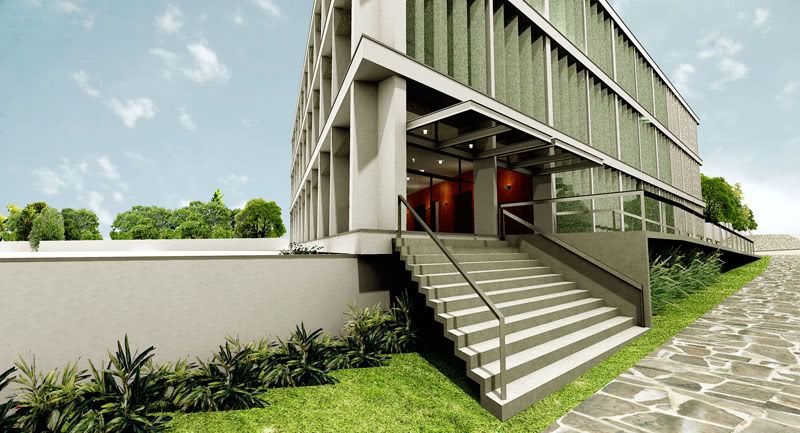
an unpleasant building type, for sure. this is a project i decided to do on my own, after having been twice within a month to one of the worst buildings i have seen. that funeral home was so degrading as a place to hold such important events that i decided to do a project to show they could have done something more decent in the same site. in spite of the subject, i am having great fun at designing and rendering it. enjoy it if you can.
-
Edson,
You must have been very happy with the outcome as I see you have used it as your Xmas card
 Do you have any plans or interiors?
Mike
-
yes, mike, i am and i have. plans and several other views will be posted here in the next few days.
since you were the only one to comment on it, don't you think people feel unconfortable with this kind of building and thus prefer not to post any comments? between here and the podium forum more than a 100 people viewed it but remained silent.
-
Looking great Edson, I like the design of the building as well, I'm looking forward to more renders!
Also, to give you my opinion about your question, I'm not feeling uncomfortable at all that it may be a funeral home
for posting comments, I actually think it's something quite interesting because you don't see that everyday.But I'm just a bit on the 'take it easy' side, I might visit a topic 3 times with great work in it before posting..

But besides everything, still great work! I might take a look at Podium in the near future, especially with version 2 coming out soon.
Cheers ;D
-
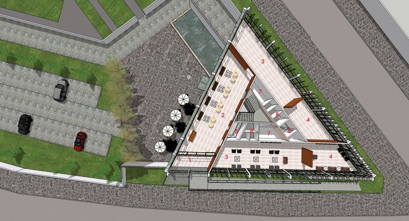
before i post any other images, a plan-like view. the main problem of the existing bldg is the fact that it is totally closed: no views out, no contact with nature. another one is the overlapping of public and service circulation.
i have used the same site – quite difficult to work with – and turned the plan inside out: there is a service core and all the public rooms have views out to the city below (it is on a hill). each level has a lounge and two chapels around the core. at the bottom level there is a cafeteria, administrative offices and the crematory (well hidden to view, of course).
it is bad enough to mourn a friend or relative; why must the place where this happens be gloomy and depressive on its own?
key:
- entrance; 2. lounge; 3-4. chapels; 5. social elevator; 6. service elevator with direct access to the chapels; 7. private room; 8. toilets; 9. lower level terrace and entrance from parking.
-
Thanks Edson. I can see why you said you found the building design challenging. The site (plot) would probably be more suited to a restaurant with city views! However I can now appreciate why you have enjoyed the work, you have come up with a good design solution and one that works very well. I would like to see what you have done with the other two levels?
While I enjoy seeing renders here, I get much more of a kick seeing the actual guts of a building and how things work. Buildings to me are partly machines and I like taking machines apart to see how they work. I think many of us here also enjoy taking things apart as its a great way of learning.
I am curious as to how you made the initial start! I remember designing a small school for the handicapped many years ago. The site (plot) like yours was triangular. This was back in 1973 and we had no computers in those days. My solution was to make a grid of 1m x 1m x 1m triangles and design the floor plan of the single story building on that. The modular designing process worked well and the building turned out to be a success, if a little unorthodox at the time.
-
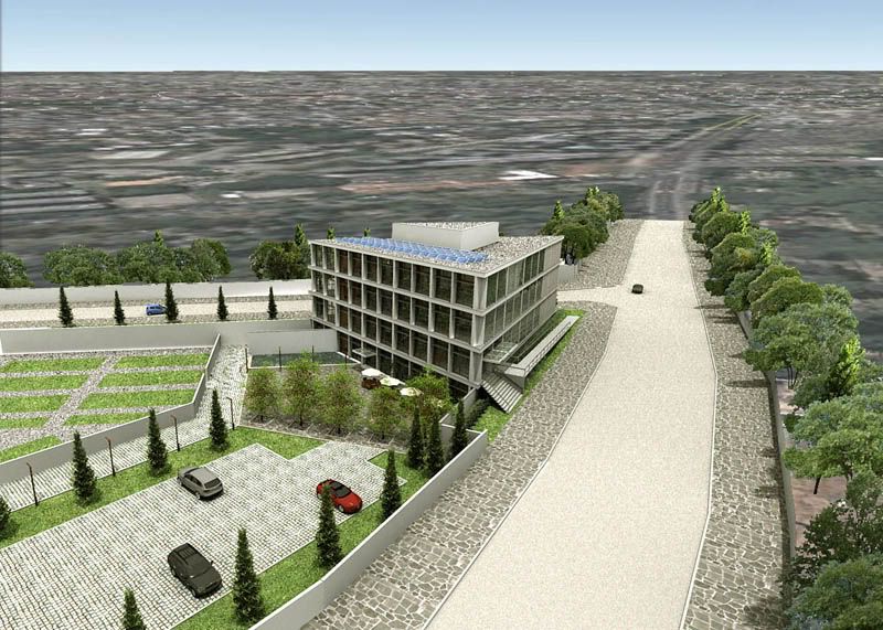
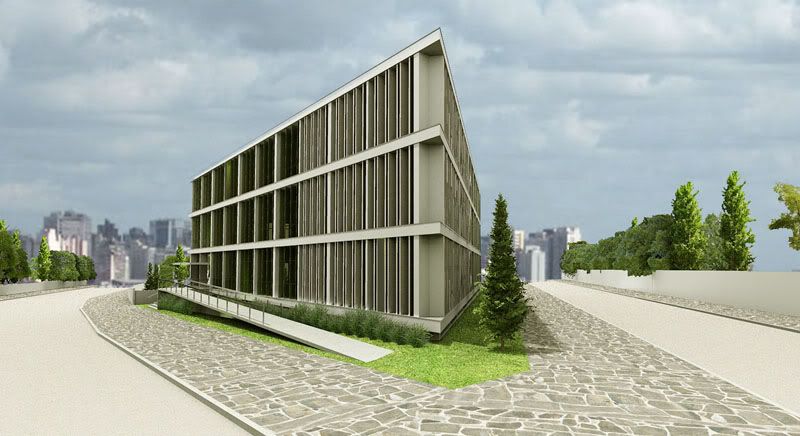
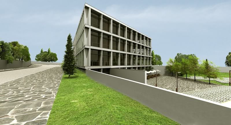
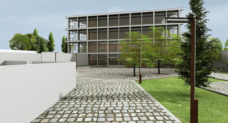
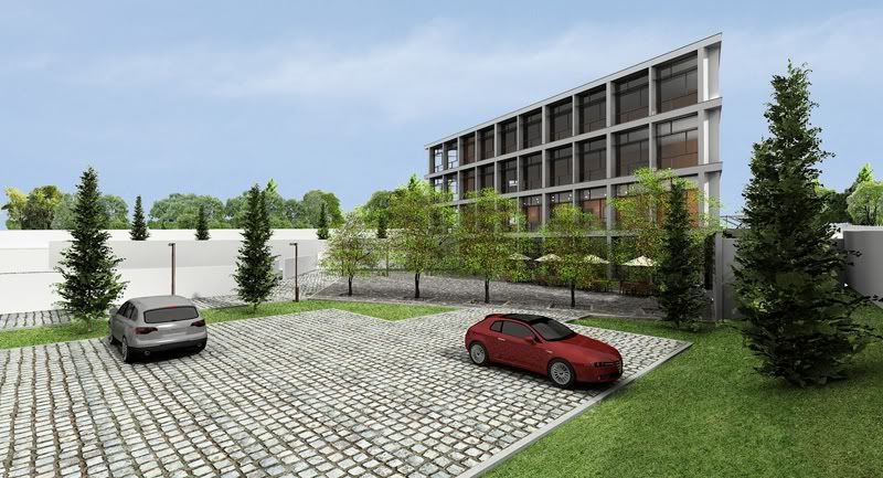
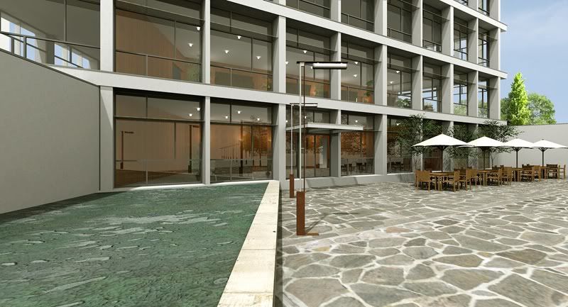
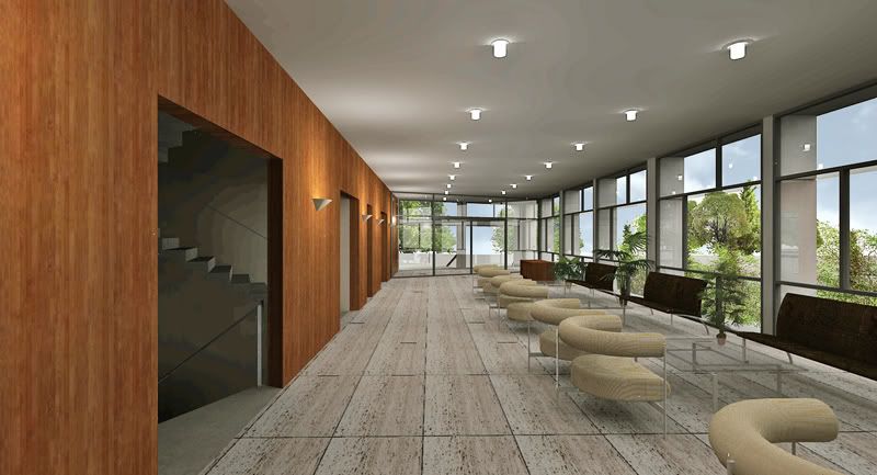
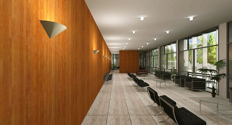
some more renders of this project.
-
Amazing design Edson

I don't have an Architectural background but find this approach to very refreshing. Here Funeral Homes are dark and morbid but this is open and welcoming.
Personally i don't find this subject uncomfortable and look forward to further posts. Thanks for sharing
-
Some very nice renders, I love the views where you can see interior lighting.

-
rich,
that was my intention: to make a building that would help people get through very difficult moments of their lives instead of exacerbating their pain.sid,
me too. i always feel unconfortable with renders in which one cannot see a little of the interiors.i am aware that some, if not all, of these renders could be better but as for me they are design tools i decided to stop at a point where thay are already believable.
Hello! It looks like you're interested in this conversation, but you don't have an account yet.
Getting fed up of having to scroll through the same posts each visit? When you register for an account, you'll always come back to exactly where you were before, and choose to be notified of new replies (either via email, or push notification). You'll also be able to save bookmarks and upvote posts to show your appreciation to other community members.
With your input, this post could be even better 💗
Register LoginAdvertisement


