I need major critiques
-
Hey all,
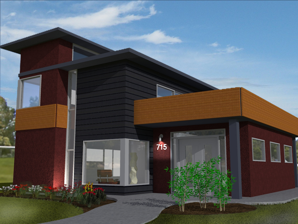
My latest render, straight from my brain to SU then to Kerkythea then to Photoshop.
Please be extremely critical, every bit helps.
Thank you,
-Will

-
Light on 715 is not very ecologic in the middle day

-
Materials are very flat and not realistic
Glass is not realistic
Camera angle and view is not complimentary to the structure. Try pulling the camera back and letting the environment play to the scene.Take some time to research GOOD architectural renderings and look at camera angles and the entourage the add. Research and reference photos are crucial when trying to put together a scene.
Some good advice I was given is that still imagery can at times be harder than an animation. An animation and the movement of a camera can help sell a product/scene/structure, where a still shot has to sell this in one or two views.
Scott
-
Hi!
Everything is too dark. Materials indead need some adjustments. Maybe try to change bump map of red wall. It looks more like a carpet to me or maybe colour is too dark - experiment is the key. I think backround image is too blurry because it is too close or maybe not.
Overall this is a good start now you just need to take Your materials one by one and make them look better.
PS. Maybe try to desaturate colour of green leaves at front plant. Otherwise they look too unnatural to me.
PPS. Waiting for improvements! Sorry for my english
-
I agree with all the points already mentioned above...
I wonder what material you've used for the windows...

It seem as if you've applied the sky and background in post pro, since the background is missing behind the windows in the livingroom...Do you know that in KT you can easily apply a sperical sky...??
There's a number of sperical backgrounds you can download from KT's website...Check page 26 - 28 in the Getting Started tutorial...

But overall - a nice start...

-
I don't know about you guys, but i like the render, the only thing i want ot tell you is to inscrease your render quality settings. Overall, the design and the render are pretty good.

-
Pretty good?with that plants and glass?
It's a good start but materials really need more work -
Uh..Sorry to inform you that Major Critiques is right now vacationing in Bahamas. I suggest you talk to Capt. Feed Bach instead.
Regards.lol..just a little joke...sorry couldn't resist that!

-

here's my crit:
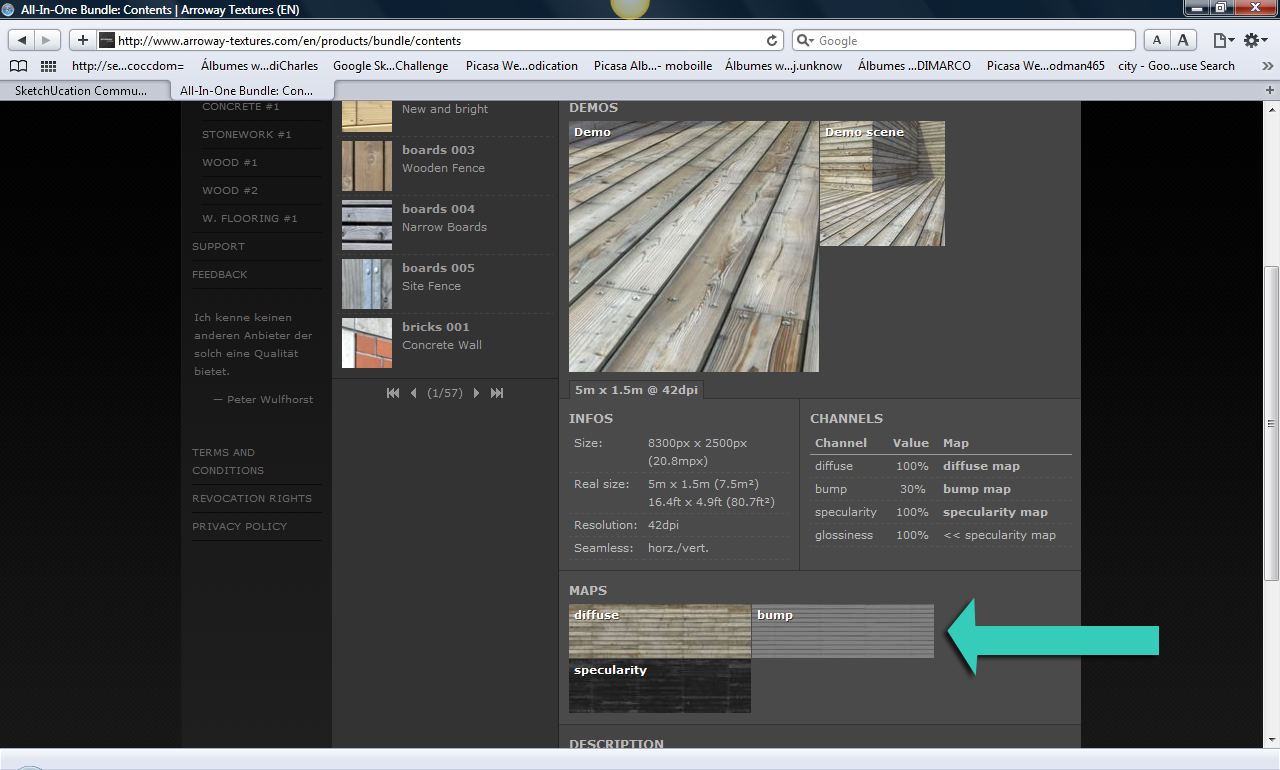
all the textures are a bit.. flat. a little more obvious bump map maybe, or better textures. There's a lot of free ones over at cg-textures or there are some low-res (sort of) free textures at arroway. Just go to the products section, and then go to the product that interests you. After that you'll be able to see a list of textures on the side view. There's a maps section at the bottom part of the texture description. Choose the diffuse map and you got yourself a free low-res arroway texture. see att.

Hello! It looks like you're interested in this conversation, but you don't have an account yet.
Getting fed up of having to scroll through the same posts each visit? When you register for an account, you'll always come back to exactly where you were before, and choose to be notified of new replies (either via email, or push notification). You'll also be able to save bookmarks and upvote posts to show your appreciation to other community members.
With your input, this post could be even better 💗
Register LoginAdvertisement


