Rendering Challenge - Bathroom sink
-
@tallbridgeguy said:
Thanks Gaieus, I was also wondering about making photo-realistic images. Is the goal the closest to "real" as possible or to make it interesting to the viewer? I tried having someone in the scene because I wanted it to look more like real life. (I know it doesn't)
A lot of the images on this site are fantastic but there never seems to be any "life" in them. I would like to see some more emphasis on rendering an image like a well thought out photograph, with people/dogs/etc...
thanks for the help!
SI suspect this could be a whole separate topic with lots of responses. I think there are a couple different reasons you don't see more "life." In arch-viz, which seems to predominate this sight, people are secondary as they tend to draw the eye away from the subject (ie. the architecture). Flipping through any given architecture magazine the only people you're bound to see are in the ads.
The other reason, I think, is that people are very hard to get right. This is a particular problem with SU which doesn't play well with lots of polygons. One photorealistic person can take longer than the rest of the modeling/texturing together. And if you don't get it just right it can detract from the rendering. Even if you do cutouts, I've seen a lot of fantastic renderings spoiled by badly integrated cutout people.
Typically for little side projects like a bathroom for SCF I don't both with people, but for my final renderings for work I almost always add some. I've used both the iClone people from the 3d Warehouse (which are pretty good so long as you don't get too close) and cutouts. The cutouts tend to separate the photoshoping men from the boys, so to speak (I'm probably at the adolescent stage). There are some great examples of cutouts integrated seamlessly into beautiful renders on this forum (Teofas having, figuratively, written the book imo) but they're far and few between.
-Brodie
-
Thanks Brodie, I just found it odd that the quality of the photorender is often more important than the subject matter. For example I design bridges and if I do a great photorender (ha!), the public will comment on the picture and not the bridge!
I guess I would like to see a topic where the subject matter is also addressed. Did the image "sell" you the design or is the photorender the dominant feature.
Thanks for the great feedback!
s
-
@earthmover said:
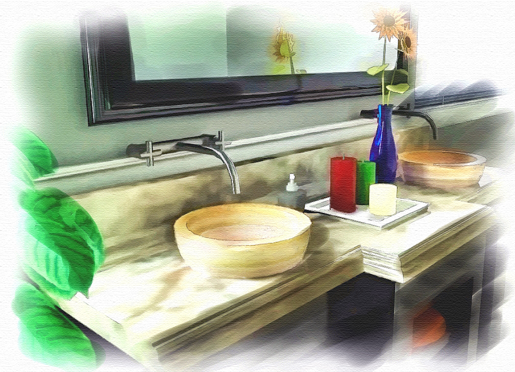
My NPR interpretation. Made with Corel Painter.
Nice - What did you take from SketchUp to Corel?
(Hidden line, full image, etc)
Any tips for us?
-
My NPR interpretation. Made with Fryrender & Corel Painter.
-
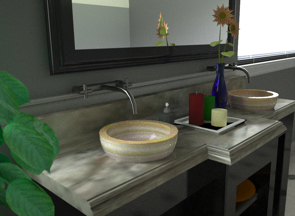
Al, it started as a quick and grainy unbiased render. Then I took it into Corel and worked at it with a couple different brushes and my Wacom Tablet. No real tricks...just doodled until I was semi-satisfied.
Here's the original render. Nothing too special.
-
@tallbridgeguy said:
Thanks Brodie, I just found it odd that the quality of the photorender is often more important than the subject matter. For example I design bridges and if I do a great photorender (ha!), the public will comment on the picture and not the bridge!
I guess I would like to see a topic where the subject matter is also addressed. Did the image "sell" you the design or is the photorender the dominant feature.
Thanks for the great feedback!
s
I think it all goes back your one of your original questions as to what the "point" is of the rendering. Much of what you see here on SCF is posted either to impress fellow renderer/modelers (90% of the kitchen renderings you see) or to get rendering/modeling advice from peers in the field. I think mostly where people get into what your talking about is with critiques on things such as lighting and camera position which can both liven up a dull rendering even if the dull rendering is plenty realistic.
-Brodie
-
@earthmover said:
Al, it started as a quick and grainy unbiased render. Then I took it into Corel and worked at it with a couple different brushes and my Wacom Tablet. No real tricks...just doodled until I was semi-satisfied.
Here's the original render. Nothing too special.
Thanks,
I saw a presentation by Jim Leggitt earlier this year where they started and ended with all kinds og things to make the NPR results. Such as coloring a hidden line drawing as well as modifying rendered drawings.
We have been trying to add "one button" aids for NPR Rendering - such as the option to overlay the rendering with Sketchy Edges - (there is a sample earlier in this thread). So I am always looking ideas of what people do in Photoshop, which could easily be added as a post-process to a renderer.
-
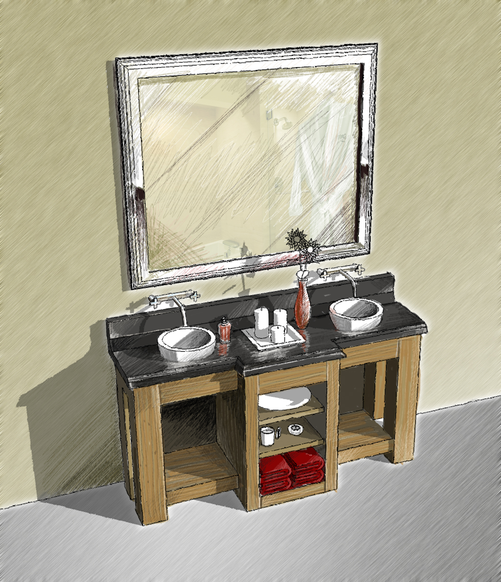
Heres My take on the challenge.
-
@rdluther said:
Heres My take on the challenge.
\Nice work.
Did you do everything in SketchUp.
Did you apply the pencil as materials, or as watermark overlay?
-
Nope I went for speed... output linework and shaddows as a JPEG a colored everything in photoshop in about 20min.
-
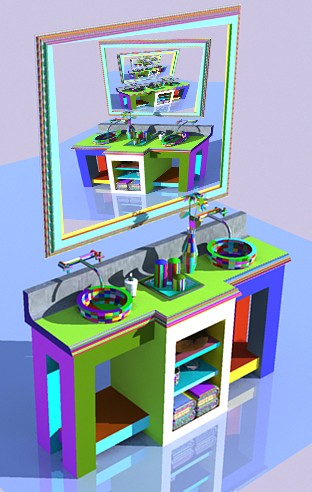
 (Click image if Scroll bar)
-
Nice,if that was my bathroom, I would be driven crazy.
-
This weeks Workshop was fun - I hope we all picked up some good ideas.
For the next workshop, I chose something a little more fun - cars.
Come check it out: Rendering Workshop - Model Cars
-
Pilou it matches your head! (avatar)

better check i think your material editor exploded!
-
For the sake of architecture ...

-
This thread is interesting for seeing the effect of different approaches. For PR I find I am looking more critically at the product, how the bowl looks, how the counter is finished. In the NPR I feel the impact of the overall concept is the focus and I am not concerned about the details so much. If the woman is in there, I tend to look at her. Anyway, funny, I find cars more boring than bathroom sinks. It has to do with my line of work, and I must be working too much.
-
-
@al hart said:
We all had a lot of fun with the Lego Rendering, so lets try something new.
Here is a 3D Warehouse model of a Bathroom Pedestal Sink:
Lets place it in a room and try some rendering ideas on it.
(It is OK to put other geometry into the room - but lets keep this a "Rendering Challenge" not a "Modelling challange")Hi Al Hart,
I like this 3D Warehouse Model. I love to try it. So tell me how can i get this to play?... -
7 years late to the party, man!
-
The same vanity/sink is found in this model:
3D Warehouse
3D Warehouse is a website of searchable, pre-made 3D models that works seamlessly with SketchUp.
(3dwarehouse.sketchup.com)
Hello! It looks like you're interested in this conversation, but you don't have an account yet.
Getting fed up of having to scroll through the same posts each visit? When you register for an account, you'll always come back to exactly where you were before, and choose to be notified of new replies (either via email, or push notification). You'll also be able to save bookmarks and upvote posts to show your appreciation to other community members.
With your input, this post could be even better 💗
Register LoginAdvertisement


