Rendering Challenge - Bathroom sink
-
We all had a lot of fun with the Lego Rendering, so lets try something new.
Here is a 3D Warehouse model of a Bath Room Sink:
Lets place it in a room and try some rendering ideas on it.
(It is OK to put other geometry into the room - but lets keep this a "Rendering Challenge" not a "Modelling challange") -
@olishea said:
BOOOOO!!

we want childish things to render!!

but yeah ok, I think we were getting a bit carried away!
If this catches on, I'll pick something childish next week.
Also, other people could suggest things.
What I had in mind for this was that we would take existing models, and show what we could do to them, Al lot of rendering contests run by vendors (us included), are often influenced by a really neat model. It will be interesting to see what we can do if we all start with the same model, and apply different techniques. This is not a contest to see who has the best rendering engine - but rather to see who knows how to use the one they have the best - including SketchUp itself, Photoshop, etc.
-
@jwlyon1 said:
It just has to be required that you crazy render people tell us non-render people what you are using to render!! Of course some other vitals would be nice too: render time, biased/unbiased (when it's an option), textured in renderer or in sketchup, etc.
I desperately want to make the plunge, but with so many options, a thread like this gives a good comparison.
That's fair - lets mention the renders used and the features used so that people not yet using external rendering engines can learn more from the presentation. (However, jwlyon1, remember that you can do almost everything you see in the image from one renderer in the other renderers. Often it is the visual design abilities, the creativeness and the talent of the operator which is creating the good images - not necessarily fundamental qualities of the renderers. - But you will see which renderers are available, at, (at least from the users of this forum), what rendering engines are in use by SketchUp users.
Also, go ahead and ask questions about the rendering you like. It would add too much detail to each posting if the artist had to explaing everything that was going on. I think we would appreciate comments like "That floor looks good - how did you do it?"
-
Here's one with a chipboard overlay:
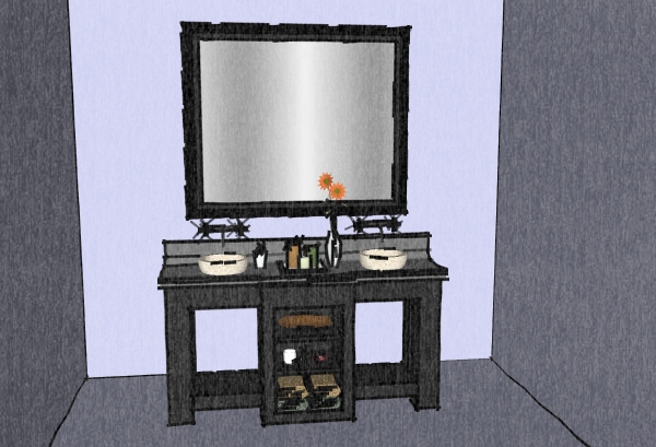
(I wanted to start with a bad example, so we could all do better)
(Rendered with SketchUp using watermark styles)
-
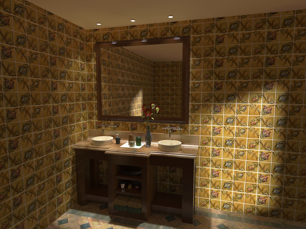
My GF says it's kitschy. Maybe indeed it is (and actually, we have soap everywhere on the sinks and counter and the laundry on the floor).

-
Nice work Gai!

Looks like you added a skylight.
What do you think - should you edit it to tell us what renderer you used, or would it be better to leave rendering information out?
-
Nice render Gaieus (although I must say I agree with your GF
 ). The vase is really looking good.
A challenge within the challenge : guess the render engine. I would say KT or Twilight, PM+FG medium AA0.3
Al, your sketchy edges say your ground is too high (maybe on purpose ?). But the charcoal effect is fine.

-
Well, actually there are two windows (on the right and behind the camera) and three spotlights above but I also placed some small point lights into those tubes so that there is a visible source of light.
Yeah, I wanted to leave out the render engine as I think that as an admin, I shouldn't really "prefer" any of them but David guessed quite right (even the render preset is kind of that)

-
Looks very nice, Gaieus. I like the lighting. I dont remember ever doing an interior render and
should start one of this days. -
Well, this was my first of this genre, too.

-
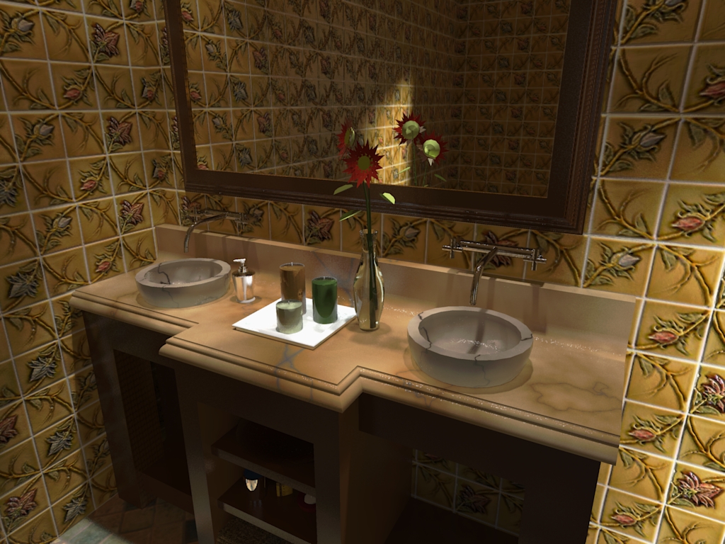
OK, maybe a close-up - now with marble sinks to make it even more extreme
 (now only used Low+ preset).
-
@gaieus said:
OK, maybe a close-up - now with marble sinks to make it even more extreme
 (now only used Low+ preset).
Marble works pretty well
-
Imagine I wanted marble sinks at home. My a*ss would be kicked.

-
Nice Challenge Al - thanks!
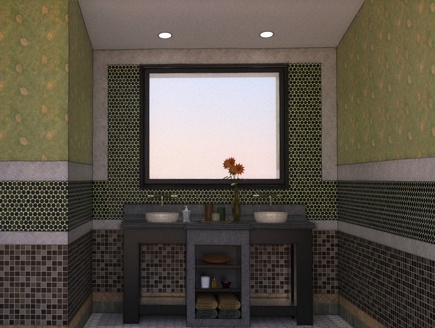
Here is my go - npr composite using multiple line exports from su and 3 different Twilight Render images. 1 = #9 preset @ 97 passes, 2 = #9 preset @ 1 pass, 3 = clay @ interior fine. I would probably try something to emphasize the lighting a little - same trick for the cans as Gaieus.
Gaieus - really like your images!

-
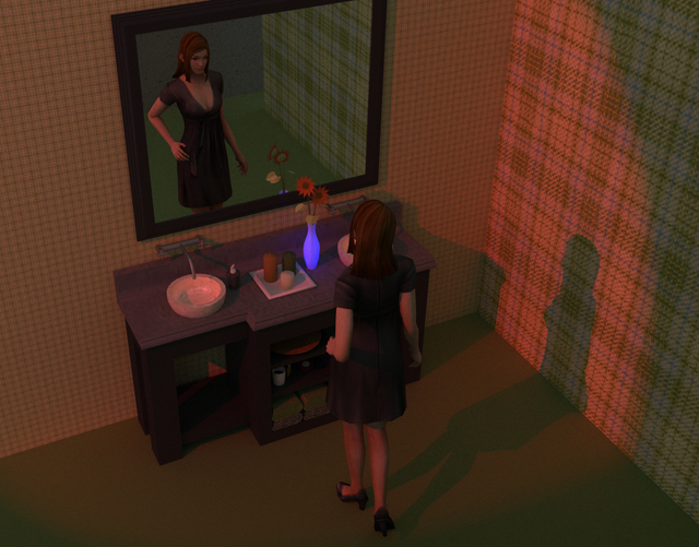
There is no way I can compete with the last two renders so I cheated and added a diversion....and tried to add a story. I used Kerky with no clue about what I am doing....it seemed so simple in the brochure. (ha)
Trying to make a decent render shows how hard it actually is (well for me.)Thanks for the challenge!
-
@tallbridgeguy said:
There is no way I can compete with the last two renders so I cheated and added a diversion....and tried to add a story. I used Kerky with no clue about what I am doing....it seemed so simple in the brochure. (ha)
Trying to make a decent render shows how hard it actually is (well for me.)Thanks for the challenge!
If this is your first rendering - Good Work!

What did you use for the human figure?
-
This is my first interior and I really don't know how to get the lighting right. (and the walls and the)
I found the young lady on the google warehouse. I can't take any credit for her.thanks again for the challenge!
-
This is a "clay rendering" with the addition of lights, highlighting, reflection, and sketchy edge lines.
(Click on image to remove scroll bars)
[Edit: New image with vanity moved up, and better lighting]
(Clay Rendering is created by treating all the materials as white, and ignoring textures.
It highlights the quality of the actual model, rather than colors and textures)(Rendered with IRender nXt using the Clay Rendering option and the Edge Line overlay option. 6 indirect lighting passes - 13 minutes rendering time)
-
@eulgrand said:
Al, your sketchy edges say your ground is too high (maybe on purpose ?). But the charcoal effect is fine.

Oops - I need to learn better how to put a room around an existing object.
I'll lower the floor if I try any more renders.
[Edit: I replaced the image in the original post, with the vanity moved up]
-
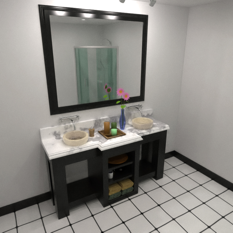
Kerkythea - MLT (BPT) approx. 70 passes (6 hours - my machine is sooo slow
 )
)
A bit of post-pro (heavy noise reduction + warm filter)Bytor, definitely like your walls

Hello! It looks like you're interested in this conversation, but you don't have an account yet.
Getting fed up of having to scroll through the same posts each visit? When you register for an account, you'll always come back to exactly where you were before, and choose to be notified of new replies (either via email, or push notification). You'll also be able to save bookmarks and upvote posts to show your appreciation to other community members.
With your input, this post could be even better 💗
Register LoginAdvertisement


